This article explains how to use trend lines in Tableau with an example. Trend Lines help visualize the trends in the data—for instance, sales trends, profit trends, etc. You can use them to check the ups and downs and quickly make decisions.
To demonstrate the addition of the Trend Lines, we used the Sample Superstore Excel sheet. Please visit the Excel Source article to understand the Data Source.
In this Add Trend Lines in Tableau example, we will create a scatter plot. For this, drag and drop the Sales Measure to the Columns shelf and the Profit to the Rows Shelf. Next, add the Category dimension to the Color shelf and the Product Name to the details shelf. By default, it creates a Scatter chart. If not, change the Mark type or use the Show Me window. For the remaining charts in Tableau, please click here.
How to add Trend Lines in Tableau?
Right-click on the report region or anywhere in the report will open the following window. Please choose the Trend Lines option and then the Show Trend Lines option.

Once you choose the option, the desktop shows the trend lines and each line represents the category.

The second option is using the Analytics tab. Please go to the Analytics tab to drag and drop the Trend Line model to the Tableau Scatter plot. It shows the following window with four options: Linear, Logarithmic, Exponential, Power, and Polynomial. Please select the required one.

The linear model is the default trendline type. The formula for calculating the Linear line type is Y= b0 + b1* X, where b0 is the intercepted line and b1 is the slope. Let me choose the Linear type, and you can see the three trend lines, each representing a category.
TIP: Double-clicking the Trend Line model will automatically add the Trend Lines of default type, i.e., Linear type, to the Tableau chart.

When you add the Sub-Category to the Rows shelf, the report shows a trend line for each Sub-Category.

Similarly, adding a Region dimension to the Columns shelf will further divide the Tableau scatter chart, show the trend line for each Sub-Category, and further divide for each region. By seeing these kinds of reports, you can identify the negative trends in a region or sub-category.

Let me remove the Sub-Category and Region from the Columns and Rows shelf. Then, add the Region to the Shape to show the distinct shapes for each region.
Edit Tableau Trend Lines
Right-click the trend line to open the following context menu. Please choose the Edit All Trend Lines option.

It will open the following window. Please use this window to change the Tableau trend line model type to linear, logical, exponential, power, and polynomial. You can check or uncheck the options, such as the tooltips, trend line colors, confidence bands, etc. For the demonstration purpose, let me checkmark the Show Confidence bands and click OK.
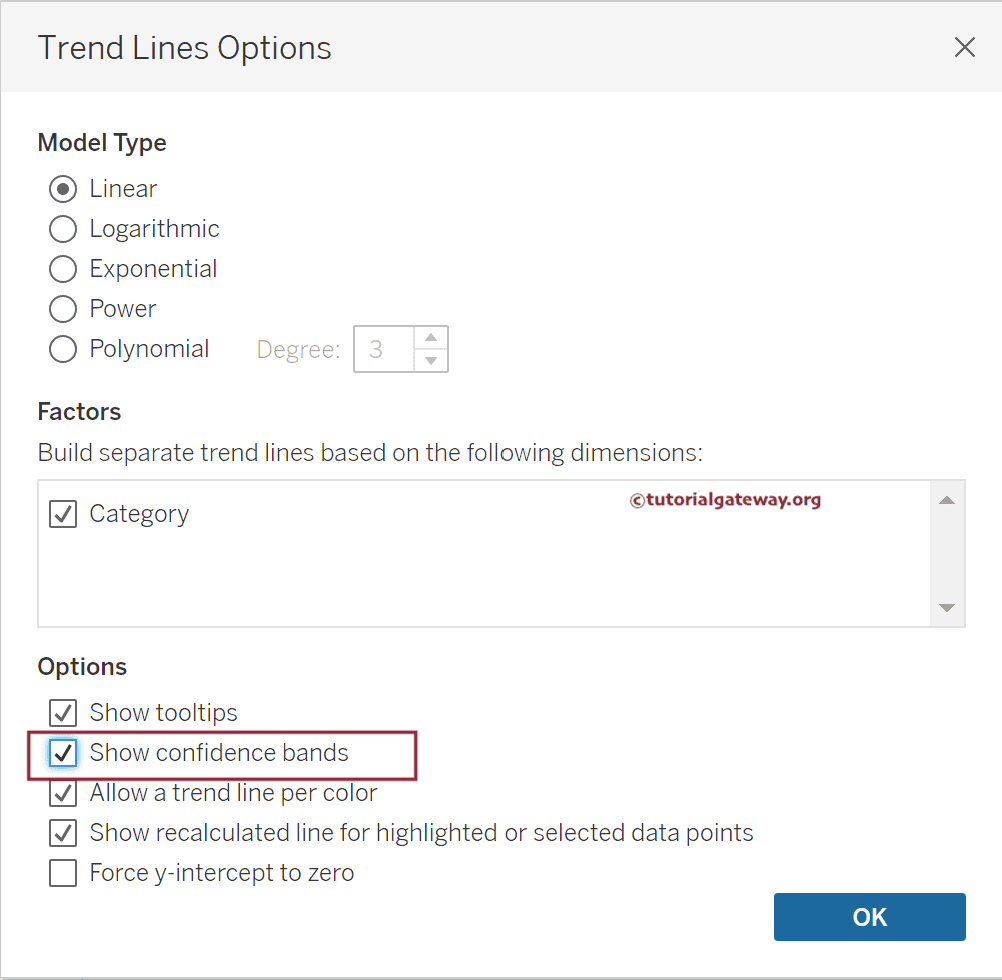
Now, you can see the confidence bands for each trend line.

Logarithmic
The Tableau Logarithmic trend line model means only positive values because logarithm is not defined for the negative values. So it will filter the negative values. The formula to calculate the Logarithmic line type is Y= b0 + b1* ln(X). If you are sure you don’t need those negative values in the final output, only use this Logarithmic trend line. Otherwise, you may be using the wrong information.
Let me change the Model type to Logarithmic. Use the Describe Trend Model Option to see the negative values this model has filtered.

Exponential
Instead of plotting the actual data, it will find the exponential value of each response variable using the formula and plot the new values. The formula to calculate the Exponential trend line model type is Y= exp(b0) + exp(b1* X).
To find the original values, ln(Y)= b0 + b1* X. The exponential value of the negative values will be different so the result might confuse you. Let me change the Model type to Exponential.

Power
The Power model trend line type transforms the values using the natural log. Then, it obtains the exponential values to plot them as the trend line. For natural log, the formula is ln(Y)= ln(b0) + b1* ln(X).
The formula to calculate the Power model type is Y = b0 * Xˆb1. Similar to the above two, it also filters the negative values. Let me change the Model type to Power.

Polynomial
The Tableau polynomial trend line model type transforms the variable into the polynomial series of the specified degrees. Here, you must select the degrees between 2 and 8; the model type will use it as the specified degrees.
The formula to calculate the Polynomial model type is Y = b0 + b1 * X + b2 * Xˆ2 + … Let me change the Model type to Polynomial.

Please click any part of the Trend Line, and it will open the context menu. Next, select the Describe Trend Model Option, and it will open the following window, giving detailed information about the trend line.

Please click any Trend Line to select the Describe Trend Line Option from the context menu to view the information about that particular one.

Click any Trend Line to select the Format Option, or go to the Tableau Format Menu and choose the Lines option. Use this window to format the trend lines as per the requirements.
