How to Format Power BI Pie Chart with examples? Formatting the Pie Chart includes changing the Legend and Title position, Slice and background Colors, etc.
To demonstrate these formatting options, we are going to use the Pie Chart that we created earlier. Please refer Pie Chart article to understand the steps involved in creating a Power BI Pie Chart.
How to Format Power BI Pie Chart
Please click on the Format button to see the list of available formatting options for this Pie Chart. For more charts >> Click Here!
Format Legend of a Power BI Pie Chart
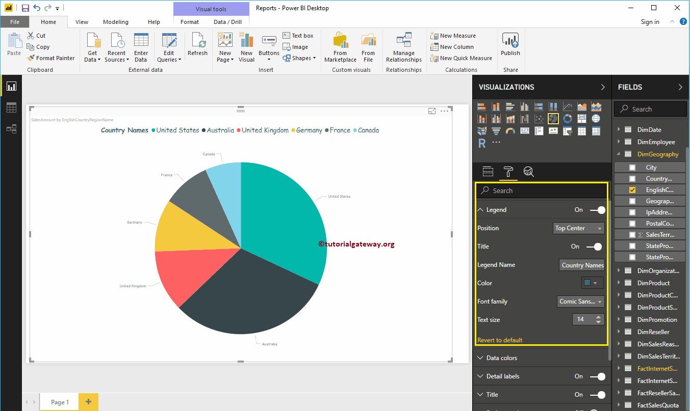
To display the Legend, Please select the Legend region and change the option from Off to On. From the below screenshot, you can see the legend.
Legend Position: Use the drop-down box to change the Pie Chart legend position as per your requirements. For now, we are selecting the Top Center and the options are Top, Bottom, Left, Right, Top Center, Bottom Center, Left Center, and Right Center.
- Title: Toggle on to display the Legend title i.e EnglishCountryRegionName
- Legend Name: You can change the Legend name. Here, we are changing its Country names
- Color: Use the Color pallet to add color to the legend
As you can see from the below screenshot, we changed the Font family to Comic Sans, and the font size to 14.
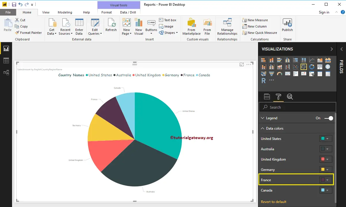
Format Data Colors of a Power BI Pie Chart
Data Colors means changing the Slice Colors. Use this section to change the default slice colors to the required ones. For the demonstration purpose, we changed the French color to Violet.
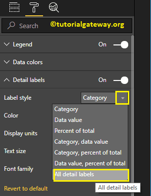
Format Detail labels of a Power BI Pie Chart
Detail labels are also called data labels. Use this section to format the slice information.
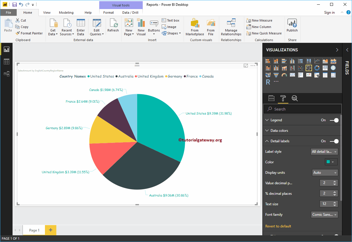
Label Style: By default, it displays the Category (Column Value) as the Label. Here we are changing it to All details labels. It means each slice shows the information about the Filed Name, Sales Amount, and Percentage of Total.
Let me change the Color of the Label to Green. You can also change the Display Units from Auto to Millions or Trillions.
We changed the Decimal Values for the Amount and Percentage of the Total to 2, the Font family to Comic Sans, and the Text size to 12. From the screenshot below, you can see all the changes that we made so far.
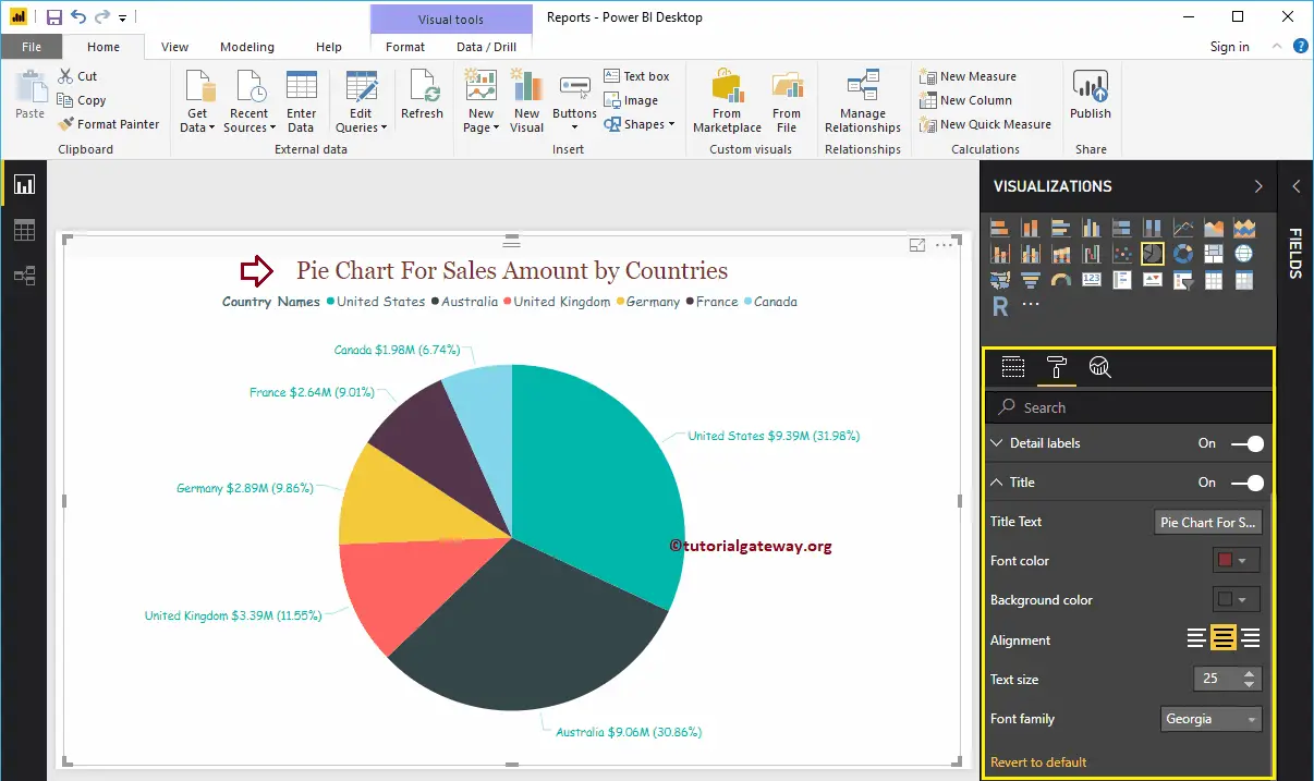
Format Title of a Power BI Pie Chart
To display the Pie Chart Title, Please select the Title, and change the option from Off to On. As you can see from the below screenshot, we changed the Title Text, Color, Font style, Font Size, and Title Alignment to the center.
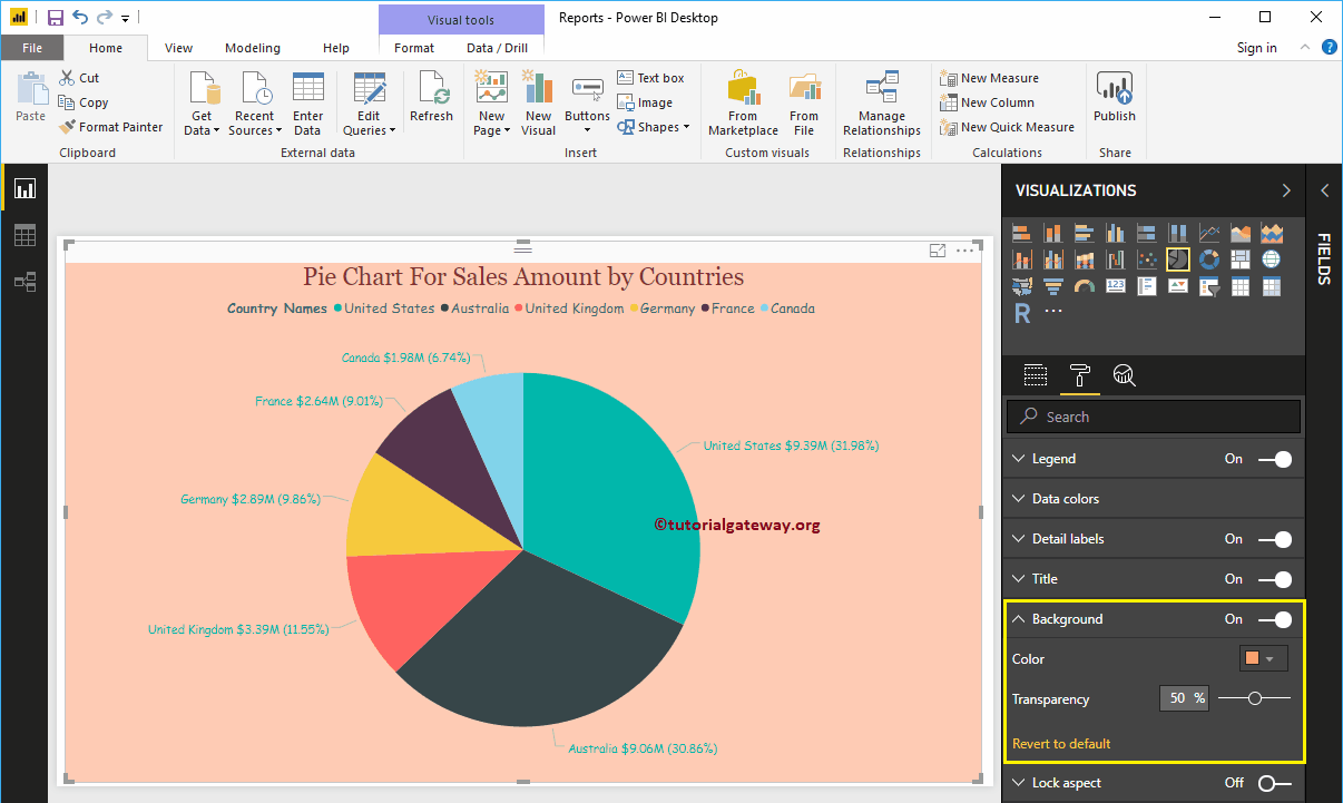
Add Background Color to Pie Chart
Toggling the Background option to On, allows you to add the Background color to the Pie Chart. For demonstration purposes, we are adding a background color. Here, you can change the Transparency percentage as well.
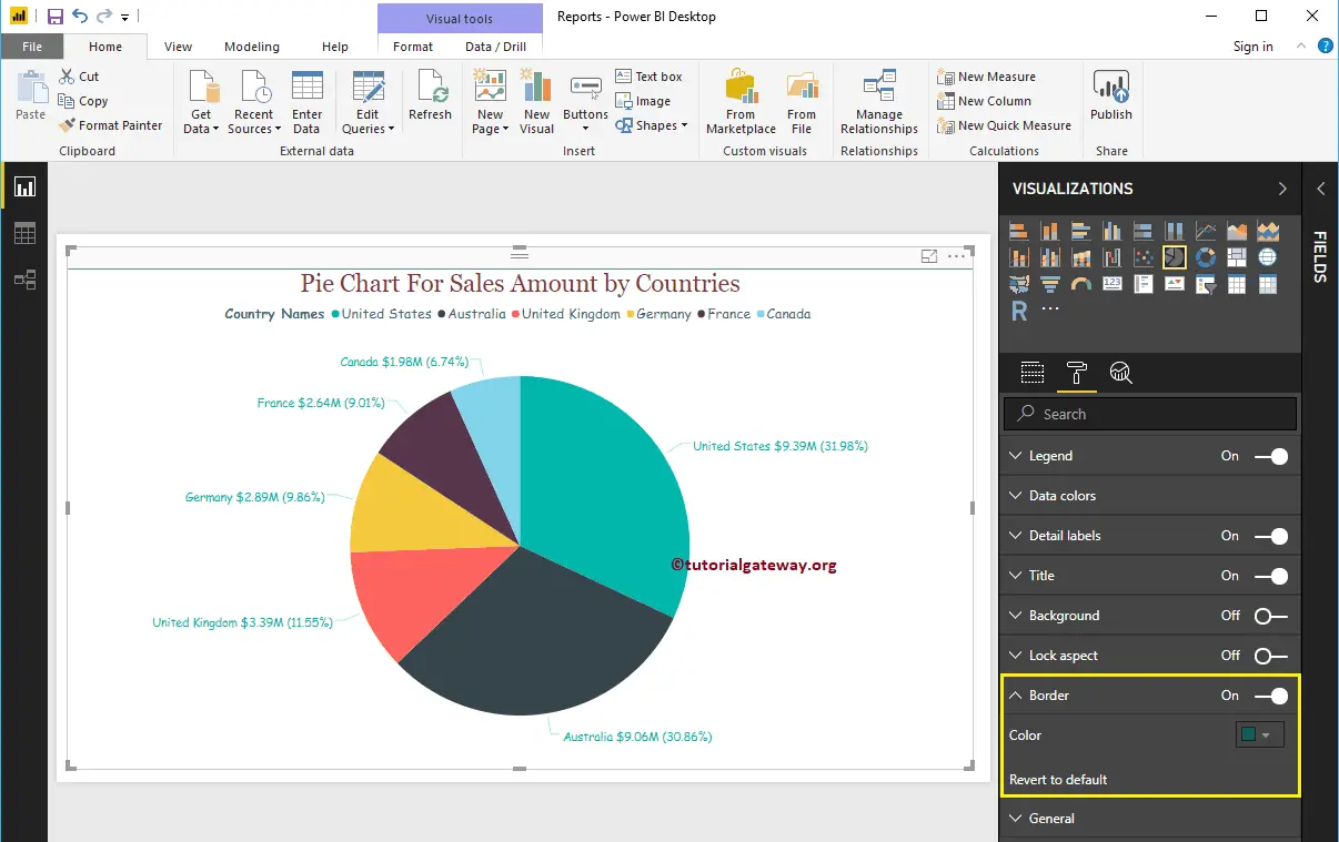
Add Border Colors to the Pie Chart
By toggling the Border option to On allows you to add Borders to the Pie Chart. For demonstration purposes, we are adding Green color as the Border color.
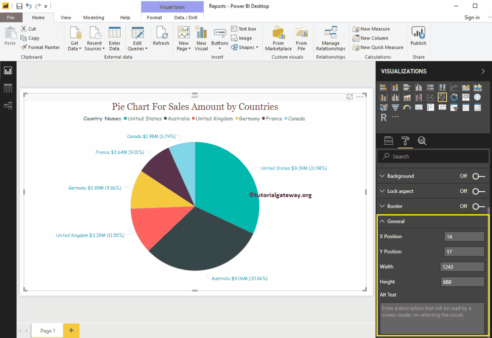
Use the General Section to Change the X, Y position, and Width and height of a Pie Chart
Comments are closed.