The box plot or boxplot in R programming is a convenient way to graphically visualize the numerical data group by specific data. Let us see how to Create, Remove outlines, Format their color, add names, add the mean, and draw a horizontal boxplot in this Programming language with an example.
R Boxplot Syntax
The syntax to draw the Boxplot in this Programming is
boxplot(formula, data = NULL,.., subset, na.action = NULL)
The complex syntax behind this Boxplot function has the following arguments
(x, ....., range = 1.5, width = NULL, varwidth = FALSE,
     notch = FALSE, outline = TRUE, col = NULL, log = "",
     border = par("fg"), names, plot = TRUE,
     pars = list(boxwex = 0.8, staplewex = 0.5, outwex = 0.5),
     horizontal = FALSE, add = FALSE, at = TRUE)
There are many arguments supported by the Boxplot in R programming language, and the following are some of the arguments:
- data: Please specify the Data Frame or List that contains the data to draw a boxplot. In this example, it is airquality
- subset: You can restrict the plots by specifying the vector of values. In this example, you can restrict them to August month.
- x: Please specify the data from which you want to draw. Here, you can use a numeric vector or a list containing the numeric vector.
- range: This Programming boxplot argument decides how far the whisker extends out of the box.
- width: It is optional, use this to specify a vector that contains the widths of each box.
- varwidth: It is a Boolean argument. If it is TRUE, boxes draw with widths proportional to the square roots of the no. of observations in the group.
- border: It is an optional argument. Please specify the vector of color you want to add to the outlines of the boxplot borders.
- plot: It is a Boolean argument. If it is FALSE, it returns the summaries on which the R boxplots are based.
- log: You have to specify a character string of three options. If X-Axis is to be logarithmic, then “x”, If Y-Axis is to be logarithmic “y”, if both X-Axis and Y-Axis are to be logarithmic, then specify either “xy” or “yx”
- add: It is a Boolean argument, and by default, it is FALSE. If it is TRUE, the plot should add to an already existing plot.
- horizontal: It is a Boolean argument. If it is FALSE, the boxplot drew vertically. If it is TRUE, it drew horizontally.
- at: It is a numeric vector, which gives the locations where the boxplot drew. It is very helpful when we are adding a new box to the existing plot region.
Before we get into the example, let us see the airquality dataset data provided by this programming, which we are going to use for this boxplot example.
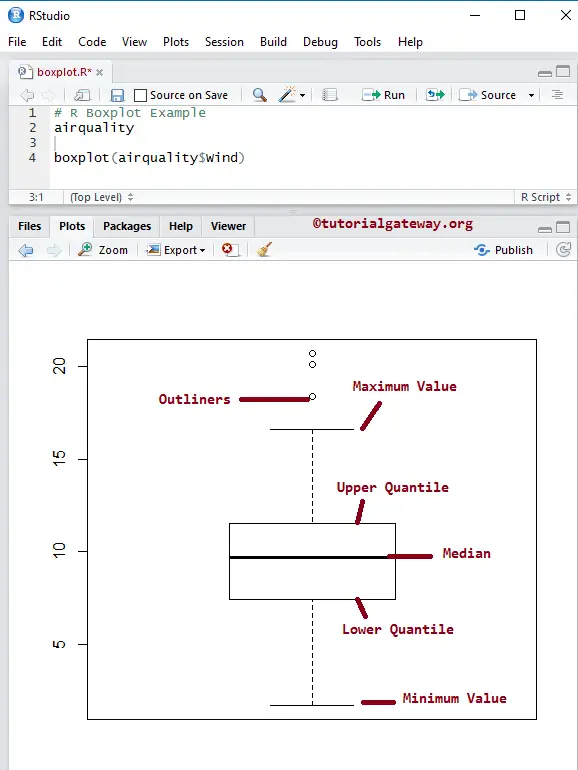
Return Value of a Boxplot in R Programming
In general, before we start creating, let us see how the data is divided. It returns the stats, outliners, groups, and names.
airquality

return.value <- boxplot(airquality$Wind)
return.value
> return.value <- boxplot(airquality$Wind)
> return.value
$stats
     [,1]
[1,]  1.7
[2,]  7.4
[3,]  9.7
[4,] 11.5
[5,] 16.6

$n
[1] 153

$conf
          [,1]
[1,]  9.176285
[2,] 10.223715

$out
[1] 20.1 18.4 20.7

$group
[1] 1 1 1

$names
[1] "1"
Create a Boxplot in R Programming
In this example, we create a Boxplot using the airquality data set, which is provided by the Studio. If you require to import data from external files, then refer to the R Read CSV article to understand the importing of the CSV file.
airquality

boxplot(airquality$Wind)
airquality data set returns the output as a List. So, we are using the $ to extract the data from the List.
boxplot(airquality$Wind)
Boxplot using Formula argument
In this example, we create using the formula argument to create a boxplot in this programming.
- formula: It should be something like value~group, where the value is the vector of numeric values, and the group is the column you want to use as a group by. For example, you want to draw the sample size box for countrywide sales, then value = sales and group = country.
airquality

boxplot(airquality$Wind~airquality$Month)
Assigning names to Boxplot
In this example, we assign names to R Boxplot, X-Axis, and Y-Axis using main, xlab, and ylab
- main: You can change or provide the Title.
- xlab: Please specify the label for the X-Axis
- ylab: Please specify the label for the Y-Axis
- las: Used to change the Y-axis values direction.
airquality

boxplot(airquality$Wind~airquality$Month,
        main = "Airquality",
        xlab = "Months",
        ylab = "Wind",
        las = 1
        )
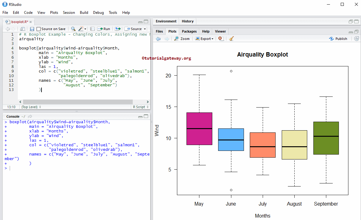
Change Colors of a Boxplot
In this example, we change the Boxplot box colors using the col argument
- col: Please specify the color you want to use. Type colors() in your console to get the list of colors available.
- names: Please specify the names of the boxes. Here, we are changing the Month numbers to Month names.
#  Changing Colors, Assigning new Names
airquality

boxplot(airquality$Wind~airquality$Month,
        main = "Airquality",
        xlab = "Months",
        ylab = "Wind",
        las = 1,
        col = c("violetred", "steelblue1", "salmon1",
                "palegoldenrod", "olivedrab"),
        names = c("May", "June", "July", "August", "September")
        )
Removing Outlines of Boxplot
In this Boxplot example, we remove the Outlines using an outline argument.
- outline: It is a Boolean argument. If it is TRUE, it draws the outlines (that are extra dots outside the box), and if it is false, all the outlines are removed.
boxplot(airquality$Wind~airquality$Month,
        outline = FALSE,
        main = "Airquality",
        xlab = "Months",
        ylab = "Wind",
        las = 1,
        col = c("violetred", "steelblue1", "salmon1",
                "palegoldenrod", "olivedrab"),
        names = c("May", "June", "July",
                  "August", "September")
        )
Calculating & Adding Mean to Boxplot in R
In this example, we calculate the Mean of each box and how to add those mean values to the existing boxplot using the points function.
boxplot(airquality$Wind~airquality$Month,
        main = "Airquality",
        xlab = "Months",
        ylab = "Wind",
        las = 1,
        col = c("violetred", "steelblue1", "salmon1",
                "palegoldenrod", "olivedrab"),
        names = c("May", "June", "July",
                  "August", "September")
        )

meanval <- by(airquality$Wind, airquality$Month, mean)
points(meanval, col = "white", pch = 8, cex = 1.5)
The following statement finds the mean value of Wind, grouped by Month numbers.
meanval <- by(airquality$Wind, airquality$Month, mean)
The following statement adds that means value to the boxes. pch = 8 means star character, cex is the size of the character, and col is for color.
points(meanval, col = "white", pch = 8, cex = 1.5)
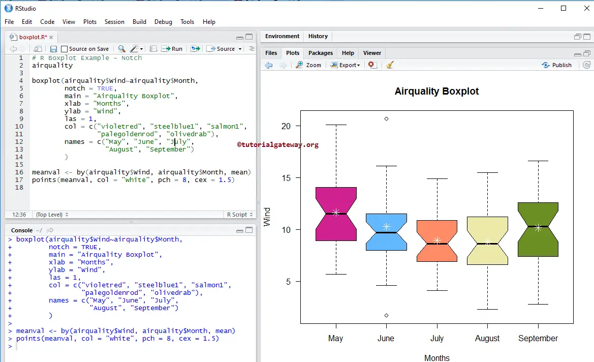
Notch argument in Boxplot
In this example, we draw a line on each side of the boxes using the notch argument.
- notch: It is a Boolean argument. If it is TRUE, a notch is drawn on each side of the box. If the notches of 2 plots overlapped, then we could say that the medians of them are the same. Otherwise, they are different.
# Notch
airquality

boxplot(airquality$Wind~airquality$Month,
        outline= FALSE,
        notch = TRUE,
        main = "Airquality",
        xlab = "Months",
        ylab = "Wind",
        las = 1,
        col = c("violetred", "steelblue1", "salmon1",
                "palegoldenrod", "olivedrab"),
        names = c("May", "June", "July",
                  "August", "September")
)

meanval <- by(airquality$Wind, airquality$Month, mean)
points(meanval, col = "white", pch = 8, cex = 1.5)
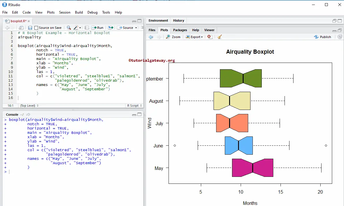
Horizontal Boxplot in R Programming
We change the default vertical boxplot into a horizontal box plot in this example using a horizontal argument.
airquality

boxplot(airquality$Wind~airquality$Month,
        notch = TRUE,
        horizontal = TRUE,
        main = "Airquality",
        xlab = "Months",
        ylab = "Wind",
        las = 1,
        col = c("violetred", "steelblue1", "salmon1",
                "palegoldenrod", "olivedrab"),
        names = c("May", "June", "July",
                  "August", "September")
        )
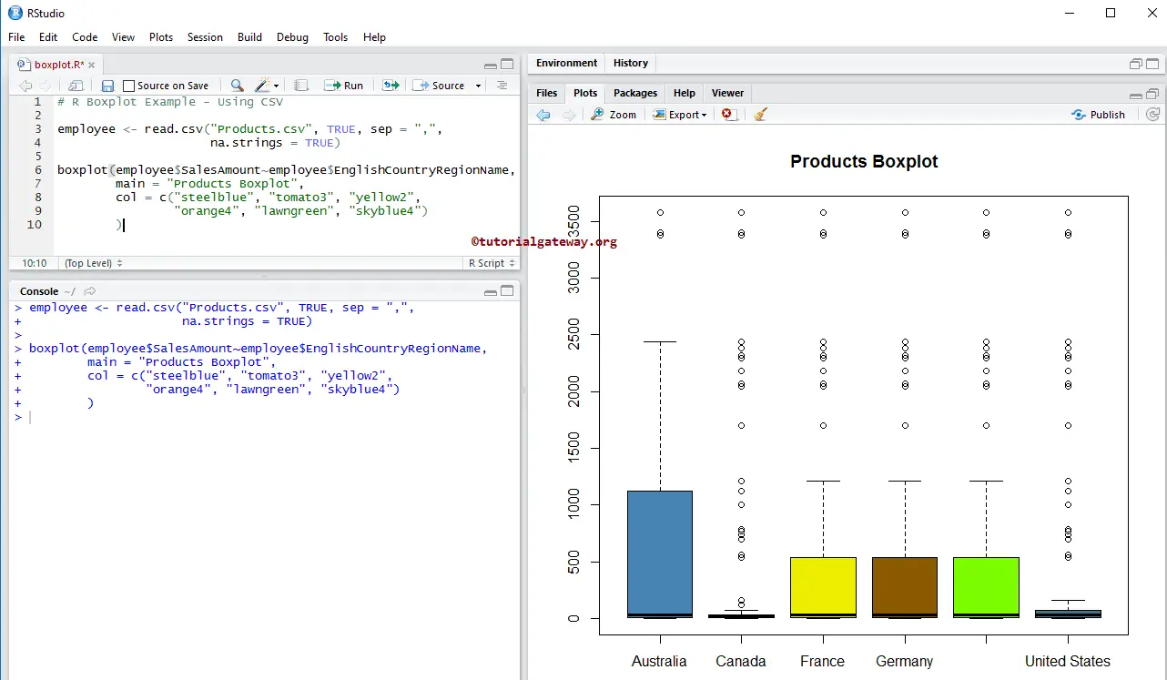
Creating Boxplot using CSV File
Let us see how to create the Boxplot using external data. For this, we are importing data from the CSV file using the read.csv function. Refer to the Read CSV article to import the CSV file.
employee <- read.csv("Products.csv", TRUE, sep = ",",
                     na.strings = TRUE)

boxplot(employee$SalesAmount~employee$EnglishCountryRegionName,
        main = "Products",
        col = c("steelblue", "tomato3", "yellow2",
                "orange4", "lawngreen", "skyblue4")
        )
The above code snippet will draw the boxplot for the Sales Amount, grouped by Country.