The Barplot or Bar Chart in R Programming is handy for comparing the data visually. By seeing this barplot or bar chart, one can understand which product is performing better compared to others. For example, If we want to compare the sales between different product categories and product colors, we can use this bar chart.
Let us see how to create a stacked Bar Chart, format its color and borders, add legions, and Juxtapose barplot in R Programming language with an example.
R Barplot Syntax
The syntax to draw the bar chart in R Programming using the barplot function is
barplot(height, name.args = NULL, col = NULL, main = NULL)
and the complex syntax behind this bar chart using barplot is:
barplot(height, width = 1, space = NULL, name.args = NULL,
        legend.text = NULL, beside = FALSE, horiz = FALSE,
        density = NULL, angle = 45, col = NULL, border = par("fg"),
        main = NULL, sub = NULL, xlab = NULL, ylab = NULL,
        xlim = NULL, ylim = NULL, xpd = TRUE, log = "",
        axes = TRUE, axisnames = TRUE, cex.axis = par("cex.axis"),
        cex.names = par("cex.axis"), inside = TRUE, plot = TRUE,
        axis.lty = 0, offset = 0, add = FALSE, args.legend = NULL,…)
Many arguments are supported by the barplot in the programming language to generate a bar chart. The following are the most used arguments in real time.
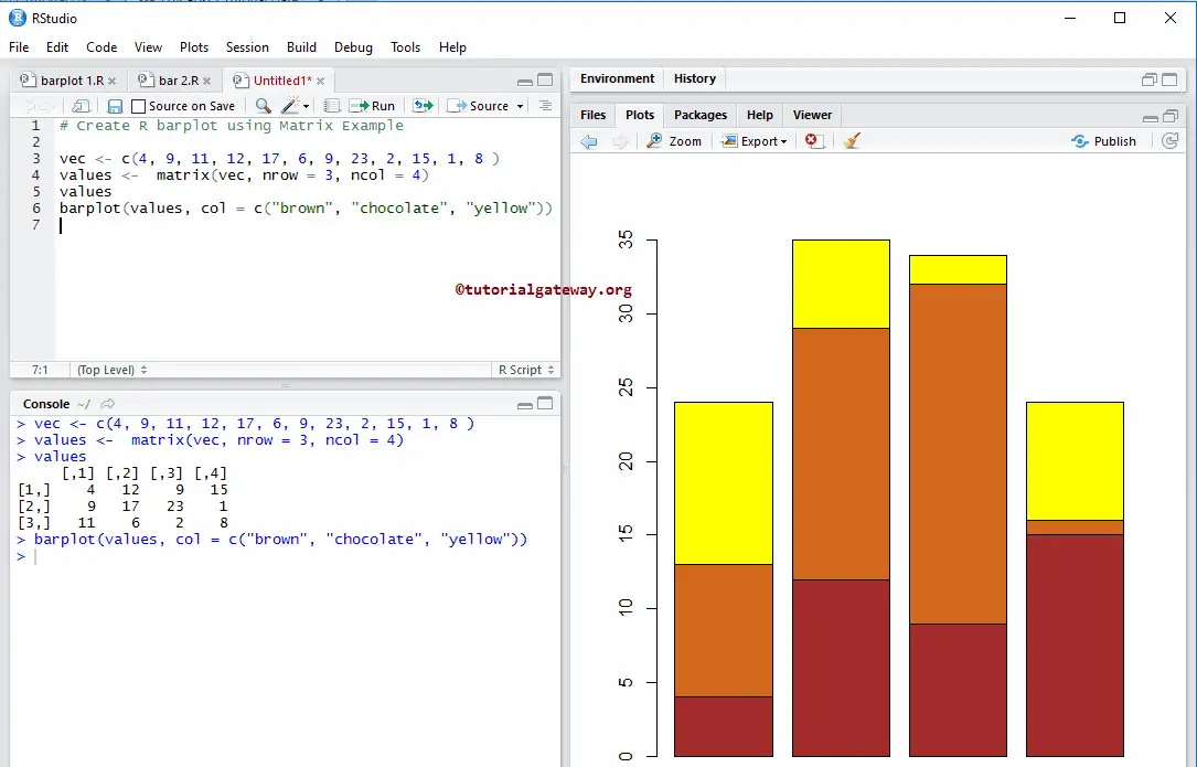
- height: You can specify either a Vector or a Matrix of values. If it is a Vector, the bar chart will create a sequence of rectangular bars, and each barplot height depends upon the vector value. And if the height is a Matrix of values and besides is FALSE, each matrix column represents the bar, and the row values create stacked sub-bars. If beside is TRUE and height is a Matrix of values, then each matrix column represents the juxtaposed bar.
- width: It is optional, but you can use this to specify the width of a bar chart.
- space: Please specify the amount of space you want to the left before each bar of the R barplot chart. If the height is a Matrix of values and besides is TRUE, you have to pass two values to the space argument, where the 1st value provides space between the same group bars, and the 2nd value is space between the different columns (groups)
- names.args: Please specify a Vector of names you want to plot below each one or group of bars in a bar chart. If we omit this argument, it takes the names from column names if it is a matrix or the names attribute of height if it is a vector.
- text: Please specify a Vector of text used to construct the legend for the bar chart or a Boolean value indicating whether you want to include the legend.
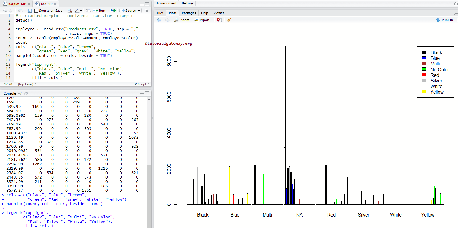
- beside: It is a Boolean argument. If it is FALSE, the chart height columns are portrayed as a stacked bar chart in R; if it is TRUE, the columns are portrayed as a Juxtaposed barplot.
- horiz: It is a Boolean argument. If it is FALSE, it drew vertically. If it is TRUE, bars are drawn horizontally.
- density: Please specify the density of the shading lines (in lines per inch). By default, it is NULL, which means no shading lines.
- angle: You can assign the slope of shading lines using this argument.
- col: Please specify the vector of colors you want to use for the bar chart or barplot in R. By default, it uses a set of 6-pascal colors.
- border: Please specify the color you want to add to the borders. If you use border = NA, then borders will omit.
- main: You can provide the Title for your bar chart.
- sub: You can provide the subtitle (if any).
- xlab: Please specify the label for the barplot X-Axis
- ylab: Please specify the label for the Y-Axis
- xlim: This argument can help you to specify the limits for the X-Axis
- ylim: This argument can help specify the barplot Y-Axis limits
- xpad: It is a Boolean argument. Do you want to allow bars outside the region?
- log: You have to specify a character string of three options. If X-Axis is to be logarithmic, then “x”, If Y-Axis is to be logarithmic “y”, if both X-Axis and Y-Axis are to be logarithmic, then specify either “xy” or “yx”
- axes: It is a Boolean argument. If it is TRUE, a vertical (or horizontal, if horiz = TRUE) axis is drawn.
- axisnames: It is a Boolean argument. If it is TRUE, and if there is arg, the other axis of the bar chart is drawn (with lty = 0) and labeled in the R barplot.
- axis: Expansion factor for numeric axis labels.
- names: Expansion factor for labels.
- inside: It is a Boolean argument. If it is TRUE, the lines that divide adjacent bars will draw. We have to use this argument when space = 0
- plot: It is a Boolean argument. If it is FALSE, nothing is plotted.
- lty: It is a graphical parameter, which is applied to the axis and tick marks of the categorical axis.
- offset: Please specify a vector indicating, How much the bars should shift relative to X-Axis.
- add: It is a Boolean argument, and by default, it is FALSE. If it is TRUE, bars will add to an already existing plot.
- legend: List of arguments you want to add to the legend() function.
Create a basic bar Chart
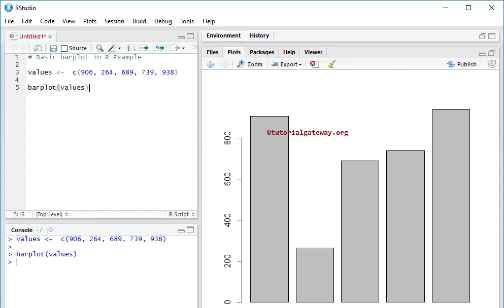
In this example, we show how to create a bar chart using the vectors and barplot in R programming.
First, we declared a vector of random numbers. Next, we used the barplot function to draw the bar chart. From the below code snippet, you can observe that height is decided by the values.
values <-  c(906, 264, 689, 739, 938)

barplot(values)
Create a Bar Chart in R using CSV and barplot
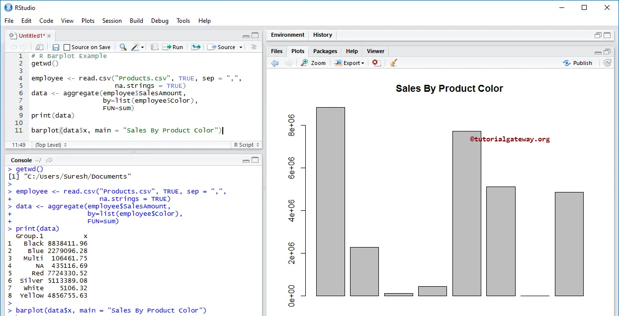
In this example, we create a Bar Chart using external data or CSV. For this, we are importing data from the CSV file using the read.csv function. I suggest you refer to the Read CSV article to understand the steps involved in CSV file import in R Programming.
getwd()

employee <- read.csv("Products.csv", TRUE, sep = ",",
                     na.strings = TRUE)
data <- aggregate(employee$SalesAmount,
                  by=list(employee$Color),
                  FUN=sum)
print(data)

barplot(data$x, main = "Sales By Product Color")
The following statement import the data from the CSV file
employee <- read.csv("Products.csv", TRUE, sep = ",",
                     na.strings = TRUE)
From the below code snippet, see that we used the Aggregate function to find each color’s total sales amount. Or we can say the Sum of Sales Amount Group By Product Color.
data <- aggregate(employee$SalesAmount,
                  by=list(employee$Color),
                  FUN=sum)
The above statement returns the output as a List. So, we use the $ to extract the aggregated data (sum of sales amount) from the List.
barplot(data$x, main = "Sales By Product Color")
Assigning names
In this barplot example, we assign names to the bar chart, X-Axis, Y-Axis, and individual bars using main, xlab, ylab, and names.
# Assign Names to X, Y Axis Example

barplot(output$x,
        main = "Sales By Product Color",
        xlab = "Product Colors",
        ylab = "Sales",
        names = output$Group.1)
Change the R Bar Chart Colors using barplot col
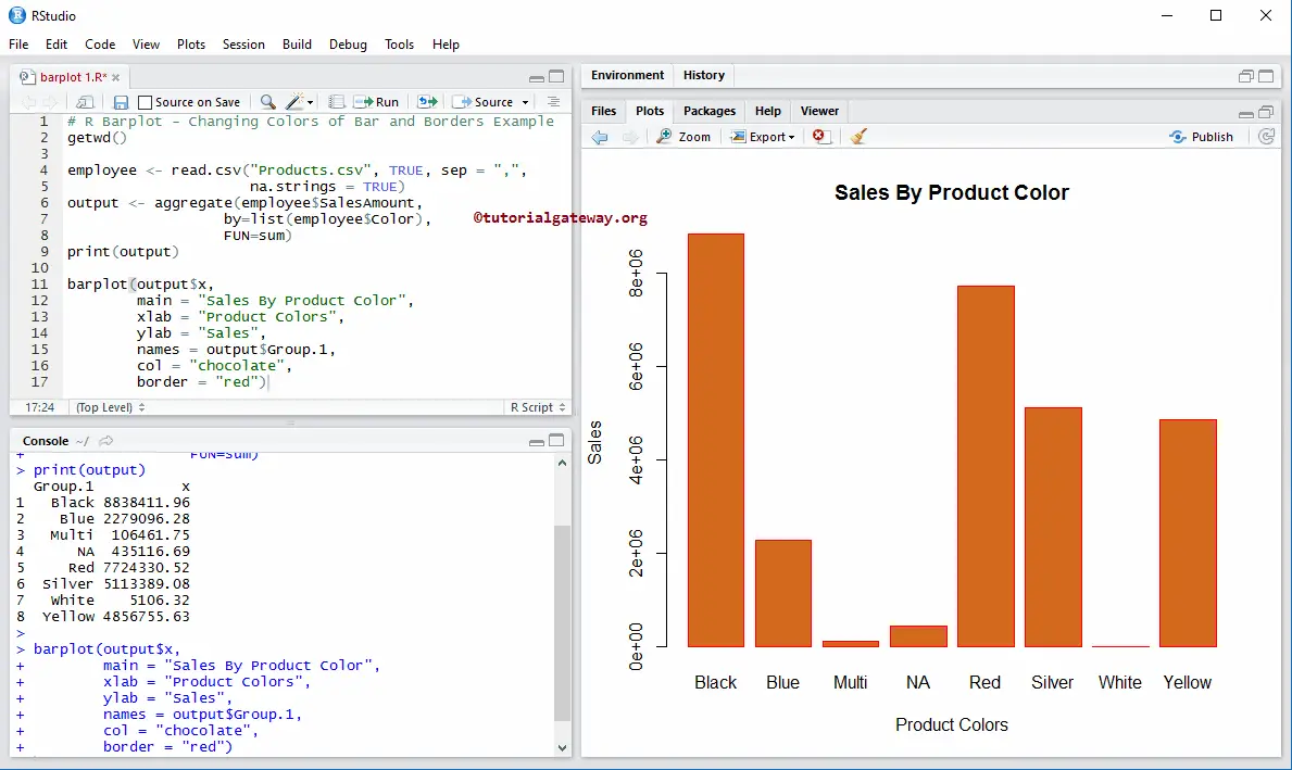
In this example, we change the bar chart colors using the col argument and border colors using the border argument.
# Changing Colors of lines and Borders Example
getwd()

employee <- read.csv("Products.csv", TRUE, sep = ",",
                     na.strings = TRUE)
output <- aggregate(employee$SalesAmount,
                  by=list(employee$Color),
                  FUN=sum)
print(output)

barplot(output$x,
        main = "Sales By Product Color",
        xlab = "Product Colors",
        ylab = "Sales",
        names = output$Group.1,
        col = "chocolate",
        border = "red")
TIP: To assign different border colors, use a Vector of colors. For example, border = c(“red”, “black”, “green”, …)
Horizontal Bar Chart
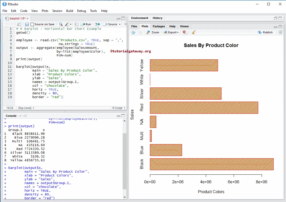
In this example, we change the default vertical into a horizontal bar chart using the barplot horiz argument. We also use the density argument to change the bar density.
getwd()

employee <- read.csv("Products.csv", TRUE, sep = ",",
                     na.strings = TRUE)
output <- aggregate(employee$SalesAmount,
                  by=list(employee$Color),
                  FUN=sum)
print(output)

barplot(output$x,
        main = "Sales By Product Color",
        xlab = "Product Colors",
        ylab = "Sales",
        names = output$Group.1,
        col = "chocolate",
        horiz = TRUE,
        density = 80,
        border = "red")
Create a Stacked Bar Chart in R Programming
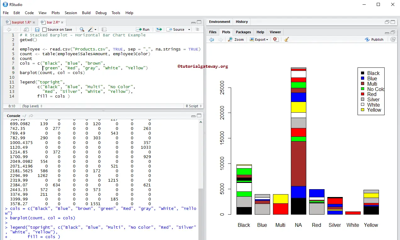
Let us see how to create a stacked bar chart in this programming and add Legend to it using the barplot and legend functions.
The following count statement creates a table with records of sales amount and color. Here, column values are unique colors, and row values are unique sales amounts.
Next, we create the stacked bar chart using the above-specified table.
getwd()

employee <- read.csv("Products.csv", TRUE, sep = ",", na.strings = TRUE)
count <- table(employee$SalesAmount, employee$Color)
count
cols = c("Black", "Blue", "brown",
         "green", "Red", "gray", "White", "Yellow")
barplot(count, col = cols)

legend("topright",
       c("Black", "Blue", "Multi", "No Color",
         "Red", "Silver", "White", "Yellow"),
       fill = cols )
Create Juxtaposed Bar Chart in R Programming
In this example, we create a juxtaposed bar chart using the beside argument.
# Juxtaposed Example
getwd()

employee <- read.csv("Products.csv", TRUE, sep = ","
                     , na.strings = TRUE)
count <- table(employee$SalesAmount, employee$Color)
count
cols = c("Black", "Blue", "brown",
         "green", "Red", "gray", "White", "Yellow")
barplot(count, col = cols, beside = TRUE)

legend("topright",
       c("Black", "Blue", "Multi", "No Color",
         "Red", "Silver", "White", "Yellow"),
       fill = cols )
Use Matrix to create a Bar Chart
In this example, we create a bar chart using Matrix values.
# Create using Matrix Example

vec <- c(4, 9, 11, 12, 17, 6, 9, 23, 2, 15, 1, 8 )
values <-  matrix(vec, nrow = 3, ncol = 4)
values
barplot(values, col = c("brown", "chocolate", "yellow"))
Comments are closed.