The R ggplot2 Histogram is very useful for visualizing the statistical information that can organize in specified bins (breaks or ranges). Though it looks like a Barplot, R ggplot Histogram displays data in equal intervals.
Let us see how to Create a ggplot Histogram in R programming, Format its color, change its labels, and alter the axis. Next, add the density curves and plot multiple Histograms using the ggplot2 with an example.
R ggplot2 Histogram Syntax
The syntax to draw a ggplot Histogram in this Programming is
geom_histogram(data = NULL, binwidth = NULL, bins = NULL)
and the complex syntax behind the ggplot2 Histogram is:
geom_histogram(mapping = NULL, data = NULL, stat = "bin",
               binwidth = NULL, bins = NULL, position = "stack", ...,
               na.rm = FALSE, show.legend = NA, inherit.aes = TRUE)
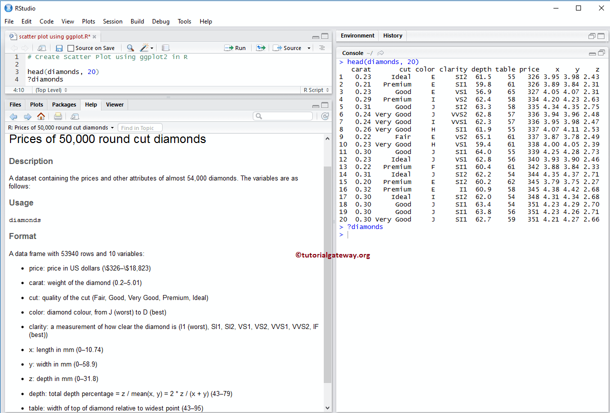
Before we get into the ggplot Histogram example, let us see the data we will use for this example. For this demonstration, we are going to use the diamonds data set that is provided by the R, and the data inside this data set is:
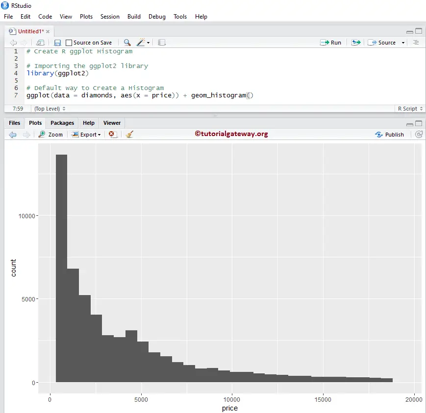
Create R ggplot2 Histogram
This example shows how to create it using the ggplot2 package. For this demo, we are going to use the above-shown diamonds data set provided by R Studio.
TIP: ggplot2 package is not installed by default. Please refer Install R Packages article to install the package in R Programming.
# Importing the ggplot2 library
library(ggplot2)

ggplot(data = diamonds, aes(x = price)) + geom_histogram()
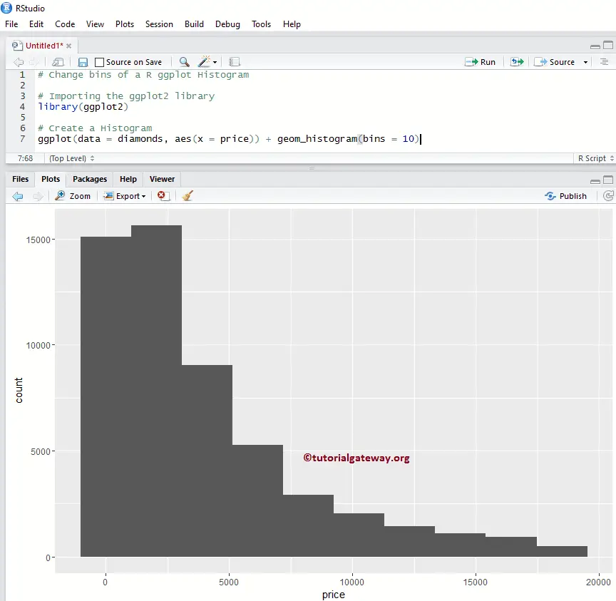
Change bins of a R ggplot2 Histogram
In this example, we show how to change the number of bins (range, or breaks) in an R ggplot histogram. By default, geom_histogram() provides 30 bins, but you can alter the value as per the requirements.
NOTE: If you require to import data from external files, then please refer to the R Read CSV article to import the CSV file.
library(ggplot2)

# Default way to Create
ggplot(data = diamonds, aes(x = price)) + geom_histogram(bins = 10)
Change binwidth
This example shows how to change the number of binwidth (overriding the bins) in an R ggplot histogram.
library(ggplot2)

ggplot(data = diamonds, aes(x = price)) + geom_histogram(binwidth = 10)
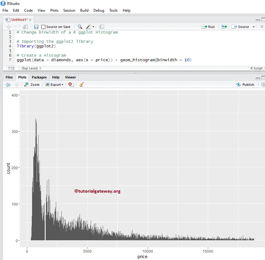
TIP: Use bandwidth = 2000 to get the same one that we created with bins = 10.
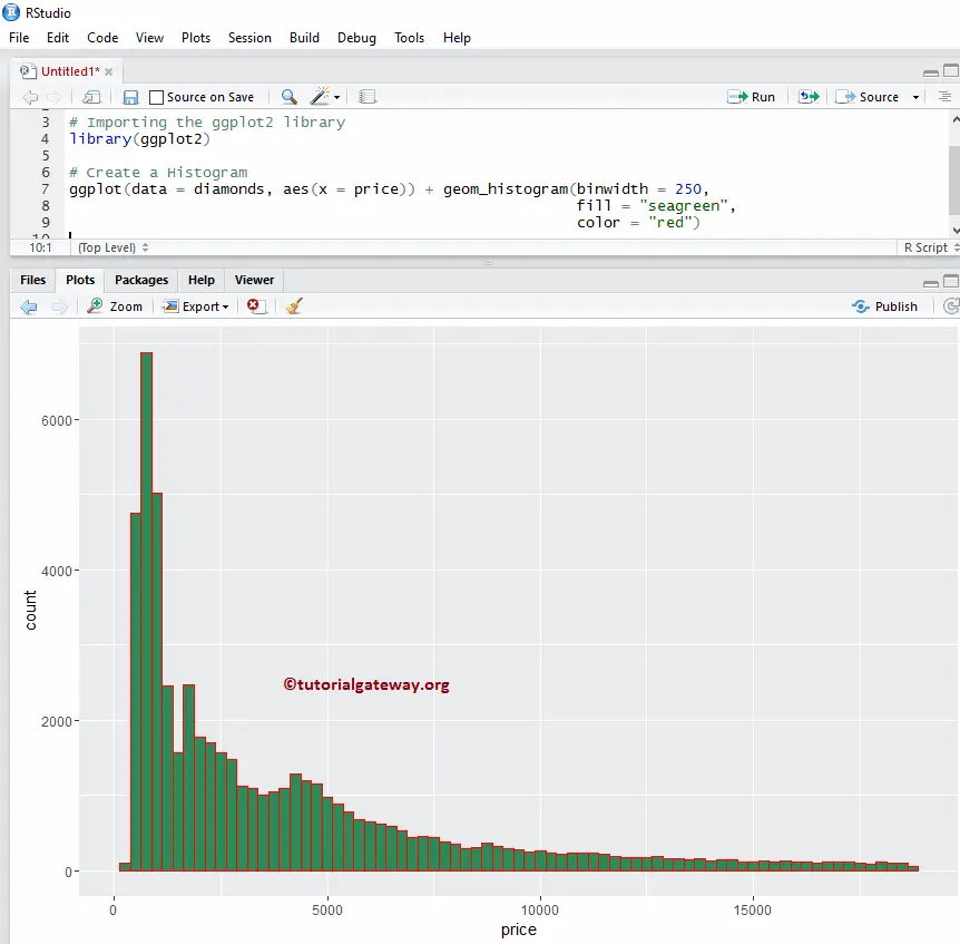
Change Colors of an R ggplot2 Histogram
In this example, we change the color of the one drawn by the ggplot2.
- color: Please specify the color to use for your bar borders. For example “red”, “blue”, “green” etc. We assign the “red” color to borders in this example.
- fill: You have to specify the Bar Colors. In this example, we are assigning the sea green color.
library(ggplot2)

ggplot(data = diamonds, aes(x = price)) + geom_histogram(binwidth = 250,
                                                         fill = "seagreen",
                                                         color = "red")
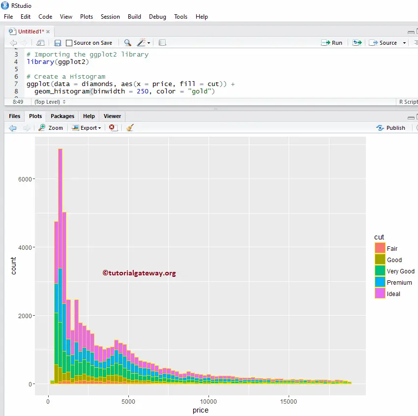
Change Color Example 2
Let us see how to change the color of a ggplot2 histogram based on the column data. In this example, we are assigning the cut column as the fill attribute. You can try changing it to any other column.
library(ggplot2)

ggplot(data = diamonds, aes(x = price, fill = cut)) +
        geom_histogram(binwidth = 250, color = "red")
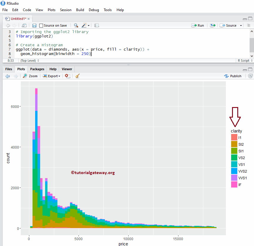
Change Color Example 3
In this example, we are changing the fill attribute to clarity and removing the borders of each bar in an r ggplot histogram.
library(ggplot2)

ggplot(data = diamonds, aes(x = price, fill = clarity)) +
  geom_histogram(binwidth = 250)
Change Line Type of an R ggplot2 Histogram
In this example, we change the borderlines of each bar in a ggplot histogram.
library(ggplot2)

ggplot(data = diamonds, aes(x = price, fill = clarity)) +
  geom_histogram(binwidth = 250, color = "midnightblue", linetype = "longdash")
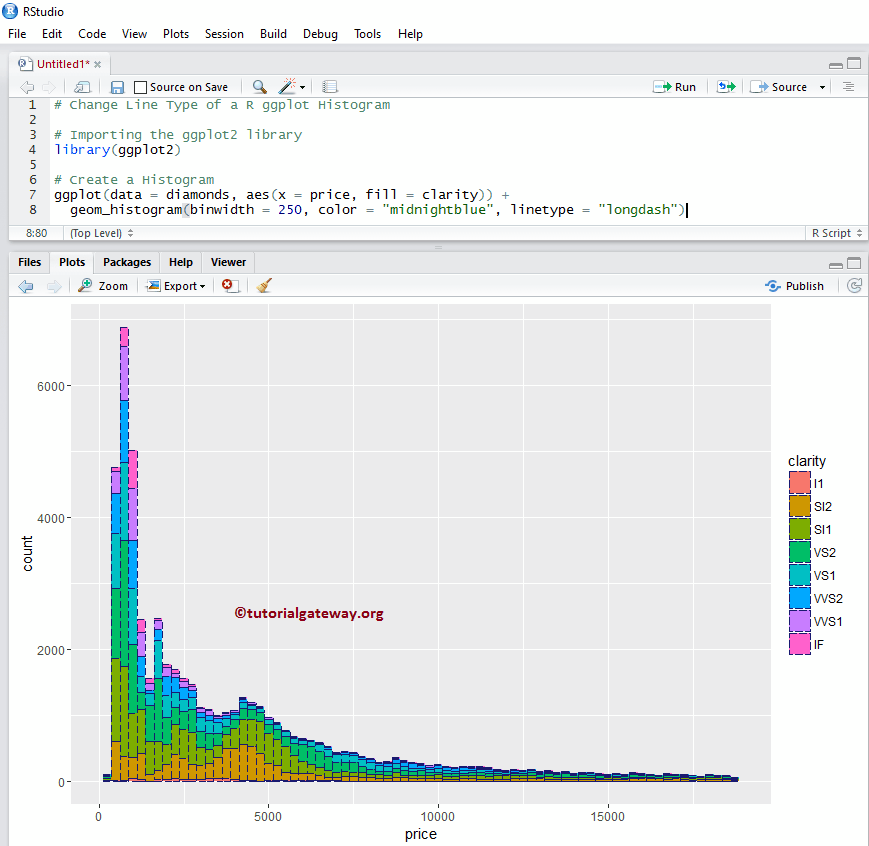
TIP: In R programming, 0 = blank, 1 = solid, 2 = dashed, 3 = dotted, 4 = dotdash, 5 = longdash, 6 = twodash. So, use numbers or string
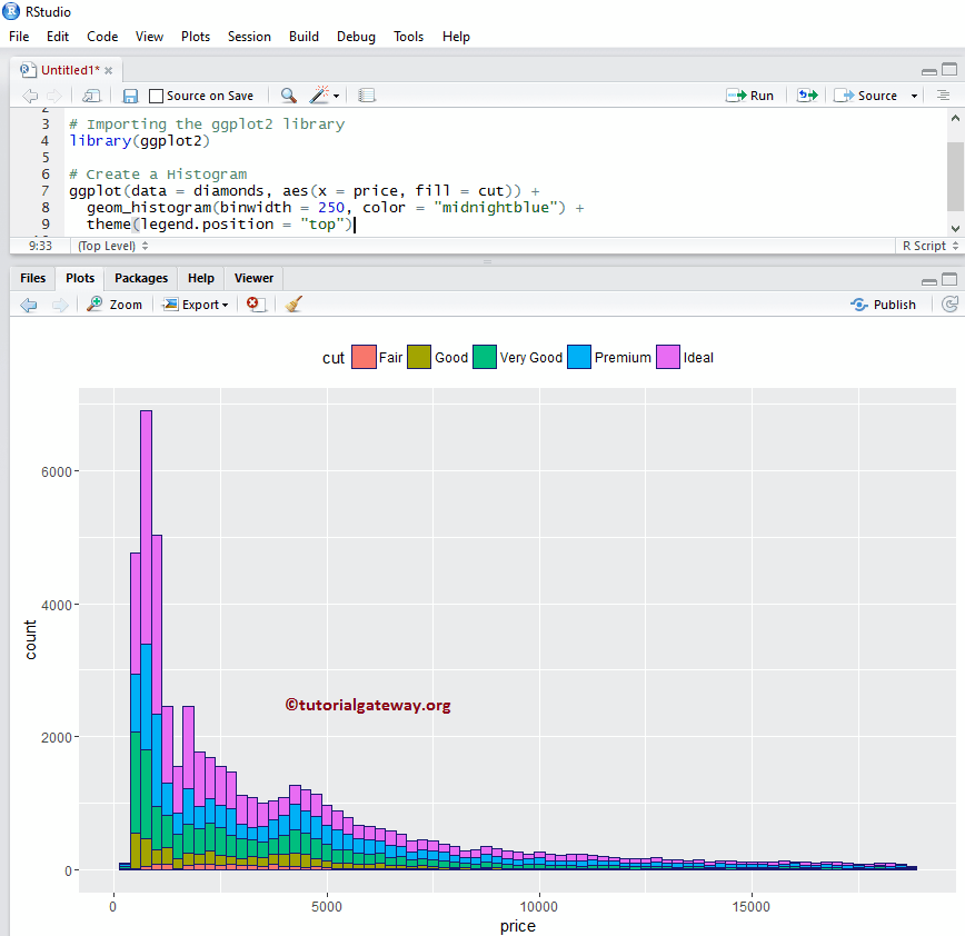
Alter Legend position of a Histogram
By default, r ggplot position the legend at the right side of it. In this example, we change the legend position from right to top. Remember, You can use a legend.position = “none” to completely remove the legend.
library(ggplot2)

ggplot(data = diamonds, aes(x = price, fill = cut)) +
  geom_histogram(binwidth = 250, color = "midnightblue") +
  theme(legend.position = "top")
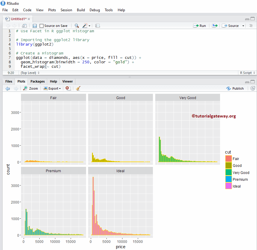
How to use Facets in R ggplot2 Histogram
This example draws multiple histograms in ggplot by dividing the data based on column values.
library(ggplot2)

ggplot(data = diamonds, aes(x = price, fill = cut)) +
  geom_histogram(binwidth = 250, color = "gold") +
  facet_wrap(~ cut) # divide the histogram, based on Cut
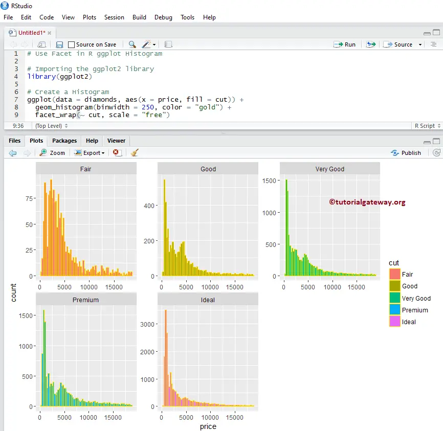
How to use Facets in ggplot2 Histogram example 2
By default, facet_wrap() assigns the same y-axis to all. But, you can change it (giving an independent axis) to each one by adding one more attribute called scale.
library(ggplot2)

ggplot(data = diamonds, aes(x = price, fill = cut)) +
  geom_histogram(binwidth = 250, color = "gold") +
  facet_wrap(~ cut, scale = "free")
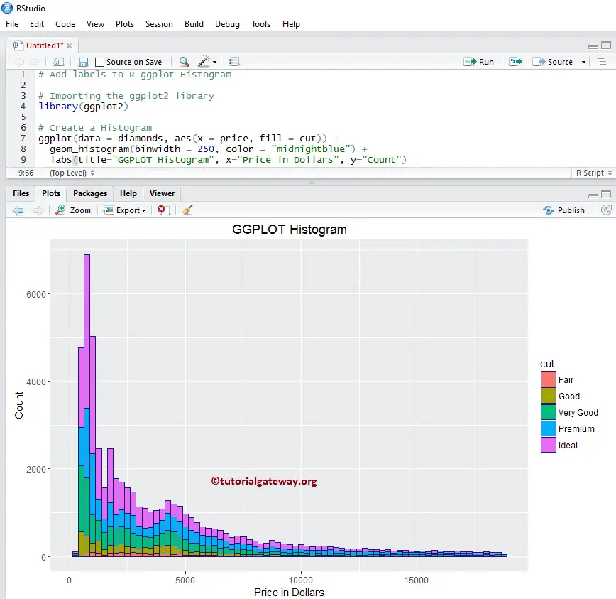
Assigning names to R ggplot Histogram
Let us assign names to ggplot2 Histogram, X-Axis, and Y-Axis using labs function.
library(ggplot2)

ggplot(data = diamonds, aes(x = price, fill = cut)) +
  geom_histogram(binwidth = 250, color = "midnightblue") +
  labs(title="GGPLOT Histogram", x="Price in Dollars", y="Count")
# Or you can add labs one more time to add X, Y axis names
+ labs(x="Price in Dollars", y="Count")
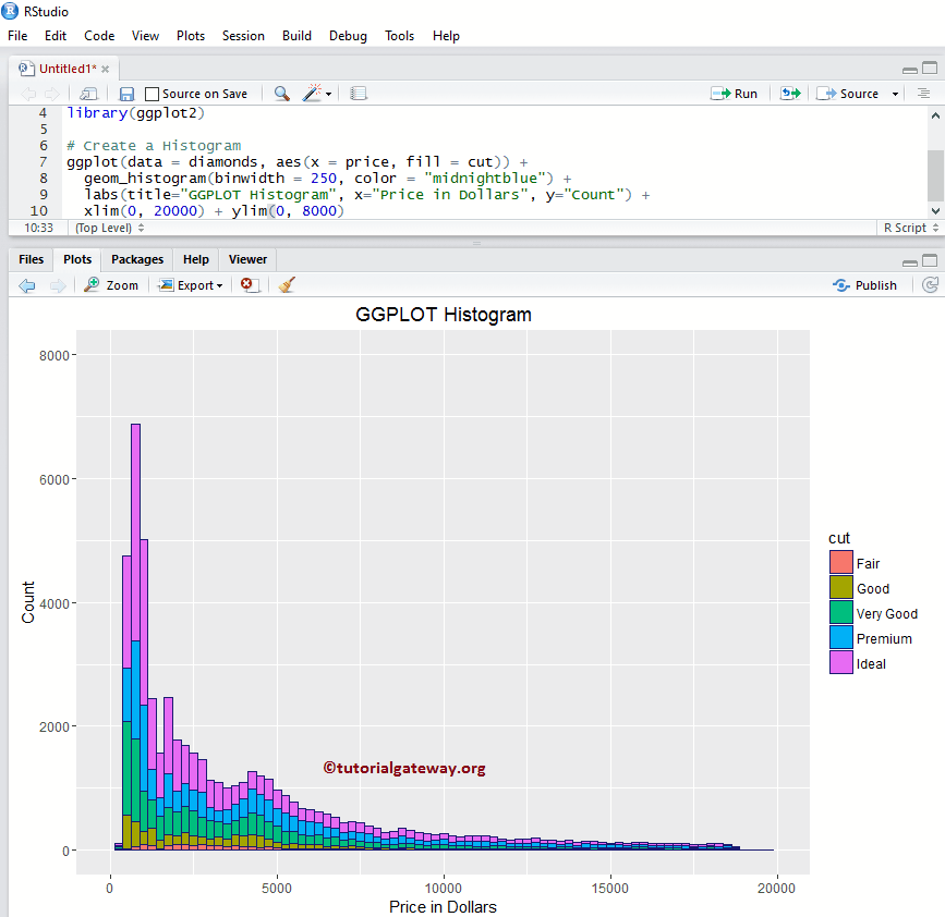
Change Axis limits of a Histogram
Let us change the default axis values in a ggplot histogram in r
- xlim: This argument can help you to specify the limits for the X-Axis
- ylim: It helps to specify the Y-Axis limits. In this example, we are changing the default x-axis limit to (0, 20000), and y-axis limit to (0, 8000)
library(ggplot2)

ggplot(data = diamonds, aes(x = price, fill = cut)) +
  geom_histogram(binwidth = 250, color = "midnightblue") +
  labs(title="GGPLOT Histogram", x="Price in Dollars", y="Count") +
  xlim(0, 20000) + ylim(0, 8000)
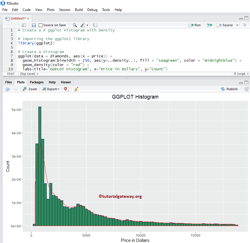
Create a Histogram with Density
Frequency counts and gives us the number of data points per bin. In real-time, we may be interested in density than the frequency-based ones because density can give the probability densities. Let us see how to create a ggplot Histogram in r against the Density using geom_density().
library(ggplot2)

ggplot(data = diamonds, aes(x = price)) +
  geom_histogram(binwidth = 250, aes(y=..density..),
                 fill = "seagreen", color = "midnightblue") +
  geom_density(color = "red") +
  labs(title="GGPLOT Histogram", x="Price in Dollars", y="Count")
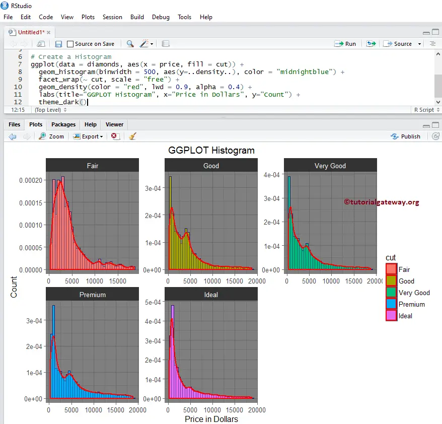
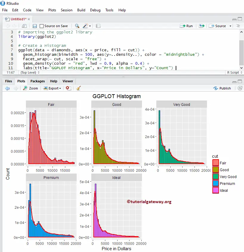
How to use Facets with Density
In this example, we draw the density line to multiple histograms drawn by the ggplot2 in r.
library(ggplot2)

ggplot(data = diamonds, aes(x = price, fill = cut)) +
  geom_histogram(binwidth = 500, aes(y=..density..), color = "midnightblue") +
  facet_wrap(~ cut, scale = "free") +
  geom_density(color = "red", lwd = 0.9, alpha = 0.4) +
  labs(title="GGPLOT Histogram", x="Price in Dollars", y="Count")
Changing Theme
Let us see how to change the default theme of a ggplot2 histogram
- theme_dark(): We are using this function to change the default theme to dark. Type theme_, then R Studio intelligence shows the list of available options. For example, theme_grey()
library(ggplot2)

ggplot(data = diamonds, aes(x = price, fill = cut)) +
  geom_histogram(binwidth = 500, aes(y=..density..), color = "midnightblue") +
  facet_wrap(~ cut, scale = "free") +
  geom_density(color = "red", lwd = 0.9, alpha = 0.4) +
  labs(title="GGPLOT Histogram", x="Price in Dollars", y="Count") +
  theme_dark()