The R ggplot2 Violin Plot is useful for graphically visualizing the numeric data group by specific data. Let us see how to Create a ggplot2 violin plot and format its colors. And drawing horizontally, draw multiple violin plots using ggplot2 with example. For this R ggplot Violin Plot demo, we use the diamonds data set provided by Rstudio.
The syntax to draw a ggplot violin plot in this Programming using the ggplot2 package is as shown below.
geom_violin(mapping = NULL, data = NULL, stat = "ydensity",
  position = "dodge", ..., draw_quantiles = NULL, trim = TRUE,
  scale = "area", na.rm = FALSE, show.legend = NA, inherit.aes = TRUE)
Create a basic R ggplot2 Violin Plot
This example shows how to create a basic violin plot using the ggplot2 package. For this example, we are going to use the diamond data set provided by the R Studio.
TIP: ggplot2 package is not installed by default. Please refer Install R Packages article to understand how to install the package.
library(ggplot2)

ggplot(diamonds, aes(x = cut, y = price)) +
  geom_violin()
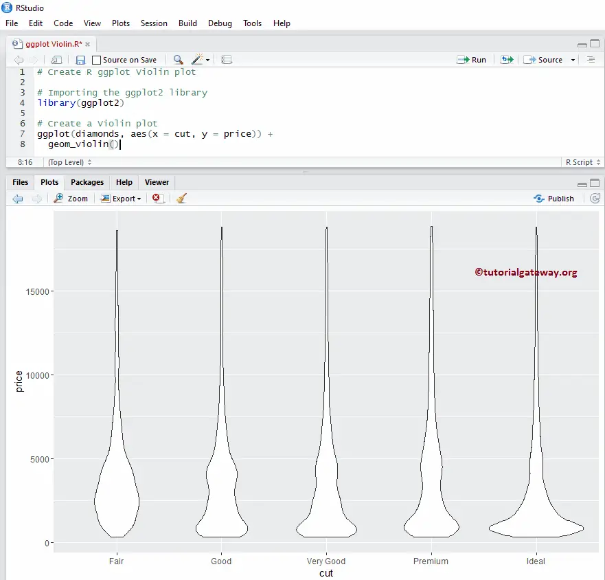
Creating R ggplot Violin Plot
In our previous R ggplot2 ggplot example, the data is huge, so there is no visibility of the proper violin plot. In this example, we scale y value with log10 and create this chart using the scaled y.
NOTE: If you require to import data from external files, then please refer to Read CSV to understand importing the CSV file in R Programming.
library(ggplot2)

ggplot(diamonds, aes(x = cut, y = price)) +
  geom_violin() + scale_y_log10()
Change Colors of a Violin Plot
In this example, we show how to change the colors using fill argument
- fill: Please specify the color you want to use. Type colors() in your console to get the list of colors available in R programming
# Change Colors

library(ggplot2)

ggplot(diamonds, aes(x = cut, y = price)) +
  geom_violin(fill = "seagreen") + scale_y_log10()
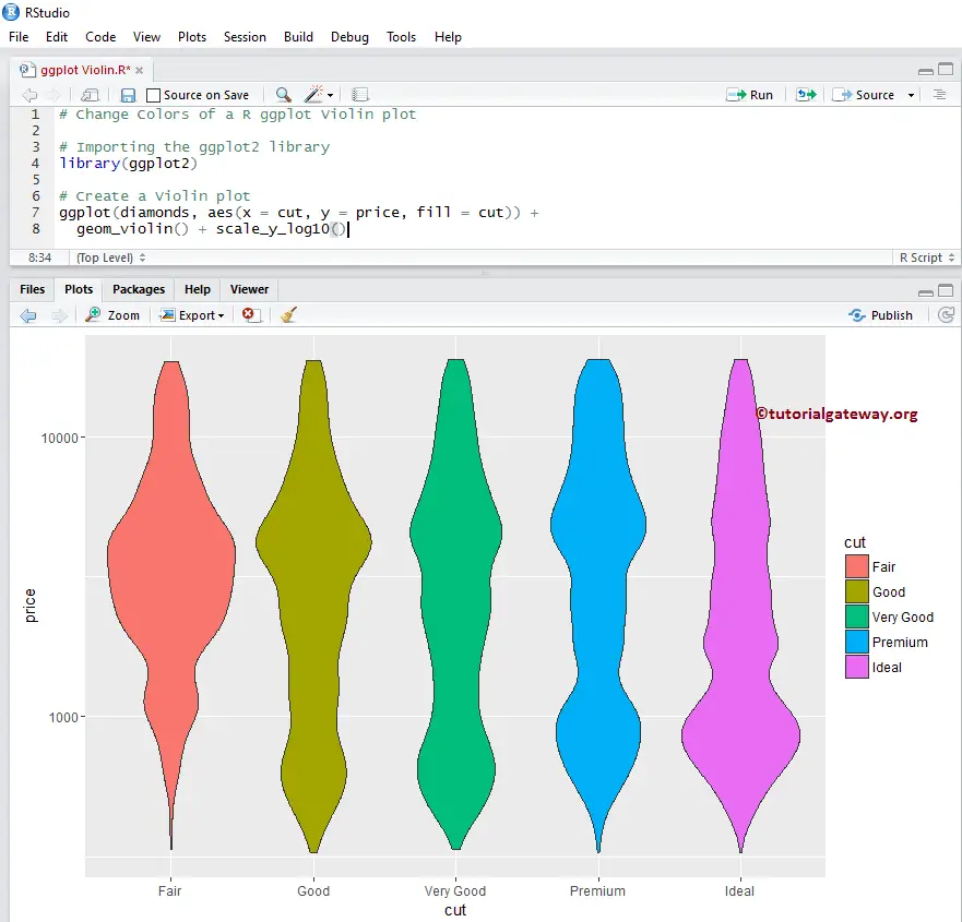
Change Colors using Columns
This example, we show how to change the violin plot colors using column data. Here, we are using the cut column data to differentiate the colors.
library(ggplot2)

ggplot(diamonds, aes(x = cut, y = price, fill = cut)) +
  geom_violin() + scale_y_log10()
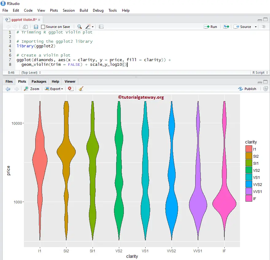
Trimming the R Violin Plot using Columns
Let us see how to trim, not to trim the data using the trim argument
# Trimming
library(ggplot2)

ggplot(diamonds, aes(x = clarity, y = price, fill = clarity)) +
  geom_violin(trim = FALSE) + scale_y_log10())
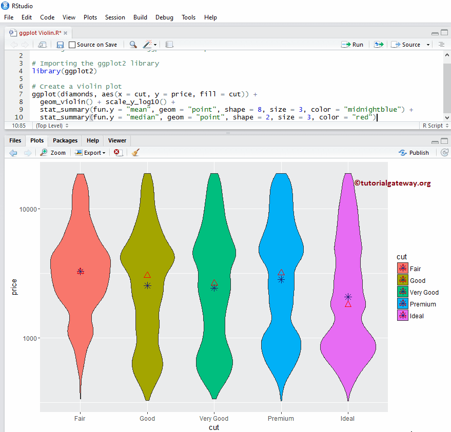
Add Mean & Median
Let us see how to add Mean and Median values to the ggplot2 violin plot using the stat_summary function.
# Adding Mean & Median

library(ggplot2)

ggplot(diamonds, aes(x = cut, y = price, fill = cut)) +
  geom_violin() + scale_y_log10() +
  stat_summary(fun.y = "mean", geom = "point", shape = 8, size = 3, color = "midnightblue") +
  stat_summary(fun.y = "median", geom = "point", shape = 2, size = 3, color = "red")
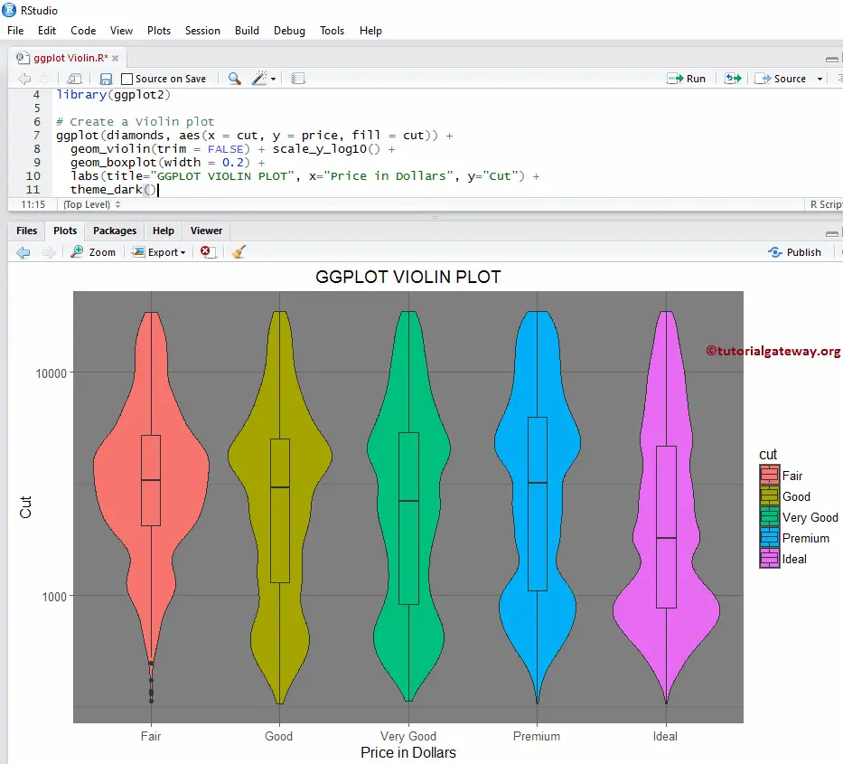
Add Boxplot to R ggplot2 Violin Plot
In this example, we show how to add a boxplot to R Violin Plot using the geom_boxplot function. It can help us see the Median and the quartile for our chart.
TIP: Please refer Boxplot article to understand the Boxplot arguments.
library(ggplot2)

ggplot(diamonds, aes(x = cut, y = price, fill = cut)) +
  geom_violin() + scale_y_log10() +
  geom_boxplot(width = 0.2)
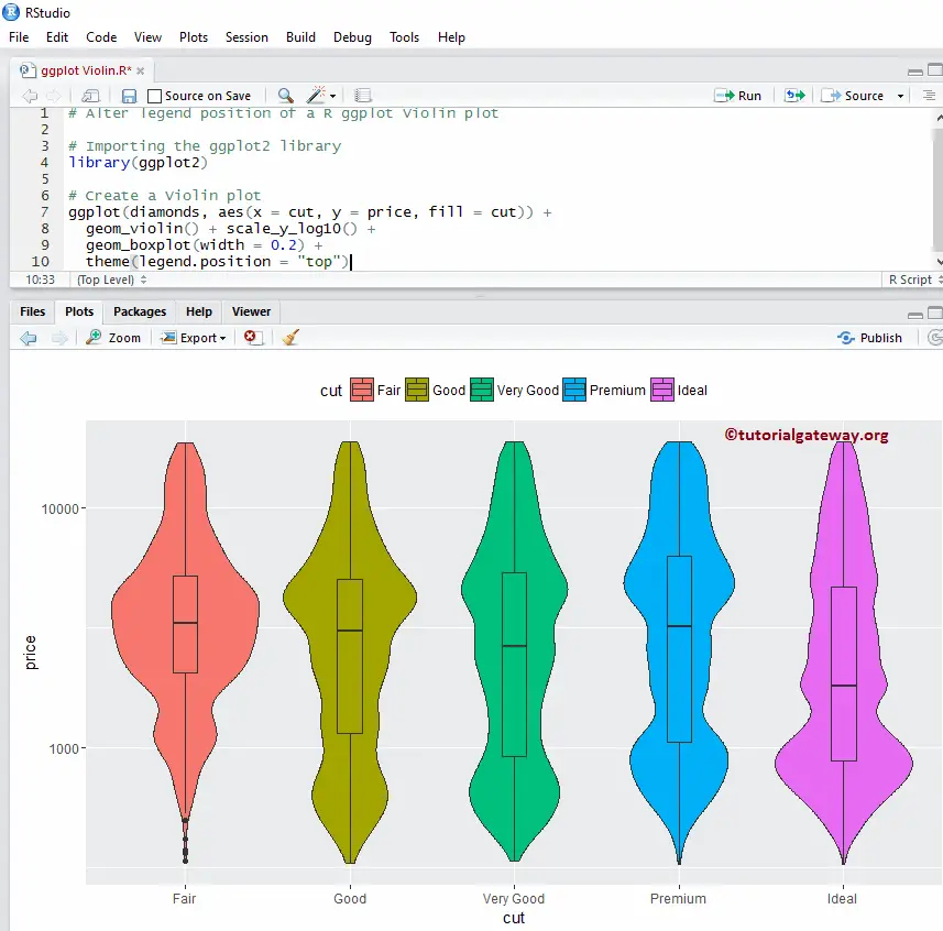
Alter Legend position of an R ggplot2 Violin Plot
By default, ggplot positions the legend on the right side. In this example, we change the legend position of the R ggplot violin plot from right to the top. Note, You can use a legend.position = “none” to altogether remove the legend.
library(ggplot2)

ggplot(diamonds, aes(x = cut, y = price, fill = cut)) +
  geom_violin() + scale_y_log10() +
  geom_boxplot(width = 0.2) +
  theme(legend.position = "top")
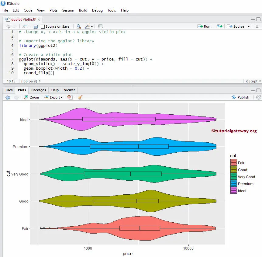
Horizontal Violin Plot
In this ggplot example, we change the default vertical into a horizontal using coord_flip() function.
library(ggplot2)

ggplot(diamonds, aes(x = cut, y = price, fill = cut)) +
  geom_violin() + scale_y_log10() +
  geom_boxplot(width = 0.2) +
  coord_flip()
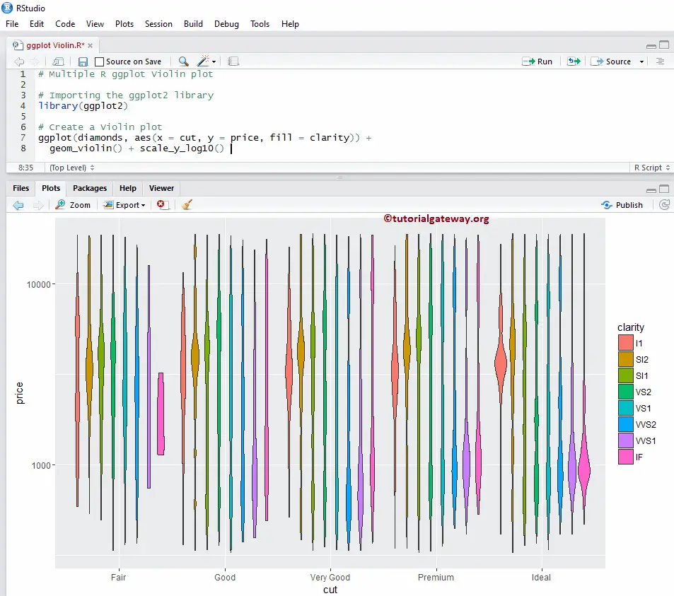
Multiple ggplot Violin plots in R
In this example, we show how to group multiple violin plots.
library(ggplot2)

ggplot(diamonds, aes(x = cut, y = price, fill = clarity)) +
  geom_violin() + scale_y_log10()
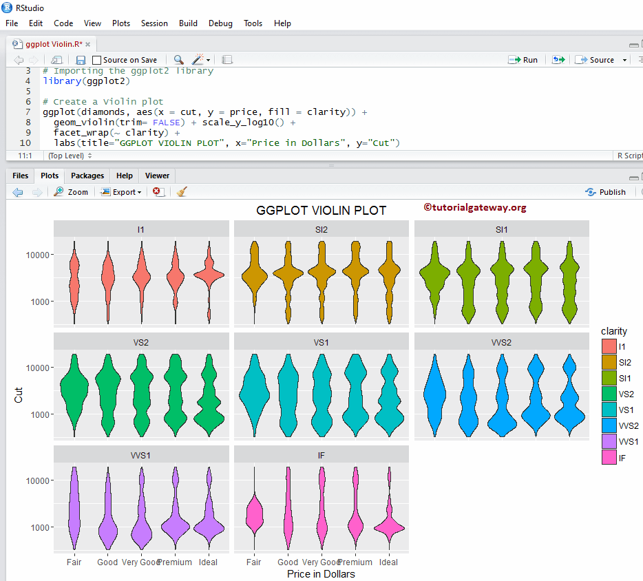
How to use Facets in R ggplot2 Violin plot
This example, we draw multiple violin plot, by dividing the data based on column value. Here, we are using the clarity column data to divide them.
library(ggplot2)

ggplot(diamonds, aes(x = cut, y = price, fill = clarity)) +
  geom_violin(trim= FALSE) + scale_y_log10() +
  facet_wrap(~ clarity)
By default, facet_wrap() assigns the same y-axis to alt. But, you can change it (giving independent axis) to each one by adding one more attribute called scale. facet_wrap(~ clarity, scale = “free”).
Assigning names
In this example, we show you how to assign names to chart, X-Axis, and Y-Axis using labs function
library(ggplot2)

ggplot(diamonds, aes(x = cut, y = price, fill = clarity)) +
  geom_violin(trim= FALSE) + scale_y_log10() +
  facet_wrap(~ clarity) +
  labs(title="GGPLOT VIOLIN PLOT", x="Price in Dollars", y="Cut")
Change Theme
In this example, we show how to change the default theme of an R ggplot violin plot.
- theme_dark(): We use this function to change the default theme to dark. If you type theme_, then R Studio intelligence shows the list of available options. For example, theme_grey().
library(ggplot2)

ggplot(diamonds, aes(x = cut, y = price, fill = cut)) +
  geom_violin(trim = FALSE) + scale_y_log10() +
  geom_boxplot(width = 0.2) +
  labs(title="GGPLOT VIOLIN PLOT", x="Price in Dollars", y="Cut") +
  theme_dark()