The ggplot2 ggplot boxplot is useful for graphically visualizing the numeric data group by specific data. Let us see how to Create an R ggplot2 boxplot and format the colors, change labels, and draw horizontal and multiple ggplot boxplots with an example.
For this ggplot2 ggplot Boxplot demo, we use two data sets provided by the Programming, and they are ChickWeight and diamonds dataset.
Create R ggplot2 Boxplot
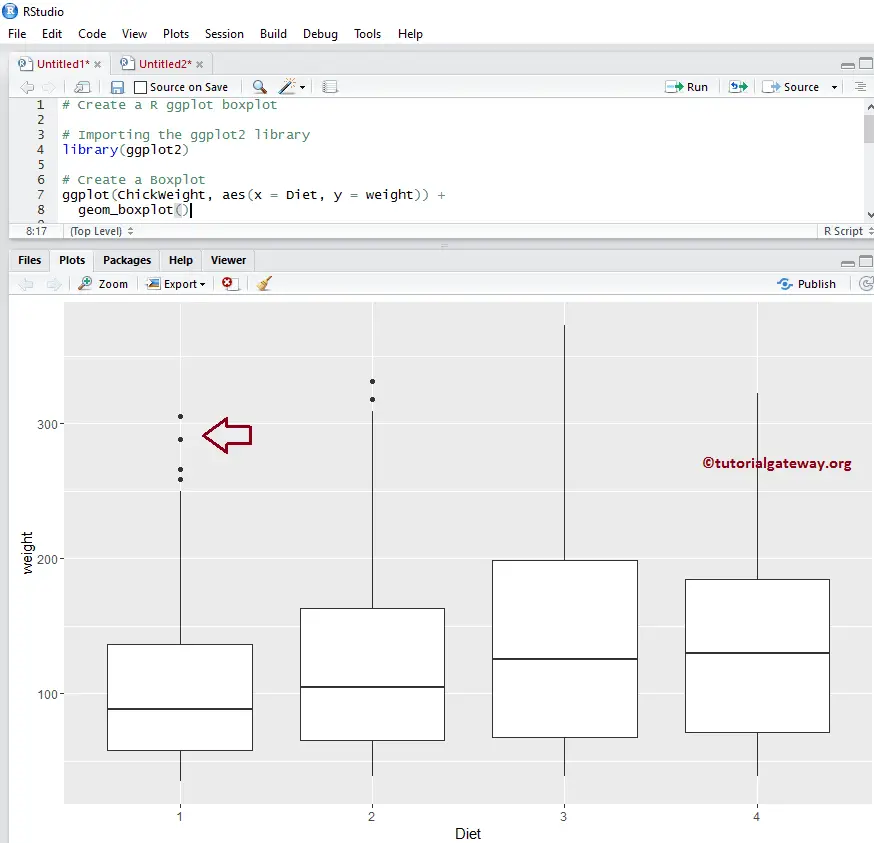
This example shows how to create a Boxplot using the ggplot2 package. For this demo, we will use the ChickWeight data set provided by the Studio.
library(ggplot2)

ggplot(ChickWeight, aes(x = Diet, y = weight)) +
  geom_boxplot()
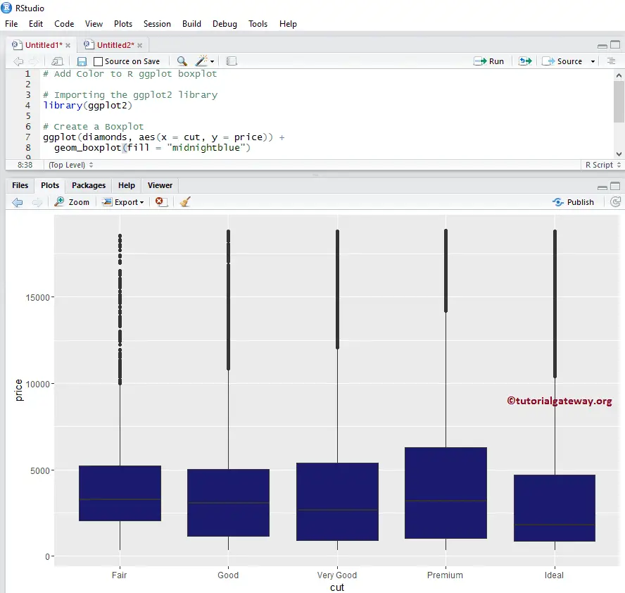
Change Colors of a ggplot2 Boxplot
In this example, we show how to change the ggplot Boxplot box colors using fill argument
- fill: Please specify the color you want to use. Type colors() in your console to get the list of colors available in R programming.
TIP: ggplot2 package not installed by in R Programming default. Please refer Install Packages article to understand installing the package.
library(ggplot2)

ggplot(diamonds, aes(x = cut, y = price)) +
  geom_boxplot(fill = "midnightblue")
Change Colors example 2
We change the R ggplo2 ggplot Boxplot box colors using column data in this example. Here, we are using the cut column data to differentiate the colors.
NOTE: If you require to import data from external files, then please refer to Read CSV to understand the steps involved in CSV file import
library(ggplot2)

ggplot(diamonds, aes(x = cut, y = price, fill = cut)) +
  geom_boxplot(outlier.colour="black", outlier.shape=16, outlier.size=2)
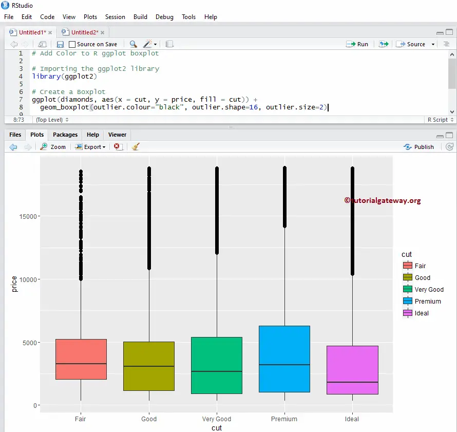
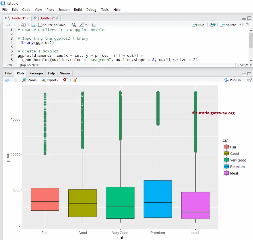
Change Outliners of R ggplot2 ggplot Boxplot
In this example, we show how to change the ggplot boxplot outliners colors using the following arguments
- outlier.color: Please specify the color you want to use for your outliner. Type colors() in your console to get the list of colors available in the R programming
- outlier.shape: Please specify the shape you want to use for the outliner.
- outlier.size: Specify the size of the outliner.
library(ggplot2)

ggplot(diamonds, aes(x = cut, y = price, fill = cut)) +
  geom_boxplot(outlier.color = "seagreen", outlier.shape = 8, outlier.size = 2)
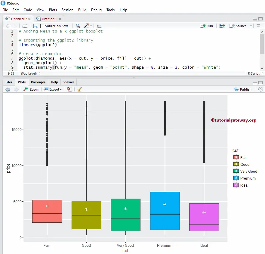
Add Mean
In this example, we add the Mean value to the ggplot boxplot using the stat_summary argument
library(ggplot2)

ggplot(diamonds, aes(x = cut, y = price, fill = cut)) +
  geom_boxplot() +
  stat_summary(fun.y = "mean", geom = "point", shape = 8, size = 2, color = "white")
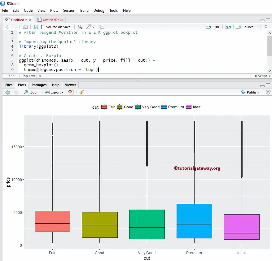
Alter Legend position of an R ggplot2 Boxplot
By default, ggplot positions the legend on the right side. We change the legend position from right to the top in this example. Note, You can use legend.position = “none” to completely remove the legend.
library(ggplot2)

ggplot(diamonds, aes(x = cut, y = price, fill = cut)) +
  geom_boxplot() +
  theme(legend.position = "top")
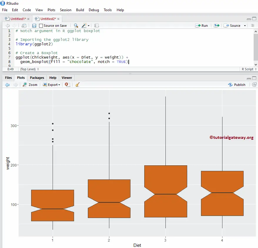
Notch argument in Boxplot
Here, we draw a line on each side of the boxes using the notch argument in the ggplot boxplot. If the notches of 2 plots overlapped, then we can say that their medians are the same. Otherwise, they are different.
- notch: It is a Boolean argument. If it is TRUE, a notch is drawn on each side of the box.
library(ggplot2)

ggplot(ChickWeight, aes(x = Diet, y = weight)) +
  geom_boxplot(fill = "chocolate", notch = TRUE)
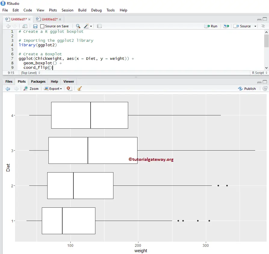
Horizontal ggplot Boxplot in R ggplot2
In this example, we change the default vertical into a horizontal boxplot using the coord_flip() function
library(ggplot2)

ggplot(ChickWeight, aes(x = Diet, y = weight)) +
  geom_boxplot() +
  coord_flip()
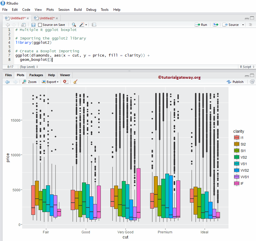
Multiple ggplot Boxplot in ggplot2
In this example, we show how to group multiple ggplot boxplots in this programming.
library(ggplot2)

ggplot(diamonds, aes(x = cut, y = price, fill = clarity)) +
  geom_boxplot()
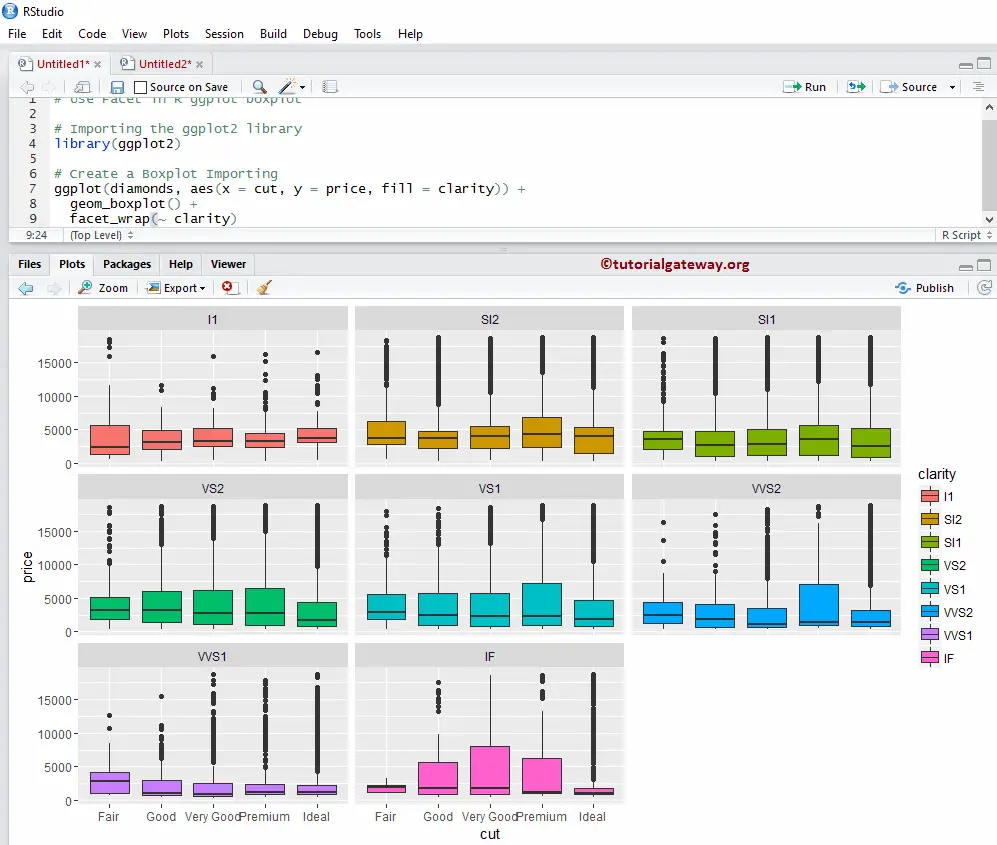
How to use Facets in R ggplot2 Boxplot?
In this example, we draw multiple boxplots by dividing the data based on a column value. Here, we are using the clarity column data to divide them.
library(ggplot2)

ggplot(diamonds, aes(x = cut, y = price, fill = clarity)) +
  geom_boxplot() +
  facet_wrap(~ clarity)
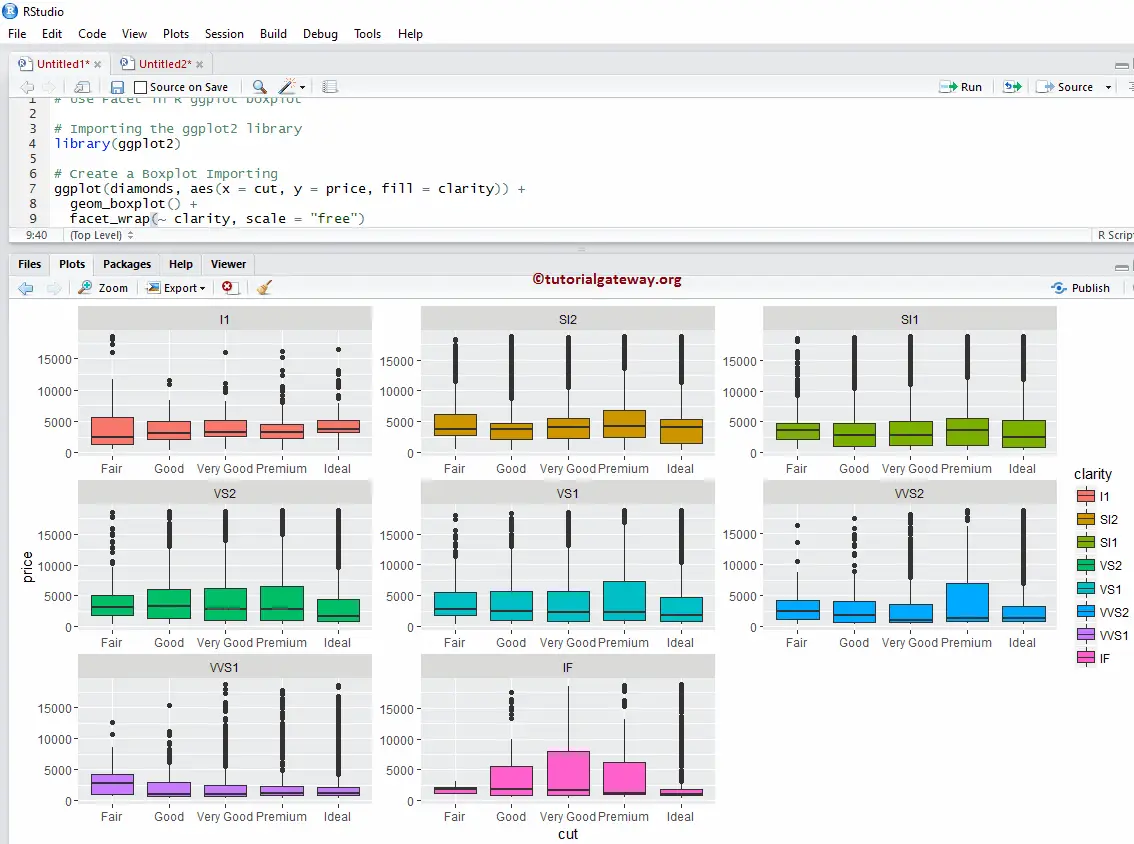
How to use Facets example 2
By default, facet_wrap() assigns the same y-axis to all. However, you can change it (giving an independent axis) to each R ggplot boxplot by adding one more attribute called scale.
library(ggplot2)

ggplot(diamonds, aes(x = cut, y = price, fill = clarity)) +
  geom_boxplot() +
  facet_wrap(~ clarity, scale = "free")
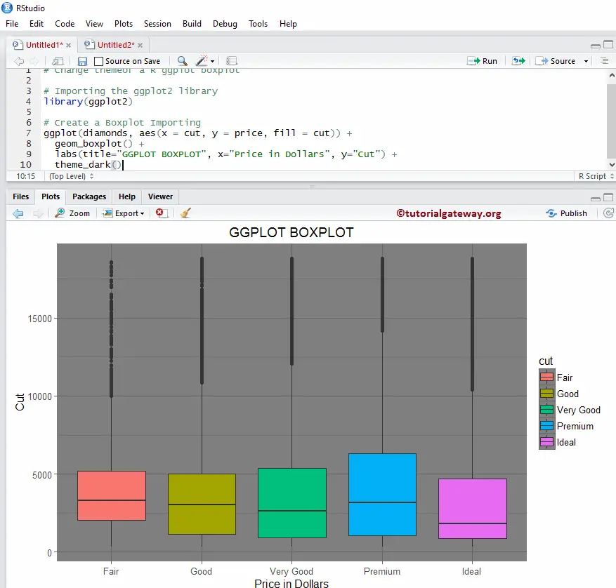
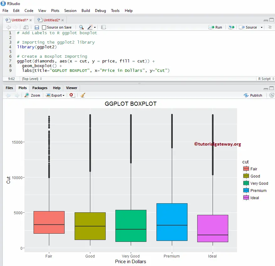
Assigning names
In this example, we assign names to the chart, X-Axis, and Y-Axis using labs function.
library(ggplot2)

ggplot(diamonds, aes(x = cut, y = price, fill = cut)) +
  geom_boxplot() +
  labs(title="GGPLOT BOXPLOT", x="Price in Dollars", y="Cut")
Change ggplot2 box plot Theme
In this example, we change the default theme of an ggplot2 box plot.
- theme_dark(): We are using this function to change the default theme to dark. Type theme_, then R Studio intelligence shows the list of available options. For example, theme_grey().
library(ggplot2)

ggplot(diamonds, aes(x = cut, y = price, fill = cut)) +
  geom_boxplot() +
  labs(title="GGPLOT BOXPLOT", x="Price in Dollars", y="Cut") +
  theme_dark()