The lattice package in R Programming provides xyplot to draw Scatter Plot. This lattice scatters plot in R is very useful to visualize the relationship between two sets of data. You can call this R Scatter Plot as a scatter chart, scatter graph, scattergram, or scatter diagram.
For example, to visualize the Salary against Experience, use this Scatter Plot. Let us see how to Create Lattice Scatter Plot in R Programming, Format its color, shape, etc., with an example. The syntax to draw the Lattice scatter chart, or Lattice Scatter Plot is
xyplot(x, data, ...)
and the complex syntax of lattice Scatter plot is:
xyplot(x, data,
       allow.multiple = is.null(groups) || outer,
       outer = !is.null(groups),
       auto.key = FALSE,
       aspect = "fill",
       panel = lattice.getOption("panel.xyplot"),
       prepanel = NULL,
       scales = list(),
       strip = TRUE,
       groups = NULL,
       xlab, xlim, ylab, ylim,
       drop.unused.levels = lattice.getOption("drop.unused.levels"),
       ...,
       lattice.options = NULL,
       default.scales,
       default.prepanel = lattice.getOption("prepanel.default.xyplot"),
       subscripts = !is.null(groups),
       subset = TRUE)
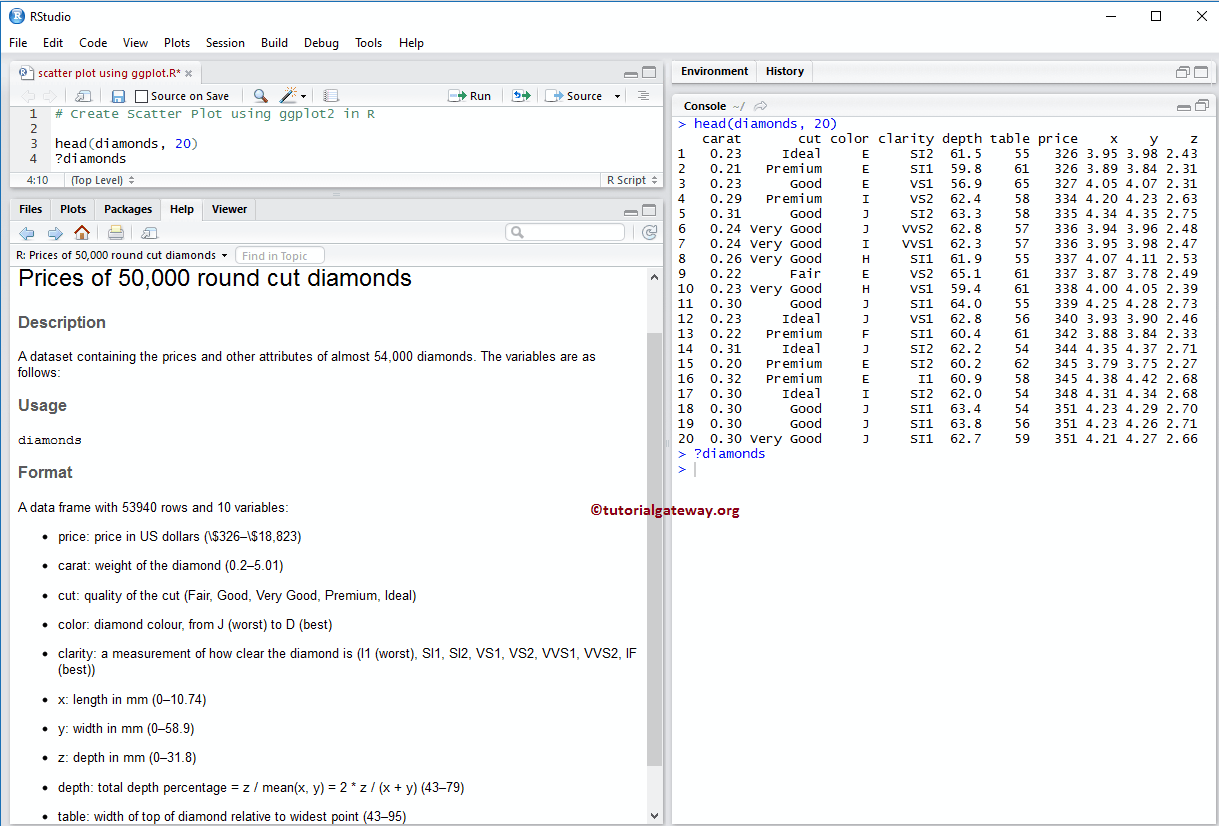
For this, we are going to use the diamonds data set that is provided by the R, and the data inside this dataset is:
Create Lattice Scatter Plot in R
In this example, we show how to use this xyplot function in the lattice package to create a Scatter Plot. For this, we are using the diamonds data set, which is provided by the R Studio. If the requirement is to import R Programming data from external files, I suggest you refer R Read CSV article to understand the CSV file import.
# Create Scatter Plot using Lattice package

# Importing the lattice library
library(lattice)

# Creating Scatter Plot
xyplot(price ~ carat, data = diamonds)
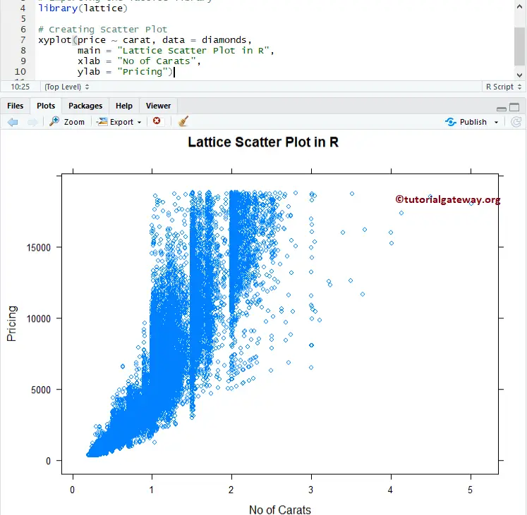
Assign names to Scatter plot in Lattice
This example shows how to use main, xlab, and ylab to assign names to lattice scatter plot, X-Axis, Y-Axis, and individual bars
- main: Main Title for your scatter plot.
- xlab: Label for X-Axis
- ylab: Label for Y-Axis
# Change Names of a Lattice Scatter Plot

# Importing the lattice library
library(lattice)

# Creating Scatter Plot
xyplot(price ~ carat, data = diamonds,
       main = "Lattice Scatter Plot in R",
       xlab = "No of Carats",
       ylab = "Pricing")
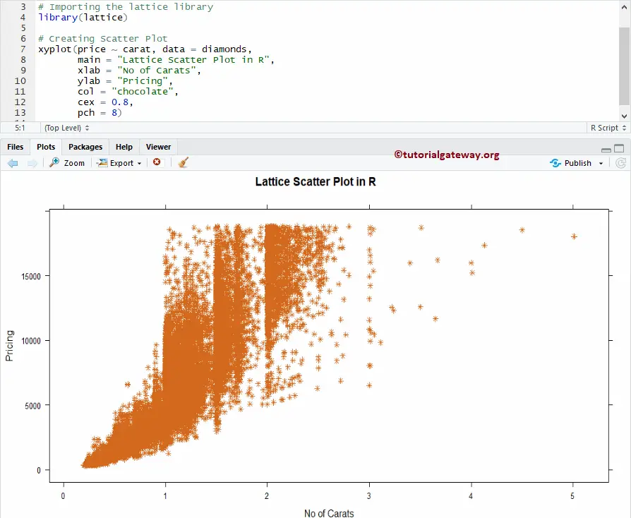
Change Shape, and Color of Lattice Scatter plot
In this example, we show you how to change the shape and color of a lattice scatter plot in R using col and cex arguments.
- col: Please specify the colour you want to use in your Scatterplot.
- cex: Specify the size of the point(s)
- pch: To change shape.
# Change Shapes, Colors of a Lattice Scatter Plot

# Importing the lattice library
library(lattice)

# Creating Scatter Plot
xyplot(price ~ carat, data = diamonds,
       main = "Lattice Scatter Plot in R",
       xlab = "No of Carats",
       ylab = "Pricing",
       col = "chocolate",
       cex = 0.8,
       pch = 8)
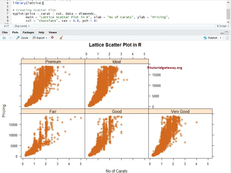
Multiple Lattice Scatter Plots
In this example, we show you how to divide the scatter plot using groups.
# Linear Progression on a Lattice Scatter Plot

# Importing the lattice library
library(lattice)

# Creating Scatter Plot
xyplot(price ~ carat | cut, data = diamonds,
       main = "Lattice Scatter Plot in R", xlab = "No of Carats", ylab = "Pricing",
       col = "chocolate", cex = 0.8, pch = 8)
Here, Scatter plot is dividing based on the Cut.