This SSRS article shows how to create an Exploded Donut or Doughnut chart, Show Data Labels, and format fonts and colors with an example. To demonstrate this example, right-click on the Datasets folder to create a new DataSet.
Writing the below code inside the SSMS shows the data set that we use for this Doughnut or Dount Chart example.
The Sql query that we used above SSRS example is:
SELECT Cat.[EnglishProductCategoryName] AS Category,
       SUM(Fact.OrderQuantity) AS Orders, SUM(Fact.SalesAmount) AS Sales
FROM FactInternetSales AS Fact
   INNER JOIN DimProduct AS Prod ON Fact.ProductKey = Prod.ProductKey
   INNER JOIN DimProductSubcategory AS SubCat ON Prod.ProductSubcategoryKey = SubCat.ProductSubcategoryKey
   INNER JOIN DimProductCategory AS Cat ON SubCat.ProductCategoryKey = Cat.ProductCategoryKey
GROUP BY Cat.[EnglishProductCategoryName]
SSRS Donut or Doughnut Chart
To add a Doughnut chart, right-click the report area, choose Insert, and then the chart option from the context menu. Otherwise, drag and drop the chart from the toolbox to the report area.

Select the Donut Chart from the window and click OK to add to the report area.

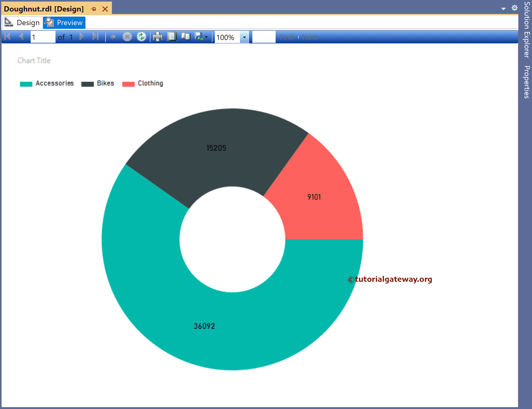
Use the Plus button or drag the fields to the Values and Category Groups section. Here, we added the Orders column to the Values and Product category to the Category Groups section. Next, right-click on the donut chart and select the Show Data Labels option to add labels.

Right-click the Data Labels and select the Series Label Properties option to format the Numbers.

Use the toolbar or properties window to format the doughnut chart font, X and Y-axis color, data labels, and legend. Next, click the preview button to see the SSRS Doughnut chart.
Right-click on the chart and choose the Change Chart Type option.

Next, select the SSRS Exploded Doughnut Chart from the window.

Here, we haven’t changed the Values (Sum of Orders) and the Category Group (Category) values. And the final Exploded Doughnut Chart or report preview is.
