This SSRS article shows how to create a 3-D Stacked Cylinder chart, Show Data Labels, and format colors and fonts with an example. To demonstrate this example, right-click on the Datasets folder to create a new DataSet. Writing the below code inside the SSMS shows the data set that we use for this example.
The Sql query that we used above SSRS example is:
SELECT Geo.[EnglishCountryRegionName] AS [Country]
	,Cust.EnglishOccupation AS Occupation, SUM(Fact.SalesAmount) AS Sales
FROM  DimCustomer AS Cust
INNER JOIN FactInternetSales AS Fact ON Cust.CustomerKey = Fact.CustomerKey
INNER JOIN [DimGeography] AS Geo ON Cust.GeographyKey = Geo.GeographyKey
GROUP BY Geo.[EnglishCountryRegionName],Cust.EnglishOccupation
SSRS 3-D Stacked Cylinder Chart
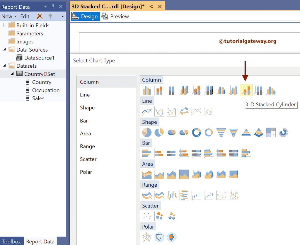
To add a 3-D Stacked Cylinder, right-click the report area, choose Insert, and then choose the chart option from the context menu. Otherwise, drag and drop the chart from the toolbox to the report area.

Select the 3-D Stacked Cylinder chart from the window and click OK to add to the report area.
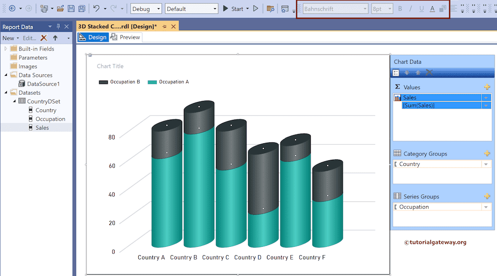
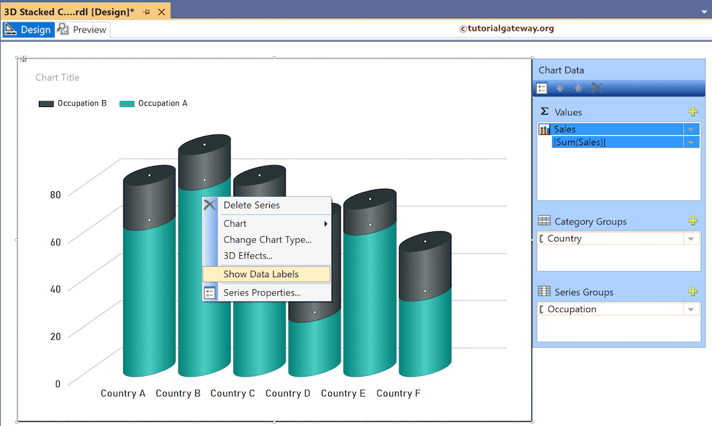
Use the Plus button or drag the fields to the Values, Category Groups, and Series Groups sections. Here, we added the Sales column to Values, the Country field to Category Groups, and the Occupation column to the Series Groups section.
Use the toolbar or the properties window to format the font, color, and size of the X-axis, Y-axis, data labels, and legend.
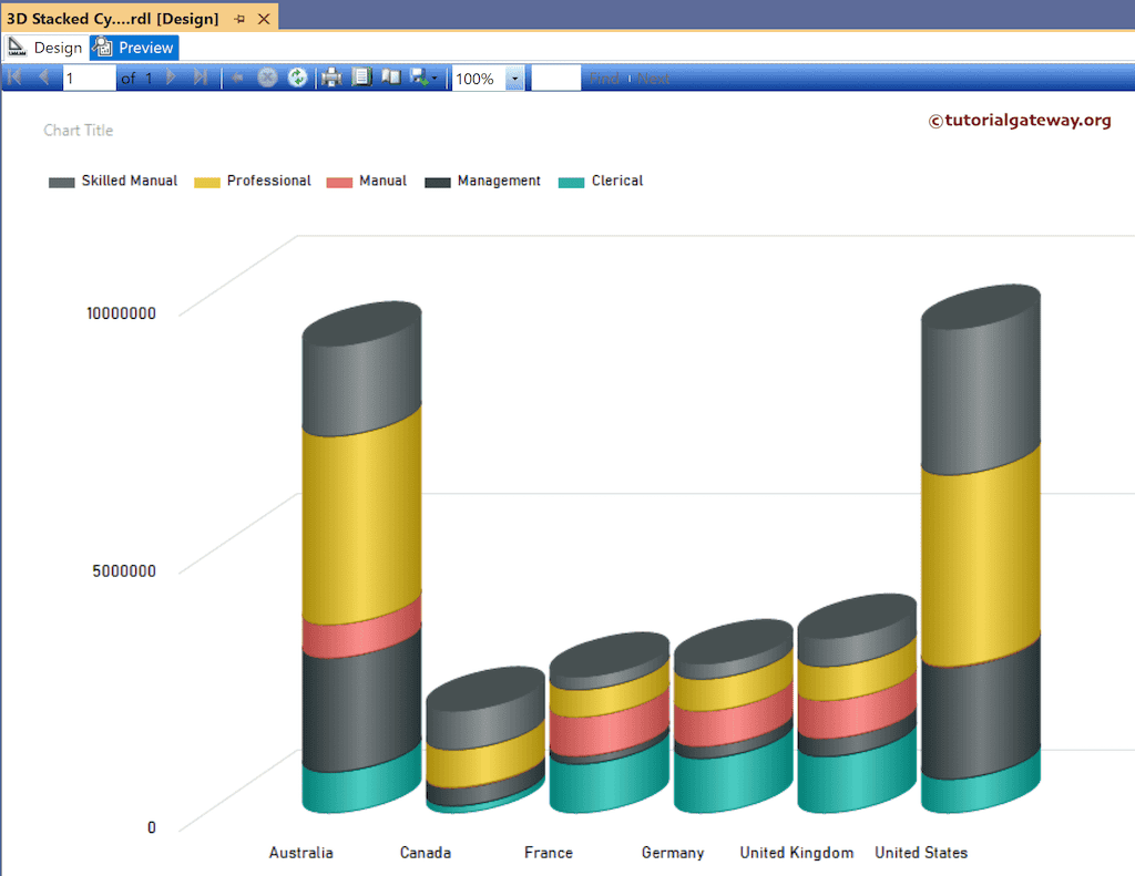
Click the preview button to see the SSRS 3-D Stacked Cylinder chart.
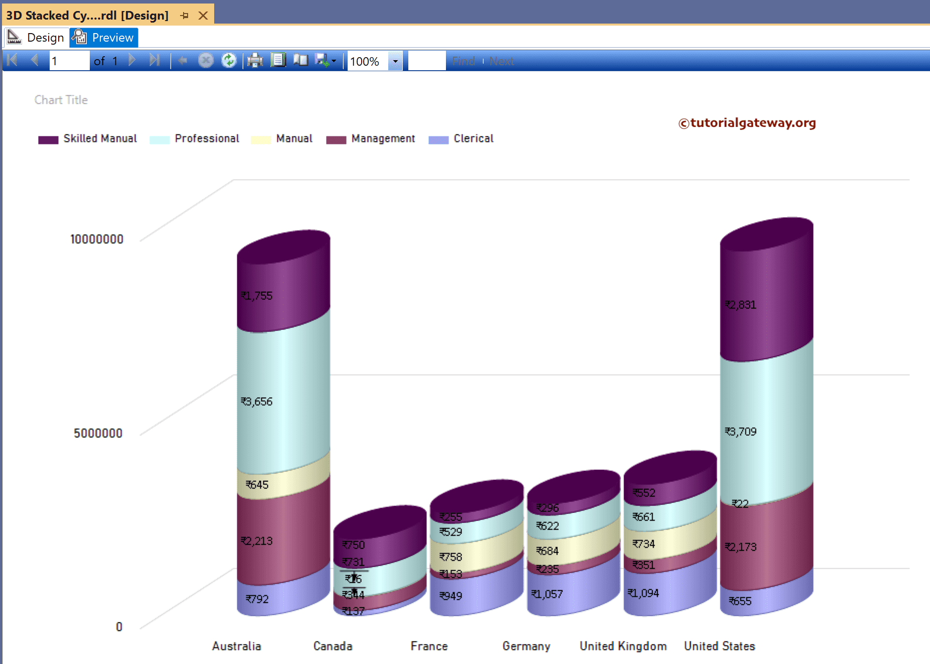
Right-click on the 3-D stacked cylinder and select the Show Data Labels option to add labels.
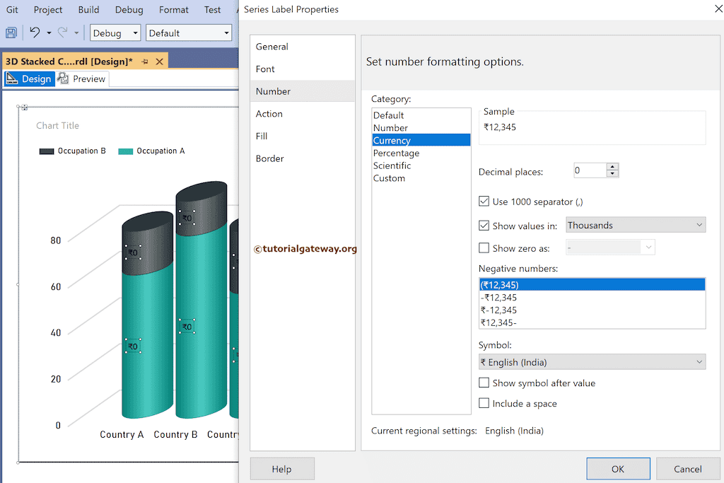
Right-click the Data Labels and select the Series Label Properties option to format Number as Currency and show values in Thousands. Next, use the toolbar or the properties window to format the 3-D stacked cylinder font and color.
Select the complete chart and change the palette to Excel.
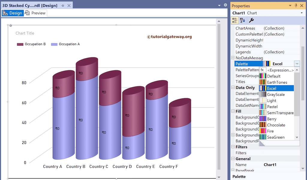
Preview the 3-D Stacked Cylinder report with custom colors.