A Funnel Chart in SSRS is useful to visualize the Data in stage-wise. For example, we can use the SSRS Funnel Charts to visualize the number of resources we used in each stage of our product development or waste percentage or production cost.
In this article, we will show you how to create an SSRS Funnel Chart, change the Funnel Chart Title, Legend Position, Legend Title, Funnel Chart Font, Funnel Chart Model, and Pallet, and Display Data Labels on a Funnel Chart in SSRS or SQL Server Reporting Services with an example.
For this SSRS Funnel Chart, we use the Custom SQL query:
-- Query that we use in Funnel Chart
SELECT Geo.EnglishCountryRegionName AS Country,
       Geo.StateProvinceName AS State, Geo.City,
       Prod.EnglishProductName AS ProductName, Prod.Color,
       Fact.OrderQuantity, Fact.TotalProductCost, Fact.SalesAmount,
       Fact.TaxAmt, Fact.[Freight]
FROM DimProduct AS Prod
INNER JOIN FactInternetSales AS Fact ON Prod.ProductKey = Fact.ProductKey
INNER JOIN DimSalesTerritory AS Terry ON Terry.[SalesTerritoryKey] = Fact.[SalesTerritoryKey]
INNER JOIN DimGeography AS Geo ON Geo.[SalesTerritoryKey] = Terry.[SalesTerritoryKey]
Create a Funnel Chart in SSRS
In this example, we are going to create a Funnel Chart to display the Sales amount according to countries. The below screenshot will show you the Data Source and Dataset we used for this Funnel Chart Report.
In the SSRS report design, we can add a Funnel chart by dragging the Chart property from the Toolbox to the Design space. Or we can right-click on the report designer to open the context menu. From the context menu, please select the Insert -> Chart option.

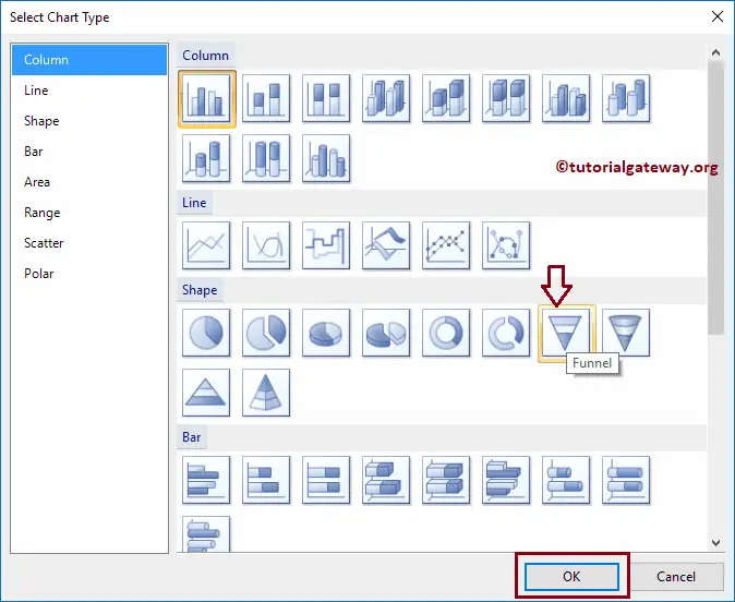
Once you select the Chart option, a new window called Select Chart Type will be opened to select the required chart from the available ones. For this example, we are selecting a Funnel Chart.
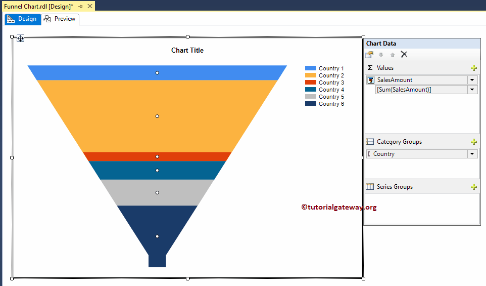
Once you click on the OK button, the Funnel chart will show in the design region with dummy data. Click on the empty space around the SSRS Funnel Chart will open the Chart Data window
- Values: Any Numerical (Metric) value such as Total Sales, sales amount, Tax, Customer count, etc. All these values will be aggregated using an aggregate function (Sum, Count, etc). This is because we are grouping them with the category group items.
- Category Group: Please specify the Column name on which you want to partition your Funnel Chart.
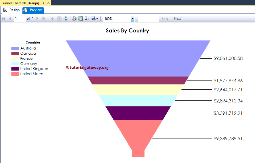
As we said before, In this example, we create a Funnel chart for Sales by country. So, Drag and drop the Sales Amount column from the dataset to chart data values and Country Name in the category group.
Click on the Preview button to see the report preview.
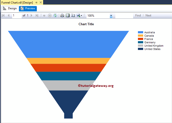
If you observe the above screenshot, It is providing a perfect result. Still, we are unable to identify the difference between Sales in Germany and Sales in France. To resolve these situations, We have to use the Data Labels.
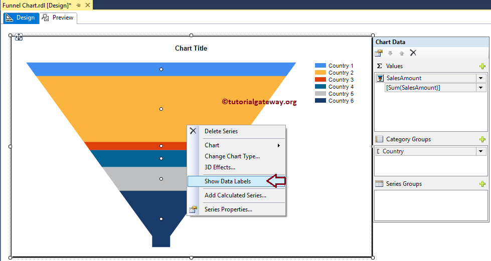
Add Data Labels to the Funnel Chart in SSRS
Right-click on the Funnel chart, and select the Show Data Labels option from the context menu to show the values
Click on the Preview button to see the Funnel Chart in the report preview.
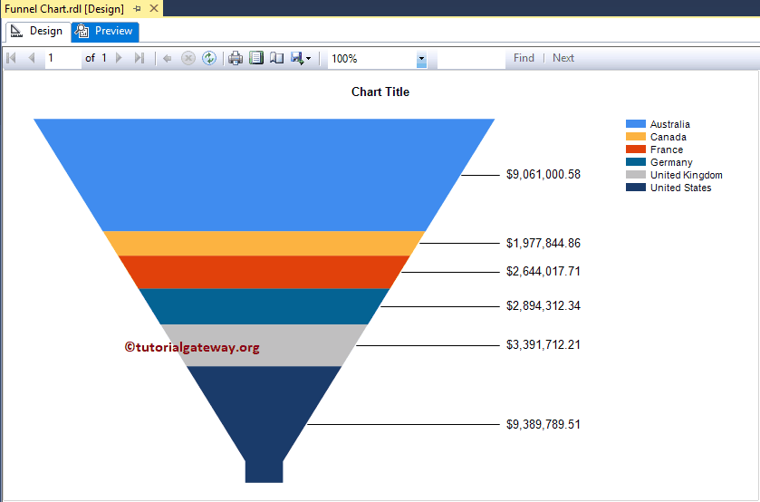
Now you can see the Sale difference between the two regions.
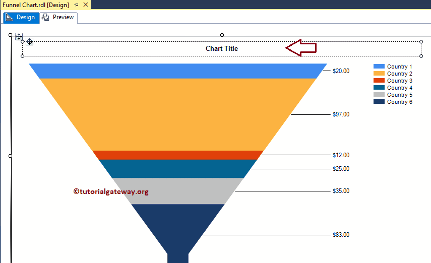
Change SSRS Funnel Chart Title
To change the Chart title, Please select the Chart title region as we showed in the below screenshot, and change the title as per your requirement. Here we are changing as Sales By Country because the report is displaying the same
Format Funnel Chart Title Font
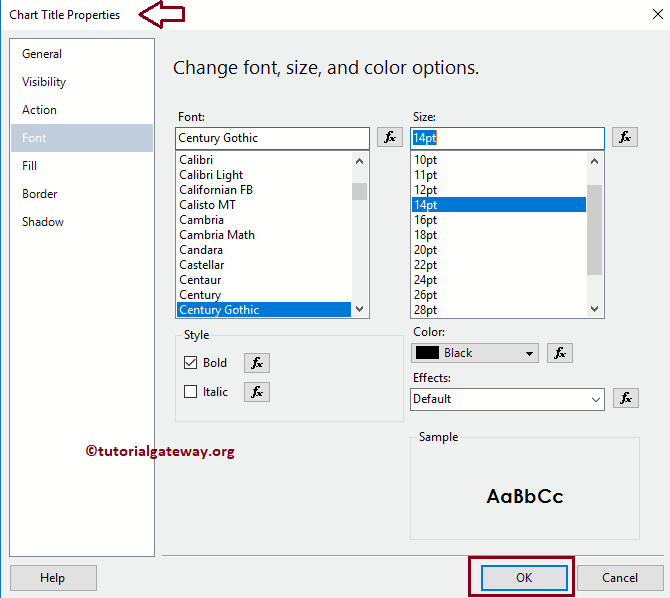
Please select the Chart title region, and right-click on it will open the context menu. From the menu, please select the Title Properties option.
Next, Within the Font ta,b we can change the Font Size, Font Family, Font Style, and Color. As you can see from the below screenshot, Here we are changing the Font to Century Gothic, and the Font size to 14 pt
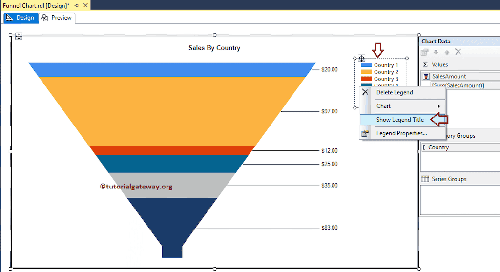
Show the Legend Title of a Funnel Chart in SSRS
To display the Legend title, Please select the Legend region, and right-click on it will open the context menu. From the context menu, please select the Show Legend Title option, as we have shown in the below screenshot.
Please rename the Legend title as per your requirement. Here we will name it as Countries
Format Legend Position, and Font of a Funnel Chart in SSRS
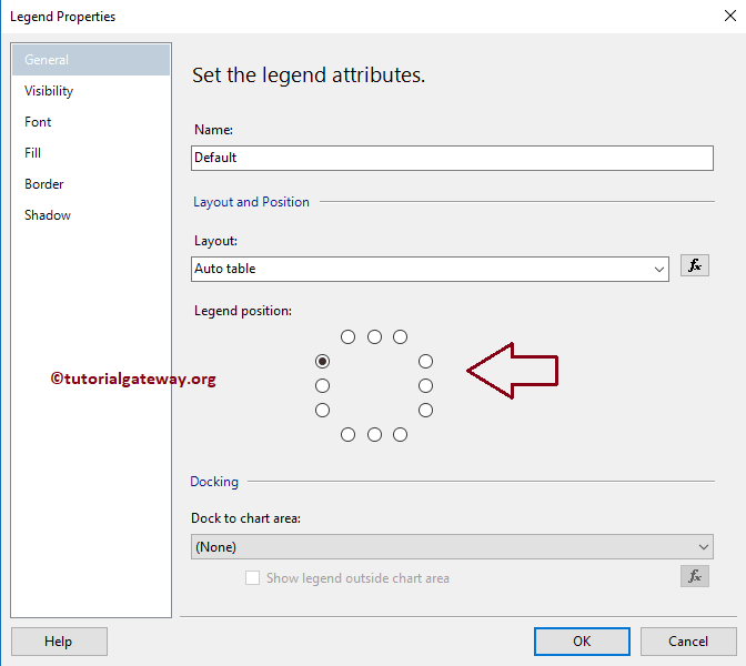
To format the Legend region, Please Select the Legend region, and right-click on it will open the context menu. From the menu, please select the Legend Properties option.
It will open a new window called the Legend Properties Window. Within the General Tab, we have an option called Legend Position, as shown in the below screenshot. You can change the Legend Position by selecting the dot positions.
For now, we are changing the position from the default right corner to the left corner.
Next, Within the Font tab, we can change the Font Size, Font Family, Font Style, and Color of a Funnel Chart Legend. Otherwise, use the toolbar to change the fonts. Here, as you can see, we changed the Font to Century Gothic, and the Font size to 10 pt
Click the OK button to close the Properties window, and hit the preview tab to see the report preview

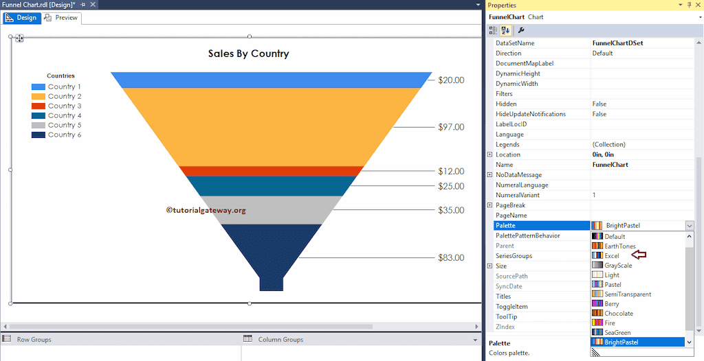
Change the Palette of a Funnel Chart in SSRS
We can also change the default Funnel Chart Colors or the chart Palette. First, select the Chart and go to properties. Change the palette color by choosing the Palette property as shown in the below image
Here we selected the palette color to Excel
Click the Funnel chart preview tab to see the preview
Change the Funnel Chart in SSRS
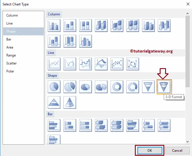
SSRS allows us to change the chart type even after creating the chart. To do so First, select the Funnel chart and right-click on it and select the Change Chart Type… option from the context menu

Once you select the Change Chart Type… option, it will open a new window called Select Chart Type to select the change. Here we are selecting the 3D Funnel chart
Click on the preview tab to see the 3D SSRS Funnel Chart preview
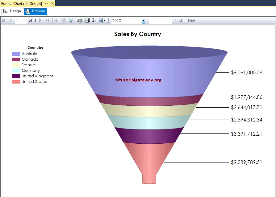
From the above screenshot, you can observe that We successfully changed the Chart Type from a two-dimensional funnel to 3D.