Tableau Funnel Chart is a specialized graph in visualizing the Data in stage-wise. This chart is helpful for users to check the workflow so that they can identify bottlenecks, optimize workflows, and enhance the overall efficiency of production. For example, we can use the Funnel Charts to visualize the production cost, Wastage percentage, or the number of resources we used in each stage of our product development.
As the name suggests, the Tableau Funnel charts resemble the shape of a funnel with different stages where the values are progressively decreasing from top to bottom. Each section of the Funnel represents each stage, and the width depends on the Measure value, such as orders, sales, production cost, wastage, etc.
Tableau supports two types of Funnel Charts they are Traditional and Advanced. This article shows how to Create traditional and advanced Funnel charts, add data labels, and change funnel colors with an example. For this Traditional Funnel Chart demo, we use the Custom Query against the SQL Server Data Source.
SELECT Geo.EnglishCountryRegionName, Geo.StateProvinceName, Geo.City,
       Prod.EnglishProductName, Prod.Color, Fact.OrderQuantity,
       Fact.TotalProductCost, Fact.SalesAmount
FROM DimProduct AS Prod
INNER JOIN FactInternetSales AS Fact ON Prod.ProductKey = Fact.ProductKey
INNER JOIN DimCustomer AS Cust  ON Fact.CustomerKey = Cust.CustomerKey
INNER JOIN DimGeography AS Geo ON Geo.GeographyKey = Cust.GeographyKey
Traditional Funnel Chart in Tableau
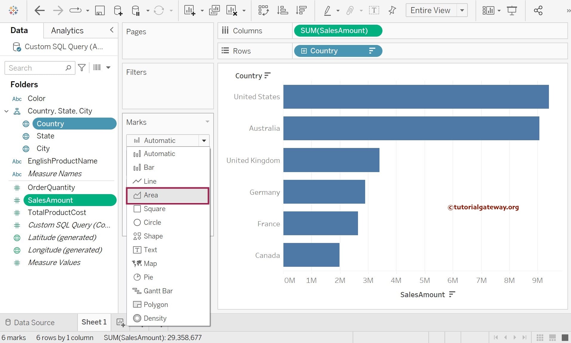
In this example, we will create a Traditional Funnel Chart against the Sales Amount size for the Country dimension. First, Drag and Drop the Sales Amount from the Measures Region to the Columns Shelf and Country names from the Dimension Region to the Rows Shelf. By default, the desktop will display the Horizontal Bar Chart. For more charts, Click Here.
As you can notice, the data is sorted country-wise. However, we need the data to sort using sales amount in descending order because the Tableau Funnel chart displays progressively decreasing values from top to bottom.
First, we must sort the Country Names by Sales Amount data in descending order. To do this, click the Toolbar’s Sort by Descending order option. Next, as shown below, we must change the Marks type from Automatic (by default Bar) to Area, and the real magic happens.
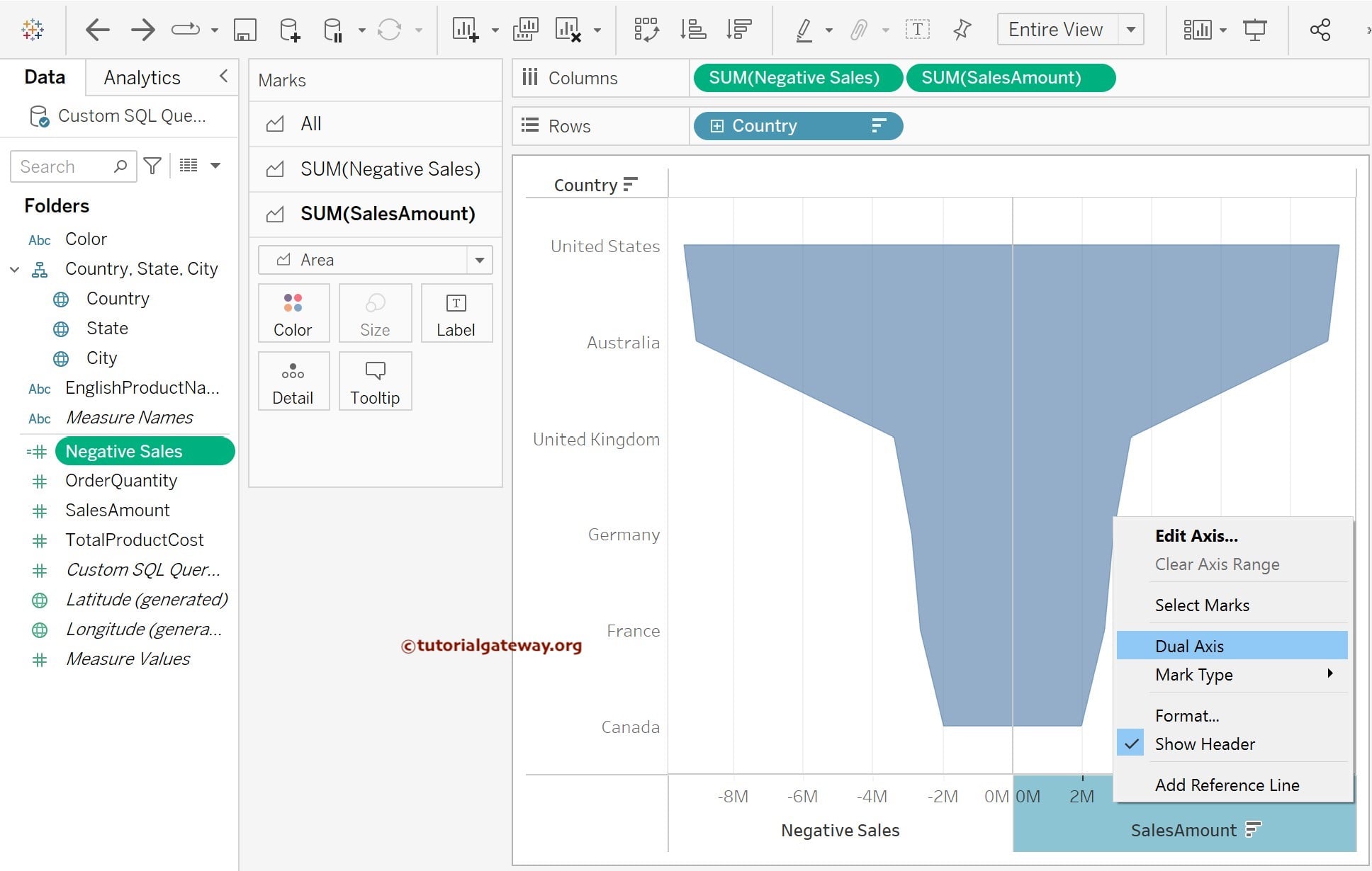
Once you complete it, the following screenshot will display. We have finished half (or the right side) of the Tableau traditional funnel chart. We can replicate the sales using the negative symbol to get the other side (left side).
First, create one calculated field for the negative values of the sales amount measure. We can create a calculated field in multiple ways. We are right-clicking the empty space and selecting the Create Calculated Field option from the context menu. Once you select the Create Calculated Field option, a new window will open to create the new calculated field. Let us add the – (SalesAmount) code in that region.
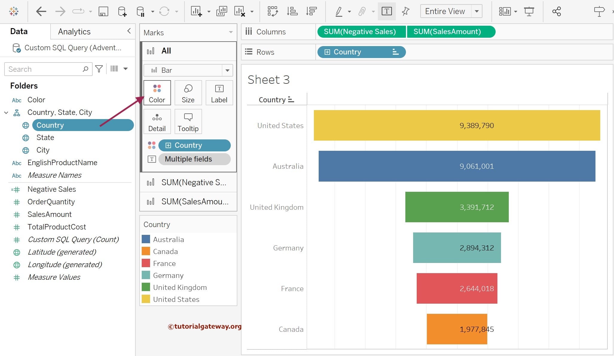
Name: Negative Sales
Expression: -[SalesAmount]
The following screenshot will show you the newly created calculated field in our measures Region. Drag and drop the freshly created calculated field (negative Sales) from the Measures Region to the Columns Shelf. Place it right before the SUM(Sales Amount) Measure. Once complete, you can see the complete Traditional Funnel Chart in Tableau.

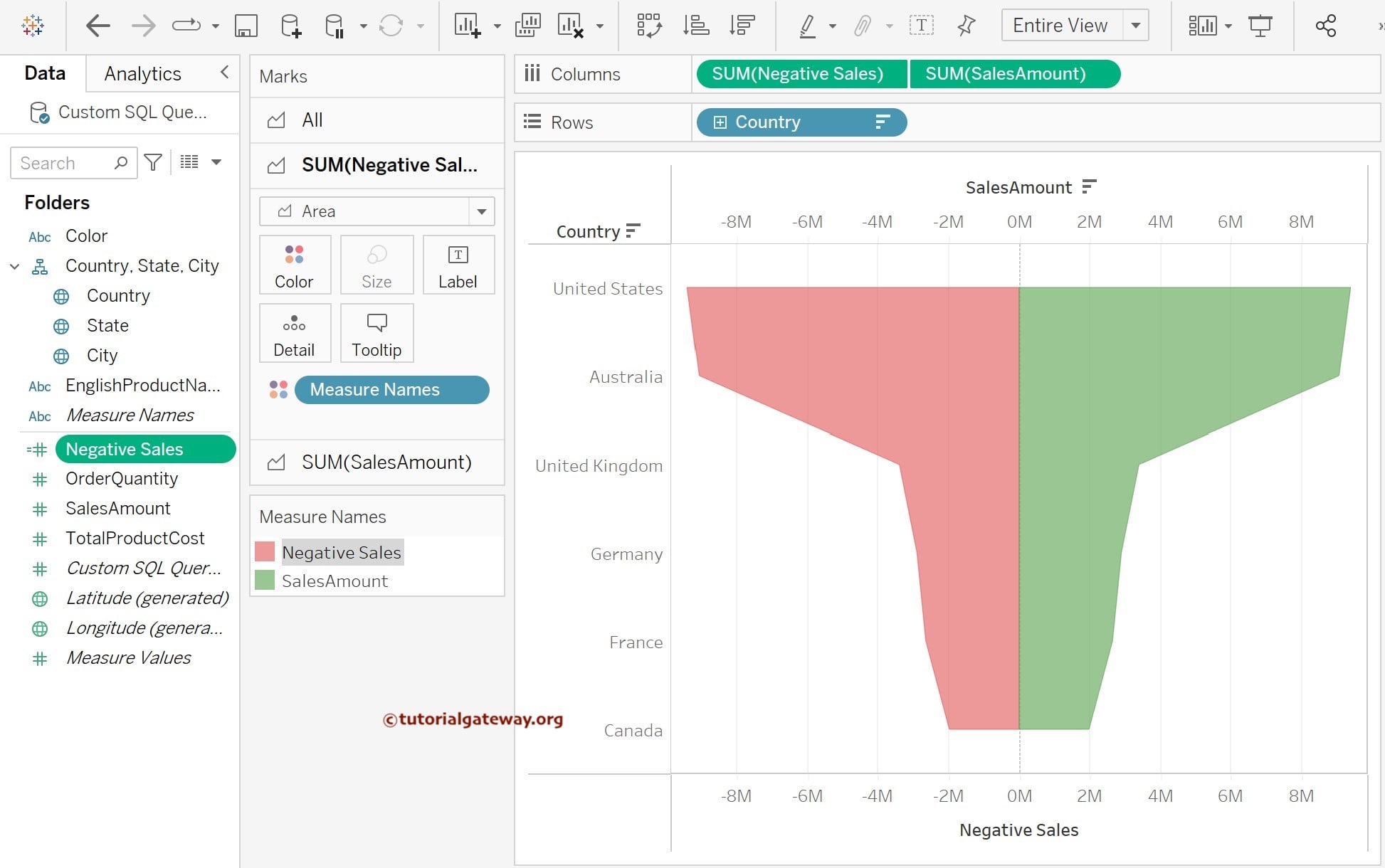
The next step is to combine the Negative Sales and SalesAmount using the Dual Axis option. So, right-click the SalesAmount axis and choose the Dual Axis option from the context menu.
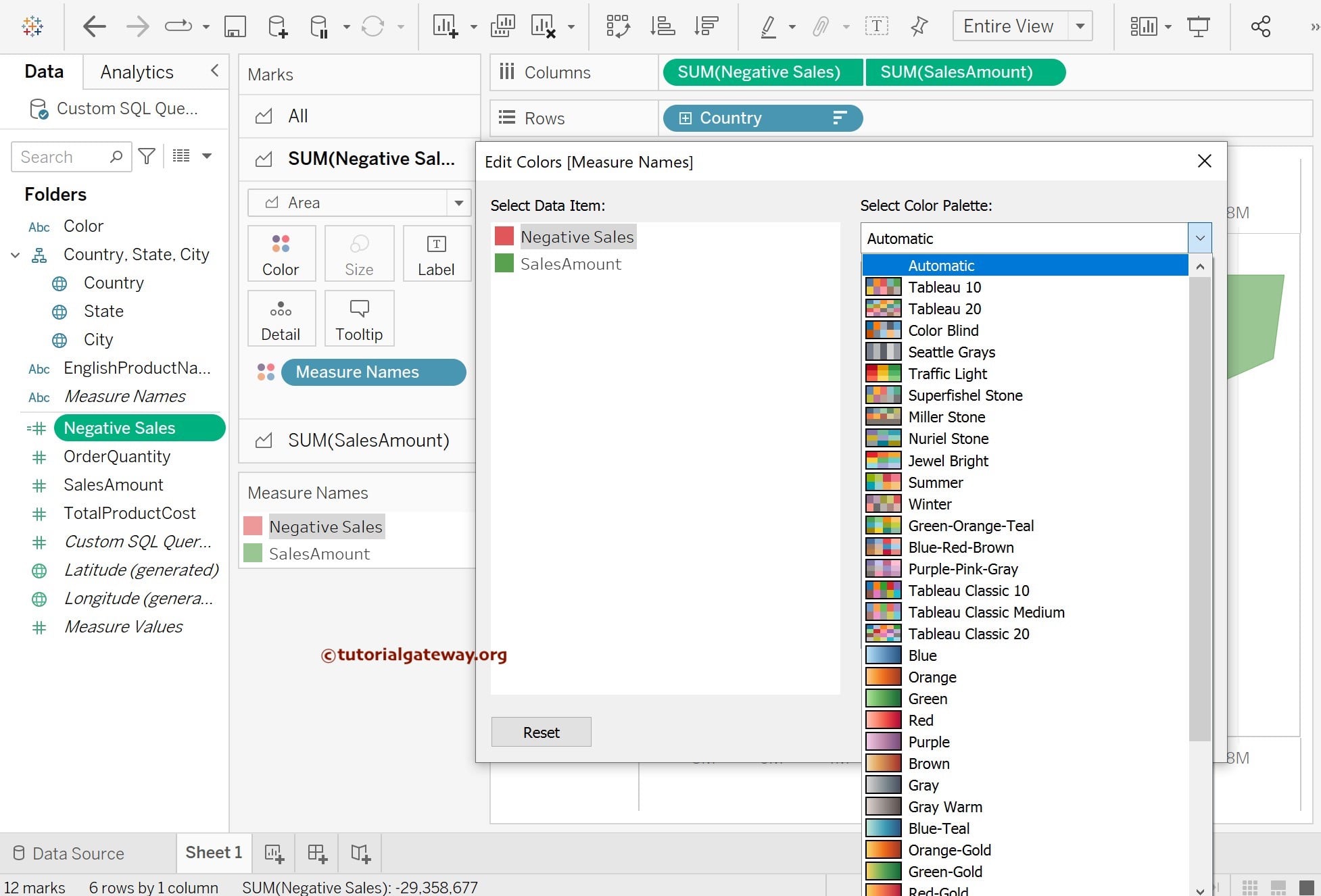
Format Color of a Traditional Funnel
The below screenshot shows you the Tableau Traditional funnel chart displaying the Negative Sales and SalesAmount, where the first one represents the red color and the latter one in green.
Although it provides the default colors to Funnel, the desktop allows us to format the Area Color. To change the color, click the Color field inside the Marks Shelf and press the Edit Colors button.
Once you click on it, the following window will be displayed. Click on the color you are interested in. We are now selecting the Green Color for the Positive Sales Amount. The screenshot below will show you the final output, our Traditional Funnel Chart.
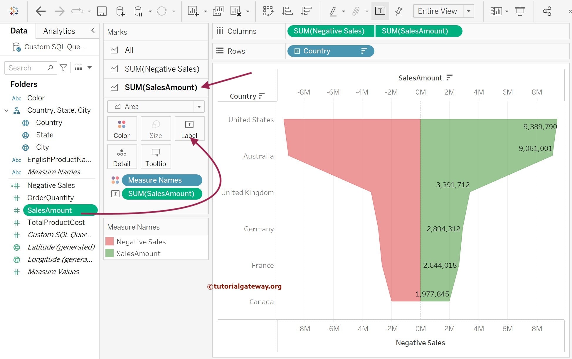
Add Data Label to Traditional Funnel Chart
Before we finish this Tableau Traditional Funnel Chart, let us add the Sales Amount Measure value as Data labels. To do this, please drag the Sales Amount from the Measures region to the Label field of the SUM(SalesAmount) Measure in the Marks Shelf.
TIP: If you want to add Data Labels to both Measures, select All Measures in the Marks Shelf and Place the Measure value. Otherwise, select the Individual Measure and place the Sales value.
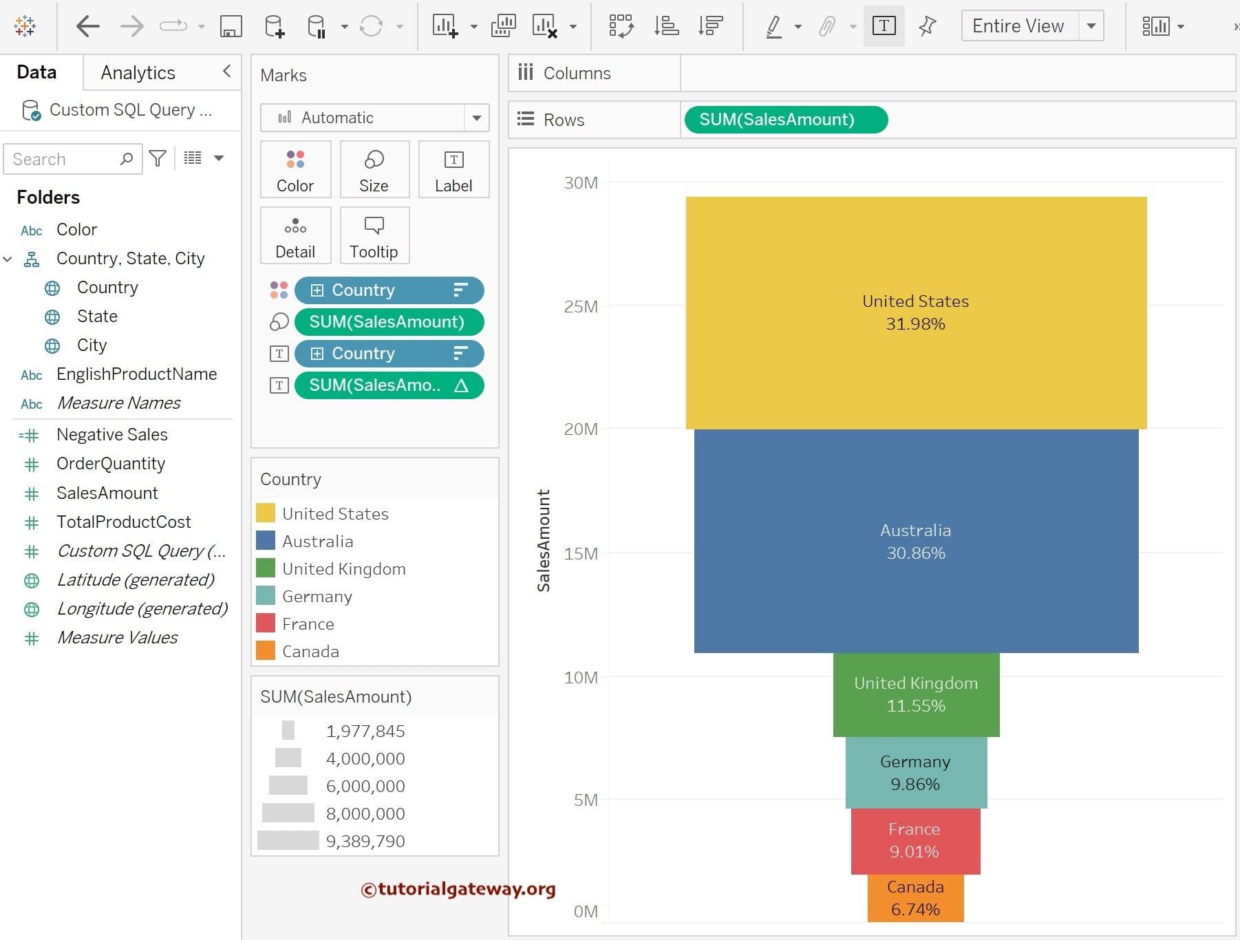
Create an Advanced Tableau Funnel Chart
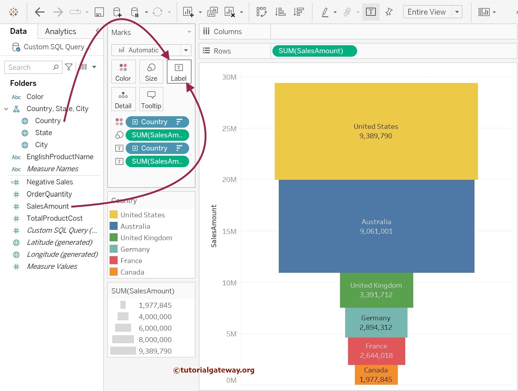
In this example, we will create an advanced Funnel Chart to display the Sales Amounts against the Country dimension. Here, the width of each stage depends on the sales. First, Drag and Drop the Sales Amount from the Measures Region to the Rows Shelf.
Second, drag and drop the Country Dimension from the Dimension Region to the Color Field present inside a Marks Shelf. Once you drag them, the following screenshot will be displayed.

We must sort the data bar in descending order using the sales amount. For this, please click on the Sort by Descending order option in the Toolbar to generate a Tableau Funnel Chart. Next, drag and drop the Sales Amount from the Measures Region to the Size Field in the Marks Shelf, as shown below. Once you drag, the Desktop will display the Chart.

Add Data Labels to Advanced Funnel
We can use the Label Shelf to add data labels to an Advanced Funnel Chart. So, before we finish the section, let us add the Country Name and Sales Amount as Data labels to the Tableau Funnel Chart. To do this, please drag the Country Name Dimension and Sales Amount Measure from the respective region to the Text field in the Marks Shelf.
Now, you can see the Country and Sales Amount Data Label in the Funnel Chart.
Click the down arrow beside the SUM(Sales Amount) to select the Quick Table Calculation and click the Percentage of Total to display the percentages in the Funnel Chart.
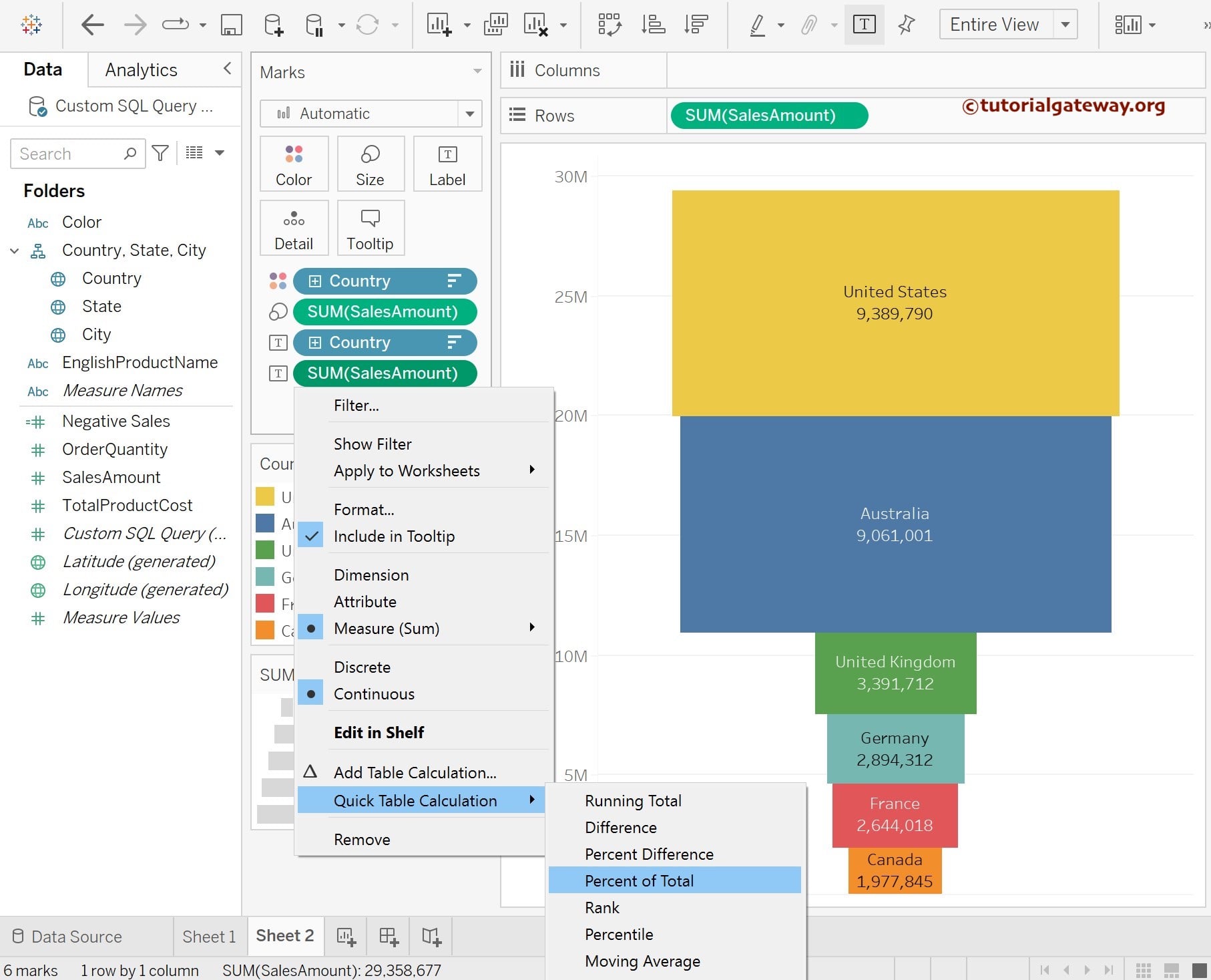
The following screenshot shows the final preview of the Advanced Funnel Chart with percentages as the data labels.
Please click on the Text field inside the Marks Shelf to format the Data Labels in the funnel chart. Once you click on it, click on the … button beside the Text to open the Edit label window to format it.
The third approach to creating a Tableau Funnel Chart
Drag and drop the Country Dimension to the Rows shelf. Next, add the previously created Negative Sales calculated field (Negative Sales) and SalesAmount to the Columns shelf.
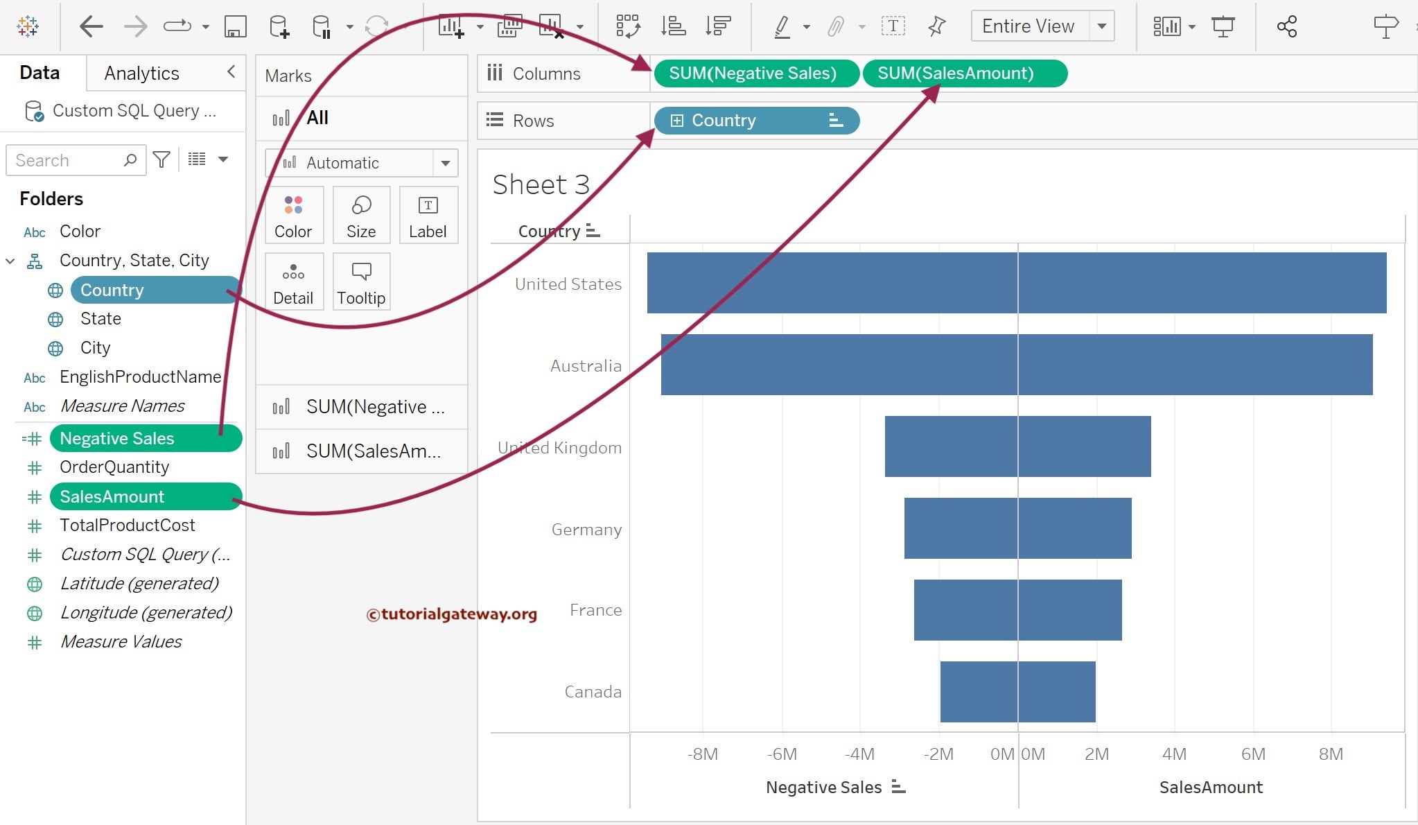
As you can see from the above screenshot, the Tableau Funnel chart is displayed. However, we must perform a few steps to get the actual result. First, we have to merge both the negative and actual sales. To do so, within the Columns shelf, click the down arrow beside the sales amount and select the Dual Axis option from the context menu.
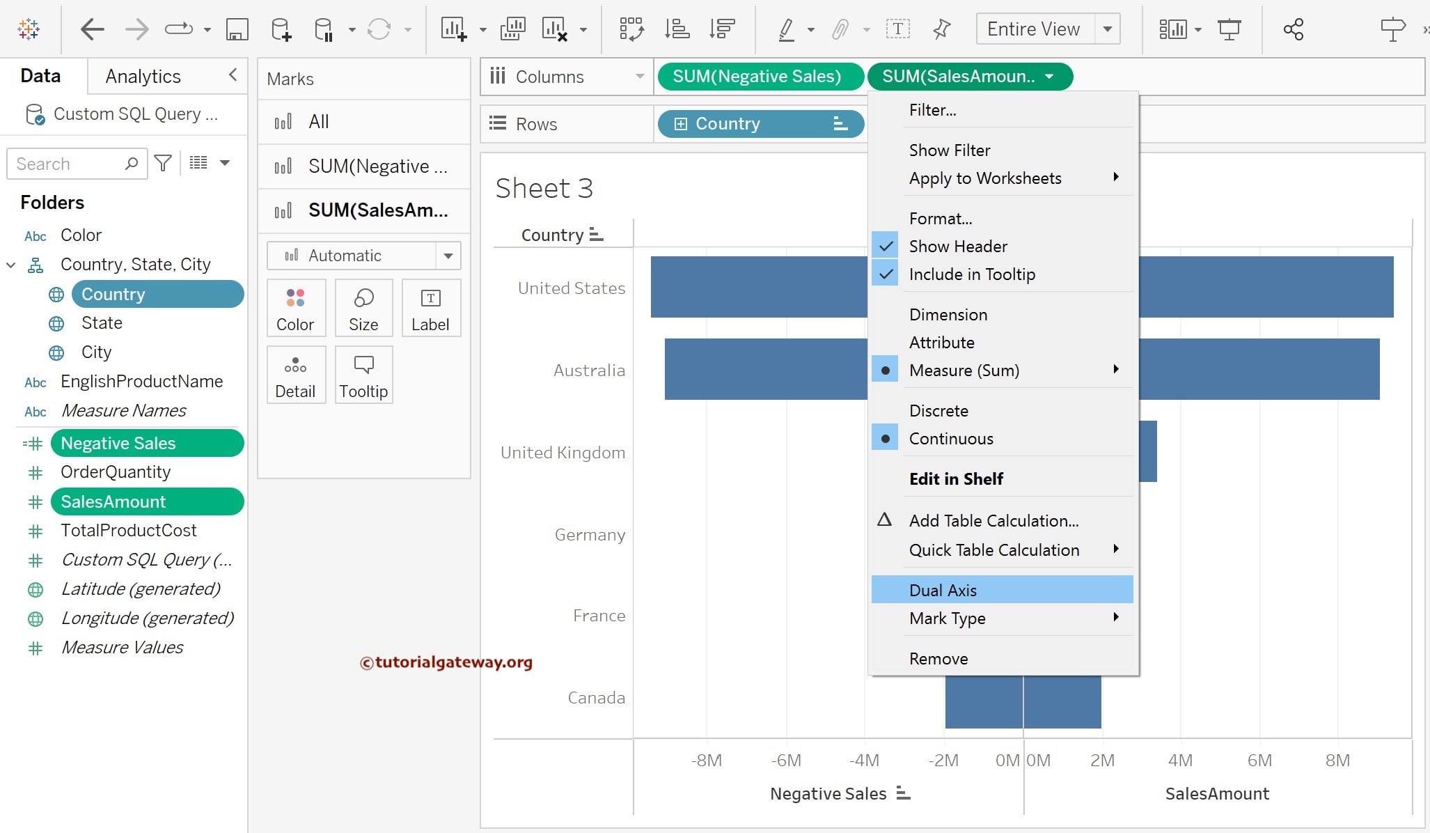
Please change the Mark type from Automatic (Circle) to Bar to generate the Funnel Chart. Now you can see the Funnel Chart. Please drag and drop the Sales Amount Measure to the SUM(SalesAmount) marks section to add data labels to the funnel chart’s right side (positive side).
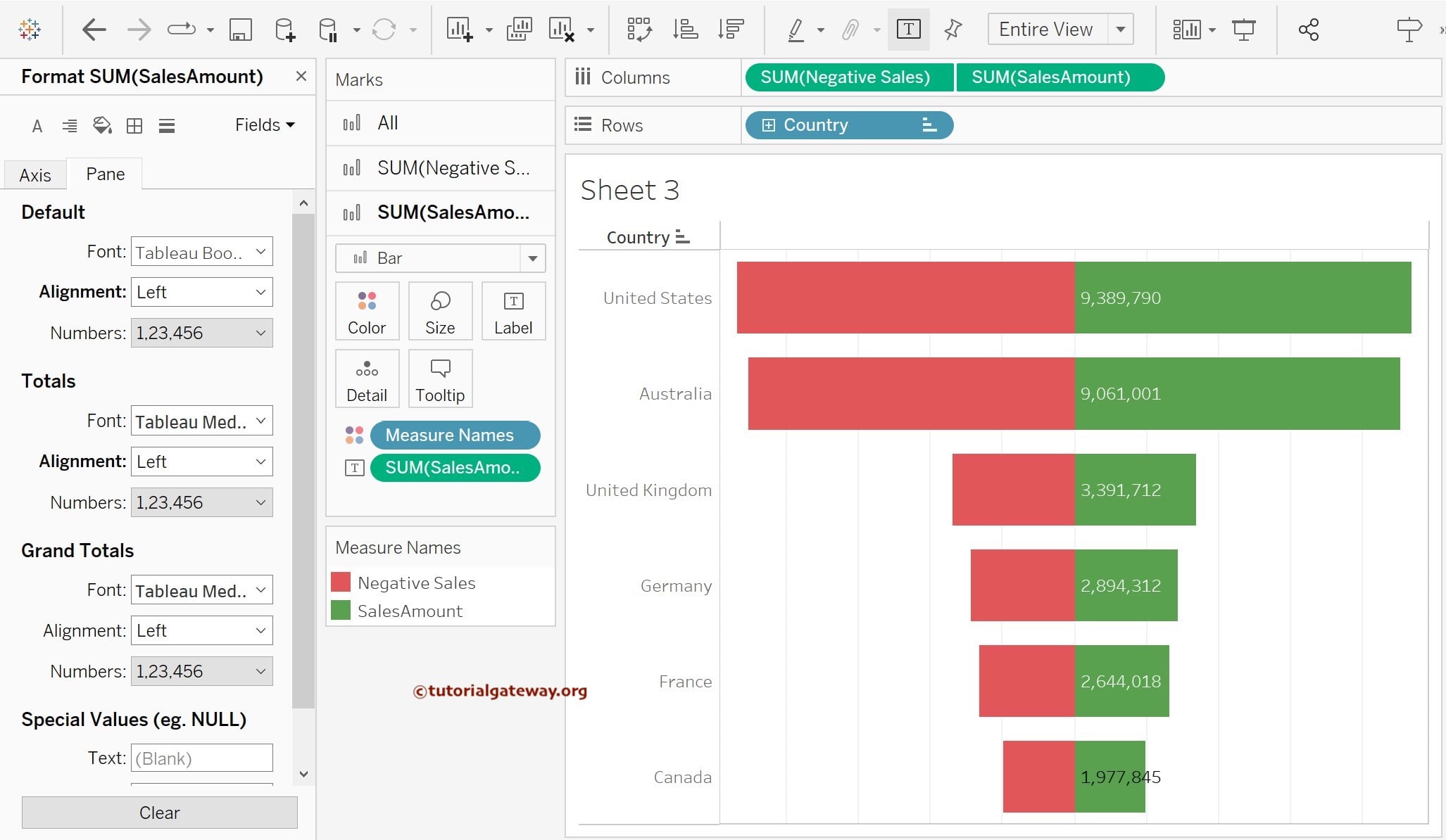
Please add the Country Dimension to the Colors section of the All (combination of SUM(Negative Sales) and SUM(SalesAmount)) Marks type. It will add different colors to each country on the Tableau Funnel Chart.