In this section, we show you how to create Power BI clusters with an example. To explain this Clusters concept, we will use the Scatter Chart we created earlier.
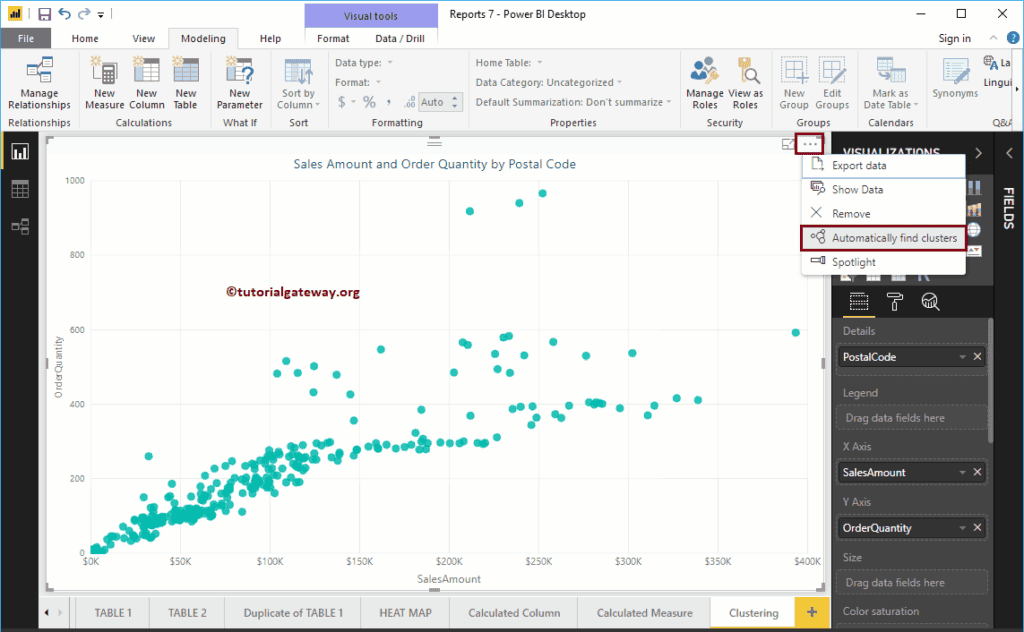
For this clusters demonstration, we will use the Data Source we created in the Connect to SQL Server article and Scatter Chart. The image shows the scatter plot that we use for the Clusters demonstration.
Create Power BI Clusters
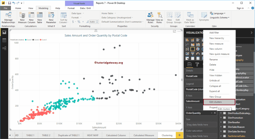
Please click on the … (3 dots) on the top right corner of the chart to see the option. As you can see from the screenshot below, we selected the Automatically Find Clusters option from the menu.
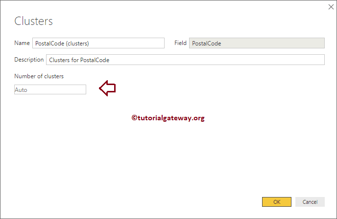
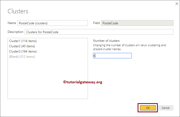
Clicking the Automatically find Power BI Clusters option opens the following window. For this cluster demo, we are leaving all the default values. So, let me click the OK button.
- Name: Use this text box to rename the default generated name
- Field: Field or Column that you used for Clustering
- Description: Write a meaningful description that describes this.
- Number of Clusters: By default, Auto is selected. However, you can specify any integer value.
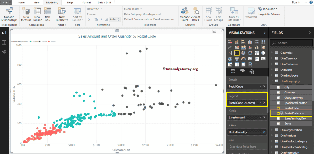
An auto option has generated three clusters
Edit Power BI Clusters
You can edit it in two ways. Under the Visualization tab, click the down arrow beside this and select the Edit Cluster option from the menu. Or, please select the Cluster that you want to edit and right-click on it to open the context menu. Please select the Edit Clusters option from it.
Clicking the Edit option opens the following window. Use this window to change as per your requirement. Let me change the default from three to six.
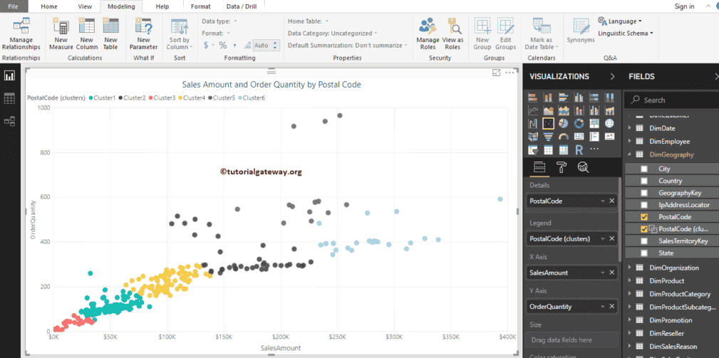
Now you can see that it has generated six different clusters
Delete Power BI Clusters
Please select the Cluster that you want to delete. Next, right-click on it and select the Delete option from the context menu. It opens a pop-up window, and click Confirm Delete. Please observe the image under the Edit section.
Create Manual Clusters
It is the same as the first example, but we are changing the Number of Clusters value from Auto to 5 this time.
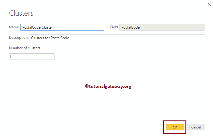
And you can see the 5 clusters.
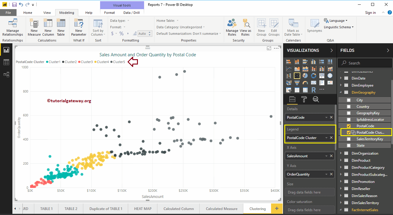
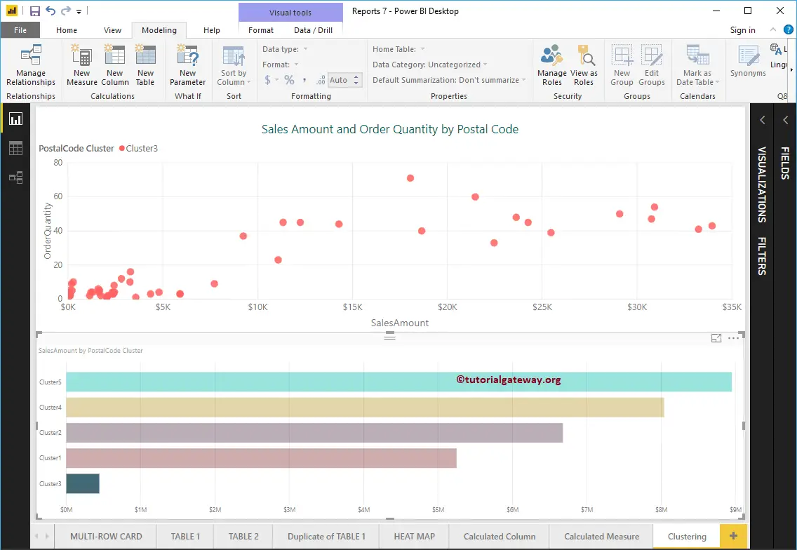
Let me use this on another (different) report. For this, we created a Bar Chart using Postal Code Cluster (newly created) and Sales Amount.
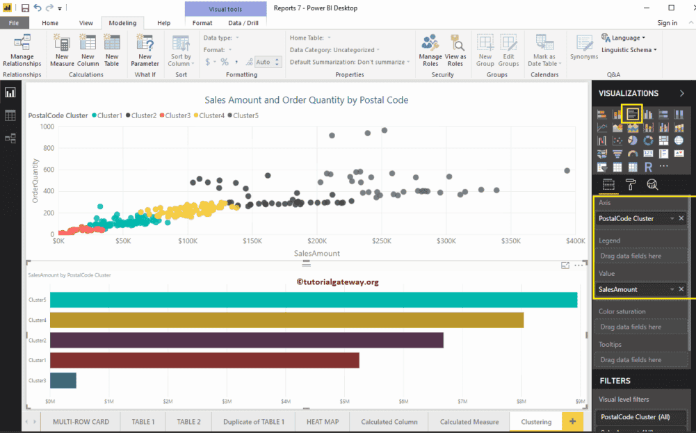
Like normal columns, you can also Filter Clusters.