A Power BI table contains the data arranged in the form of rows and columns Let me show you how to create it with an example. Each row contains detailed low-level information of each column. It may also include the header section and the row totals.
Generally, tables help compare multiple fields on a single page. For instance, one or more measures and columns are placed side by side. For this table report demonstration, we will use the SQL Data Source we made in our previous article.
What are the types of tables in Power BI?
There are three types of tables.
- Physical table – It contains the actual data.
- Calculated Table or DAX expression table.
- Virtual table or DAX measure code.
When to use them
Although the basic Power BI Table looks similar to Excel or any other reporting tool, the formatting options give more power and look good. For instance, add background colors to individual cells, background color, data bars, indicators, etc.
- To display the data in a tabular format.
- To view the data at the detailed level.
- To show all the available rows in the given columns.
- If you don’t need a visual representation of data.
- To show more number of numerical column data by categories.
Option #1: Create a table in Power BI
If you drag and drop any dimension field, the desktop automatically creates a table for you. Please refer to the Connect to SQL Server and the List of Charts article to understand the Power BI Data Source.
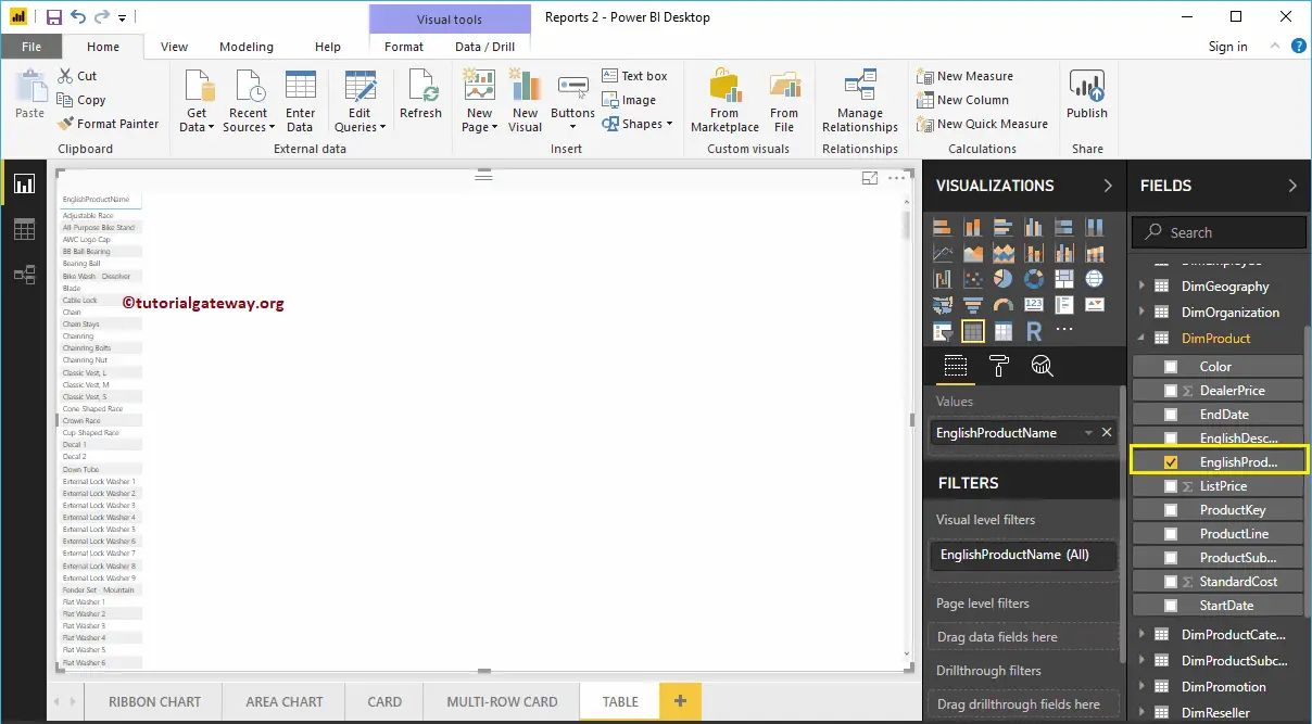
Selecting the Table icon under the Visualization section within the black page will generate a dummy table. Otherwise, selecting any text field on the desktop will automatically create a table. Next, add the required fields to the columns section.
Let me drag and drop the English Product Name from the Fields section to Canvas. As you can see from the screenshot below, the desktop automatically creates a table for you.
Option #2: Convert Column Chart to Power BI Table
You can follow this step to convert the existing chart to a table. We created a column chart, which represents the Sales Amount by Product Name.
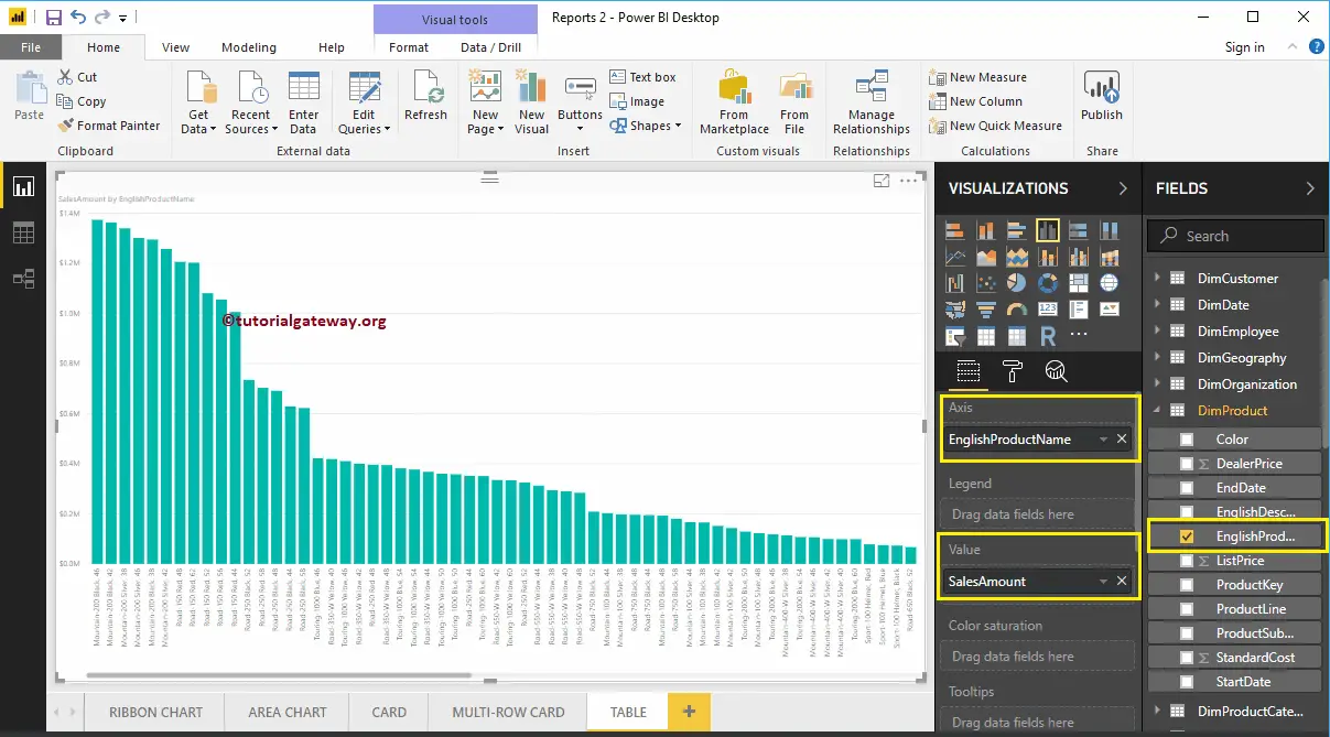
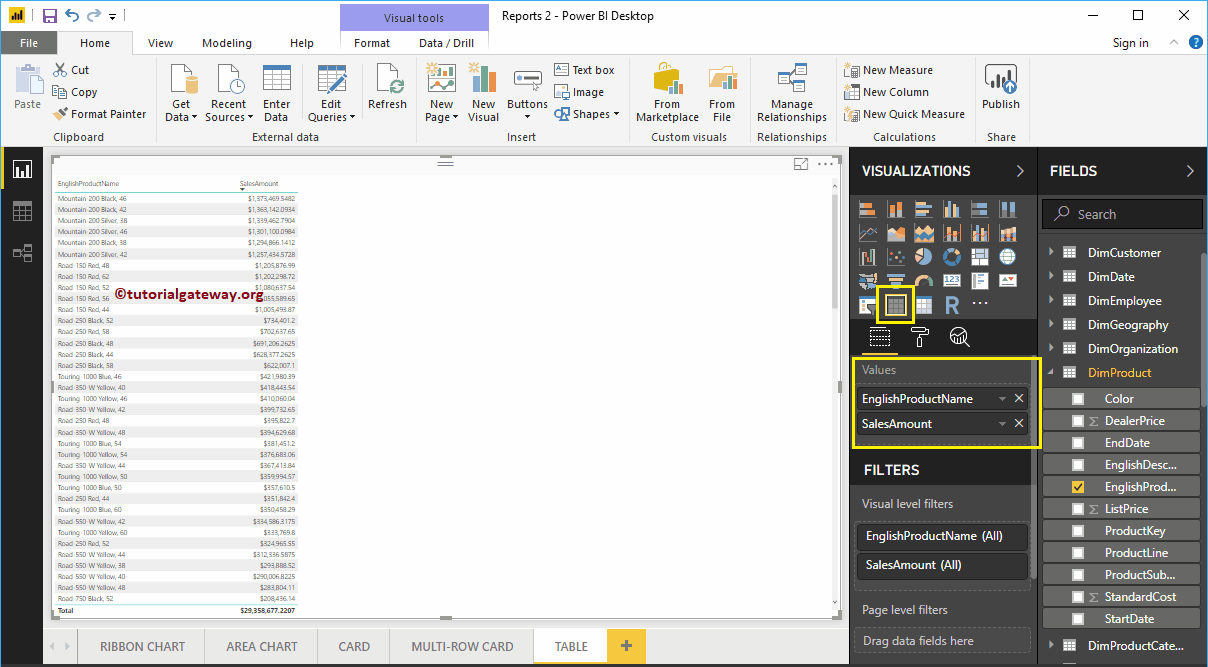
Click on the shown button under the Visualization section. It automatically converts the Column Chart into a Table. From the below screenshot, you can see the Tabular representation of Product names and their Sales Amount.
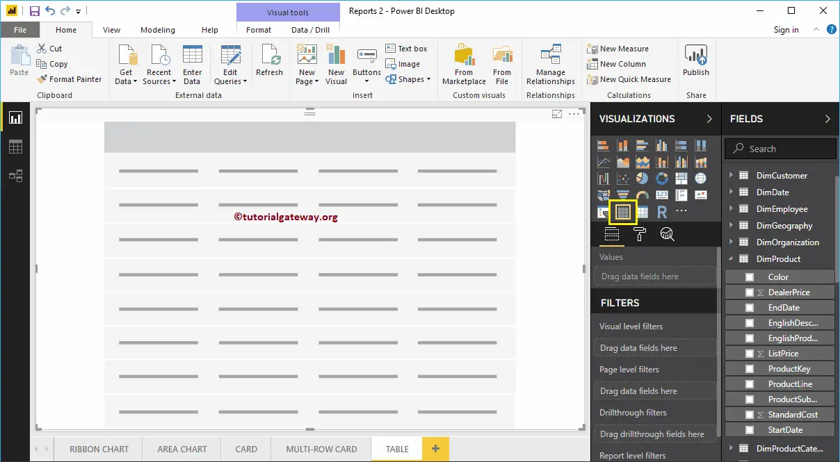
Option #3: Create a Table using Visualization
First, click on the shown icon present in the Visualization section. Power BI automatically creates a Table with dummy data, as shown in the below screenshot.
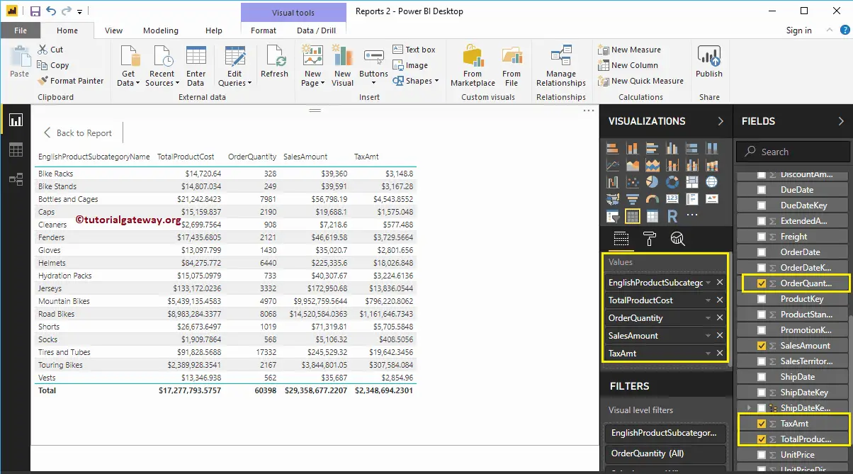
Next, drag the English product Subcategory Names and Sales Amounts to the Values section. Let me add more metric values to tables, such as Total Product Cost, Order Quantity, and Tax amount. Now, you can see the actual one with data.
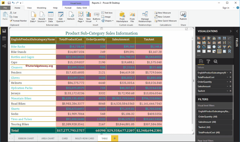
Let me do some quick formatting to this. I suggest you refer to the Format Table article to understand the steps involved in changing the title, background colors, alternative colors, etc.
Comments are closed.