Tableau Butterfly Chart is the combination of two bar plots on either side of the same y-axis. Typically, a Butterfly Chart helps to compare two data sets at a time. In this article, we use the superstore Excel file to build this.
Create a Butterfly Chart in Tableau
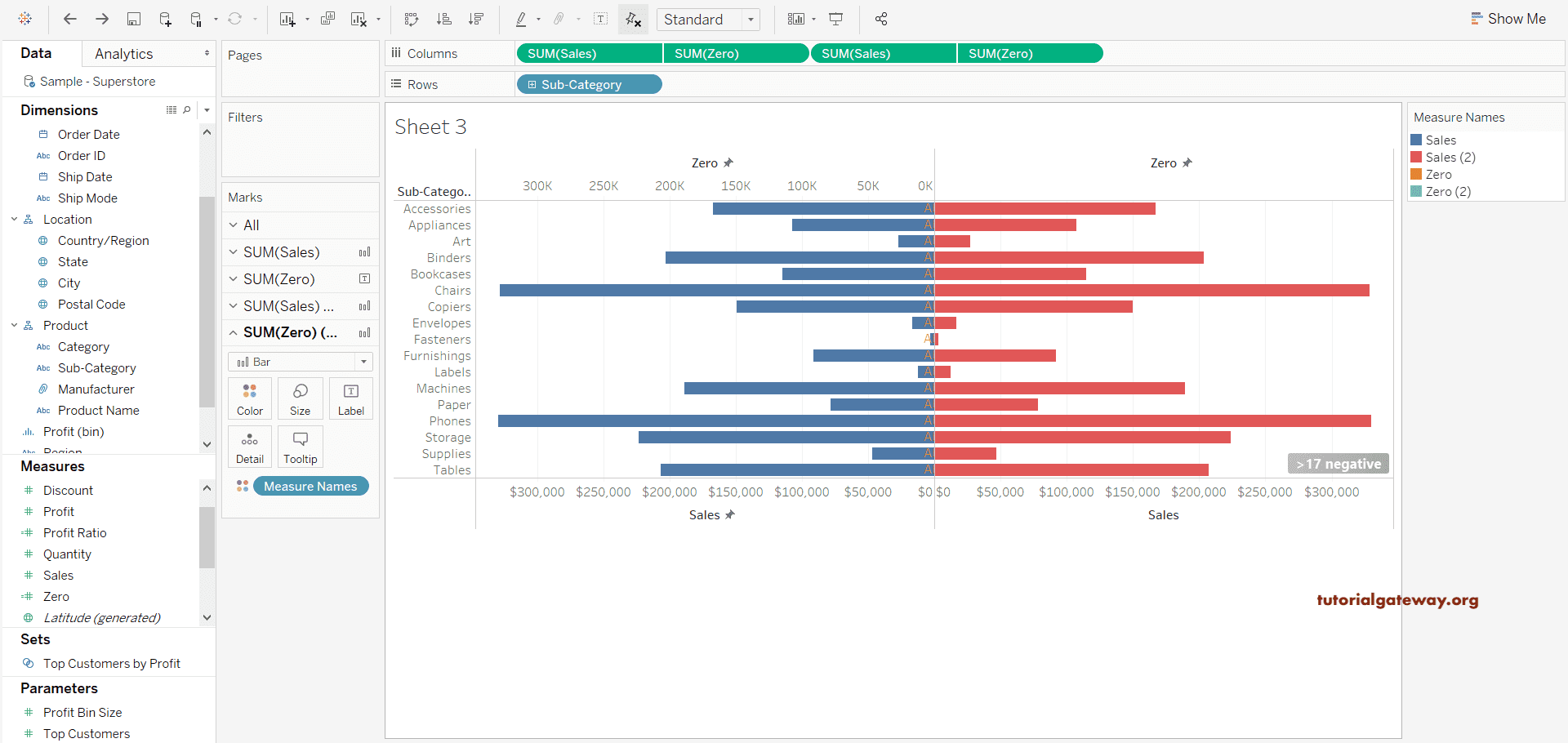
Drag and drop the Sub-Category dimension to the row shelf will create a simple table. For this Butterfly Chart, drop the Sales measure into the column shelf multiple times. By default, it displays two horizontal bar plots side-by-side.

To create a Tableau butterfly chart, we need a calculated field to show the zero axis. So, right-click the down arrow beside the dimension section, Analysis Menu, or space within the Measures shelf to create a calculated field. Next, select the Create Calculated Field.. option from the context menu.
We named the calculated field Zero and placed 0, which means it shows zeros.
0
Drag the Zero calculated field onto the columns section in between the two sales fields. As you see, we have Sales, Zero, Sales, Zero on the columns shelf, and Sub-Category on the Rows shelf.

Convert the Circles of Zero field to Bars using Marks shelf. Either select the individual Maark (SUM(Zero) and SUM(Sales) or choose All and change them.
Here, we choose All and convert all the column measure fields to bar charts by changing Marks. If it doesn’t work, choose SUM(Zero) and change to Bar, and so on.

Now, you can see the Bar graphs. We have to convert this to a Tableau Butterfly Chart.

Let me change the Zero field to Tableau Text or labels. As its value is 0, it shows Abc as the text. For more Charts >> Click Here. Next, select and right-click on the Sales field, zero fields, and select the Synchronize Axis option.

Now, the data of both the measures have synchronized for this Tableau Butterfly Chart.

Again, right-click on the axis, and this time, please select the Edit Axis option(instead of the Synchronize Axis option). It opens the Edit Axis window to change the range. By default, the synchronization selects the range automatically.
Let me change this option to Fixed and change the start value to 0 and the end value to 347,101.602227. By this, both the Sales and Zero will be on the same scale.

You can see the Butterfly Chart.

We have to do the same for the remaining Sales and Zero measures. So, right-click on the Zero measure and click the Dual Axis option.

It almost completes the Tableau Butterfly Chart.

Right-click on the second axis (Zero Axis above the red color bars) and select the Edit Axis option. Here, the range is from automatic to fixed, with 0 and 0 as the start and end values. Next, we also checkmarked the logarithmic option.

Changing the SUM(Zero) (2) Marks from bar to text will show the text for the other half of this chart. We left it as it is, and you can see the final Butterfly Chart.