This SSRS article shows how to create a 3D Cylinder Chart to compare two measures against a dimension, show data labels, and format fonts and colors with an example. To demonstrate this example, right-click on the Datasets folder to create a new DataSet.
The below code shows the data set that we use for this 3D Cylinder Chart example.
The Sql query that we used above SSRS example is:
SELECT Geo.[EnglishCountryRegionName] AS [Country]
	,SUM(Fact.SalesAmount) AS Sales
	,SUM(Fact.TotalProductCost) AS ProductCost
FROM  DimCustomer AS Cust
INNER JOIN FactInternetSales AS Fact ON Cust.CustomerKey = Fact.CustomerKey
INNER JOIN [DimGeography] AS Geo ON Cust.GeographyKey = Geo.GeographyKey
GROUP BY Geo.[EnglishCountryRegionName]
SSRS 3D Cylinder Chart
To add a 3D Cylinder, right-click the report area, choose Insert, and then the chart option from the context menu. Otherwise, drag and drop the chart from the toolbox to the report area.

Select the 3D Cylinder chart from the window and click OK to add to the report area.

Use the Plus button beside the Category Group, Values, and Series Group sections, or drag the fields to the Values and Category Groups section.
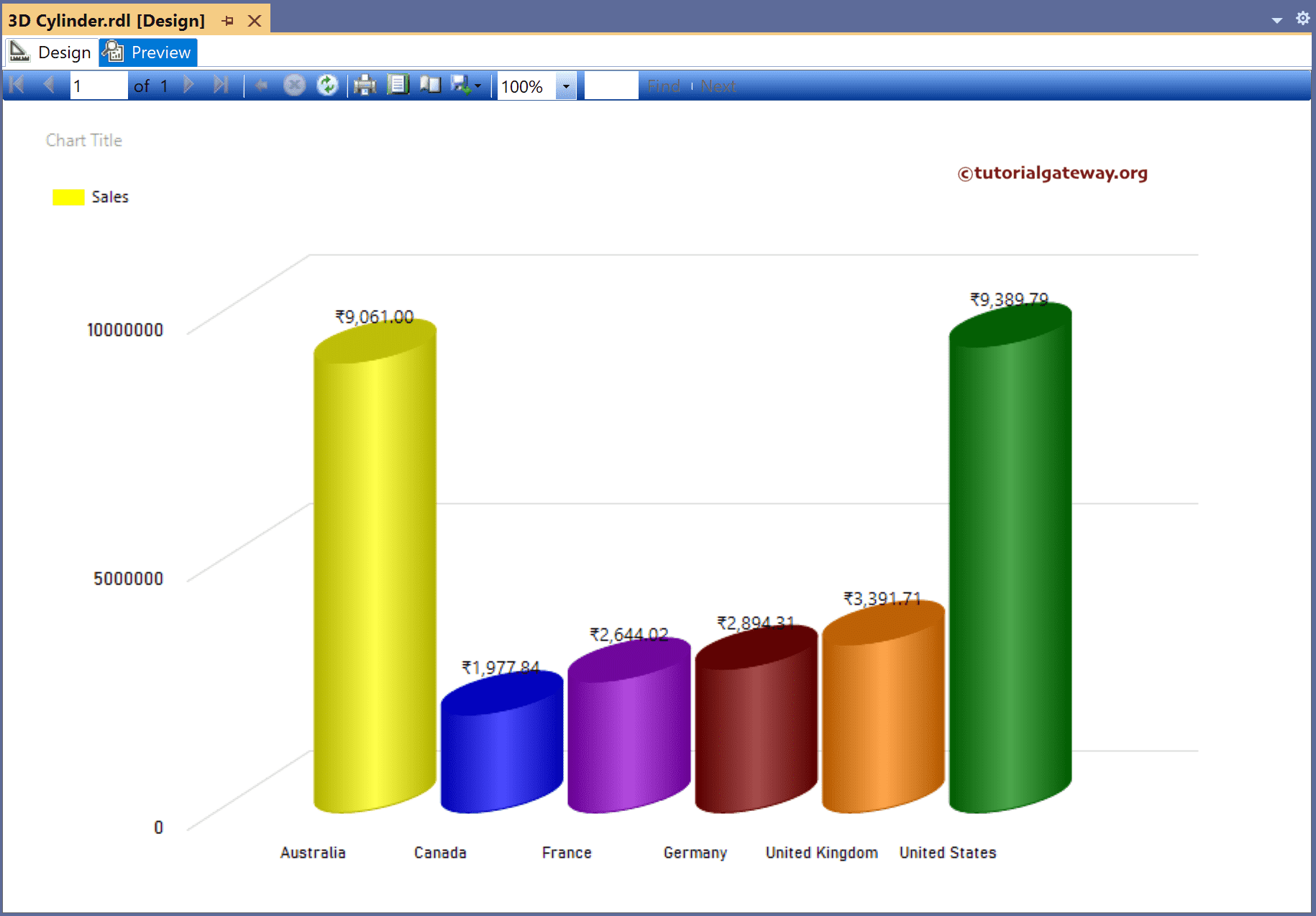
Here, we added the Sales column to the Values and Country column to the Category Groups section. Next, right-click on the 3d cylinder and select the Show Data Labels option to add labels.

Right-click the Data Labels and select the Series Label Properties option to format 3d cylinder Numbers as Currency and show values in Thousands.

Let me select the chart and change the palette to Earth Tones. Next, click the preview button to see the SSRS 3D Cylinder chart.

To compare multiple measure values, let me add the Product Cost column to the Values section and enable Data Labels. Here, we used the toolbar to format the 3d cylinder font, color, and size of the X-axis, Y-axis, data labels, and legend. However, you can use the properties window to format the report.

Preview the report.

Let me remove the Product cost column from the Values section, right-click on the 3d cylinder, and select Series properties. Next, go to the Fill tab, select Fill styles Solid, and click the ƒx button to write the expression.
The below switch statement assigns different colors for each country.
=Switch(Fields!Country.Value = "Australia", "Yellow",
	Fields!Country.Value = "Canada", "Blue",
	Fields!Country.Value = "France", "DarkViolet",
	Fields!Country.Value = "Germany", "Maroon",
	Fields!Country.Value = "United States", "Green",
	Fields!Country.Value = "United Kindgom", "Magenta")

Let me show you the SSRS 3D Cylinder Chart preview.