The Python matplotlib pyplot scatter plot is a two-dimensional graphical representation of the data. A scatter plot is useful for displaying the correlation between two numerical data values or two data sets. In general, we use this pyplot Scatter Plot to analyze the relationship between two numerical data points by drawing a regression line.
The Python matplotlib pyplot module has a function that will draw or generate a scatter plot, and the basic syntax to draw it is
matplotlib.pyplot.scatter(x, y)
- x: list of arguments that represents the X-axis.
- y: List of arguments represents Y-Axis.
Python matplotlib pyplot Scatter Plot Examples
This is a simple scatter plot example where we declared two lists of random numeric values. Next, we used the pyplot function to draw a scatter plot of x against y.
import matplotlib.pyplot as plt

x = [1, 9, 5, 3, 8, 6, 2, 4, 7]

y = [22, 4, 40, 27, 33, 15, 5, 20, 30]

plt.scatter(x, y)
plt.show()

Here, we used Python randint function to generate 50 random integer values from 5 to 50 and 100 to 1000 for x and y. Next, we draw the scatter plot.
import matplotlib.pyplot as plt
import numpy as np

x = np.random.randint(5, 50, 50)

y = np.random.randint(100, 1000, 50)

print(x)
print(y)

plt.scatter(x, y)

plt.show()
Python matplotlib pyplot Scatter Chart or plot using CSV
In this example, we read the CSV file and converted it into DataFarme. Next, we draw a scatter plot using Profit on X-Axis and Sales on Y-Axis.
import pandas as pd
from matplotlib import pyplot as plt

df = pd.read_excel('/Users/suresh/Downloads/Global_Superstore.xls')

sales_data = df.groupby('Order Date')[['Sales', 'Profit']].sum()

print(sales_data.sort_values(by = ['Profit']))

plt.scatter(sales_data['Profit'], sales_data['Sales'])

plt.show()
Python matplotlib pyplot Scatter Plot titles
We already mentioned in previous charts about labeling the charts. In this pyplot scatter plot example, we used the xlable, ylabel, and title functions to show X-Axis, Y-Axis labels, and chart titles.
plt.title('Example')
plt.xlabel('Profit')
plt.ylabel('Global Sales')
plt.show()

Python matplotlib pyplot Scatter Plot color and Marker
In all our previous examples, you can see the default color of blue. However, you can change the marker colors using the color argument and the opacity by the alpha argument. In this pyplot Scatter Plot example, we change the marker color to red and opacity to 0.3 (bit lite).
Apart from this, you can use the markers argument to change the default marker shape. Here, we changed the shape of the marker to *. I suggest you refer matplotlib article to understand the list of available markers.
import pandas as pd
from matplotlib import pyplot as plt

df = pd.read_excel('/Users/suresh/Downloads/Global_Superstore.xls')

market_data = df.groupby('Order Date')[['Quantity', 'Profit']].sum()

plt.scatter(market_data['Quantity'], market_data['Profit'],
            color = 'red',
            marker = '*', alpha = 0.3)

plt.title('Example')
plt.show()

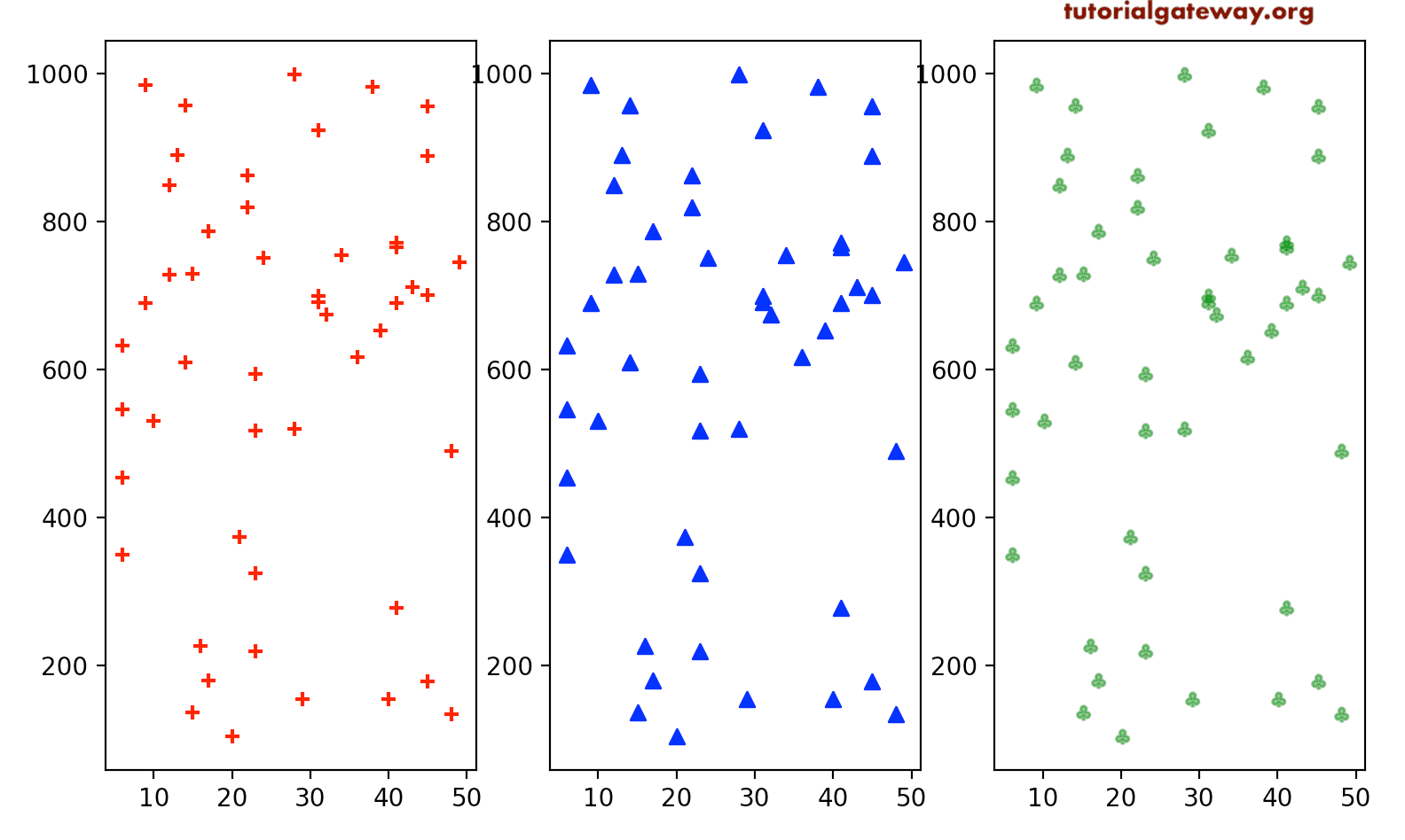
Here, we are trying to showcase three other available markers in it.
import matplotlib.pyplot as plt
import numpy as np

x = np.random.randint(5, 50, 50)

y = np.random.randint(100, 1000, 50)

fix, (ax1, ax2, ax3) = plt.subplots(1, 3, figsize = (8, 4))

ax1.scatter(x, y, marker = '+', color = 'red')
ax2.scatter(x, y, marker = '^', color = 'blue')
ax3.scatter(x, y, marker = '$\clubsuit$', color = 'green',
            alpha = 0.5)

plt.show()
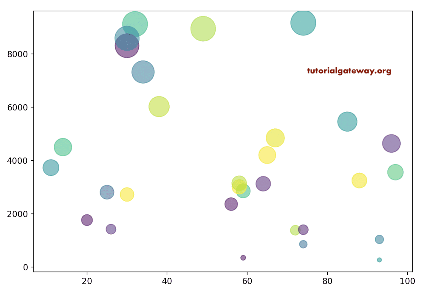
In the previous Python matplotlib pyplot Scatter Plot examples, we used a single color for all the markers associated with the axis values. However, using the color argument, you can use multiple or individual colors for each marker.
Here, we defined two Radom integer arrays and a random array for colors. Next, we assigned that colors array to c to generate random colors for markers.
import matplotlib.pyplot as plt
import numpy as np

x = np.random.randint(10, 100, 30)

y = np.random.randint(100, 10000, 30)

colors = np.random.rand(30)

plt.scatter(x, y, c = colors, alpha = 0.5, s = y/10)

plt.show()

It is another way of assigning different colors to the markers. Apart from the above, you can also define a gradient to the markers (for example, rainbow) using the color and cmap arguments. To do this, first, you have to assign the list of values that define the marker color as a c argument. Second, you have to define the cmap color (gradient that you want to use), as we defined below.
import pandas as pd
from matplotlib import pyplot as plt

df = pd.read_excel('/Users/suresh/Downloads/Global_Superstore.xls')

market_data = df.groupby('Order Date')[['Sales', 'Quantity', 'Profit']].sum()

plt.scatter(market_data['Quantity'], market_data['Profit'],
            c = market_data['Quantity'],cmap = 'gist_rainbow_r',
            marker = '*')

plt.title('Markers Example')

plt.show()

Python matplotlib pyplot Scatter Plot size and edge colors
The matplotlib scatter function has an s argument that defines the size of a marker. It accepts a static one value for all the markers or array-like values. Here, we assigned 150 as a marker size, which means all the markers will size to that value.
import pandas as pd
from matplotlib import pyplot as plt

df = pd.read_excel('/Users/suresh/Downloads/Global_Superstore.xls')

market_data = df.groupby('Order Date')[['Quantity', 'Profit']].sum()

plt.scatter(market_data['Quantity'], market_data['Profit'],
            color = 'green', marker = '*', alpha = 0.5,
            s = 150)

plt.title('size and edge colors')

plt.show()

In this Python matplotlib pyplot Scatter Plot example, we assigned y/10 as the s values. It means each marker value will be different and entirely based on the y value.
import matplotlib.pyplot as plt
import matplotlib.patches as patches
import numpy as np

x = np.random.randint(10, 100, 30)

y = np.random.randint(100, 10000, 30)

colors = np.random.rand(30)

plt.scatter(x, y, c = colors, alpha = 0.6, s = y/10)

plt.show()
Let me take a CSV file example. Here, we draw it using Profit and Sales values. Next, we defined the size of the marker based on the profit. It means marker size will increase when the profit is more.
import pandas as pd
from matplotlib import pyplot as plt

df = pd.read_excel('/Users/suresh/Downloads/Global_Superstore.xls')

sales_data = df.groupby('Region')[['Sales', 'Profit']].sum()

print(sales_data.sort_values(by = ['Profit']))

plt.scatter(sales_data['Profit'], sales_data['Sales'], marker = 'o',
            color = 'r', s = sales_data['Profit']/ 1000)

plt.show()

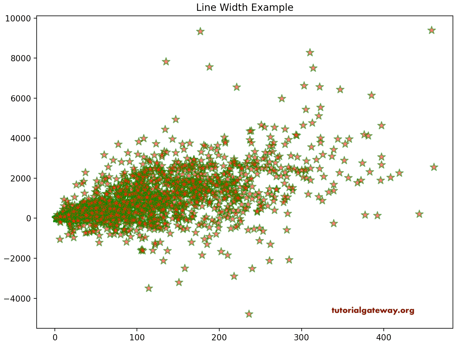
The linewidths argument accepts a scalar value or array, and the default value is None. This pyplot Scatter Plot linewidths argument defines the width of marker edges. The edgecolors argument allows choosing the line edge color of the markers. In this example, we assigned the line width as 1.1 and the edge color to green.
import pandas as pd
from matplotlib import pyplot as plt

df = pd.read_excel('/Users/suresh/Downloads/Global_Superstore.xls')

market_data = df.groupby('Order Date')[['Quantity', 'Profit']].sum()

plt.scatter(market_data['Quantity'], market_data['Profit'],
            color = 'red', marker = '*', alpha = 0.6,
            s = 100,  linewidths = 1.1, edgecolors = 'g')

plt.title('Line Width Example')

plt.show()
Multiple scatter Charts
The Python matplotlib pyplot scatter function also allows you to draw multiple plot values. First, we plot y against x, and then we plot z against x. It will display z and y values agist x in one chart to differentiate them. We used red and blue colors.
import matplotlib.pyplot as plt

x = [1, 9, 5, 3, 8, 6, 2, 4, 7]

y = [22, 4, 40, 27, 33, 15, 5, 20, 30]

z = [16, 35, 4, 19, 20, 40, 35, 7, 12]

plt.scatter(x, y, color = 'blue')
plt.scatter(x, z, color = 'red')
plt.show()

It is another example of drawing multiple plots. However, this time, we are using the CSV file to compare the Region and Market Sales against the Profits.
df = pd.read_excel('/Users/suresh/Downloads/Global_Superstore.xls')

region_data = df.groupby('Region')[['Sales', 'Profit']].sum()

market_data = df.groupby('Market')[['Sales', 'Profit']].sum()

plt.scatter(region_data['Profit'], region_data['Sales'],
            s= 100, marker = '*', color = 'yellow',
             linewidths = 1.1, edgecolors = 'g')

plt.scatter(market_data['Profit'], market_data['Sales'],
            s =100, marker = 'o', color = 'r')

plt.title('Multiple ones')

plt.show()
Add a legend to Python matplotlib pyplot Scatter Plot
As you can see from the above screenshot, you might not know or identify which markers represent the Region’s Sales and Market. To resolve this, you can use the legend function to add a legend to the Scatter plot.
df = pd.read_excel('/Users/suresh/Downloads/Global_Superstore.xls')

region_data = df.groupby('Region')[['Sales', 'Profit']].sum()

market_data = df.groupby('Market')[['Sales', 'Profit']].sum()

plt.scatter(region_data['Profit'], region_data['Sales'],
            label = 'Region Sales',
            s= 100, marker = '$\heartsuit$', color = 'b',
             linewidths = 1.2, edgecolors = 'g')

plt.scatter(market_data['Profit'], market_data['Sales'],
            label = 'Market Sales',
            s =100, marker = '$\clubsuit$', color = 'r')

plt.legend()
plt.show()

Highlight Area
In some situations, you might need to focus on a particular location or area within the scatter plot. So, you need to highlight that particular area for better focus. All you need to do for this is add patches to an existing one. In this example, we are adding a rectangle to highlight the area.
import pandas as pd
import matplotlib.pyplot as plt
import matplotlib.patches as patches

df = pd.read_excel('/Users/suresh/Downloads/Global_Superstore.xls')

market_data = df.groupby('Order Date')[['Quantity', 'Profit']].sum()

fig, ax = plt.subplots()

ax.scatter(market_data['Quantity'], market_data['Profit'],
            color = '#A90303', marker = '*', alpha = 0.6,
            s = 100,  linewidths = 1.1, edgecolors = '#A4F5AF')

ax.add_patch(patches.Rectangle((50, -50), 100, 2000, alpha = 0.3))

plt.show()

Similarly, we can add a circle to the area. Apart from this, we can format that circle to view it better. In this example, we add a circle to this chart of random values and then format the color, line widths, etc.
import matplotlib.pyplot as plt
import matplotlib.patches as patches
import numpy as np

x = np.random.randint(10, 100, 30)

y = np.random.randint(10, 101, 30)

colors = np.random.rand(30)

fig, ax = plt.subplots()

ax.scatter(x, y, c = colors, alpha = 0.5, s = y*10)

ax.add_patch(
    patches.Circle((40, 60), 20, alpha = 0.3,
                   edgecolor = 'red', facecolor = 'yellowgreen',
                   linewidth = 2, linestyle = 'solid'))

plt.show()

By using the axvline function, you can add a vertical line inside a pyplot scatter plot. Similarly, use the axhline to add a horizontal line.
import pandas as pd
import matplotlib.pyplot as plt
import matplotlib.patches as patches

df = pd.read_excel('/Users/suresh/Downloads/Global_Superstore.xls')

market_data = df.groupby('Order Date')[['Quantity', 'Profit']].sum()

plt.scatter(market_data['Quantity'], market_data['Profit'],
            color = '#A90303', marker = '*', alpha = 0.6,
            s = 100,  linewidths = 1.1, edgecolors = '#A4F5AF')

plt.axvline(150, color = 'b')
plt.axhline(1000, color = 'red')
plt.show()
