This SSRS article shows how to change the column chart Min (Minimum) and max (Maximum) vertical bar colors using iif condition or expression with an example. To demonstrate this example, right-click on the Datasets folder to create a new DataSet. Writing the below code inside the SSMS shows the data set that we use for this example.
The Sql query that we used for this SSRS example is:
SELECT Geo.EnglishCountryRegionName AS Country,
       SUM(Fact.SalesAmount) AS Sales
FROM FactInternetSales AS Fact  INNER JOIN DimCustomer
ON DimCustomer.CustomerKey = Fact.CustomerKey
JOIN DimGeography AS Geo ON DimCustomer.GeographyKey = Geo.GeographyKey
GROUP BY Geo.EnglishCountryRegionName
Change SSRS Column Chart Min and Max Bar Colors
To add a Column Chart, right-click the report area, choose Insert, and then the chart option from the context menu. Otherwise, drag and drop the chart from the toolbox to the report area.
Select the SSRS Column Chart from the window and click OK to add to the report area. Next, add the Sales field to Values and the Country field to the Category Groups section. Let us see the report preview.

Select or click on the column chart vertical bars, use the down arrow beside the Color property, and click the Expression hyperlink.

To change SSRS Column Chart Min and Max Bar Colors, write the below iif condition inside the expression window. For example, assign the Sea Green color if the sales value equals maximum sales. Otherwise, Orange in color.
=IIf(Fields!Sales.Value = Max(Fields!Sales.Value, "CountryDSet"),
"SeaGreen", "Orange")

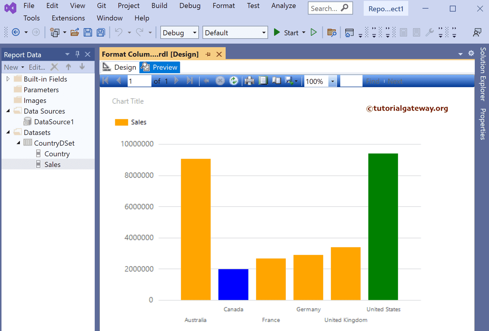
Now, all the countries are filled with orange, and the United States is filled with Sea Green.

We used the Nested IIF condition this time to check whether the Sales value equals the maximum or minimum dataset value. If Maximum, assign Green, Blue for Minuend Orange for the remaining columns. To do so, click the Color expression as shown in the second image and replace the code with the below Expression to change the Column Chart Min, Max, and Average Bar Colors.
=IIf(Fields!Sales.Value = Max(Fields!Sales.Value, "CountryDSet"), "Green",
IIf(Fields!Sales.Value = Min(Fields!Sales.Value, "CountryDSet"),
"Blue", "Orange"))
Preview the report.