The Stacked Bar Chart is very useful in comparing the data visually. Let us see how to Create a Stacked Barplot, Format its color, add legends, add names, creating clustered Barplot in R Programming language with an example.
Before we get into the Stacked Barplot example, let us see the data we will use for this bar plot example. First, the employee is the date set we used in our previous articles.
Create Stacked Barplot in R Programming
This example shows how to create a stacked barplot using external data. We import data from the CSV file using the read.csv function for this example.
I suggest you refer to R Read the CSV article to understand the steps involved in importing a CSV file. And also, refer to the Barplot in R Programming article.
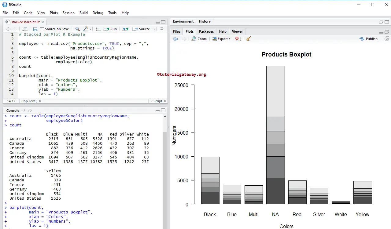
# Read Data from CSV File
employee <- read.csv("Products.csv", TRUE, sep = ",", na.strings = TRUE)

count <- table(employee$EnglishCountryRegionName, employee$Color)
count

barplot(count)
The following R Programming statement creates a table with records of Countries and colors. Here, column values are unique colors, and row values are unique country names.
count <- table(employee$EnglishCountryRegionName, employee$Color)
Next, we create a bar chart using the above-specified table.
barplot(count)
Assigning names to Stacked Barplot in R Programming
In this example, we give names to stacked barplot, X-Axis, and Y-Axis using main, xlab, and ylab.
- main: You can change or provide the Title for your stacked Barplot.
- xlab: Please specify the label for the X-Axis
- ylab: Please select the label for the Y-Axis
- las: Used to change the Y-axis values direction
employee <- read.csv("Products.csv", TRUE, sep = ",",
                     na.strings = TRUE)

count <- table(employee$EnglishCountryRegionName,
               employee$Color)
count

barplot(count,
        main = "Products Boxplot",
        xlab = "Colors",
        ylab = "Numbers",
        las = 1)
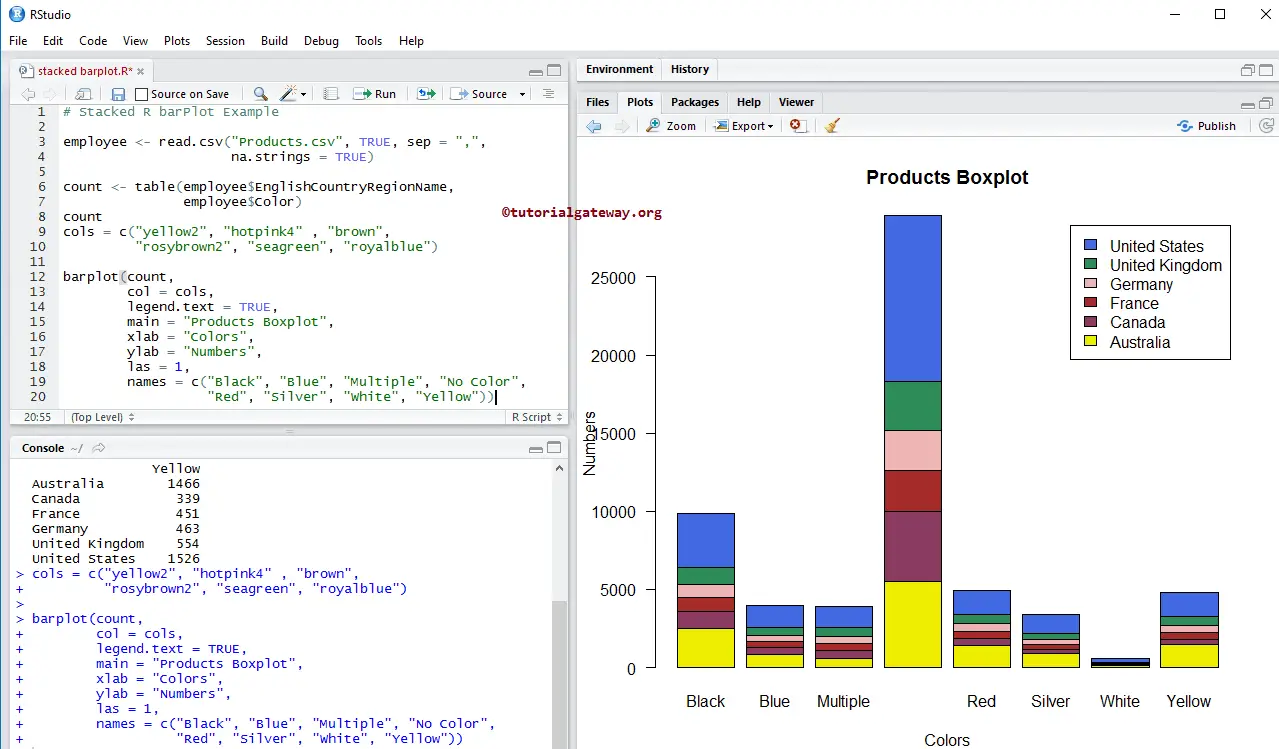
In this example, we change the stacked Barplot colors using col argument
- col: Please specify the color you want to use for your barplot. Here, colors are differentiated by country names. Type colors() in your console to get the list of colors available in R programming.
- names: Please specify the names for the stacked. Here, we are changing the names.
employee <- read.csv("Products.csv", TRUE, sep = ",",
                     na.strings = TRUE)

count <- table(employee$EnglishCountryRegionName, employee$Color)
count
cols = c("yellow2", "hotpink4" , "brown",
         "rosybrown2", "seagreen", "royalblue")

barplot(count,
        col = cols,
        main = "Products Boxplot",
        xlab = "Colors",
        ylab = "Numbers",
        las = 1,
        names = c("Black", "Blue", "Multiple", "No Color",
                  "Red", "Silver", "White", "Yellow"))
Add Legend to Stacked Barplot in R
In this example, we add the legend to the stacked barplot using legend.text argument.
- If you specify legend.text = TRUE, legend values will automatically assign, or
- You can use vectors of characters as legend values. For example, legend.text = c(“black”, “blue”, “green”, ..)
employee <- read.csv("Products.csv", TRUE, sep = ",",
                     na.strings = TRUE)

count <- table(employee$EnglishCountryRegionName, employee$Color)
count
cols = c("yellow2", "hotpink4" , "brown",
         "rosybrown2", "seagreen", "royalblue"

barplot(count,
        col = cols,
        legend.text = TRUE,
        main = "Products Boxplot",
        xlab = "Colors",
        ylab = "Numbers",
        las = 1,
        names = c("Black", "Blue", "Multiple", "No Color",
                  "Red", "Silver", "White", "Yellow"))
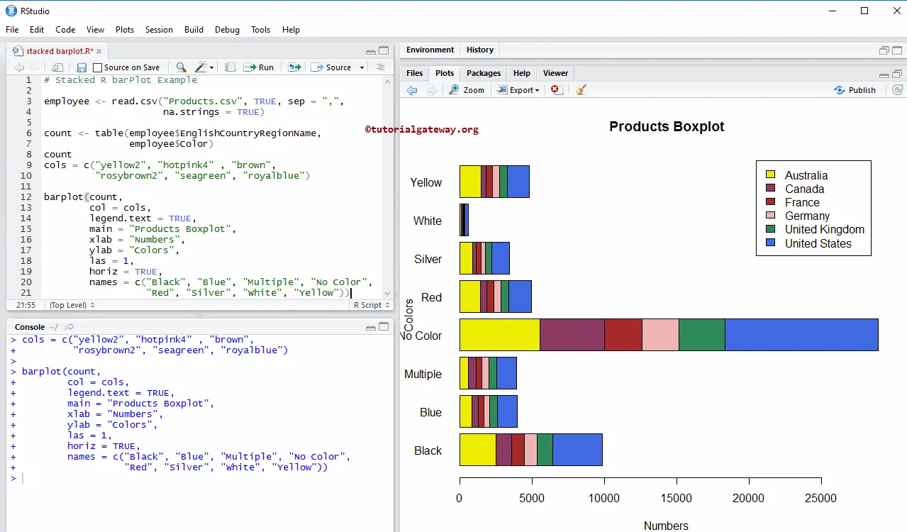
Horizontal Stacked Bar Chart
In this example, we convert the default vertical Stacked Barplot into a horizontal bar chart using the horiz argument.
employee <- read.csv("Products.csv", TRUE, sep = ",",
                     na.strings = TRUE)

count <- table(employee$EnglishCountryRegionName,
               employee$Color)
count
cols = c("yellow2", "hotpink4" , "brown",
         "rosybrown2", "seagreen", "royalblue")

barplot(count,
        col = cols,
        legend.text = TRUE,
        main = "Products Boxplot",
        xlab = "Numbers",
        ylab = "Colors",
        las = 1,
        horiz = TRUE,
        names = c("Black", "Blue", "Multiple", "No Color",
                  "Red", "Silver", "White", "Yellow"))
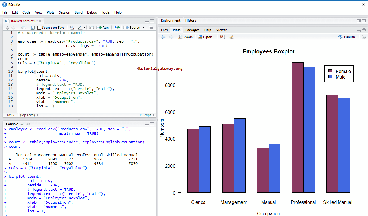
Create Clustered Barplot in R Programming
In this example, we create a clustered barplot using the beside argument.
employee <- read.csv("Products.csv", TRUE, sep = ",",
                     na.strings = TRUE)

count <- table(employee$Gender, employee$EnglishOccupation)
count
cols = c("hotpink4" , "royalblue")

barplot(count,
        col = cols,
        beside = TRUE,
        # legend.text = TRUE,
        legend.text = c("Female", "Male"),
        main = "Employees Boxplot",
        xlab = "Occupation",
        ylab = "Numbers",
        las = 1)