This SSRS article shows how to create a Tree Map, Show Data Labels, and format fonts and colors with an example. To demonstrate this Treemap example, right-click on the Datasets folder to create a new DataSet.
Writing the below code inside the SSMS shows the data set that we use for this SSRS Tree Map example.
The Sql query that we used in this SSRS example is:
SELECT Geo.[EnglishCountryRegionName] AS [Country]
,Geo.[StateProvinceName] AS [State],Cust.Gender
,SUM(Fact.OrderQuantity) AS Orders,  SUM(Fact.SalesAmount) AS Sales
FROM  DimCustomer AS Cust
INNER JOIN FactInternetSales AS Fact ON Cust.CustomerKey = Fact.CustomerKey
INNER JOIN [DimGeography] AS Geo ON Cust.GeographyKey = Geo.GeographyKey
GROUP BY Geo.[EnglishCountryRegionName],Geo.[StateProvinceName],Cust.Gender
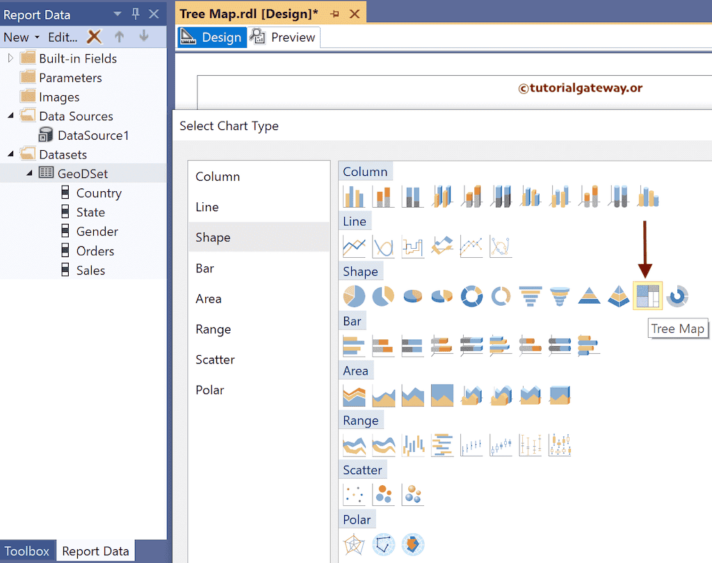
Create the SSRS Tree Map Example
To add a Tree Map, right-click the report area, choose Insert, and then the chart option from the context menu. Otherwise, drag and drop the chart from the toolbox to the report area.

Select the Tree Map from the window and click OK to add to the report area.
Use the Plus button or drag the fields to the Values, Category Groups, and Series Groups sections. Here, we added the Sales column to Values and the State column to Category Groups.
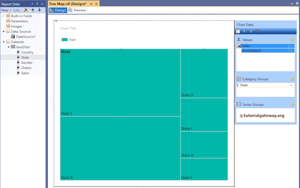
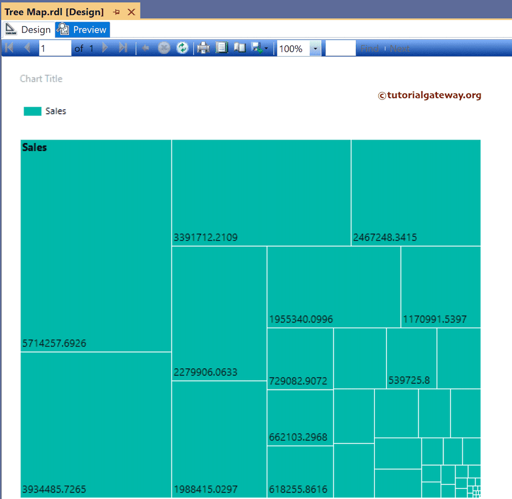
Click the preview tab to see the Tree Map report. As you can see, it displays a group of rectangular boxes; each box belongs to a state, and its size depends on the sales value.
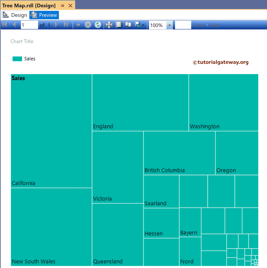
By default, Show data Labels display the State Names, and to change them to sales values, right-click on the Tree Map and uncheck the Show Data Labels option once. If you do it twice, you lose the data labels entirely.

Now, you can see the SSRS Tree Map with Sales values.
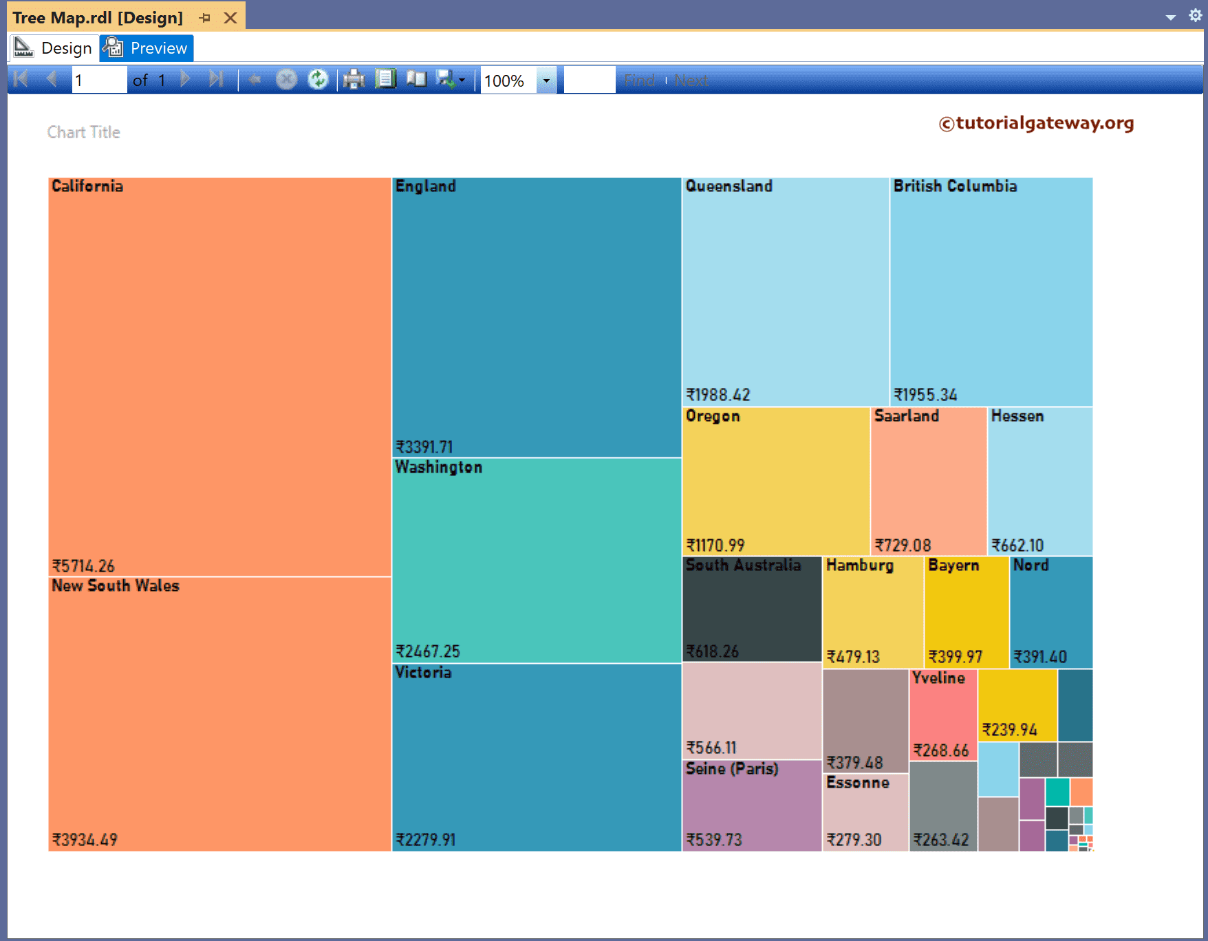
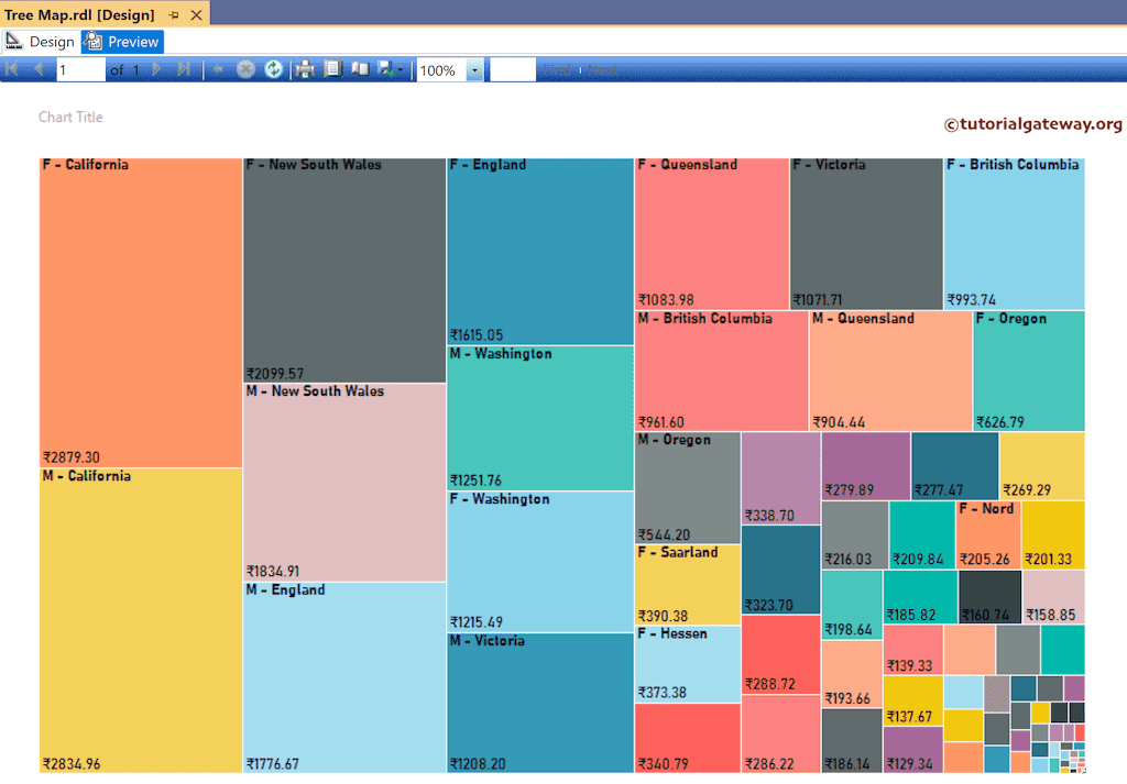
Let me add the States Column to the Series groups section to provide different colors for each state. Next, delete the legend because we don’t want to see all the state names.

In the SSRS Tree Map report review, each state has a different color and sales values as data labels.
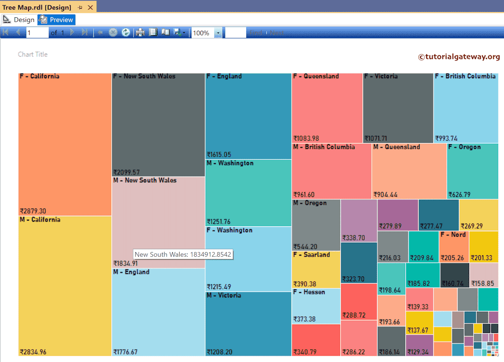
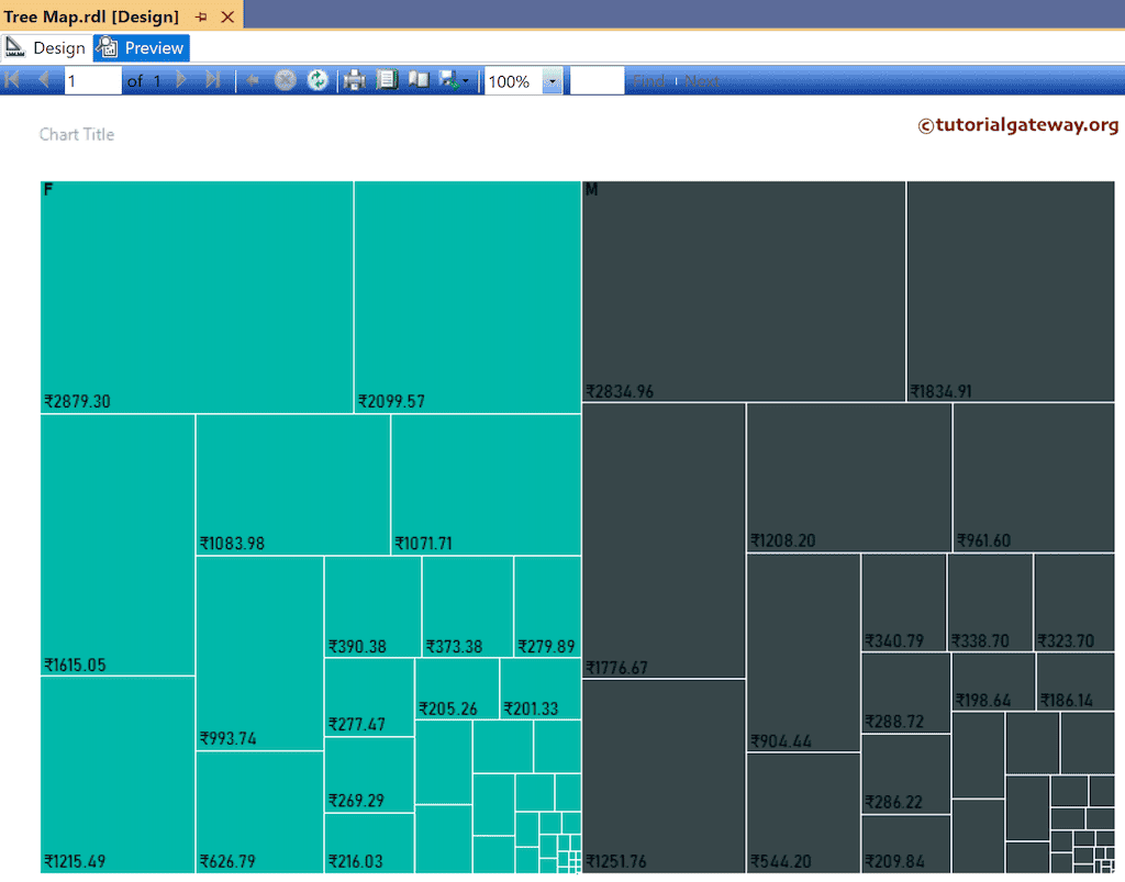
Suppose you change the Series Groups column from State to Gender. It divides the sales by Gender and displays the sales for both males and females. Preview the report with the Gender Series Group.
Let me add the State column and Gender to the Series groups to see the Colors. Next, use the toolbar or the properties window to format the X and Y-axis fonts and colors.
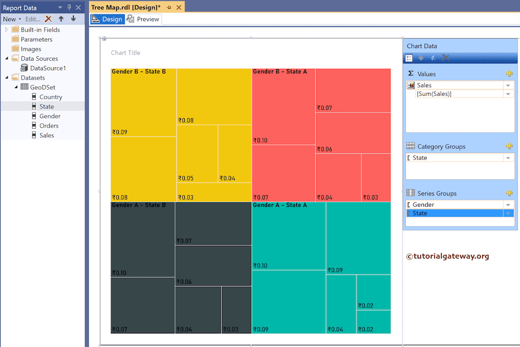
Preview the SSRS Tree Map that represents sales by state and each state is further divided by Gender.
Edit the tooltip to display more information. Here, we concat State and Sales values.
=Fields!State.Value &": " & Fields!Sales.Value
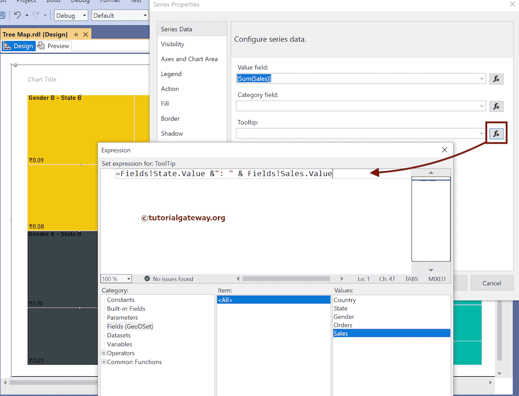
Check the tooltip when you preview the report.