This SSRS article shows how to create a Sunburst Chart, Show data Labels, and format fonts and colors with an example. To demonstrate this Sunburst example, right-click on the Datasets folder to create a new DataSet.
Writing the below code inside the SSMS shows the data set that we use for this Sunburst Chart example.
The Sql query that we used in this SSRS example is:
SELECT Terry.SalesTerritoryGroup AS TerGroup, Terry.SalesTerritoryCountry AS Country,
       Cust.Gender, SUM(Fact.SalesAmount) AS Sales
FROM FactInternetSales AS Fact INNER JOIN DimSalesTerritory AS Terry
      ON Terry.[SalesTerritoryKey] = Fact.[SalesTerritoryKey]
INNER JOIN DimCustomer AS Cust ON Cust.CustomerKey = Fact.CustomerKey
GROUP BY Terry.SalesTerritoryGroup, Terry.SalesTerritoryCountry, Cust.Gender
SSRS Sunburst Chart
To add a Sunburst Chart, right-click the report area, choose Insert, and choose the chart option from the context menu. Otherwise, drag and drop the chart from the toolbox to the report area.

Select the Sunburst Chart from the window and click OK to add to the report area.

Use the Plus button or drag the fields to the Values, Category Groups, and Series Groups (optional) sections.
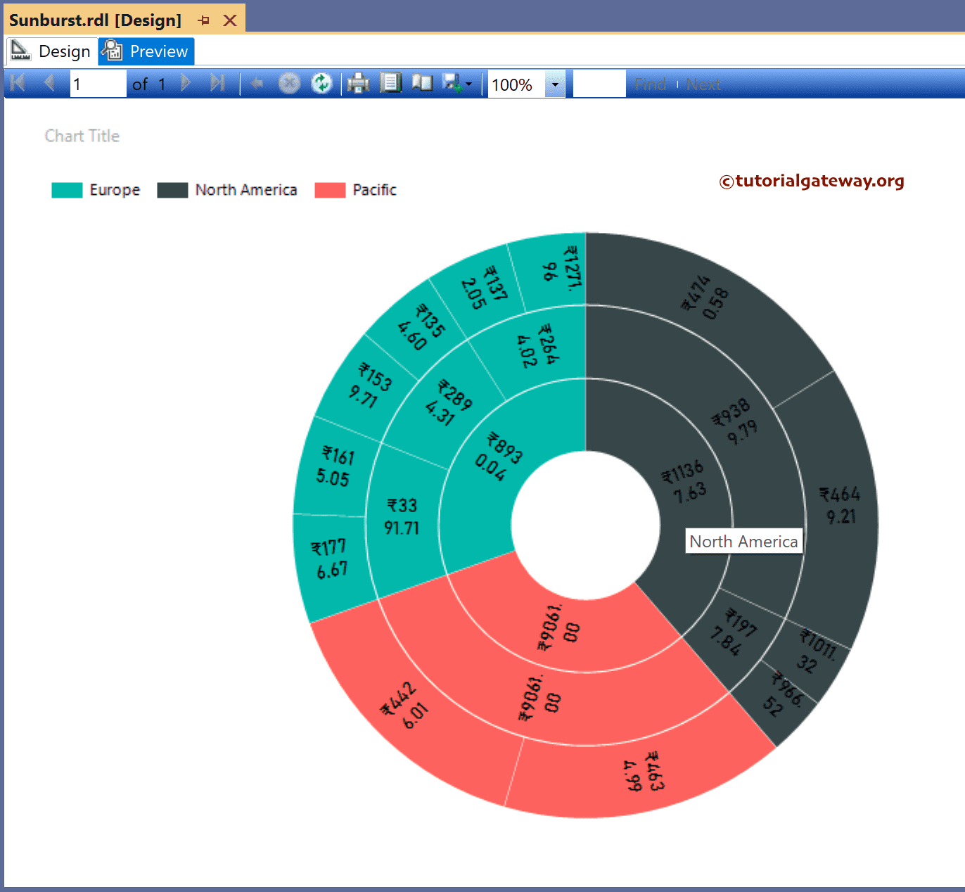
Here, we added the Sales column to Values, the TerritoryGroup column to Category Groups, and TerritoryGroup to the Series Groups section to add colors. Next, right-click on the Sunburst Chart and select the Show Data Labels option to add labels.

Right-click the Data Labels and select the Series Label Properties option to format Sunburst Numbers to show values in Thousands with a currency symbol. The preview up to this step will show the Donut Chart, but we need the SSRS Sunburst Chart Report.

The above chart looks like a doughnut chart, and to convert or change it to Sunburst, we have to add multiple layers. So, add Country to the Category Groups section. Then add the Gender column to category groups.

Now, preview the actual Sunburst chart.
Change the palette to Chocolate.

Preview the Sunburst chart report with a custom color palette(Chocolate).
