The R ggplot2 line Plot or chart connects the dots in order of the variable present on the x-axis. Let us see how to Create a ggplot2 ggplot line plot in this programming, Format its colors, and add points to it with an example. For this line chart, we use the economics data set provided by RStudio.
The syntax to draw a ggplot2 ggplot line plot in this Programming is shown below.
geom_line(mapping = NULL, data = NULL, stat = "identity",
  position = "identity", inherit.aes = TRUE, na.rm = FALSE, show.legend = NA,...)
Create a basic R ggplot2 Line Plot
In this example, we create a basic line plot using the ggplot2 package. For this, we are going to use the economics data set provided by RStudio.
TIP: ggplot2 package is not installed by default. Please refer Install Packages article to install the required package.
library(ggplot2)

ggplot(economics, aes(date, pop)) +
  geom_line()
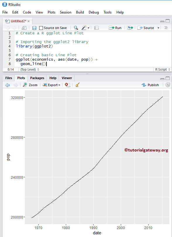
NOTE: If you require is to import data from external files, then please refer Read CSV article in R Programming to import the CSV file.
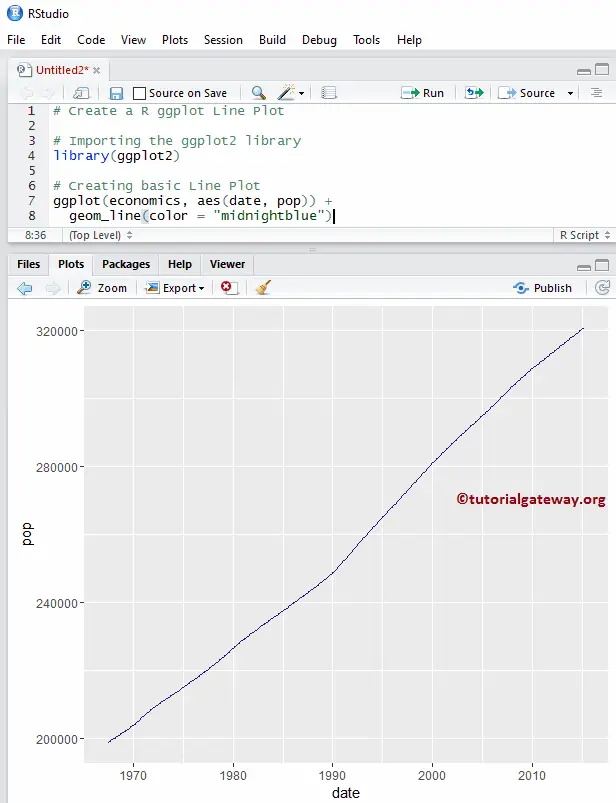
Change Colors of a Line Plot in R
In this example, we show how to change the color using the color argument
library(ggplot2)

ggplot(economics, aes(date, pop)) +
  geom_line(color = "midnightblue")
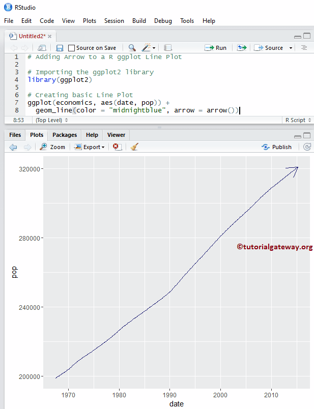
R ggplot2 Line Plot arrow argument
Use the arrow function to add the arrow at the end of it.
library(ggplot2)

ggplot(economics, aes(date, pop)) +
  geom_line(color = "midnightblue", arrow = arrow())
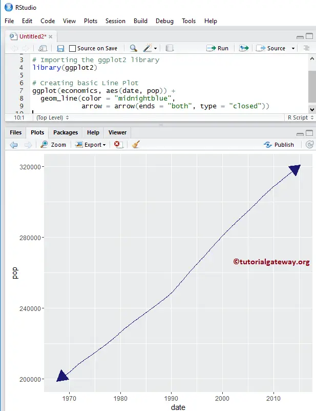
In this example, we show how to change the array type to both sides using the ends, and type argument
library(ggplot2)

ggplot(economics, aes(date, pop)) +
  geom_line(color = "midnightblue",
            arrow = arrow(ends = "both", type = "closed"))
Change Type of an ggplot2 Line plot
In this example, we show you how to change the type of it.
library(ggplot2)

ggplot(economics, aes(date, pop)) +
  geom_line(color = "midnightblue",
            linetype = 5,
            arrow = arrow(ends = "both", type = "closed"))
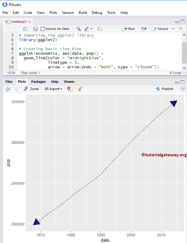
TIP: In R programming, 0 = blank, 1 = solid, 2 = dashed, 3 = dotted, 4 = dotdash, 5 = longdash, 6 = twodash. So, you can use numbers or strings as the linetype value
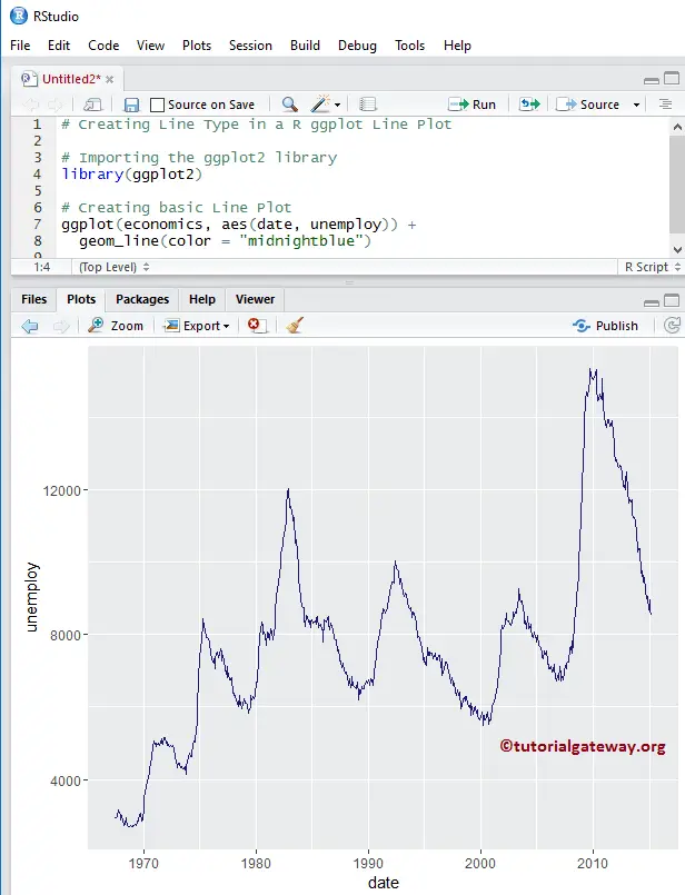
Creating R ggplot2 Line plot
In this example, we are using different data to create this, so that we can explore more arguments present in the geom_line() function
library(ggplot2)

ggplot(economics, aes(date, unemploy)) +
  geom_line(color = "midnightblue")
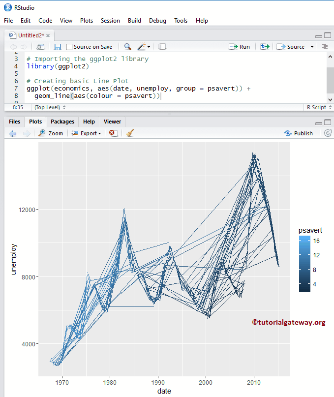
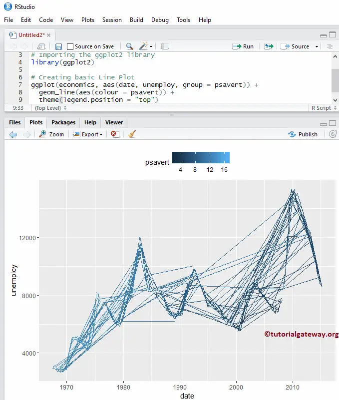
Change Line Plot Color using Column Data
In this example. we show you how to add groups and change the colors using column data
library(ggplot2)

ggplot(economics, aes(date, unemploy, group = psavert)) +
  geom_line(aes(colour = psavert))
Alter Legend position of an R ggplot2 Line plot
By default, ggplot positions the legend on the right side of it. In this example, we change the legend position from right to top. Remember, You can use a legend.position = “none” to altogether remove the legend.
library(ggplot2)

ggplot(economics, aes(date, unemploy, group = psavert)) +
  geom_line(aes(colour = psavert)) +
  theme(legend.position = "top")
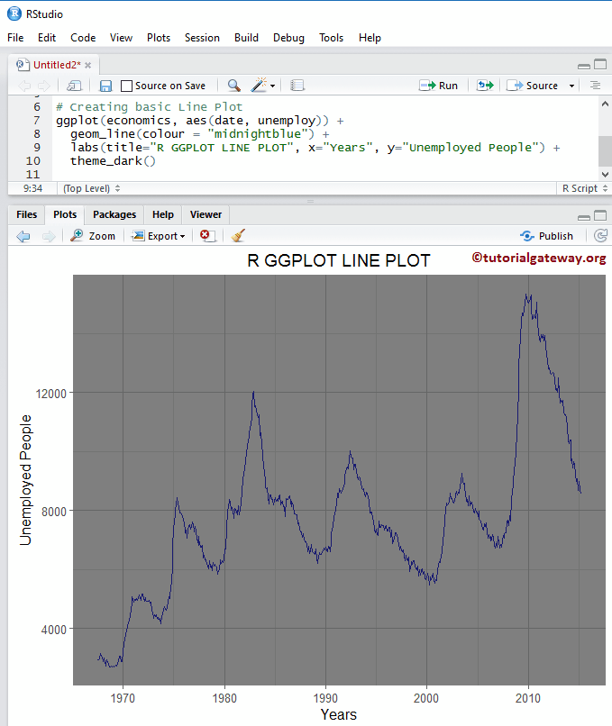
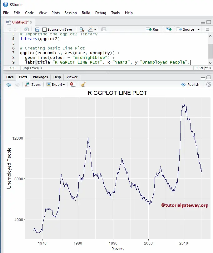
Assigning names
We assign names to the chart, X-Axis, and Y-Axis using the labs function.
library(ggplot2)

ggplot(economics, aes(date, unemploy)) +
  geom_line(colour = "midnightblue") +
  labs(title="R GGPLOT LINE PLOT", x="Years", y="Unemployed People")
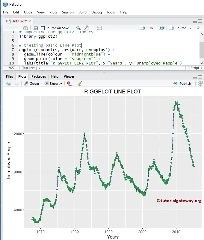
Add points to the Line plot
In this R ggplot line chart, we add the data points using the geom_point() function.
library(ggplot2)

ggplot(economics, aes(date, unemploy)) +
  geom_line(colour = "midnightblue") +
  geom_point(color = "seagreen") +
  labs(title="R GGPLOT LINE PLOT", x="Years", y="Unemployed People")
Change Theme
How to change the default theme of a ggplot2 line plot?
- theme_dark(): We use this function to change the default theme to dark. If you type theme_, then R Studio intelligence shows the list of available options. For example, theme_grey()
# Importing the ggplot2 library
library(ggplot2)

# Creating basic
ggplot(economics, aes(date, unemploy)) +
  geom_line(colour = "midnightblue") +
  labs(title="R GGPLOT LINE PLOT", x="Years", y="Unemployed People") +
  theme_dark()