A Python Bar chart, Plot, or Graph in the matplotlib library is a chart that represents the categorical data in a rectangular format. By seeing those bars, one can understand which product is performing well or badly. This means that the longer the bar is, the better the product will perform. You can create horizontal and vertical bar charts in this programming language using this library and pyplot.
The Python matplotlib pyplot has a bar function, which helps us to create this chart or plot from the given X values, height, and width. The basic syntax of the bar chart is shown below.
bar(x, height, width=0.8, bottom=None, *, align='center', data=None, **kwargs)
Apart from these, there are a few other optional arguments to define color, titles, line widths, etc. Here, we cover most of these bar chart arguments with an example of each. Before we go into the Python pyplot matplotlib Bar Chart example, let us see the Excel file data that we use for this.
import pandas as pd
from matplotlib import pyplot as plt

df = pd.read_excel('/Users/suresh/Downloads/Global_Superstore.xls')
print(df)

sales_groupedby_region = df.groupby('Region')[['Sales']].sum()

print(sales_groupedby_region.sort_values(by = ['Sales']))

Create a Basic matplotlib bar chart in Python
In this example, we create a basic bar chart using the pyplot from the library. First, we declared two lists of width and height. Next, we used the bar function available in pyplot to draw this.
import matplotlib.pyplot as plt

x = ['A', 'B', 'C', 'D', 'E']
y = [22, 9, 40, 27, 55]

plt.bar(x, y)

plt.show()

Python pyplot matplotlib Bar Chart names
The bar plot has xlabel, ylabel, and title functions, which are useful to provide names to the X-axis, Y-axis, and chart name.
- xlabel: Assign your own name to the X-axis. This function accepts a string, which is assigned to the X-axis name.
- ylabel: Use this function to assign a name to Y-axis
- title: Please specify the chart name
import matplotlib.pyplot as plt

x = ['A', 'B', 'C', 'D', 'E']
y = [22, 9, 40, 27, 55]

plt.bar(x, y)

plt.title('Simple Example')
plt.xlabel('Width Names')
plt.ylabel('Height Values')

plt.show()
NOTE: Use this import matplotlib.pyplot as plt as the first line for all the below examples.
bar chart grid lines
If you want to display grid lines in your bar chart, use the grid() function that is available.
x = ['A', 'B', 'C', 'D', 'E']
y = [22, 9, 40, 27, 55]

plt.bar(x, y)

plt.title('Simple Example')
plt.xlabel('Width Names')
plt.ylabel('Height Values')

plt.grid(color = 'red', alpha = 0.3, linestyle = '--', linewidth = 2)
plt.show()

Python matplotlib Bar chart from CSV file
In this example, we use the CSV file’s data in our local directory. As you can see from the below Python code, first, we are using the panda’s Dataframe groupby function to group Region items. Next, we find the Sum of the Sales Amount.
Next, we plot the Region name against the Sales sum value. It means the below bar chart will display the Sales of all regions.
df = pd.read_excel('/Users/suresh/Downloads/Global_Superstore.xls')
print(df)

sales_groupedby_region = df.groupby('Region')[['Sales']].sum()
print(sales_groupedby_region.sort_values(by = ['Sales']))

fig, ax = plt.subplots()

ax.bar(sales_groupedby_region.index, sales_groupedby_region['Sales'])

plt.title('Sales by Region')
plt.xlabel('Region Names')
plt.ylabel('Sales Amount')

plt.show()
The above bar chart will show the x-axis values merged, so we cannot identify them. Let me rotate them to 45 degrees.
df = pd.read_excel('/Users/suresh/Downloads/Global_Superstore.xls')

sales_groupedby_region = df.groupby('Region')[['Sales']].sum()

fig, ax = plt.subplots()

ax.bar(sales_groupedby_region.index, sales_groupedby_region['Sales'])

labels = ax.get_xticklabels()
plt.setp(labels, rotation = 45, horizontalalignment = 'right')

plt.title('Sales by Region')
plt.xlabel('Region Names')
plt.ylabel('Sales Amount')

plt.show()

Limit Y-axis values of bar plot
There is a ylim method in the Python matplotlib pyplot bar function that will limit or change the chart y-axis values. Here, we changed the starting value from 0 to 50000 and the end value from 2500000 to 3000000.
df = pd.read_excel('/Users/suresh/Downloads/Global_Superstore.xls')

sales_data = df.groupby('Region')[['Sales']].sum()

fig, ax = plt.subplots()

ax.bar(sales_data.index, sales_data['Sales'])

labels = ax.get_xticklabels()
plt.setp(labels, rotation = 45, horizontalalignment = 'right')

plt.title('Sales by Region')
plt.xlabel('Region Names')
plt.ylabel('Sales Amount')
plt.ylim(50000, 3000000)
plt.show()

Similarly, you can limit the axis values of the X-axis using the xlim method. To use the same, try plt.xlim(0, 10) or something like that.
Python pyplot matplotlib Horizontal Bar Chart
This library provides a barh function to draw or plot a horizontal bar chart. In this example, we replaced the actual function with the barh function to draw a horizontal bar chart. Next, we changed the xlabel and ylabel to change the axis names.
df = pd.read_excel('/Users/suresh/Downloads/Global_Superstore.xls')

sales_data = df.groupby('Region')[['Sales']].sum()

fig, ax = plt.subplots()

ax.barh(sales_data.index, sales_data['Sales'])

plt.title('Horizontal Sales')
plt.xlabel('Sales Amount')
plt.ylabel('Region Names')

plt.show()

Change the Bar Chart Colors
Use color argument to change the colors of the rectangles and edgecolor argument to change the color of the edges. Here, we used a list of 6 colors. It means that if there are 6, the default color will replace these colors. If there are more than 6, then these colors will repeat for the other ones. Next, we used an edgecolor argument to change the bar chart border color to green.
df = pd.read_excel('/Users/suresh/Downloads/Global_Superstore.xls')

sales_data = df.groupby('Region')[['Sales']].sum()

colors = ['red', 'green', 'blue', 'yellow', 'black', 'cyan']

fig, ax = plt.subplots()

ax.bar(sales_data.index, sales_data['Sales'],
    color = colors, edgecolor = 'green')

labels = ax.get_xticklabels()
plt.setp(labels, rotation = 45, horizontalalignment = 'right')

plt.show()

Here, we used the colors names as the list items. However, you can use the hex color code. For example,
ax.bar(sales_data.index, sales_data['Sales'],
    color = '#FFFF00', edgecolor = 'green')

# Or use the first letter of a color in the list items
colors = ['r', 'g', 'b', 'y', 'b', 'c']

# Or simply use the following method
plt.bar(sales_data.index, sales_data['Sales'],
    color = 'rgbycm', edgecolor = 'green')
Format Axis Labels of a bar chart
In this example, we are changing the color of y-axis tables to blue color, and x-axis tables to orange color rotating them to 45 degrees. Next, we added the axis labels and formatted their font color, font size, and font weight to bold.
df = pd.read_excel('/Users/suresh/Downloads/Global_Superstore.xls')

sales_data = df.groupby('Region')[['Sales']].sum()

colors = ['red', 'green', 'blue', 'yellow', 'black', 'cyan']

plt.bar(sales_data.index, sales_data['Sales'],
    color = colors, edgecolor = 'green')

plt.xticks(color = 'orange',rotation = 45, horizontalalignment = 'right')
plt.yticks(color = 'blue')
plt.xlabel('Region', color = 'green', fontweight = 'bold', fontsize = '20')
plt.ylabel('Sales', color = 'red', fontweight = 'bold', fontsize = '20')

plt.show()

If you cannot see the X-axis and Y-axis labels, then you can adjust the position of the top, left, right, and bottom of the subplots. For this Python matplotlib pyplot bar chart example, you have to use the subplots_adjust function.
df = pd.read_excel('/Users/suresh/Downloads/Global_Superstore.xls')

sales_data = df.groupby('Region')[['Sales']].sum()

plt.bar(sales_data.index, sales_data['Sales'],
    color = ['r','g','b','y','c','m'], edgecolor = 'green')

plt.xticks(color = 'orange',rotation = 45, horizontalalignment = 'right')
plt.yticks(color = 'blue')
plt.xlabel('Region', color = 'green', fontweight = 'bold', fontsize = '20')
plt.ylabel('Sales', color = 'red', fontweight = 'bold', fontsize = '20')

plt.subplots_adjust(bottom = 0.2, left = 0.2)
plt.show()
Control Width and position of a Hist
Use y_pos argument to control the position of each rectangle in a chart. And the pyplot width argument helps you to control the width of them.
df = pd.read_excel('/Users/suresh/Downloads/Global_Superstore.xls')

sales_data = df.groupby('Region')[['Sales']].sum()

plt.bar(sales_data.index, sales_data['Sales'],
   color = ['r','g','b','y','m','c','k'], width = 0.50)

plt.xticks(color = 'green',rotation = 45, horizontalalignment = 'right')

plt.show()

Or you can use a list of values to define each rectangle width, and use y_pos to change the axis ticks positions. If you forgot to use the y_pos, then the rectangles will overlap.
Styling Python matplotlib Bar chart
Use the below code to find out the list of available styles in pyplot.
from matplotlib import pyplot as plt
plt.style.available

Here, we are using the tableau-colorblind10.
import pandas as pd
from matplotlib import pyplot as plt

df = pd.read_excel('/Users/suresh/Downloads/Global_Superstore.xls')

sales_data = df.groupby('Region')[['Sales']].sum()

plt.bar(sales_data.index, sales_data['Sales'])

plt.xticks(color = 'green',rotation = 45, horizontalalignment = 'right')

plt.style.use('tableau-colorblind10')
plt.show()
These days, seaborn module visuals have become very popular in the Data Science world. So, we use the same in this example.
import pandas as pd
from matplotlib import pyplot as plt
import seaborn as sns
sns.set()

df = pd.read_excel('/Users/suresh/Downloads/Global_Superstore.xls')

sales_data = df.groupby('Region')[['Sales', 'Profit']].sum()

plt.bar(sales_data.index, sales_data['Sales'], color = ['r','g','b','y','m','c','k'])

plt.xticks(color = 'green',rotation = 45, horizontalalignment = 'right')

plt.show()

Change the Bar chart texture
The bar chart has an argument called hatch to change the texture. Instead of filling the empty space, you can fill them with different patterns or shapes. For example, we will fill all the cylinders with the * symbol.
import pandas as pd
import numpy as np
from matplotlib import pyplot as plt
import seaborn as sns
sns.set()

df = pd.read_excel('/Users/suresh/Downloads/Global_Superstore.xls')

sales_data = df.groupby('Region')[['Sales']].sum()

plt.bar(sales_data.index, sales_data['Sales'],
    color = ['r','g','b', 'y','m','c','k'], hatch = ("*"))

plt.xticks(color = 'green',
      rotation = 45, horizontalalignment = 'right')

plt.show()

This time, we are using a different pattern for each rectangle in a bar chart.
df = pd.read_excel('/Users/suresh/Downloads/Global_Superstore.xls')

sales_data = df.groupby('Region')[['Sales']].sum()

patterns = ("*", "\\", "+", "*", "|", "o", "/", "x", "O", "+", "o", "*", "-")

bars = plt.bar(sales_data.index, sales_data['Sales'], color = ['r','g','b','m','c','k'])

for i, x in zip(bars,patterns):
  i.set_hatch(x)

plt.xticks(color = 'c', rotation = 45, horizontalalignment = 'right')

plt.show()

Plot two matplotlib Bar Charts in Python
It allows you to plot two bar charts side by side to compare sales of this year vs. last year or any other statistical comparisons. Here, we are comparing the Region wise Sales vs. profit. It may not be a good comparison, but you get the idea of how we can achieve the same.
import numpy as np
import pandas as pd
from matplotlib import pyplot as plt
import seaborn as sns
sns.set()

df = pd.read_excel('/Users/suresh/Downloads/Global_Superstore.xls')

sales_data = df.groupby('Region')[['Sales', 'Profit']].sum()

index = np.arange(13)
bar_width = 0.45

r1 = plt.bar(index, sales_data['Sales'],
       bar_width, color = 'green', label = 'Sales')

r2 = plt.bar(index + bar_width, sales_data['Profit'],
       bar_width, color = 'blue', label = 'Profit')

plt.xticks(index + bar_width, sales_data.index,
      color = 'green',rotation = 45, horizontalalignment = 'right')

plt.legend()
plt.tight_layout()

plt.show()

Similarly, you can draw one more chart to compare the three bar charts.
Use Python pyplot legend function to display a legend of a Bar chart. There are multiple ways to assign legend values. In the above example, we have already shown one way of displaying legend items. And the alternate way is to replace plt.legend() with plt.legend([r1, r2], [‘Sales’, ‘Profit’]) and remove label arguments from r1 and r2.
Python pyplot matplotlib Stacked Bar Chart
You can also stack a column of data on top of another column of data, and this called a stacked bar chart. In this example, we are stacking Sales on top of the profit.
import pandas as pd
from matplotlib import pyplot as plt
import seaborn as sns
sns.set()

df = pd.read_excel('/Users/suresh/Downloads/Global_Superstore.xls')

sales_data = df.groupby('Region')[['Sales', 'Profit']].sum()

plt.bar(sales_data.index, sales_data['Sales'], color = 'c', label = 'Sales')

plt.bar(sales_data.index, sales_data['Profit'], color = 'r', label = 'Profit')

plt.xticks(color = 'green',rotation = 45, horizontalalignment = 'right')

plt.legend()
plt.show()

You can alter the position of the stacked columns using the bottom argument. For instance, you can put the sales at the bottom and profit at the top by replacing the second plot with the below code.
plt.bar(sales_data.index, sales_data['Profit'], color = 'r', label = 'Profit', bottom = sales_data['Sales'] )
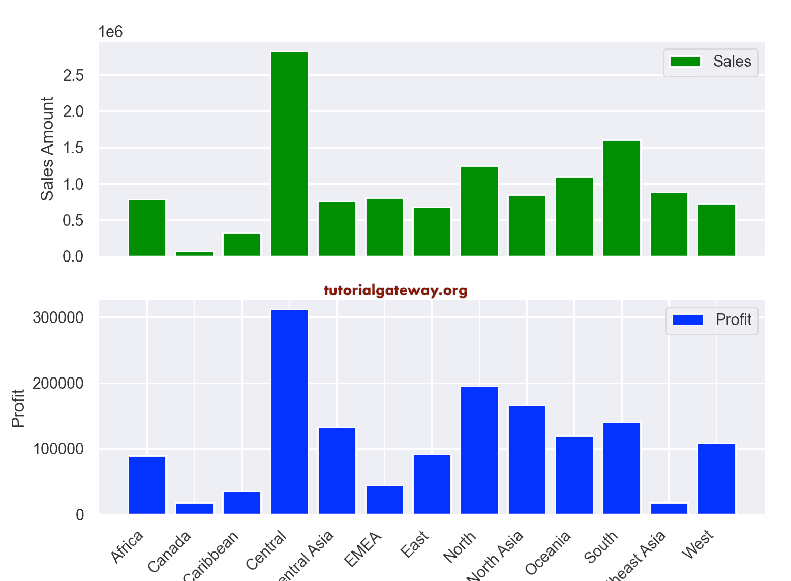
Bar Chart subplots
In this module, you can also create subplots of bar charts. In this example, we are creating two separate graphs for Sales and Profit for all the regions in our dataset.
import numpy as np
import pandas as pd
from matplotlib import pyplot as plt
import seaborn as sns
sns.set()

df = pd.read_excel('/Users/suresh/Downloads/Global_Superstore.xls')

sales_data = df.groupby('Region')[['Sales', 'Profit']].sum()

plt.subplot(2, 1, 1)
plt.bar(sales_data.index, sales_data['Sales'], color = 'green', label = 'Sales')
plt.xticks([],[])
plt.ylabel('Sales Amount')
plt.legend()

plt.subplot(2, 1, 2)
plt.bar(sales_data.index, sales_data['Profit'],color = 'blue', label = 'Profit')

plt.xticks(rotation = 45, horizontalalignment = 'right')
plt.ylabel('Profit')
plt.legend()

plt.show()
Add Data labels to Python pyplot matplotlib Bar Chart
In this example, we will show you how to add data labels on top of each rectangle. For this, use the text function in the pyplot.
import numpy as np
import pandas as pd
from matplotlib import pyplot as plt
import seaborn as sns
sns.set()

df = pd.read_excel('/Users/suresh/Downloads/Global_Superstore.xls')

sales_data = df.groupby('Region')[['Sales']].sum()

index = np.arange(13)

plt.bar( sales_data.index, sales_data['Sales'], color = ['r','g','b','y','m','c','k'])

plt.xticks(color = 'green',rotation = 45, horizontalalignment = 'right')

label = sales_data['Sales'].round(2)

for i in range(13):
  plt.text(x = i, y = label[i], s = label[i],
       size = 9, rotation = 90, color = 'red')

plt.show()

As you can see, the data labels rotated to 90 degrees, and the color is red. It is because we defined the rotation = 90, color = ‘red’, and you can change them as per your requirement.
Bar Chart Error Lines
By using the bar functions yerr argument, you can draw the error lines or the confidence lines on top of the chart.
import matplotlib.pyplot as plt

x = ['A', 'B', 'C', 'D', 'E']
y = [22, 9, 40, 27, 55]
err_values = [3, 1, 5, 2, 4]

plt.bar(x, y, yerr = err_values, capsize = 5)

plt.title('Simple Bar Chart')
plt.xlabel('Width Names')
plt.ylabel('Height Values')

plt.show()

Let me perform the same for the Dataframe that we retrieved from the CSV file.
import pandas as pd
from matplotlib import pyplot as plt
import seaborn as sns
sns.set()

df = pd.read_excel('/Users/suresh/Downloads/Global_Superstore.xls')

sales_data = df.groupby('Region')[['Sales']].sum()

data = df.groupby('Region')[['Profit']].sum()

plt.bar(sales_data.index, sales_data['Sales'],
    color = ['r','g','b','y','m','c','k'], yerr = data['Profit'], capsize = 5)

plt.xticks(color = 'green',rotation = 45, horizontalalignment = 'right')

plt.show()
