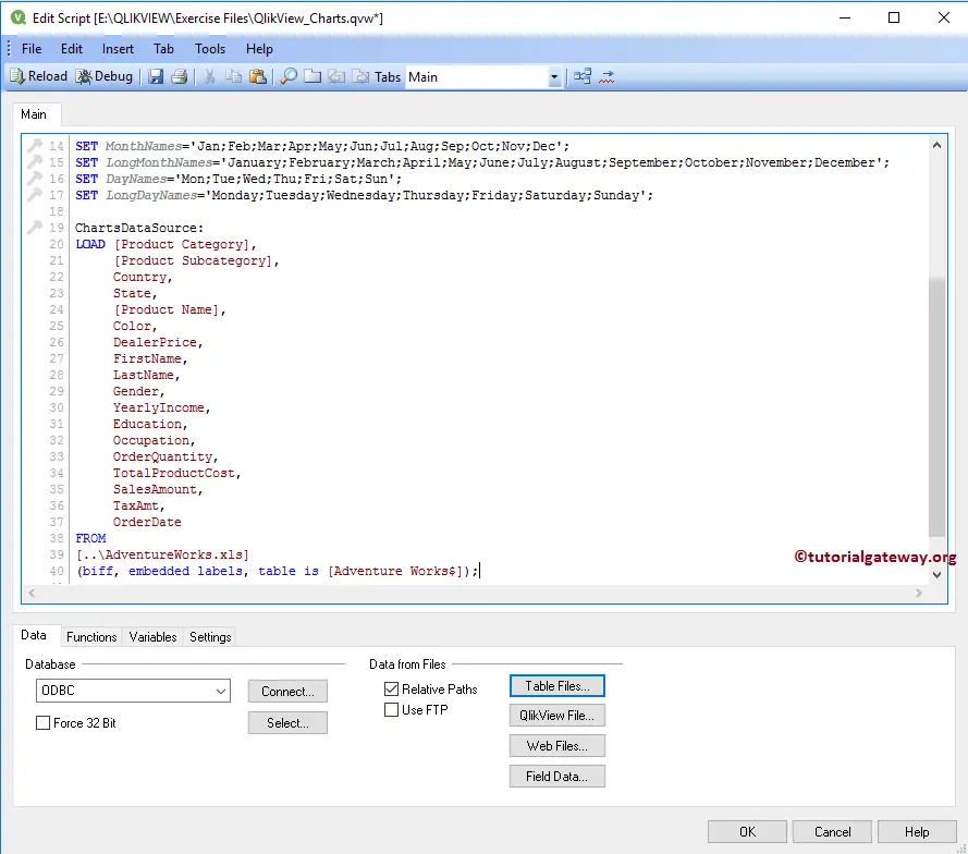
A Bar Chart in QlikView is very useful in comparing the data visually. Let us see the steps involved in creating the Bar Chart with an example. For this Bar Chart demo, we will use the Tableau Sample Super Store data in the Excel table.
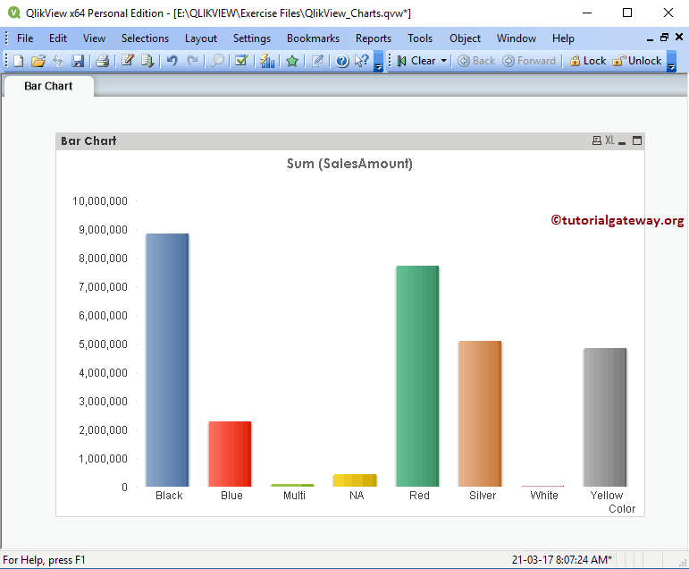
For example, If we want to check the Sales by Country, Region, or Continent, we can use this QlikView bar chart. By seeing this bar chart, One can understand which country or region is performing better than others.
From the screenshot below, see that we are loading the above-specified Excel sheet into QlikView.
Create a Bar Chart in QlikView
In this QlikView Bar Chart example, we find out which color product is performing better than the other. We use the Color Column on the X-axis and the Sales Amount expression on the Y-axis for this.
We can create a bar chart in multiple ways: Please navigate to the Layout Menu, select the New Sheet Object, and then select the Charts.. option.
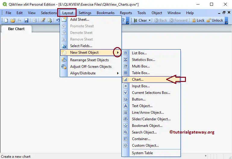
The second approach is to right-click on the Report area to open the Context menu. Please select the New Sheet Object and then select the Charts.. option. Either way opens a new window to create a Bar Chart in QlikView.
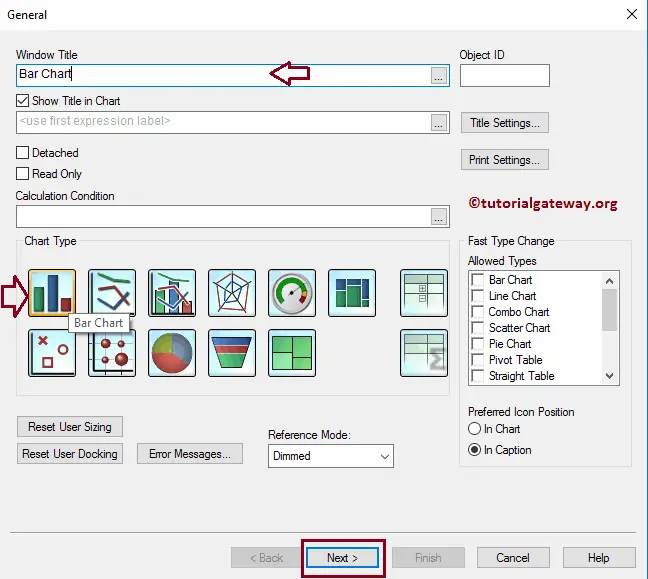
Step 1 – General: From the below screenshot, see we assigned a new name to it and then selected the Bar Chart as the type
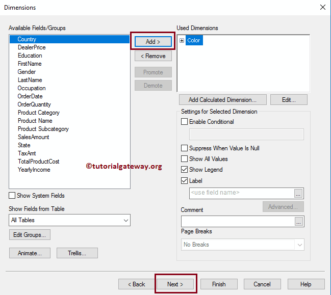
Step 2 – Dimensions: Please select the Dimension column to use in the QlikView Bar chart X-Axis.
- Available Filed/Groups: List all the available columns or groups displayed under this section.
- Used Dimensions: All the columns in this section are useful in the Bar Chart.
- Add: This button adds the Available columns to the used columns section.
- Remove: This button removes the columns from the used columns section.
- Add Calculated Dimension: It opens the Edit Expression window to write a custom expression.
We are now adding the Color dimension to the used dimension section. Refer to the Import data from Excel article in QlikView to import the Excel tables.
Step 3 – Expression: Clicking the Next button on the Dimension page opens the Expression page, and on top of that, a pop-up window opens. Use this bar Chart window to write the custom expression for the Y-Axis data or select the Columns.
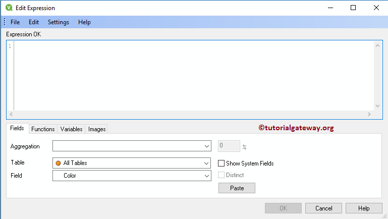
Here, we select the Filed as Sales Amount and Aggregation as Sum. Remember, if you know how to write an expression, write it in the empty space under the Expression OK section.
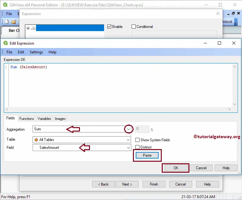
Clicking the OK button, the edit expression window is closed.
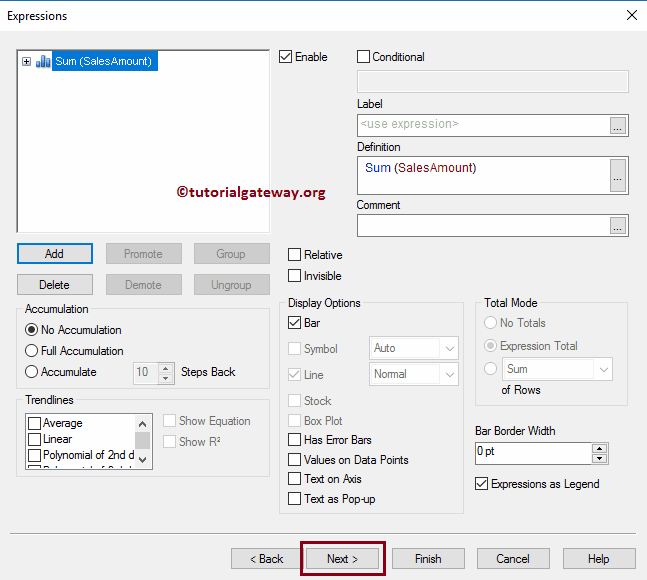
- Label: By default, the text under the Definition section is displayed as the Y-Axis label. It means Sum(SalesAmount). To change that default text, place the custom text under this section.
- Values on Data Points: It shows the Data Points or Data labels for each bar. It means the Sales Amount is displayed on top of each colored bar.
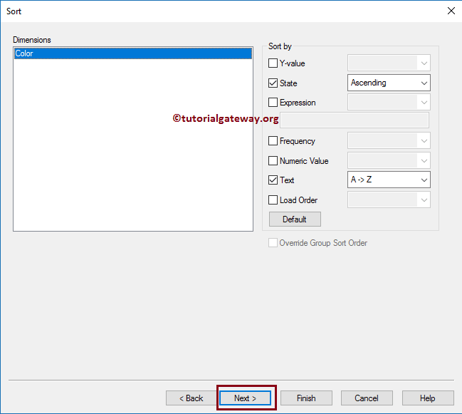
Step 4 – Sort: Under this section, we can specify the sorting order for the dimensions on the x-axis.
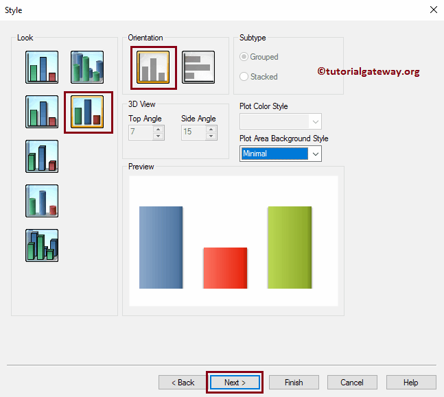
Step 5 – Style: This QlikView Bar Chart page is to change the style or look. Here we can select the 3D, Horizontal, Vertical, or 2D bar chart. From the below screenshot, see that we selected the standard bar chart
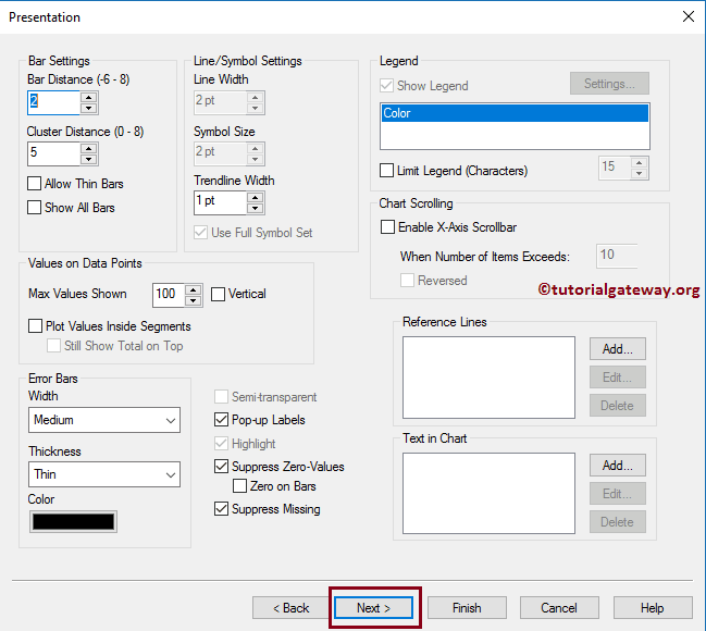
Step 6 – Presentation: We can change the Bar Chart Bar settings here.
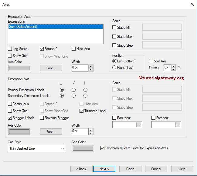
Axes: Use this Axes page to change the Axes setting.
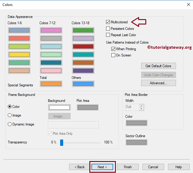
Step 8 – Colors: This page is very helpful for changing the Color pattern of the bar chart. Here, we are selecting the Multicolored option. By this, it displays different colors for the different colored products.
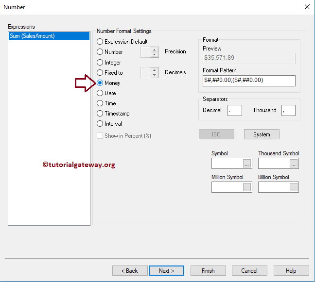
Step 9 – Number: Use this Bar Chart page to format the Expression value. It only reflects when we display the data labels or data points. For example, here, we display the Sum of the Sales Amount on the y-axis. As we all know, it is money so we can select it.
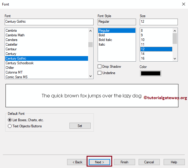
Step 10 – Font: Please change the font’s font family, style, and size per the requirements. All these changes are reflected in the Chart report.
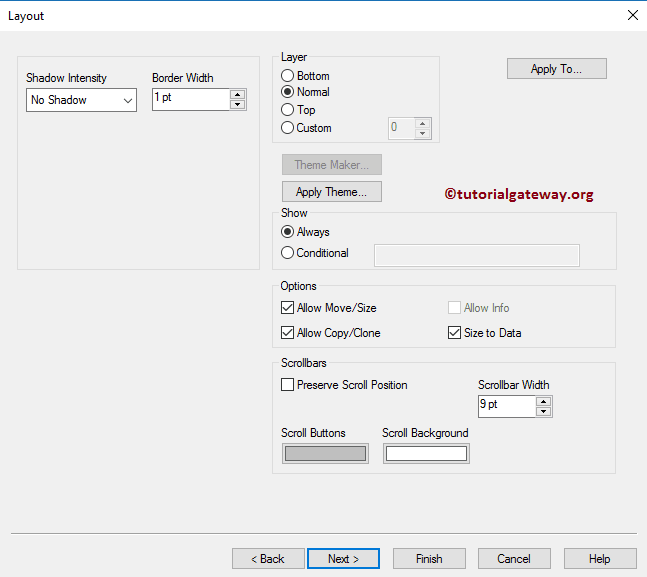
Step 11 – Layout: As we selected the Shadow bar chart, QlikView shows the setting to alter the shadow intensity, etc. Use this page to alter it.
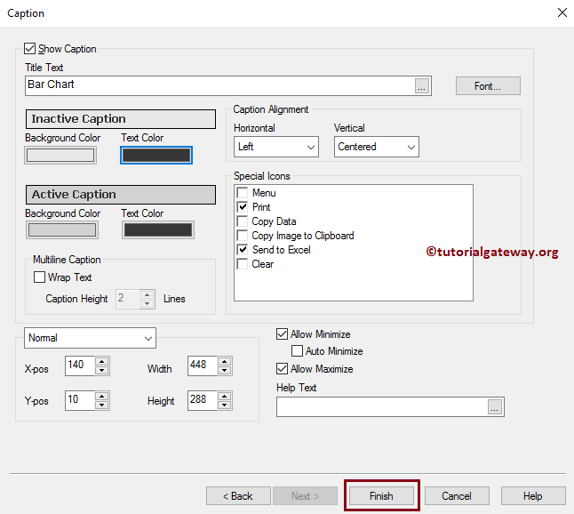
Step 12 – Caption: This page is used to stylize the bar Chart Caption. For example, its color, background, position, etc. Once complete, click the Finish button.
Now, see our newly created Bar Chart.