The Scatter Plot in SSRS is useful to visualize the relationship between any two sets of data. In this article, we will show you how to create a Scatter Plot in SSRS and how to change the Chart Title, Legend Position, Legend Title, and Font style of a Scatter Plot in SQL Reporting Services with an example.
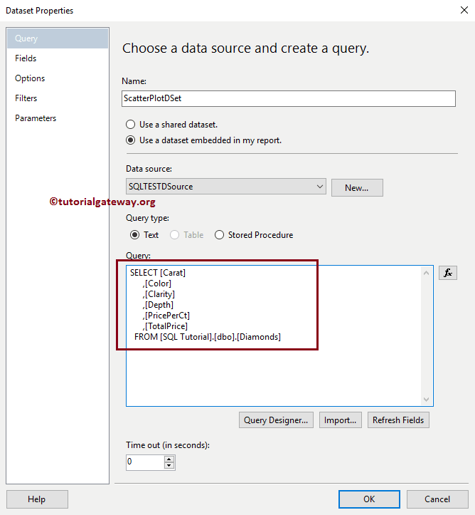
For this scatter plot example, we used the Custom SQL query:
-- Query that we use in Scatter Plot
SELECT [Carat]
      ,[Color]
      ,[Clarity]
      ,[Depth]
      ,[PricePerCt]
      ,[TotalPrice]
  FROM [Diamonds]
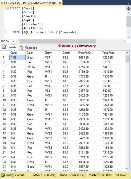
and the Data that it’s going to return is:
Create a Scatter Plot in SSRS
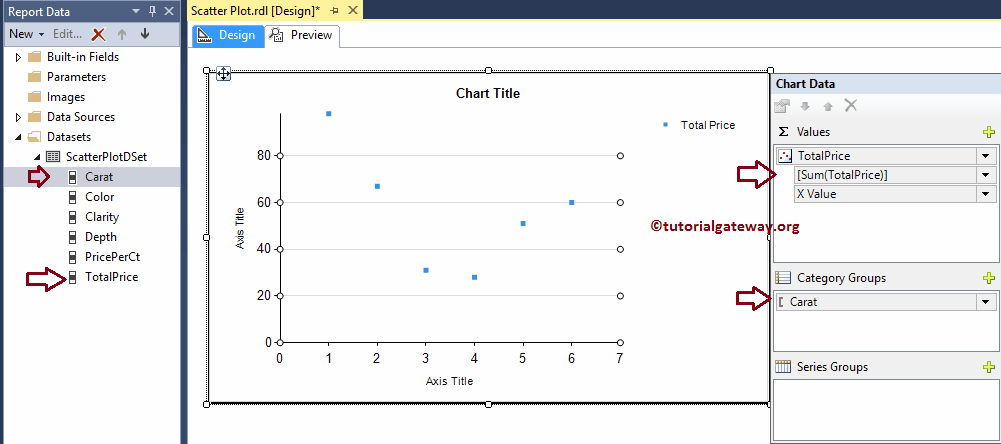
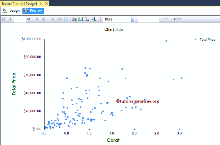
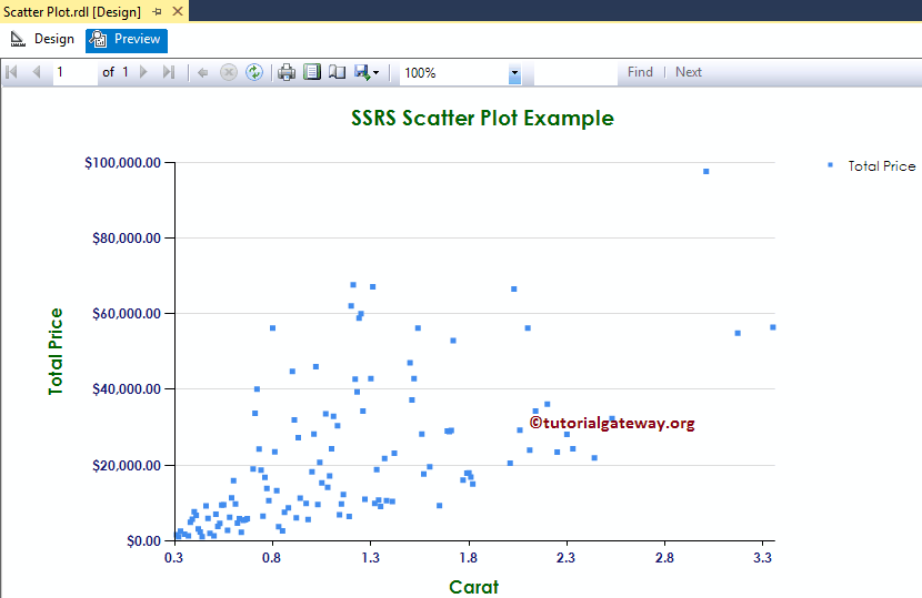
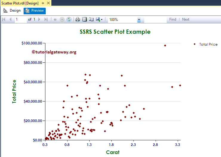
In this example, we are going to create a Scatter Plot to display the Total Price against the Diamond caret. The below screenshot will show you the Data Source, and Dataset that we used for this Scatter Plot Report.
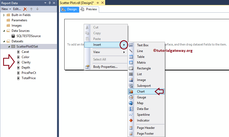
In the SSRS report design, we can add a Scatter Plot by dragging the Chart property from the Toolbox to Design space, or right-click on the report designer and select the Insert -> Chart option.
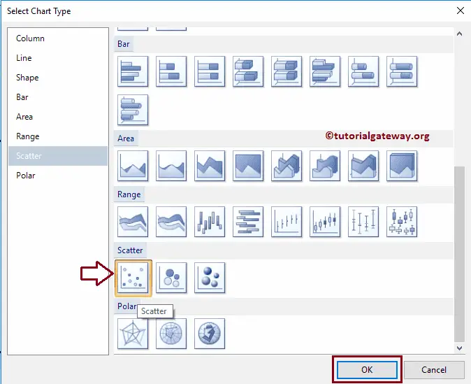
Once you select the Chart option, a new window called Select Chart Type will be opened to select the required chart from the available once. For this SSRS example, we are selecting a Scatter Plot.
Once you click on the OK button, the Scatter Plot will display in the design region with dummy data.
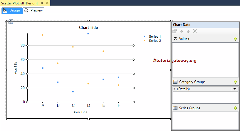
Click on the empty space around the SSRS Scatter Chart will open the Chart Data window
- Values: Any Numeric (Metric) value such as Total Sales, Sale Amount, Number of Customers, Tax etc. All these values will be aggregated using an aggregate function (Sum, Avg, Count etc). It is because we are grouping them with the category group items.
- Category Group: Please specify a Column name on which you want to partition you the Scatter Plot.
- Series Group: Please specify the Dimension here. It further groups the individual category
Drag and drop the Total Price Metric column from dataset to chart data values, and Carat Dimension to category group.
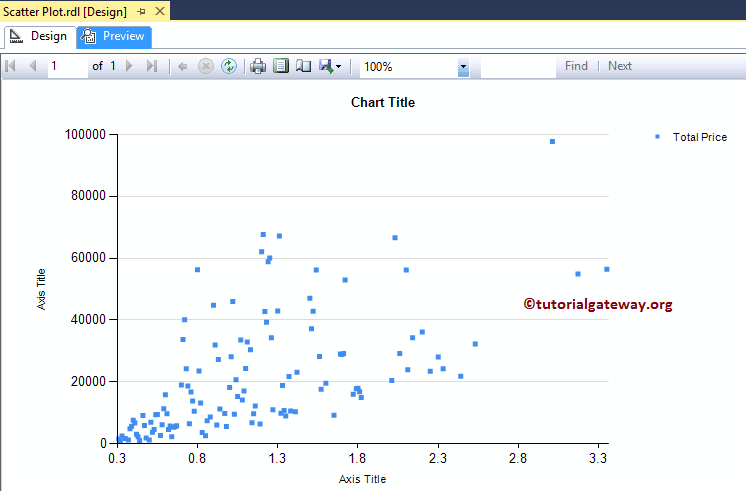
Click on the Scatter Plot Preview tab to see the report preview.
Format Scatter Plot in SSRS
The following list of examples will show you the steps involved in formatting the Scatter Plot.
Change Axis properties of a Scatter Plot in SSRS
Right-click on the Axis of a Scatter Plot, and select the Horizontal Axis Properties.. option from the context menu to format the Axis values.
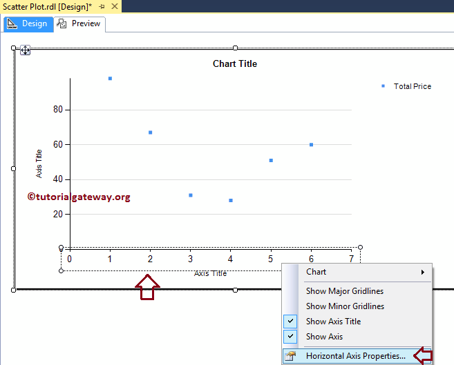
Here we changed the font style and font size of the Horizontal Axis.
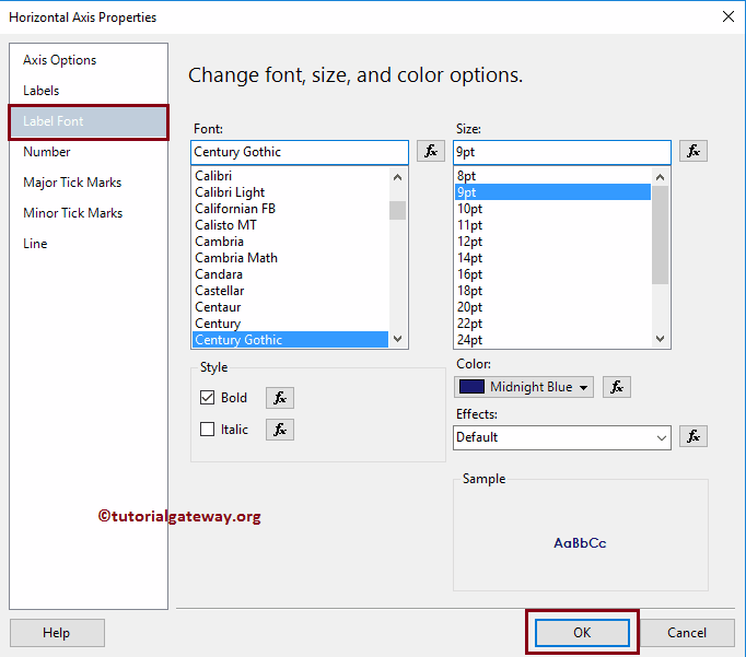
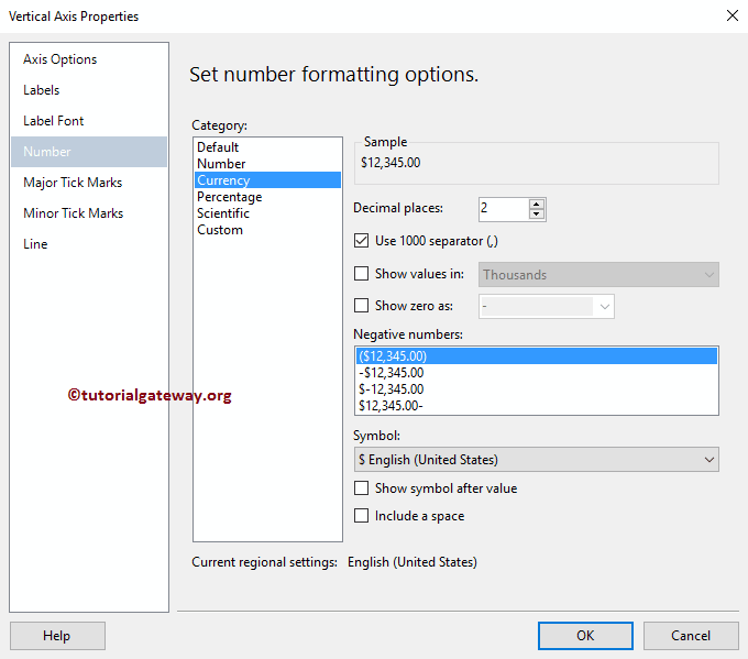
Next, Right-click on the Vertical Axis of a Scatter Plot, and select the Vertical Axis Properties.. option from the context menu to format the Axis values. Please use the above-specified technique to change the font of the vertical Axis. Next, format the Numbers in the vertical axis by selecting the Number tab.
Change Axis Titles of a Scatter Plot in SSRS
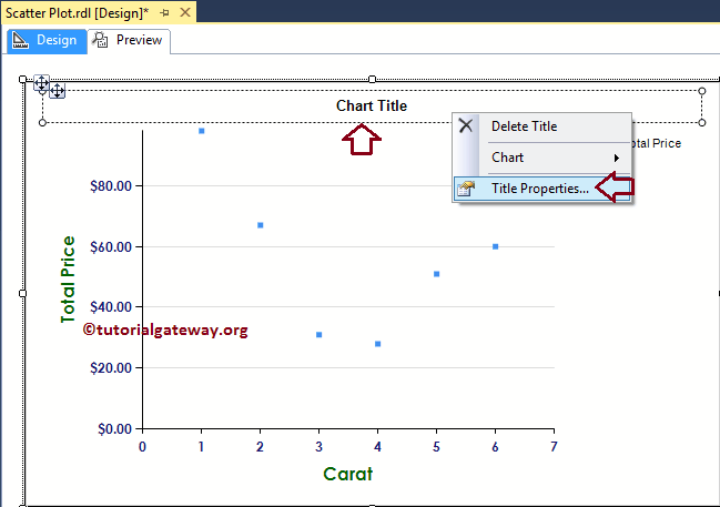
To change an Axis title of a scatter plot, Please select the Axis title region, and change the title as per your requirement. OR, right-click on it will open the context menu. Please select the Axis Title properties.. option from it.
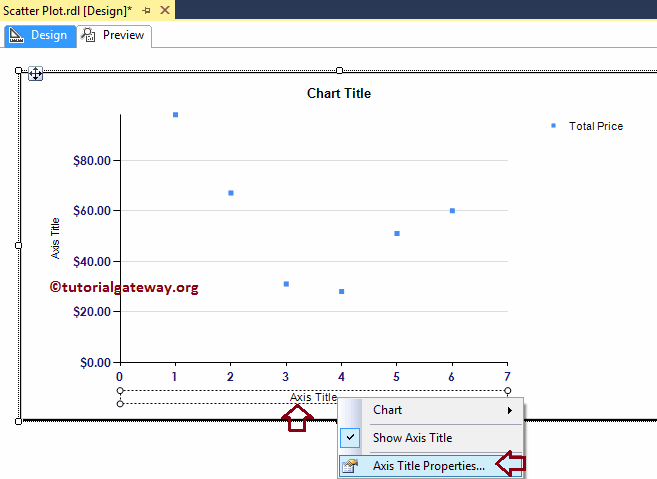
It will open a new window called the Axis Title Properties window. Under the General section, we can change the Title text as per our requirements. For now, we are changing it to Carat
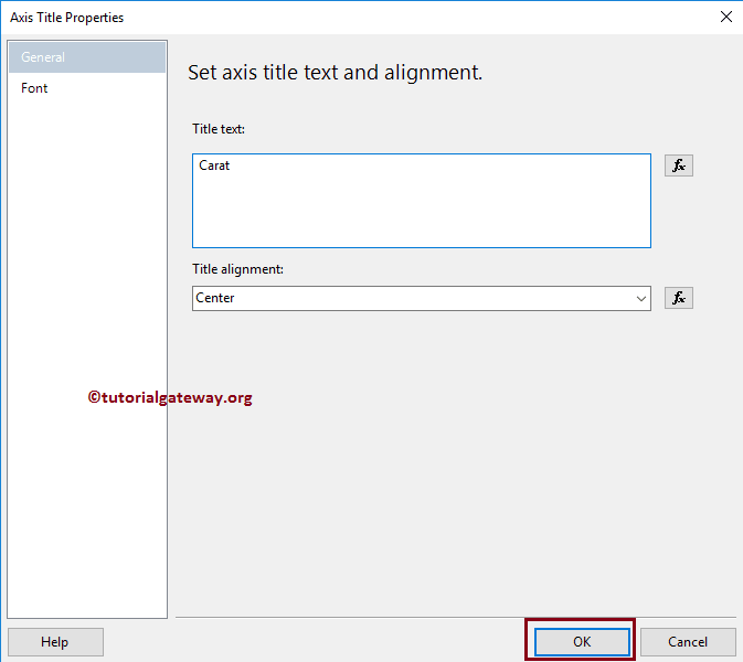
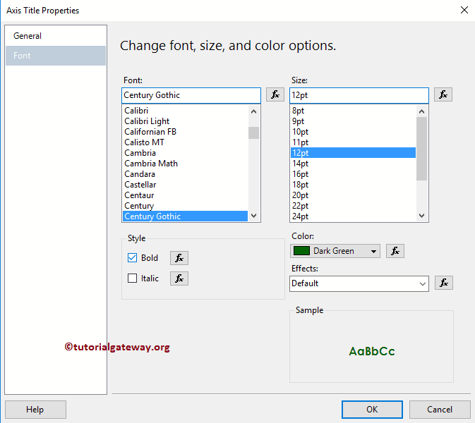
Under the Font tab, we can change the Font style, size, and color of an Axis title. For now, we are changing the Color to Dark Green, Font to Century Gothic, Size to 12pt, and style to Bold
Please apply the same properties to Y-Axis, as well. Once complete, click on the Preview to see the SSRS Scatter Plot preview.
Change SSRS Scatter Plot Title
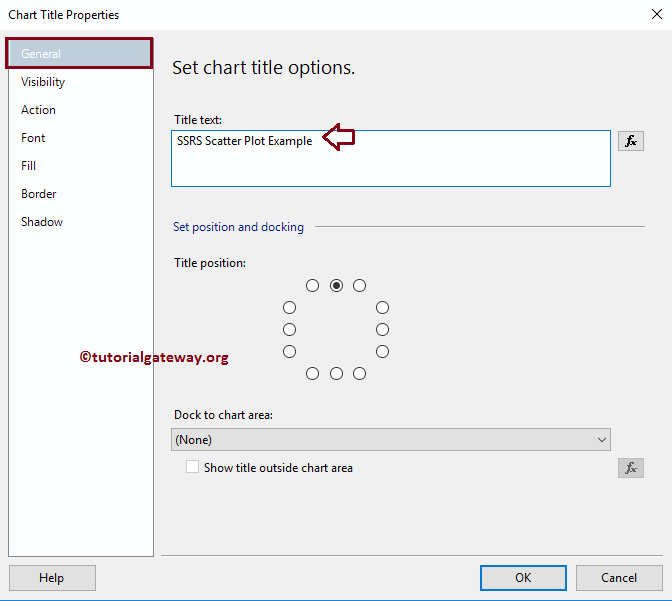
To change the title of a Scatter Plot, Please select the Chart title region, and change the title as per your requirement. OR, right-click on it will open the context menu. Please select the Title Properties.. option from it.
Here we are changing the title as Scatter Plot Example because the report is displaying the same
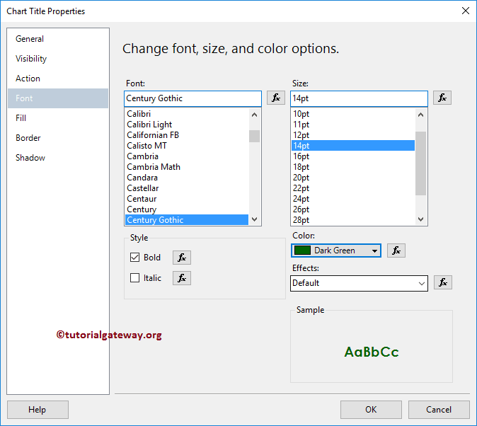
Format SSRS Scatter Plot Title Font
Within the Font tab, we can change the Font Size, Font Family, Font Style, and Color of a Scatter Plot Title. Here we are changing the Font to Century Gothic, the Font size to 14pt, and the colour to Dark Green
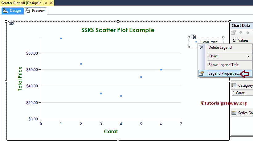
Format Legend of a Scatter Plot in SSRS
To format the Scatter Plot Legend region, please Select the Legend region and right-click on it will open the context menu. From the menu, please select the Legend Properties option.
It will open a new window called the Legend Properties Window. Within the General Tab, we have an option called Legend Position to change the Legend Position by changing the dot positions. For now, we are leaving its position as it is.
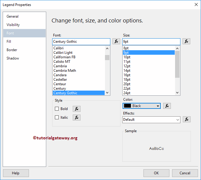
Next, Under the Font tab, we can change the Font style, size, and color of a Legend. For now, we are changing the Font to Century Gothic, and the Size to 9pt
Click the OK button to close the Properties window, and hit the preview tab to see the report preview
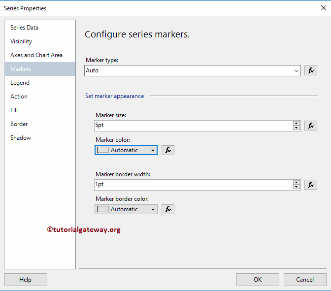
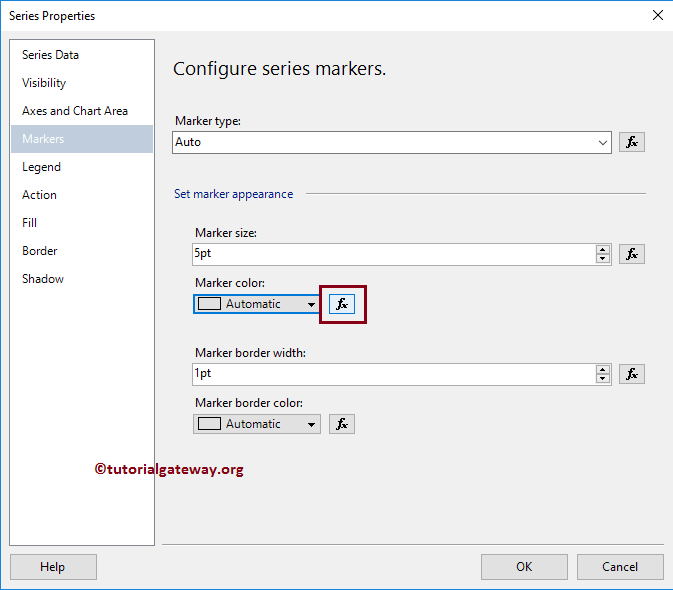
Right-click on the Marker will open the context menu. Please select the Series Properties from it.
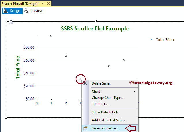
Once you click on the Series Properties option, a new window called Series Properties will open.
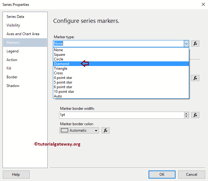
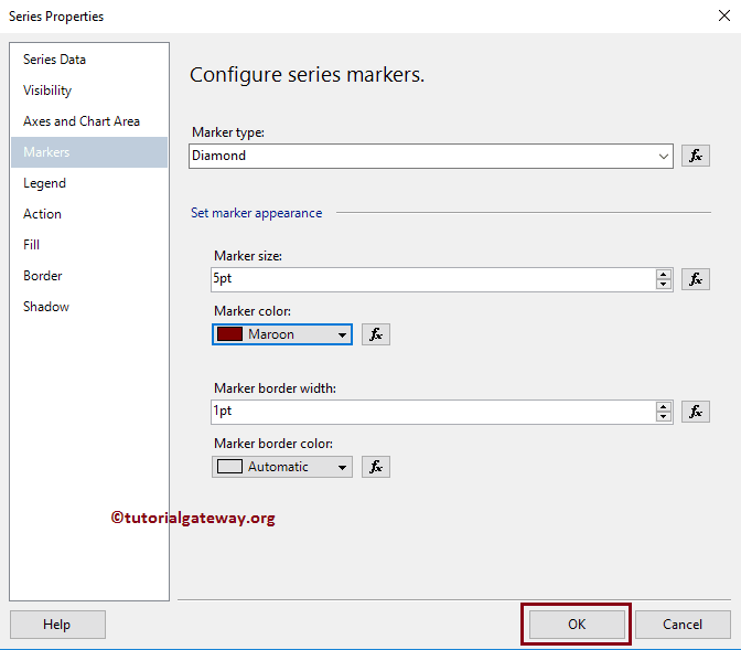
Under the Markers tab, we can change the Marker Type, Color, Size, Border width, and Border Color. First, let me change the shape from Auto to Diamond
Let me change the Color to Maroon, and the size to 5pt
From the report preview, you can see we successfully changed the Marker Shape, size, and color
You have the option to add one more dimension to the Series group to further divide the Scatter plot markers. For now, we are adding Color to the Series group
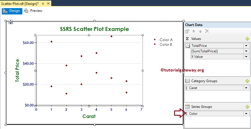
Next, we are changing the Marker size to 5pt(default 3.5pt) and kept the color to Automatic
Let me show you the report preview
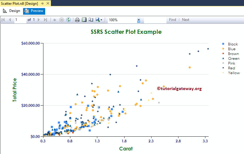
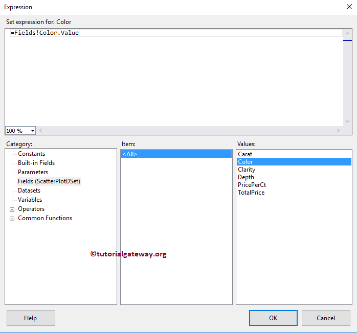
As you can see the report is showing the perfect result, perhaps it would be nice if I changed the default Color combinations to more meaningful output. For this let me go to the series properties (as I explained above) and click on the expression button under the Make Color property
Let me change the Color from Automatic to Color Dimension filed
Click on the preview tab to see the SSRS Scatter Plot preview
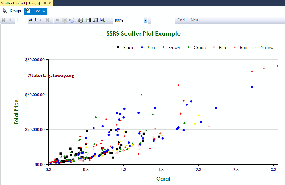
From the above screenshot, you can observe that we successfully changed the Color of a Scatter Plot using the Color Dimension.