The Scatter Plot in R Programming is very useful for visualizing the relationship between two data sets. The Scatter plot displays data as a collection of points that shows the linear relation between those two data sets.
A Scatter Plot in this Programming language is also called a scatter chart, graph, diagram, or gram. For example, If we want to visualize Age against Weight, then we can use this Scatter Plot. Let us see how to Create a Scatter Plot, Format its color and shape, and add the linear progression with an example.
R Scatter Plot Syntax
The syntax to draw the Scatter Plot in this Programming is shown below
plot(x, y = NULL, xlim = NULL, ylim = NULL, main = NULL)
And the complex syntax behind this Scatter Plot is:
plot(x, y = NULL, type = "p", xlim = NULL, ylim = NULL, log = "",
     main = NULL, sub = NULL, xlab = NULL, ylab = NULL,
     ann = par("ann"), axes = TRUE, frame.plot = axes,
     panel.first = NULL, panel.last = NULL, asp = NA,..)
The Scatter Plot supports many arguments in R programming language, and the following are some of the arguments in real-time:
- x, y: Please specify the data sets you want to compare. Here, you can use two separate vectors or Matrix with columns or lists.
- type: Please specify what type of one you want to draw.
- To draw Points, use type = “p”.
- To draw Lines, use type = “l”.
- Use type = “h” for Histograms
- Use type = “s” for stair steps
- To draw over-plotted use type = “o”
- sub: You can provide the subtitle (if any) for your scatter plot.
- log: You have to specify a character string of three options. If X-Axis is to be logarithmic, then “x”, If Y-Axis is to be logarithmic “y”, if both X-Axis and Y-Axis are to be logarithmic, then specify either “xy” or “yx”
- axes: It is a Boolean argument. If it is TRUE, the axis is drawn for the scatter plot.
- frame.plot: It is a Boolean argument that specifies whether a box should be drawn around the plot or not.
- panel.first: Please specify an expression evaluated after the axes are drawn but before the points are drawn.
- panel.last: Please specify an expression evaluated after the points are plotted.
- asp: Please specify the aspect ratio of the plot (as y/x).
How to Create a Scatter Plot in R Programming
In this example, we show how to create a scatter plot using the faithful data set that RStudio provides. If you require to import data from external files, then refer to the R Read CSV article to understand the steps involved in CSV file import in R Programming.
The following statement finds the correlation between the eruptions and waiting. The faithful data set will return the output as a List from this code snippet.
So, we are using the $ to extract the data from the List.
# Example
faithful

# Finding the Correlation
cor(faithful$eruptions, faithful$waiting)

# Drawing
plot(faithful$eruptions, faithful$waiting)
How to assign names to the Scatter Chart?
In this example, we assign names to scatter plot X-Axis, Y-Axis, and individual bars using main, xlab, and ylab.
- main: You can provide the Title for the created scatterplot.
- xlab: Please specify the label for the X-Axis
- ylab: Please specify the label for the Y-Axis
- las: Used to change the Y-axis values direction.
# Changing Names Example
faithful

# Drawing
plot(faithful$eruptions, faithful$waiting,
     main = "R Scatter Plot",
     xlab = "Eruptions",
     ylab = "Waiting",
     las = 1)
Change Colors of Scatter Chart
In this R scatter plot example, we change the color using the col argument and the size of the character that represents the point using cex argument.
- col: Please specify the color you want to use.
- cex: Please specify the size of the point(s).
# Changing Color, Dot Size Example
faithful

plot(faithful$eruptions, faithful$waiting,
     col = "chocolate",
     cex = 1.2,
     main = "R Scatter Plot",
     xlab = "Eruptions",
     ylab = "Waiting",
     las = 1)

Change Shapes and Axis limits of Scatter Plot
In this example, we change the shape using the pch argument.
- xlim: This argument can help you to specify the limits for the X-Axis
- ylim: This argument may help you to specify the Y-Axis limits
# Changing X, Y Limitations, Dot Shape Example
faithful


plot(faithful$eruptions, faithful$waiting,
     col = "chocolate",
     pch = 8,
     main = "R Scatter Plot",
     xlab = "Eruptions",
     ylab = "Waiting",
     las = 1,
     xlim = c(1.5, 5.5),
     ylim = c(40, 100))
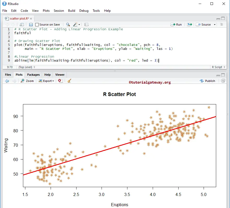
Adding Linear Progression to Scatter Plot in R
In this example, we find the linear progression of two data sets and add them to the scatterplot using the abline function.
# Adding Linear Progression Example
faithful


plot(faithful$eruptions, faithful$waiting, col = "chocolate", pch = 8,
     main = "R Scatter Plot", xlab = "Eruptions", ylab = "Waiting", las = 1)

#Linear Progression
abline(lm(faithful$waiting~faithful$eruptions), col = "red", lwd = 3)
The following statement creates a table with records of sales amount and color. Here, column values are unique colors, and row values are unique sales amounts.
count <- table(employee$SalesAmount, employee$Color)
Next, we add a line, and the line represents the linear progression. The lwd argument changes the width of the line
abline(lm(faithful$waiting~faithful$eruptions), col = "red", lwd = 3)