In this article, we will show you how to create a Range Chart in SSRS, How to change the Chart Title, Legend Title, Legend Position, Font style, and chart type to smooth Range Chart in SSRS or SQL Reporting Services with an example.
For this SSRS range chart example, we are going to write the Custom Query against the SQL Server Data Source and the query that we are going to use for this SSRS report is shown below.
-- Query that we use in Range Chart
SELECT Cat.[EnglishProductCategoryName] AS ProductCategory,
       SubCat.[EnglishProductSubcategoryName] AS ProductSubCategory,
       Prod.EnglishProductName AS ProductName, Prod.Color, Fact.OrderQuantity,
       Fact.TotalProductCost, Fact.SalesAmount, Fact.TaxAmt, Fact.[Freight]
FROM FactInternetSales AS Fact
   INNER JOIN DimProduct AS Prod ON Fact.ProductKey = Prod.ProductKey
   INNER JOIN DimProductSubcategory AS SubCat
      ON Prod.ProductSubcategoryKey = SubCat.ProductSubcategoryKey
   INNER JOIN DimProductCategory AS Cat
      ON SubCat.ProductCategoryKey = Cat.ProductCategoryKey
Create a Range Chart in SSRS
In this example, we are going to create a Range Chart to display the Sales Amount and total Product Cost against the Product Names (or Color). Please type the above query inside the SSMS to see the SQL Data that it’s going to return. We will use it as the Data Source, and Dataset for this Range Chart Report.
In the SSRS report design, we can add a Range Chart by dragging the Chart property from the SSRS Toolbox to the Design space. Or right-click on the report designer to open the context menu. From it, please select the Insert -> Chart option.

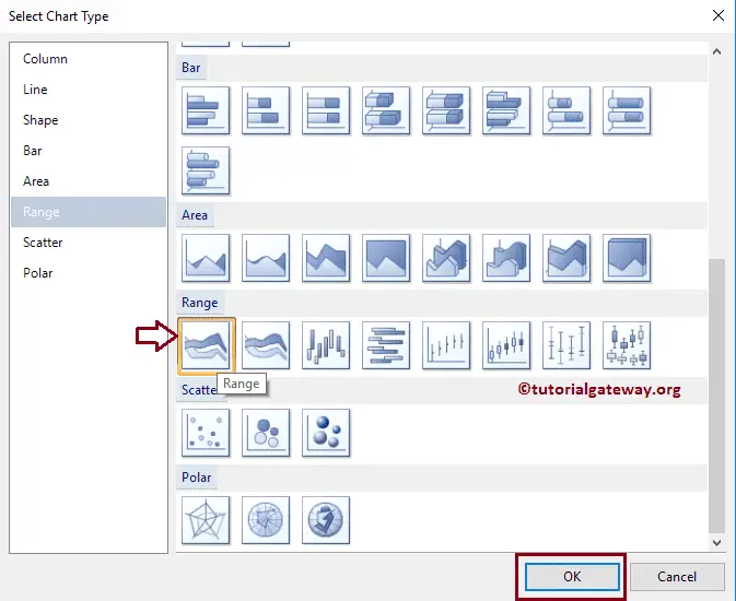
Once you select the Chart option, a new window called Select Chart Type will be opened to select the required chart from the available ones. For this SSRS example, we are selecting a Range Chart.
Once you click on the Ok button, the Range Chart will display in the design region with dummy data. Click on the empty space around the SSRS Range Chart will open the Chart Data window
- Values: Any Numerical (Metric) value such as Total Sales, Sale amount, Number of Customers, Tax, etc. All these values will be aggregated using an aggregate function (Sum, Avg, Count, etc). It is because we are grouping them with the category group items.
- Category Group: Please specify the Column name on which you want to partition the Bubble Chart.
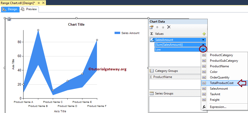
Drag and drop the Sales Metric column from the data set to chart data values, and the Product Name Dimension to the category group.

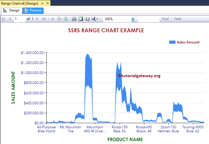
Click on the SSRS Range Chart Preview tab to see the range report preview.
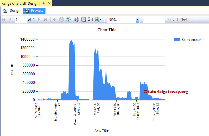
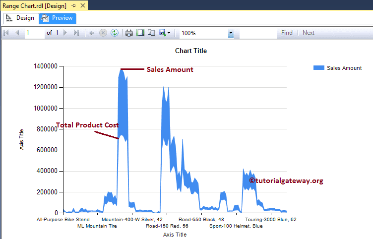
If you observe the above screenshot, It is the same chart that we generated in the Area Chart. It’s because the range chart means (High Value to Low Value), and here the high value is the Sum of Sales Amount, and the Low Value is zero by default.
Let me change the Low value from default to Sum of Total Product Cost.
Now you can see that the SSRS Range chart displays the Range of difference between the Total Product Cost, and the Sales Amount.
Format Range Chart in SSRS
The following list of examples will show you the steps involved in formatting the Range Chart in SQL Reporting Services
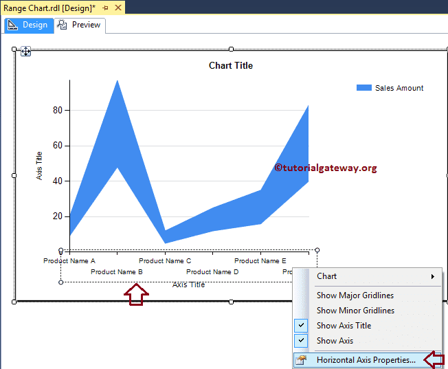
Change Axis properties of a Range Chart in SSRS
Right-click on the Axis of a Range Chart, and select the Horizontal Axis Properties.. option from the context menu to format the Axis values.
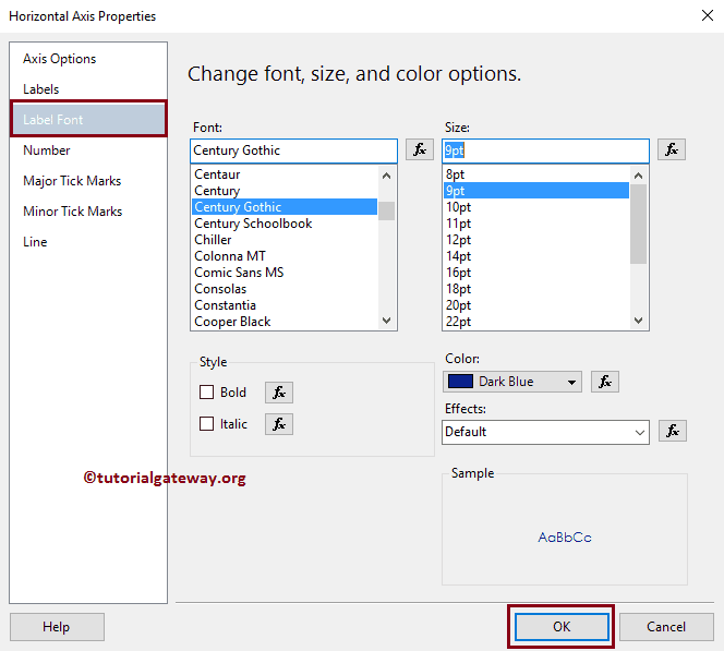
Here we changed the Font style to Century Gothic, the Font Style to Bold, the Color to Dark Blue, and the font size to 9pt of the Horizontal Axis.
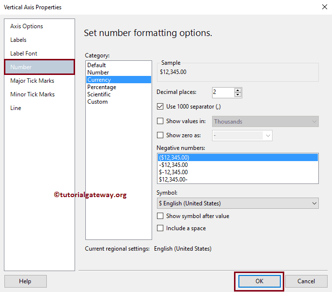
Next, Right-click on the Vertical Axis of an Area Chart, and select the Vertical Axis Properties.. option from the context menu to format the Axis values.
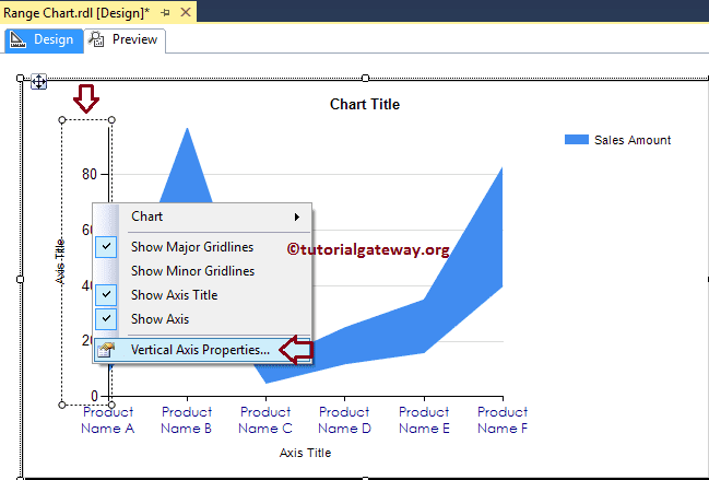
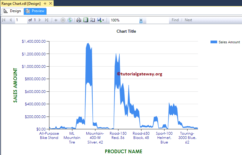
Please use the above-specified technique to change the font properties of the vertical Axis. Next, format the Numbers in the vertical Axis by selecting the Number tab.
Change Axis Titles of a Range Chart in SSRS
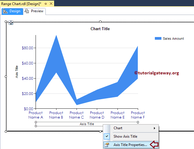
To change the Range chart Axis titles, Please select the Axis title, and change the title as per your requirement. OR, right-click on it will open the context menu. Please select the Axis Title properties.. option.
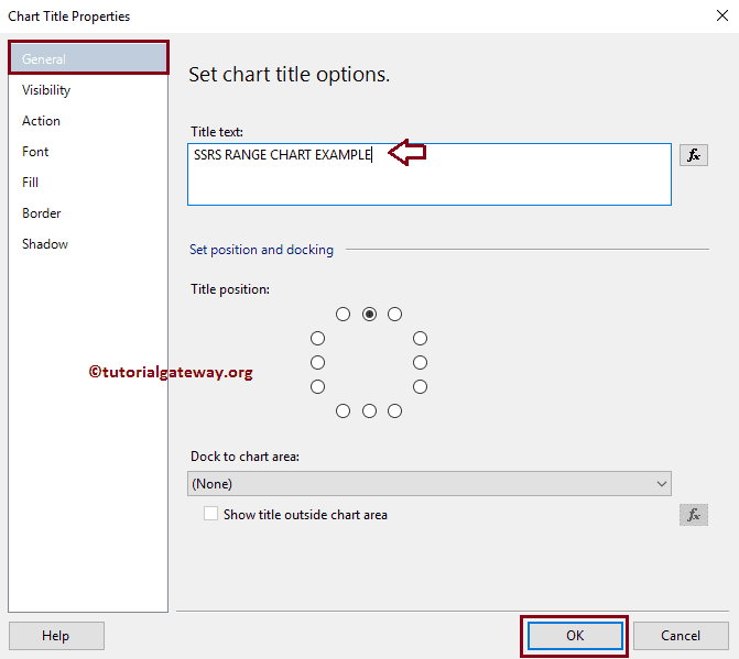
It will open a new window called the Axis Title Properties window. Under the General section, we can change the Title text as per our requirements. For now, we are changing it to PRODUCT NAME and title alignment to center.
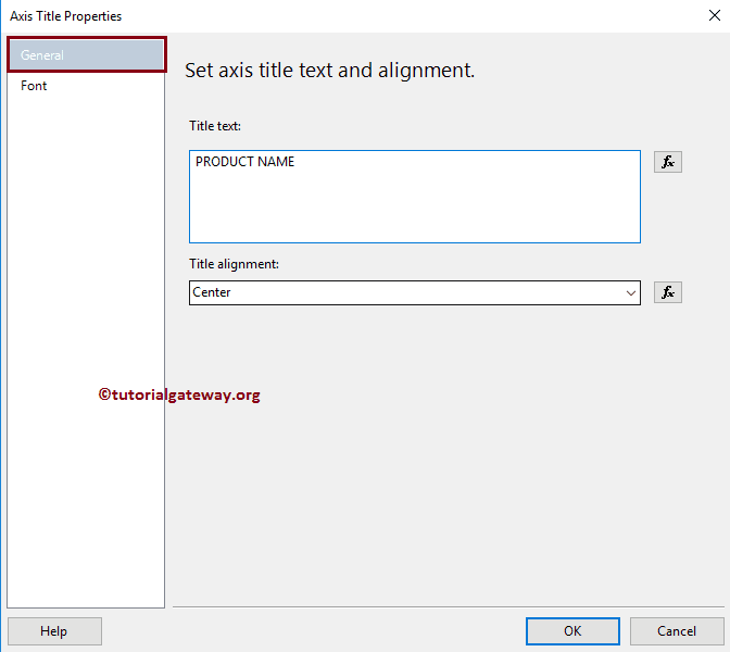
Under the Font tab, we can change the Font style, size, and color of an Axis title. For now, we are changing the Color to Dark Green, Font to Century Gothic, Size to 12pt, and style to Bold. Please apply the same properties to Y-Axis, as well. Once completed, click on the Preview tab to see the report preview.
Change SSRS Range Chart Title
To change the title of a Range chart, Please select the Chart title region, and change the title as per your requirement. OR, right-click on it will open the context menu. Please select the Title Properties.. option.
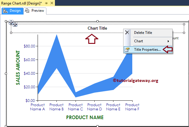
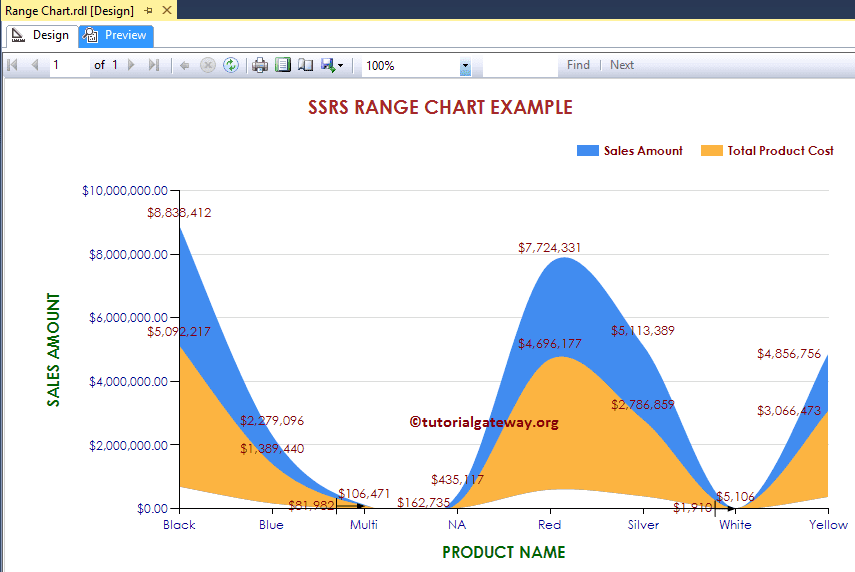
Here we are changing the title as SSRS Range Chart Example because the report is displaying the same
Format SSRS Range Chart Title Font
Within the Font tab, we can change the Font Size, Font Family, Font Style, and Color of a Range chart Title. Here we are changing the Font to Century Gothic, Style to Bold, Font size to 14pt, and color to Brown. Please refer to the second image under the Change Axis properties subheading.
Format Legend of a Range Chart in SSRS
To format the Range Chart Legend region, Please Select the Legend region, and right-click on it will open the context menu. From the menu, please select the Legend Properties option.
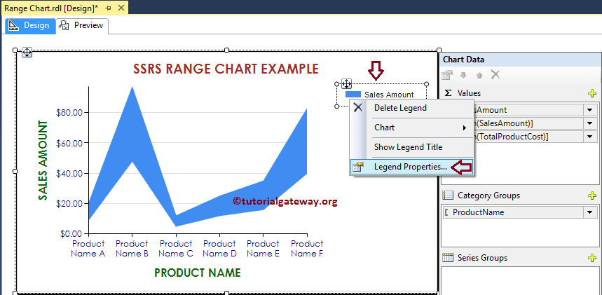
It will open a new window called the Legend Properties Window. Within the General Tab, we have an option called Legend Position to change the Legend Position by changing the dot positions. For now, we are changing the position to the top right corner.
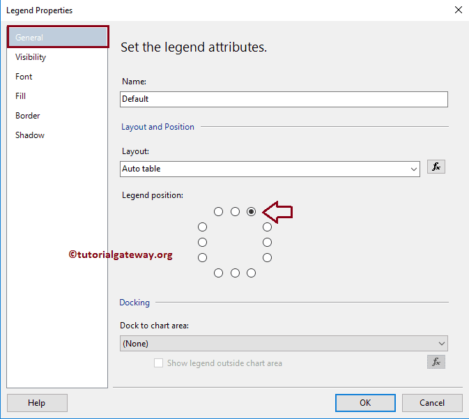
Next, Under the Font tab, we can change the Font style, size, and color of a Legend. For now, we are changing the Font to Century Gothic, Color to Maroon, Style to Bold, and Size to 10pt. Please refer to the second image under the Change Axis properties subheading.
Click the OK button to close the Properties window, and hit the preview tab to see the report preview.
Convert Range Chart to Smooth Range Chart in SSRS
SSRS allows us to change the chart type even after creating a Range Chart. To do so First, select the Range Chart, and right-click on it will open the context menu. Please select the Change Chart Type… option
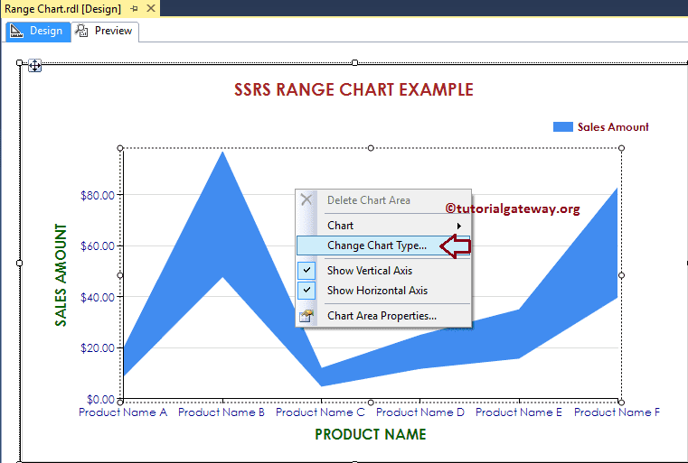
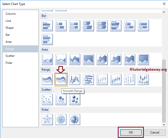
Once you select the Change option, it will open a new window called Select Chart Type to select the change. Here we are selecting the Smooth Range Chart
Click on the preview tab to see the report preview
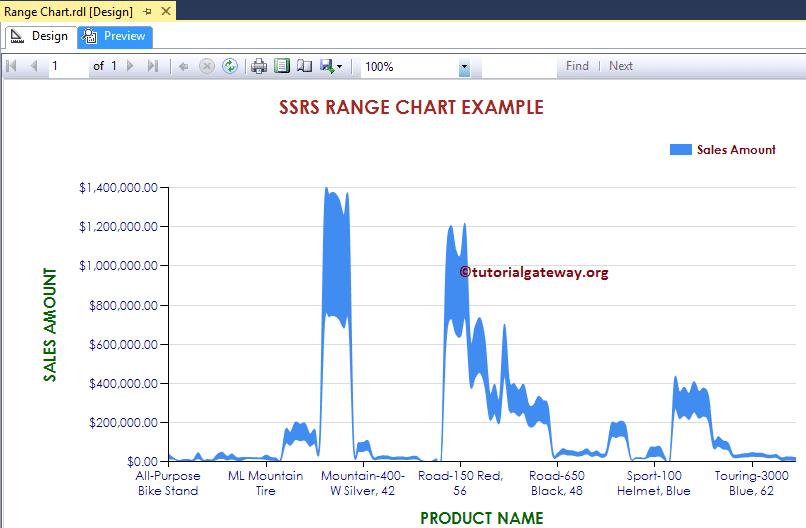
From the above screenshot, you can observe that we successfully changed the Chart Type from the Normal Range Chart to the Smooth Range Chart.
Until now, we were working with single data series values. Let me add the Total Product Cost to Chart Values, and change the Low property to Tax amount. Just for the demonstration purpose.
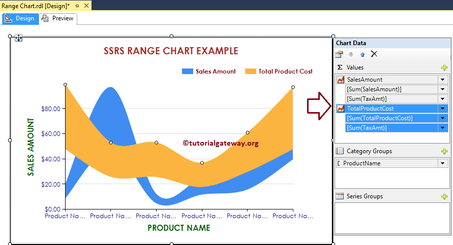
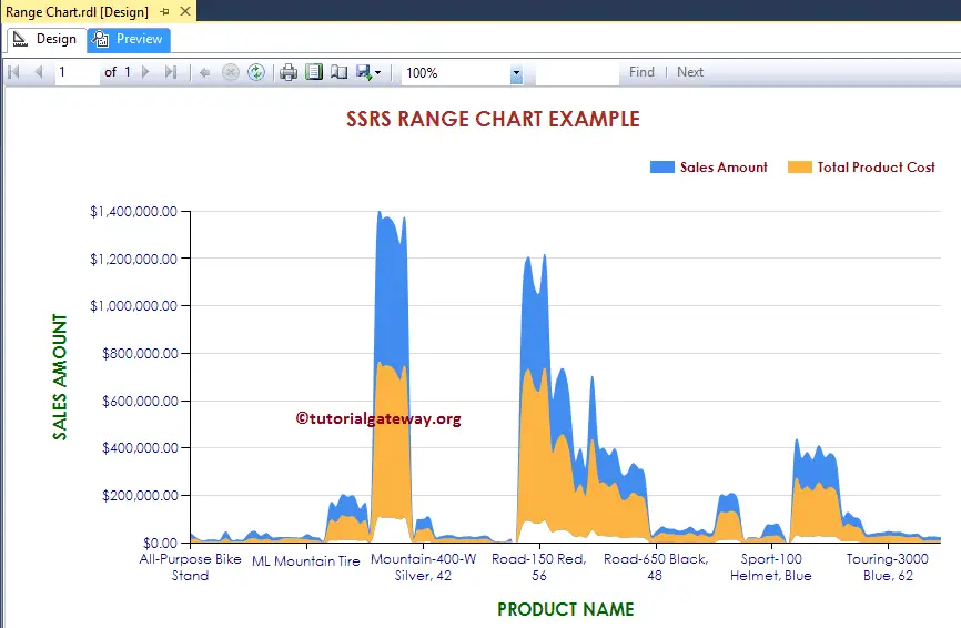
Now you can see, our range chart is displaying the chart for both the Sales Amount and the Total Product Cost
Add Data Labels to the Range Chart in SSRS
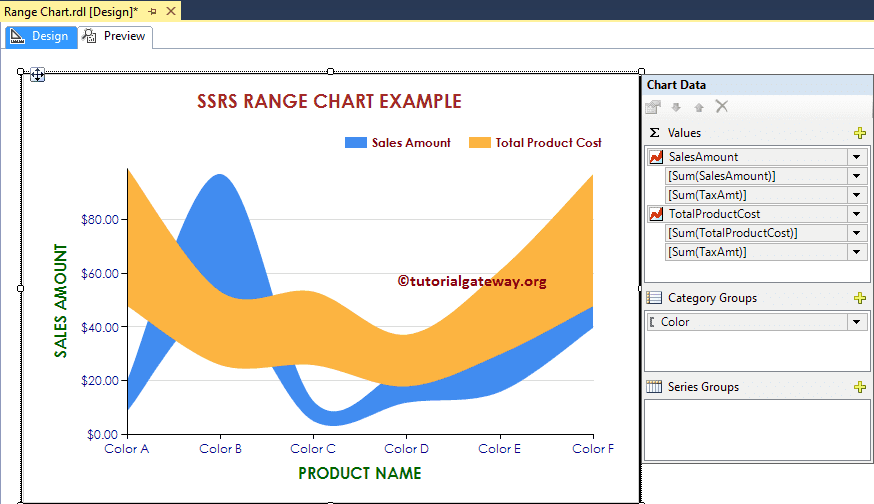
The above chart holds too much data to display in the Data labels. So let me change the dimension in the Category Group from Product Name to Color.
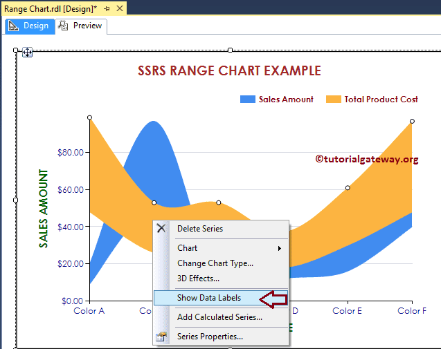
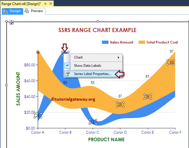
Right-click on the Chart, and select the Show Data Labels option from the context menu to show the values
Next, let me format the Font of Data Labels. To do so, Please select the Data labels. Next, right-click on it and select the Series Label Properties option from it.
Here we are changing the font to Century Gothic, font size to 10pt, font color to Maroon, and style to Bold. Please refer to the second image under the Change Axis properties subheading.
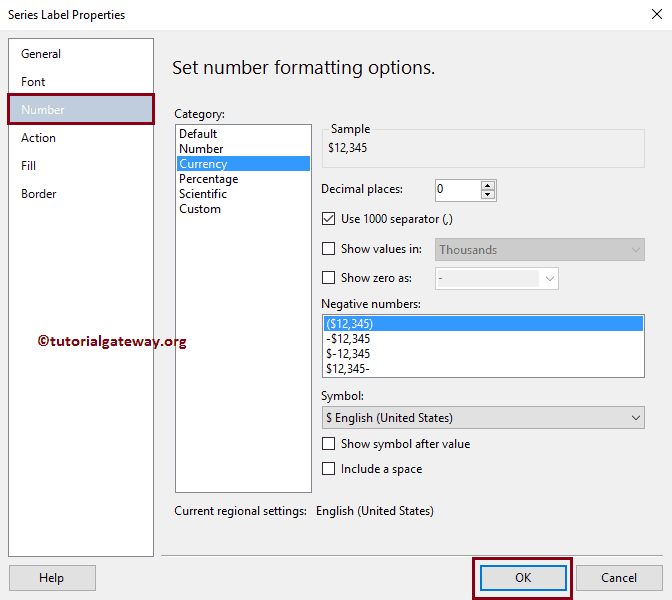
Next, format the Numbers to Currency by selecting the Number tab.
Do the same for the Blue color chart as well. Once you complete, click on the Preview tab to see the report preview