The Line Chart in SSRS is useful to connect individual dots. We can use this line chart to find the Forecast details, trends in sales, profit trends, etc.
In this article, we will show you how to create an SSRS Line Chart, How to change the Chart Title, Legend Title, Legend Position, Line Chart Font, and Chart Model, and Display Data Labels on Line Chart in SSRS or SQL Server Reporting Services with an example.
For this SSRS Line Chart example, we use the Custom SQL query on AW DW.
-- Query that we use in Line Chart
SELECT Geo.EnglishCountryRegionName AS Country,
       Geo.StateProvinceName AS State, Geo.City,
       Prod.EnglishProductName AS ProductName, Prod.Color,
       Fact.OrderQuantity,  Fact.TotalProductCost, Fact.SalesAmount,
       Fact.TaxAmt, Fact.[Freight] FROM DimProduct AS Prod
   INNER JOIN FactInternetSales AS Fact ON Prod.ProductKey = Fact.ProductKey
   INNER JOIN DimSalesTerritory AS Terry ON Terry.[SalesTerritoryKey] = Fact.[SalesTerritoryKey]
   INNER JOIN DimGeography AS Geo ON Geo.[SalesTerritoryKey] = Terry.[SalesTerritoryKey]
Create a Line Chart in SSRS
In this example, we are going to create a Line Chart to display the Trend in Sales amount by the Product Color. The above code shows the Data Source and Dataset we used for this Line Chart Report and type the same in SSMS to see the data.
In the SSRS report design, we can add a Line chart by dragging the Chart property from the Toolbox to the Design space. Or right-click on the report designer and elect the Insert -> Chart option from the context menu.

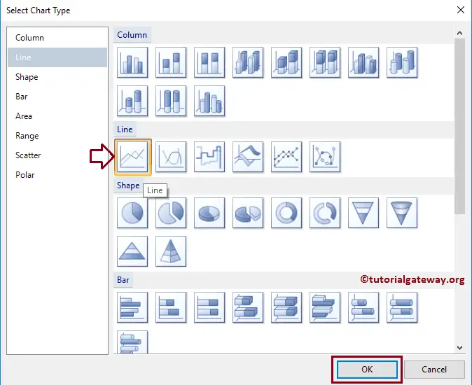
It opens a new window called Select Chart Type to select the required chart from the available ones. For this SSRS example, we are choosing the Line Chart.
Once you click on the Ok button, the Line chart will display in the design region with dummy data. Click on the empty space around the SSRS Line Chart will open the Chart Data window
- Values: Any Numerical (Metric) value such as Total Sales, Sale Amount, etc. All these values will aggregate using an aggregate function (Sum, Avg, Count, etc). Because we are grouping them with the category group items.
- Category Group: Please specify the Column name on which you want to partition your Line Chart.
As we said before, In this example, we create a Line chart to find the Sales Trend by Product color. So, Drag and drop the Sales Amount column from the dataset to chart data values and Product Color in the category group.

Click on the Preview button to see the report preview.
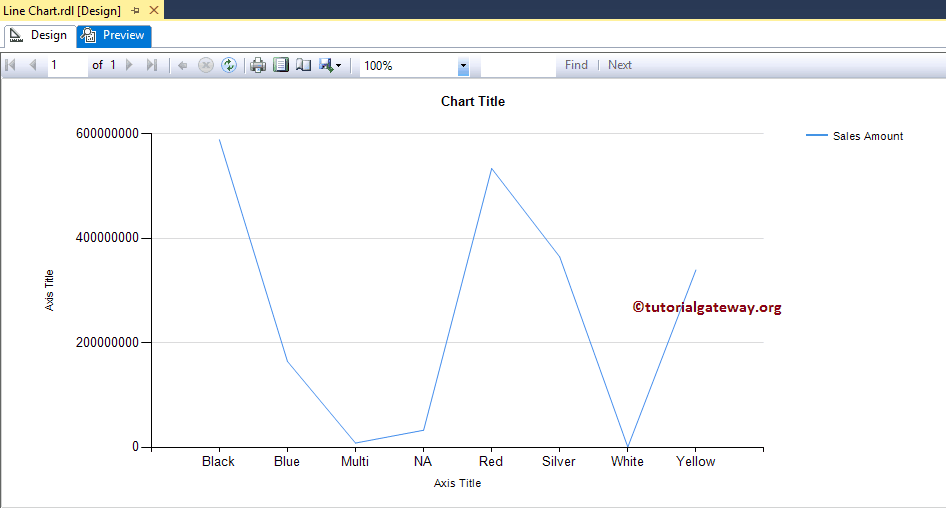
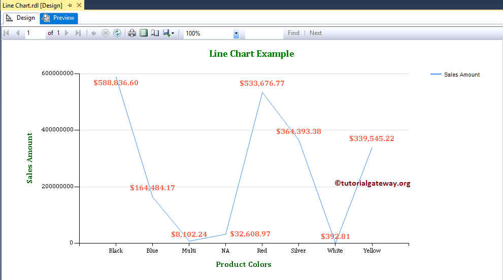
If you observe the above screenshot, It is providing the perfect result. Still, we are unable to identify the Sales at a Given point. So, let us add the Data Labels.
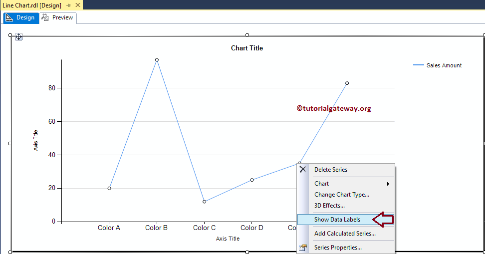
Add Data Labels to the Line Chart in SSRS
Right-click on the Line chart, and select the Show Data Labels option from the context menu to show the values
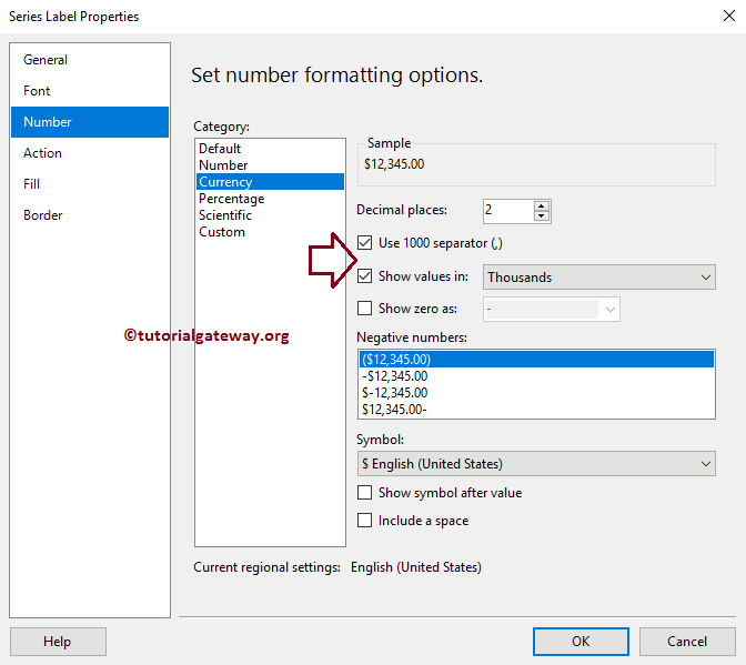
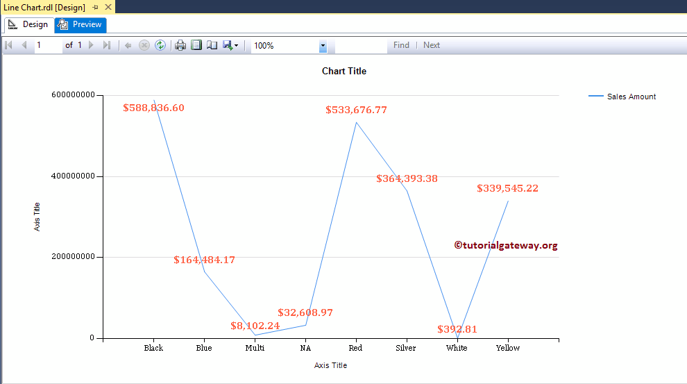
Next, we are formatting the Font, and changing the Number format from Default to Currency. To do so, Please select the Data labels, and right-click on it will open the context menu. Next, please select the Series Label Properties option.
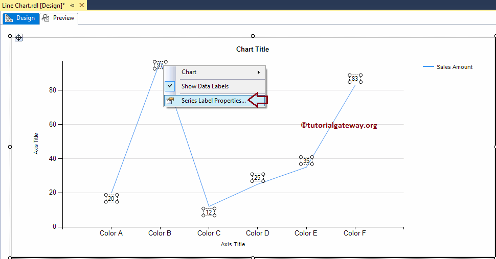
Here we are using a comma separator for 1000, and we are allowing the report to show the data labels in Thousands
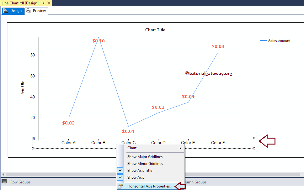
Change Axis properties of a Line Chart in SSRS
Right-click on the Axis of a Line chart, and select the Horizontal Axis Properties.. option to format the Axis values.
Here we changed the Font style and font size of both the Horizontal and Vertical Axis
Click on the Preview button to see the Line Chart in the SSRS report preview.
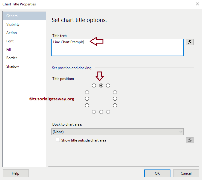
Change SSRS Line Chart Title
To change a Line Chart title, Please select the Chart title region, and change the title as per your requirement. OR, right-click on it and select the Title properties.. option from the context menu.
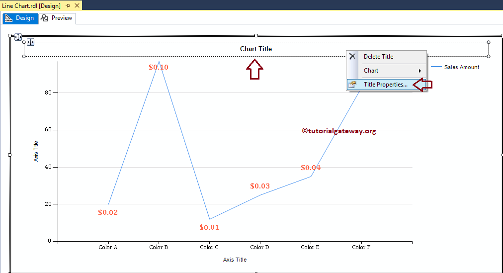
Here we are changing the title to Line Chart Example because the report is displaying the same and set the position to center.
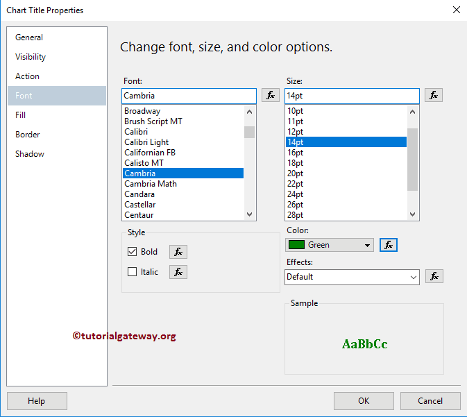
Format SSRS Line Chart Title Font
Within the Font tab, we can change the Font Size, Font Family, Font Style, and Color of a Line Chart Title. Here we are changing the Font to Cambria, the Font size to 14pt, and the color to Green.
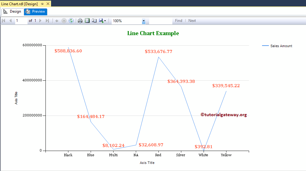
Click on the Preview button to see the report preview.
Change Axis Titles of a Line Chart in SSRS
To change an Axis title, Please select the Axis title region, and change the title as per your requirement. OR, right-click on it and select the Axis Title properties.. option from the context menu.
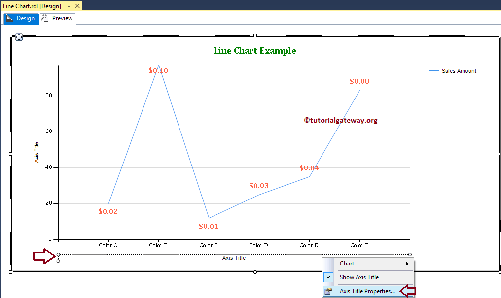
It opens a new window called the Axis Title Properties window. Here you can change the Title text and also the Font style, size, and color. For now, we are changing the Color to Green, Font to Cambria, Size to 12pt.
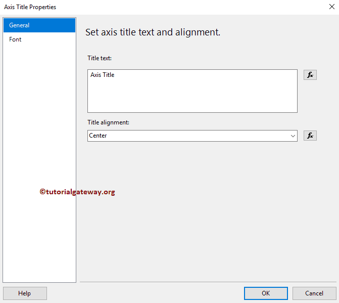
Please apply the same properties to Y-Axis, as well. Next, click on the Preview tab to see the report preview.
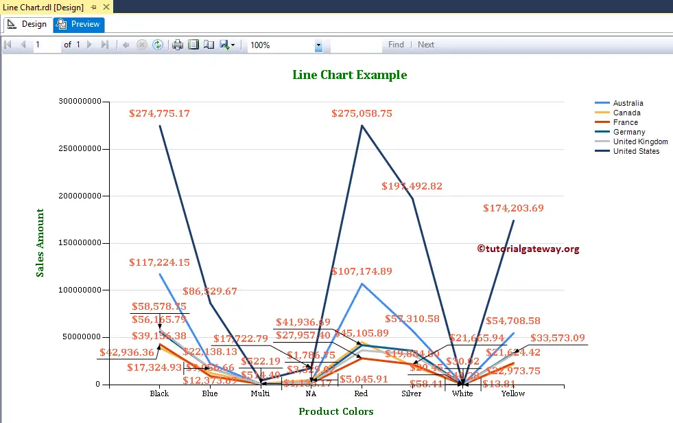
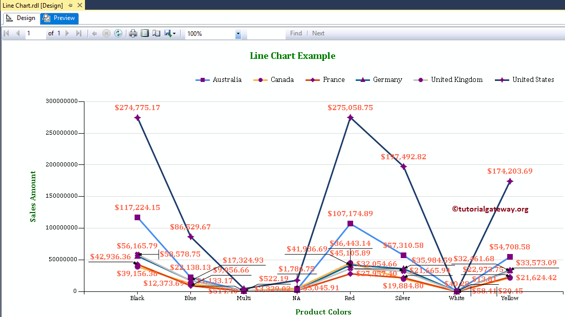
Multiple Line Charts in SSRS
Though the above chart fulfilled our requirement. Let me check the sales trend for each country. To do so, we have to add the country dimension to the existing Line chart.
For this, select the empty region around the Line Chart, and add the Country dimension to the Series Group.
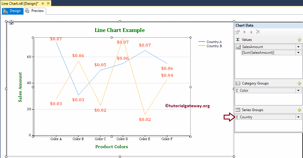
Now you see the sales trend for each color and country
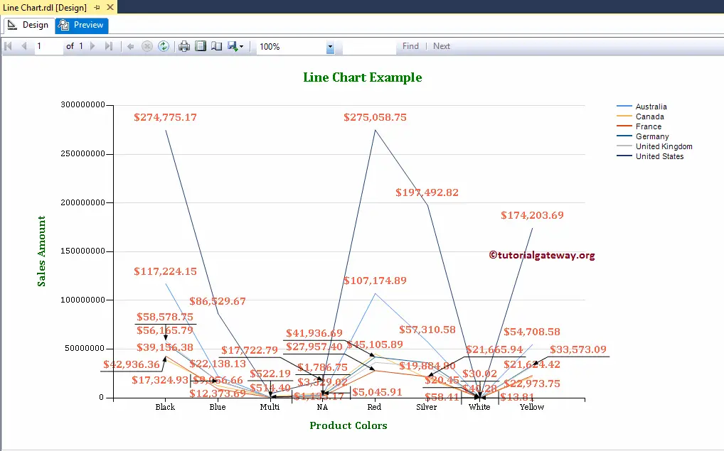
Let me change the Lines thickness. And to do so, right-click on the Lines, and select the Series properties..

It opens a new window called the Series Properties window. Under the Border tab, we can change the Line width, Color, and Style (dotted, solid, etc). For now, we are changing the line width from default 1pt to 2pt.
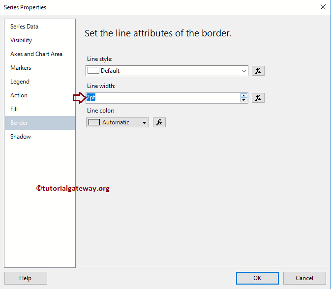
Click the Ok button to close the Series Properties window, and select the preview tab to see the report preview
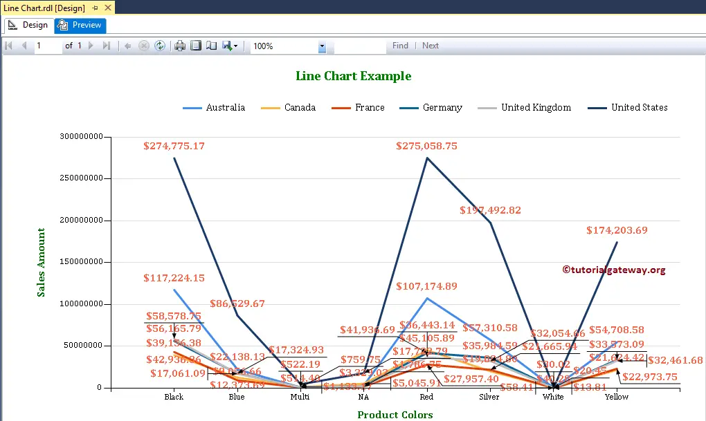
Format Legend Position of a Line Chart in SSRS
To format the Legend region, Please right-click on the Legend region, and select the Legend Properties option.
It opens a Legend Properties Window. Within the General Tab, we have an option called Legend Position to change the Legend Position by changing the dot positions. For now, we are changing the position from a default right corner to the Middle.
Click the Ok button to close the Properties window, and hit the preview tab to see the report preview
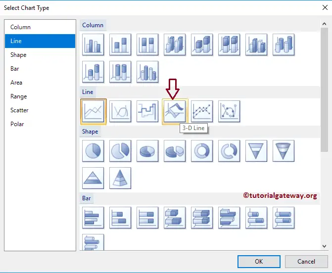
Change the type of a Line Chart in SSRS
It allows us to change the chart type even after creating a Line chart. To do so First, select the Line chart and right-click on it will open the context menu. Please select the Change Chart Type… option from it

Once you select the Change Chart Type… option, it will open a new window called Select Chart Type to select the change. Here we are choosing the 3D Line chart
Click on the preview tab to view the 3D line report preview
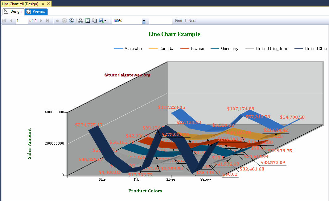
From the above screenshot, you can observe that We successfully changed the Chart Type from the 2D Line chart to the 3D Line chart in SSRS.
This time we are going to change the Chart Type from the 3D Line chart to the Smooth Line. Please click on the preview tab to see the line chart preview

This time we are going to change the Chart Type from Smooth Line to Line with Markers. Let me change the Marker type to Auto, Marker Size to 6pt, Color to Purple, Border Width to 2pt, and border Color to Purple, before we see the preview. For this, use the Series Properties window as shown in the above image. Please click on the preview tab to see the Smooth Line with Markers chart preview
This time we are going to change the Chart Type from Line with Markers to Smooth Line with Markers. Let’s see the report preview

Comments are closed.