The lattice package in R Programming provides barchart to plot Bar Chart. In real-time, the Lattice Bar chart in R is very useful to compare the data visually. For instance, If we want to compare the sales against region, categories, or product color, use this bar chart. Let me show you to Create a Lattice bar Chart, Format bar colors, etc. with an example.
Lattice Bar chart in R Syntax
The syntax to draw the lattice bar chart
barchart(x, data,.............)
and the complex syntax behind this bar chart is:
barchart(x, data,
         panel = lattice.getOption("panel.barchart"),
         default.prepanel = lattice.getOption("prepanel.default.barchart"),
         box.ratio = 2,
         ...)
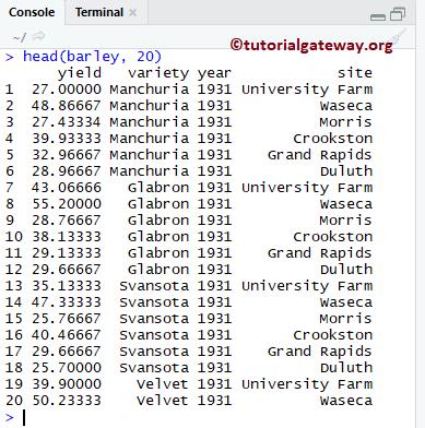
To demonstrate this, we are going to use the barley dataset that is provided by the R, and the data inside this data set is:
Create Lattice Bar chart in R
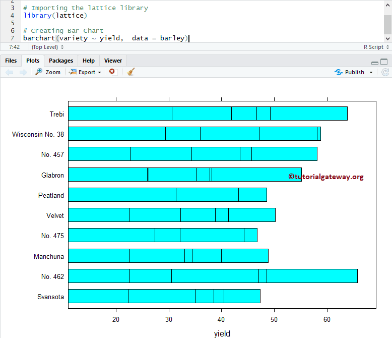
In this example, we show you how to create a Lattice bar chart. If you require to import data from external files, then please refer R Read CSV article to understand the steps involved in the CSV file import.
# Create Lattice Bar Chart in R Programming

# Importing the lattice library
library(lattice)

# Creating Bar Chart
barchart(variety ~ yield,  data = barley)
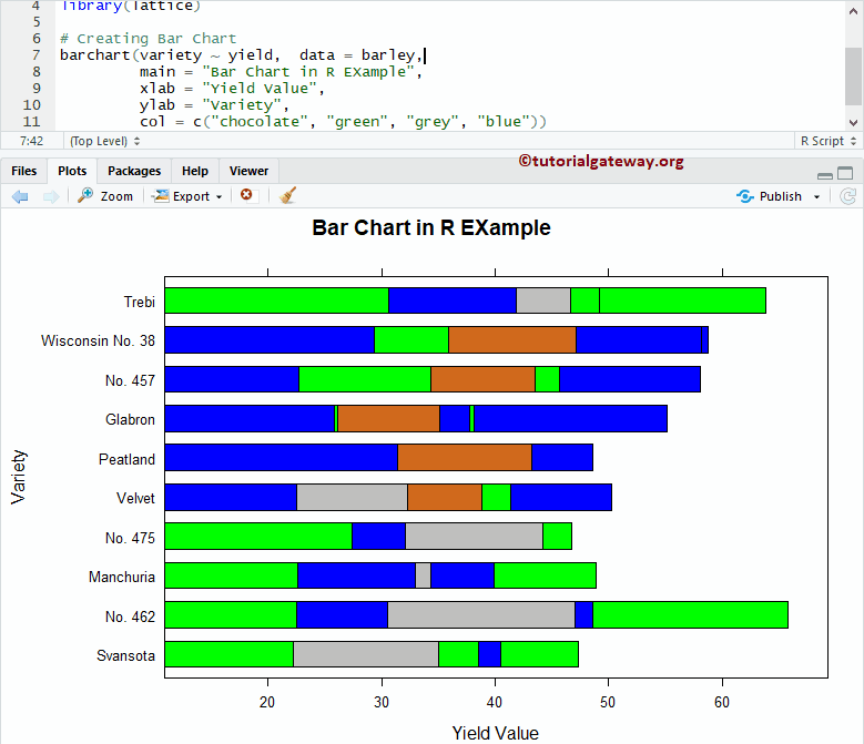
Assign names to Lattice Bar chart
Change the colors of a R Programming bar, assign names to bar chart, X-Axis, and Y-Axis using main, xlab, and ylab
# Chaging Colors, Names of a Lattice Bar Chart in R Programming

# Importing the lattice library
library(lattice)

# Creating Bar Chart
barchart(variety ~ yield,  data = barley,
         main = "Bar Chart in R EXample",
         xlab = "Yield Value",
         ylab = "Variety",
         col = c("chocolate", "green", "grey", "blue"))
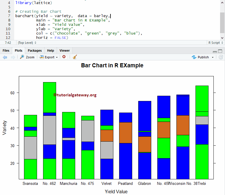
Lattice Vertical Bar Chart
This example shows how to change the horizontal bar chart into a vertical bar chart using the horiz argument.
# Vertical Lattice Bar Chart in R Programming

# Importing the lattice library
library(lattice)

# Creating Bar Chart
barchart(yield ~ variety,  data = barley,
         main = "Bar Chart in R EXample",
         xlab = "Yield Value",
         ylab = "Variety",
         col = c("chocolate", "green", "grey", "blue"),
         horiz = FALSE)
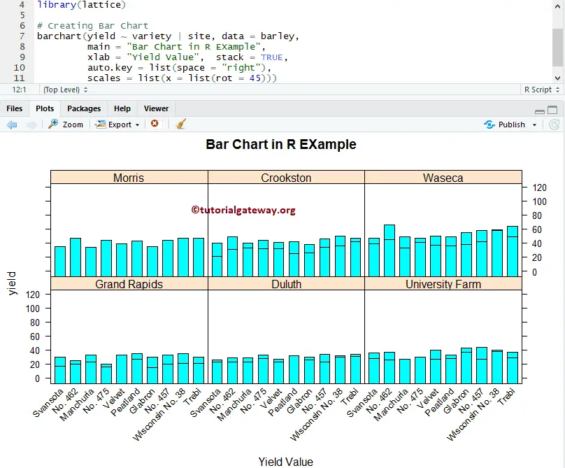
Multiple Lattice Bar Charts
In this example, we show you how to divide the bar chart based on the groups. Here, scales are useful to rotate the x-axis labels to 45 degrees angle.
# Multiple Lattice Bar Chart in R Programming

# Importing the lattice library
library(lattice)

# Creating Bar Chart
barchart(yield ~ variety | site, data = barley,
         groups = year, main = "Bar Chart in R EXample",
         xlab = "Yield Value",  stack = TRUE,
         auto.key = list(space = "right"),
         scales = list(x = list(rot = 45)))
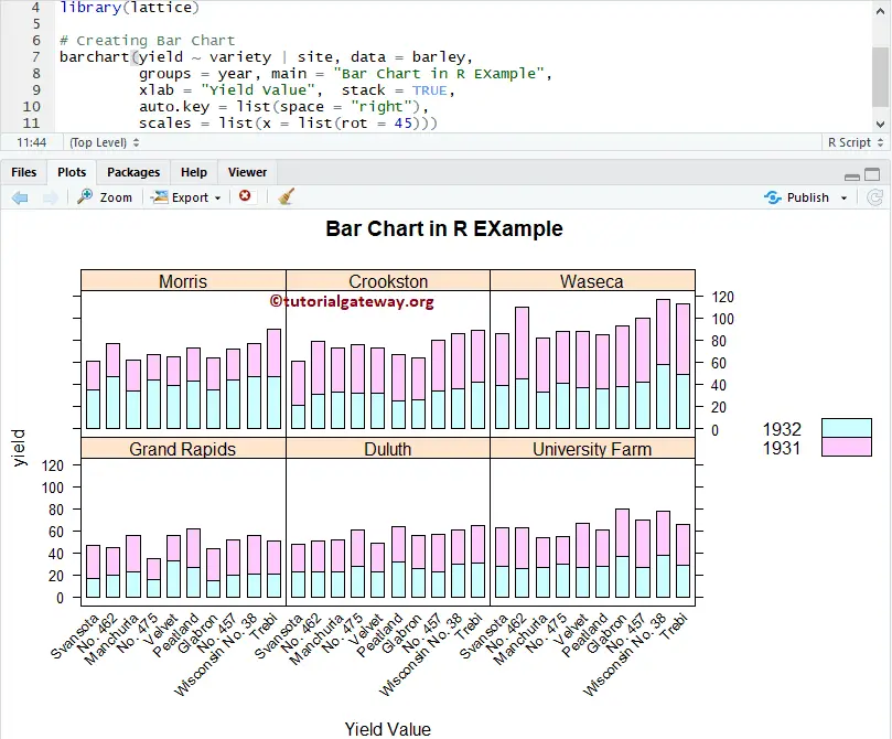
Groups in Lattice Bar Chart
Here, we are using groups to group common data. groups – variable or expression act as a grouping variable within each panel
# Multiple Lattice Bar Chart in R Programming

# Importing the lattice library
library(lattice)

# Creating Bar Chart
barchart(yield ~ variety | site, data = barley,
         groups = year, main = "Bar Chart in R EXample",
         xlab = "Yield Value",  stack = TRUE,
         auto.key = list(space = "right"),
         scales = list(x = list(rot = 45)))
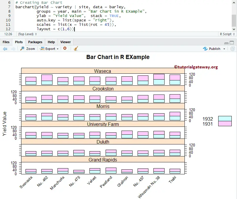
A layout of Lattice Bar Chart in R
In this example, we show you how to use the layout option in the Lattice bar chart.
- Layout: In general, the Lattice Bar Chart consists of several panels arranged in a rectangular array. And, the Layout determines this arrangement. It is a numeric vector of length 2 (or 3). It means a vector of the number of columns, rows, and pages (optional).
# Importing the lattice library
library(lattice)

# Creating Bar Chart
barchart(yield ~ variety | site, data = barley,
         groups = year, main = "Bar Chart in R EXample",
         ylab = "Yield Value",  stack = TRUE,
         auto.key = list(space = "right"),
         scales = list(x = list(rot = 45)),
         layout = c(1,6))