Bubble Chart in SSRS is used to display the data in circles. Bubble charts play a significant role while creating Maps because we can use bubbles on top of the Map to show the Profit or Sales by Postal code etc.
In this article, we will show you how to make a Bubble Chart in SSRS, How to change the Chart Title, Legend Position, Legend Title, Font style, and chart type to 3D bubble chart in SSRS or SQL Reporting Services with an example.
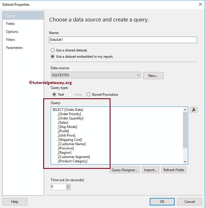
For this SSRS bubble chart example, we are going to use the Custom SQL query:
-- Query that we use in Bubble Chart
SELECT [Order Date]
      ,[Order Priority]
      ,[Order Quantity]
      ,[Sales]
      ,[Ship Mode]
      ,[Profit]
      ,[Unit Price]
      ,[Shipping Cost]
      ,[Customer Name]
      ,[Province]
      ,[Region]
      ,[Customer Segment]
      ,[Product Category]
      ,[Product Sub-Category]
      ,[Product Name]
      ,[Product Container]
  FROM [Super Store]
Create a Bubble Chart in SSRS
In this example, we are going to create a Bubble Chart to display the Sales Amount against the Product Container. The below screenshot will show you the Data Source, and Dataset that we used for this Bubble Chart Report.
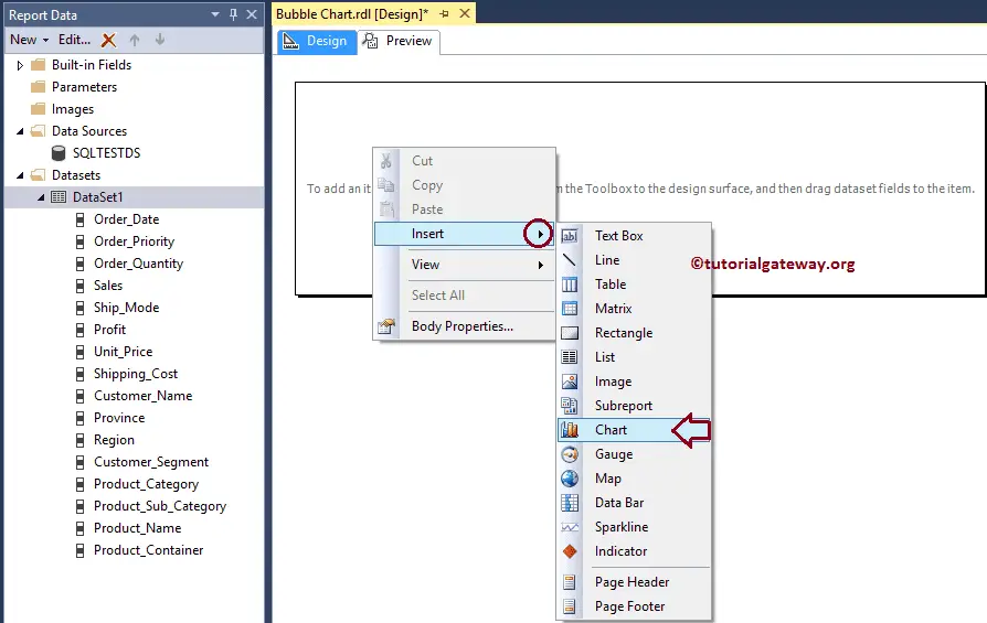
In the SSRS report design, we can add a Bubble Chart by dragging the Chart property from the Toolbox to Design space. Or we can right-click on the report designer to open the context menu. From the context menu, please select the Insert -> Chart option.
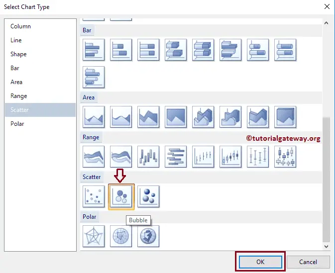
Once you select the Chart option, a new window called Select Chart Type will open to select the required chart from the available once. For this example, we are selecting a Bubble Chart.
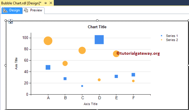
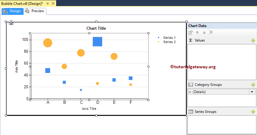
Once you click on the Ok button, the Bubble Chart will display in the design region with dummy data.
Click on the empty space around the SSRS bubble chart will open the Chart Data window
- Values: Any Numeric (Metric) value such as Total Sales, Sale amount, Number of Customers, Tax etc. All these values will be aggregated using an aggregate function (Sum, Avg, Count etc). It is because we are grouping them with the category group items.
- Category Group: Please specify the Column name on which you want to partition you the Bubble Chart.
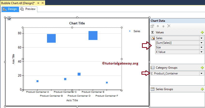
Drag and drop the Sales Metric column from the data set to chart data values, and Product Container Dimension to category group.
Click on the Preview tab to see the report preview.
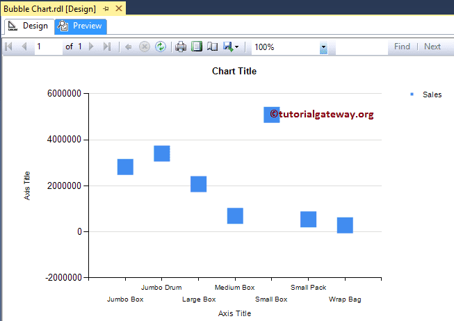
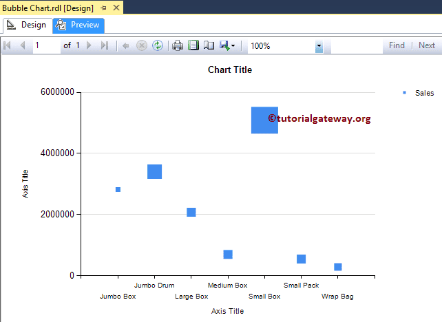
If you observe the above screenshot, It is providing perfect result, but the size of the Markers (Square boxes) are in same. So, let me change the size based on the Profit dimension.
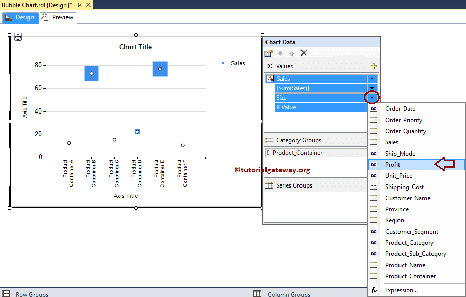
Now you can see that the squares are displaying in different sizes (based on the Profit of each product container)
Though the above chart is showing the required result, it is not displaying the bubbles. Right-click on the Marker will open the context menu. Please select the Series Properties from it.
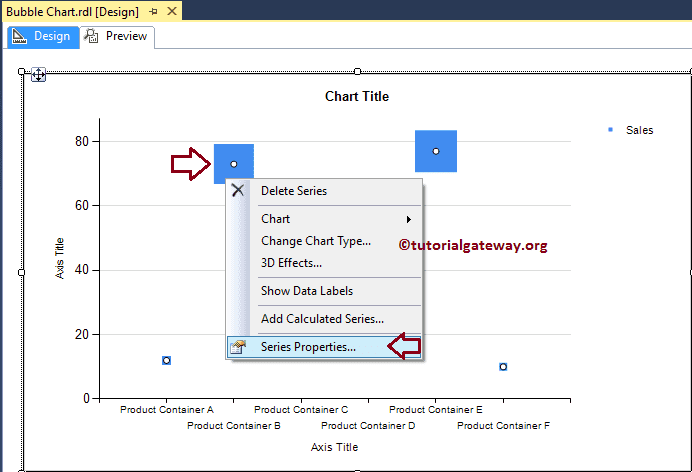
Once you click on the Series properties option, a new window called Series properties will open up.
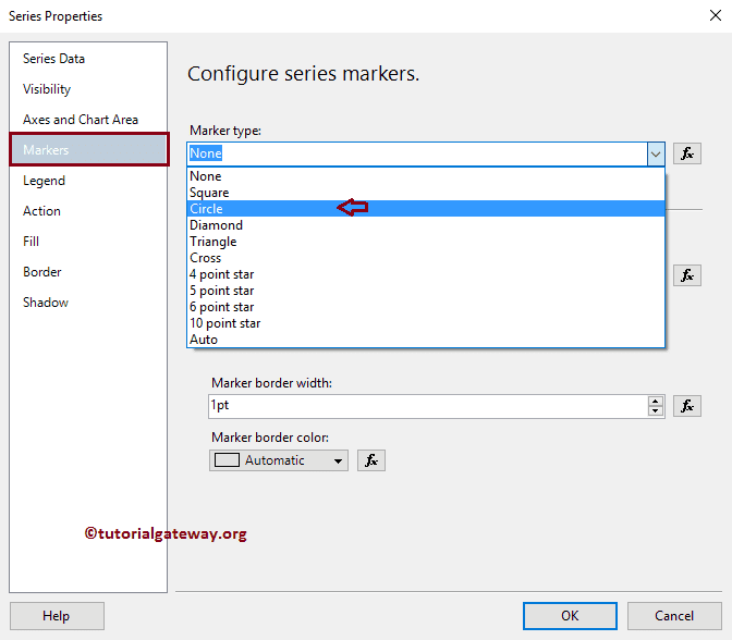
Under the Markers tab, we can change the Marker Type, Color, Size, Border width, and Border Color. First, let me change the shape from None to Circle
Let me change the Color to Dark Green
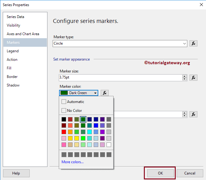
From the report preview, you can see we successfully changed the Marker Shape and color
Format Bubble Chart in SSRS
The following list of examples will show you the steps involved in formatting the Bubble Chart.
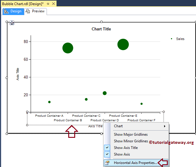
Change Axis properties of a Bubble Chart in SSRS
Right-click on the Axis of a Bubble Chart, and select the Horizontal Axis Properties.. option from the context menu to format the Axis values.
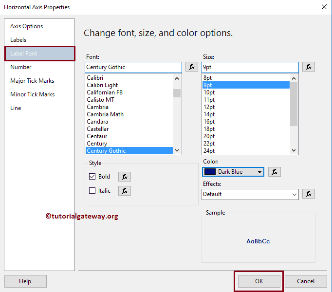
Here, we changed the Font style to Century Gothic, Color to Dark Blue, Font Style to Bold, and font size to 9pt of the Horizontal Axis.
Next, Right-click on the Vertical Axis of an Area Chart, and select the Vertical Axis Properties.. option from the context menu to format the Axis values.
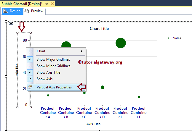
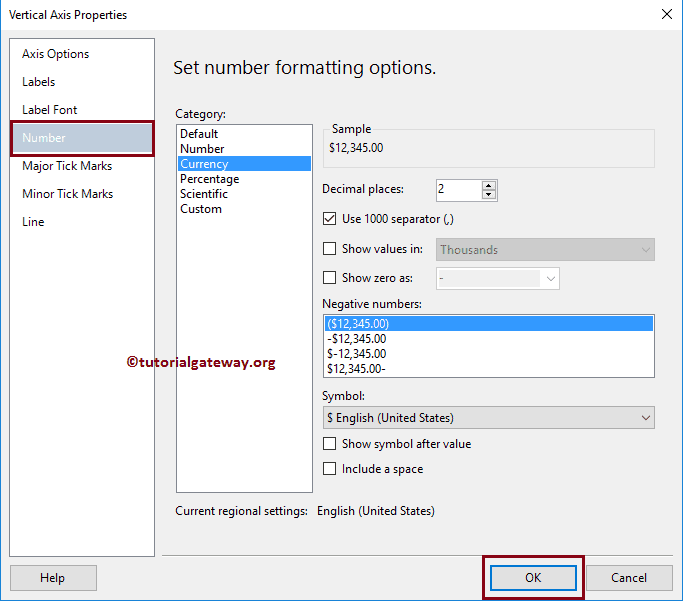
Please use the above-specified technique to change the font of the vertical Axis. Next, format the Numbers in the vertical Axis by selecting the Number tab.
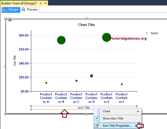
Change Axis Titles of a Bubble Chart in SSRS
To change an Axis title, Please select the Axis title region, and change the title as you need. OR, right-click on it and select the Axis Title properties.. option from the context menu.
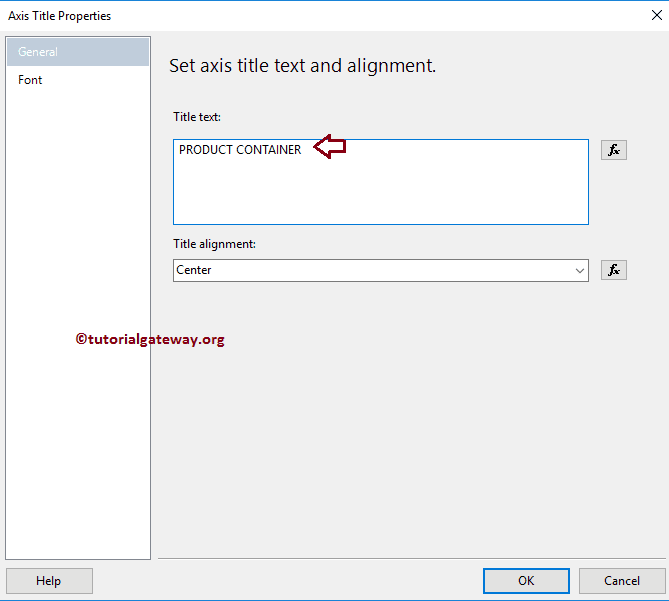
It will open a new window called the Axis Title Properties window. Under the General section, we can change the Title text as per our requirements. For now, we are changing it to PRODUCT CONTAINER
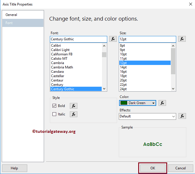
Under the Font tab, we can change the Font style, size, and color of an Axis title. For now, we are changing the Color to Dark Green, Font to Century Gothic, Size to 12pt, and style to Bold
Please apply the same properties to Y-Axis, as well. Once done, click on the Preview tab to see the report preview.
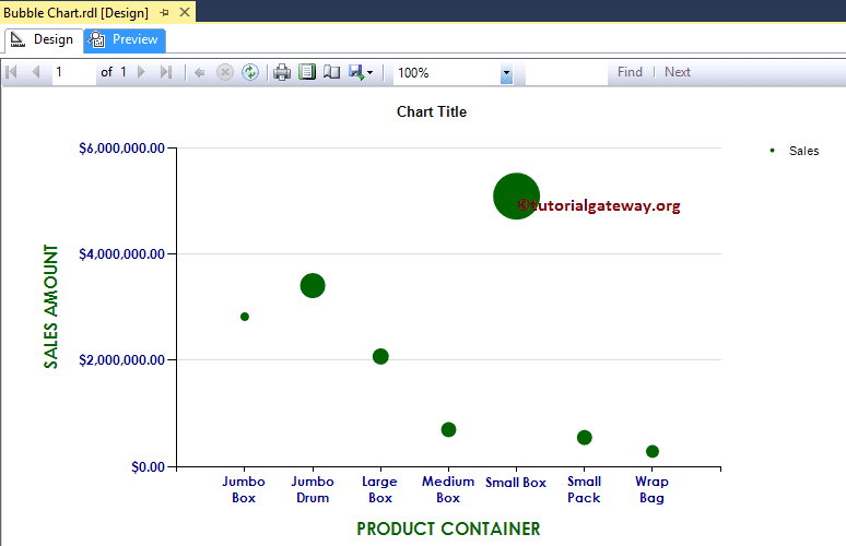
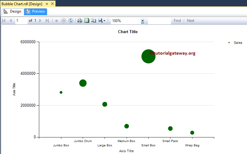
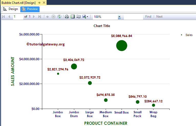
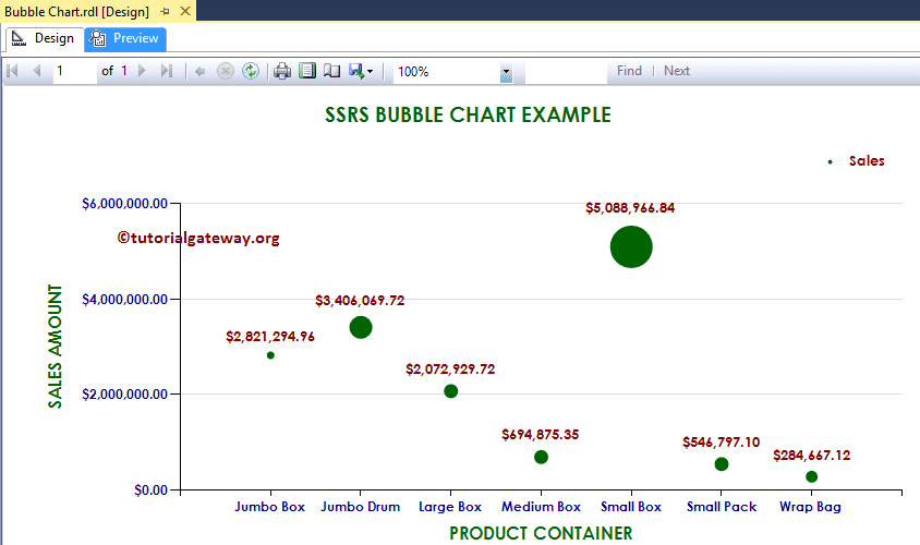
If you observe the above screenshot, It is providing a perfect result, but we are unable to identify the exact Sales. So, let us add the Data Labels.
Add Data Labels to Bubble Chart in SSRS
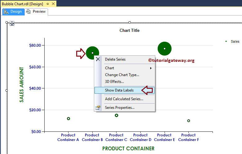
To add text or data labels to bubble chart, Right-click on the Bubbles, and select the Show Data Labels option from the menu to show the values
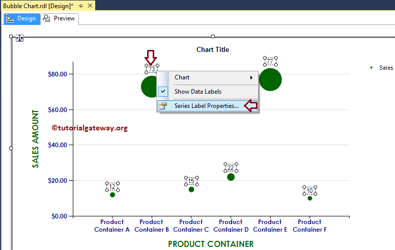
Next, let me format the Font of Data Labels. To do so, Please select the Data labels, and right-click on it will open the context menu. Next, please select the Series Label Properties option from it.
Here we are changing the font to Century Gothic, font size to 10pt, font color to Maroon, and style to Bold
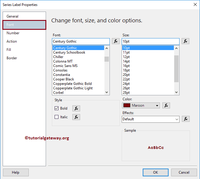
Next, format the Numbers to Currency by selecting the Number tab.
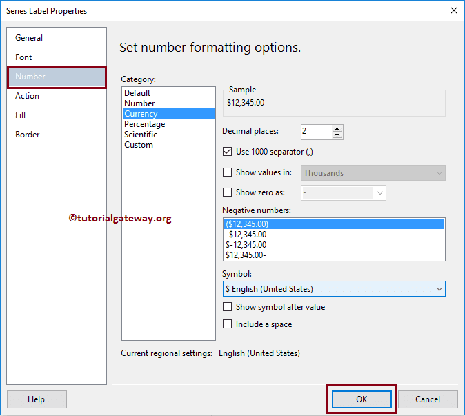
Click on the Preview tab to see the report preview
Change SSRS Bubble Chart Title
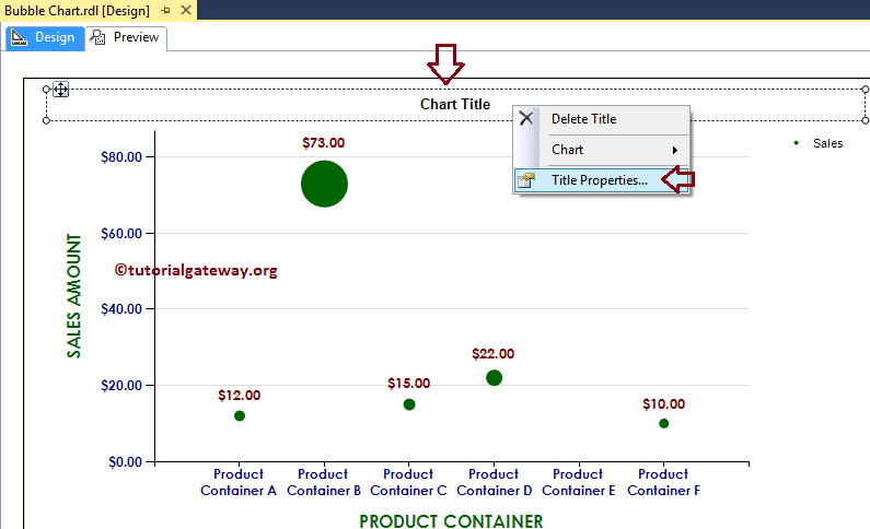
To change the title of the SSRS bubble chart, Please select the Chart title region, and change the title as per your requirement. OR, right-click on it and select the Title properties..option from the context menu.
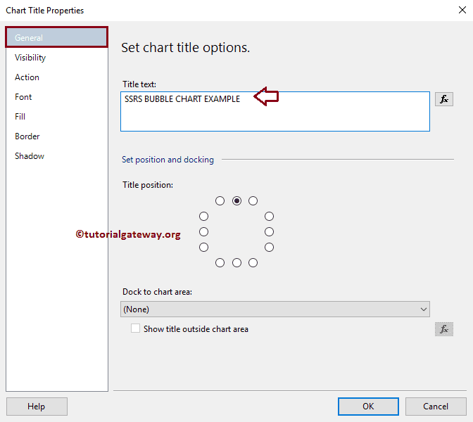
Here we are changing the title as Bubble Chart Example because the report is displaying the same
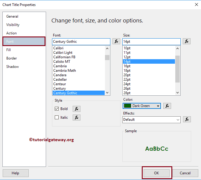
Format SSRS Bubble Chart Title Font
Within the Font tab, we can change the Font Size, Font Family, Font Style, and Color of a bubble chart Title. Here we are changing the Font to Century Gothic, Font size to 14pt, and color to Dark Green as shown in below screenshot
Format Legend of a Bubble Chart in SSRS
To format the SSRS Bubble Chart Legend region, Please Select the Legend region, and right-click on it will open the context menu. From the list, please select the Legend Properties option.
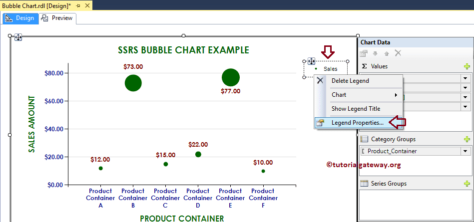
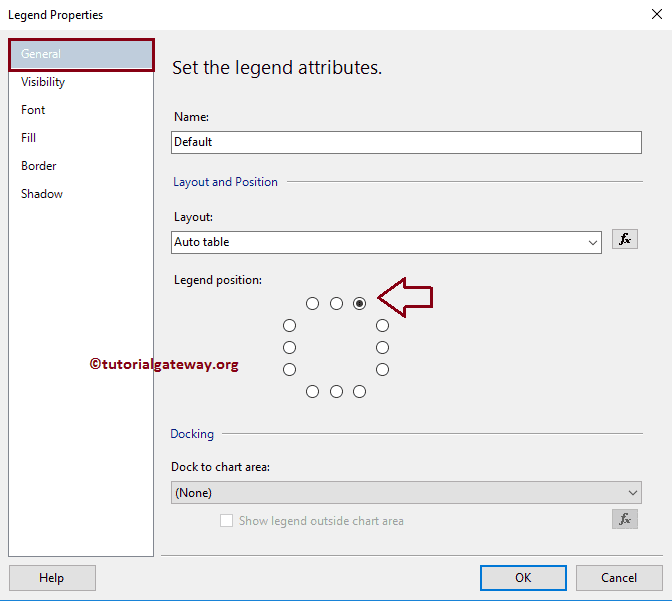
It will open a new window called the Legend Properties Window. Within the General Tab, we have an option called Legend Position. Use this to change the Legend Position by changing the dot positions. For now, we are changing the position to the top right corner.
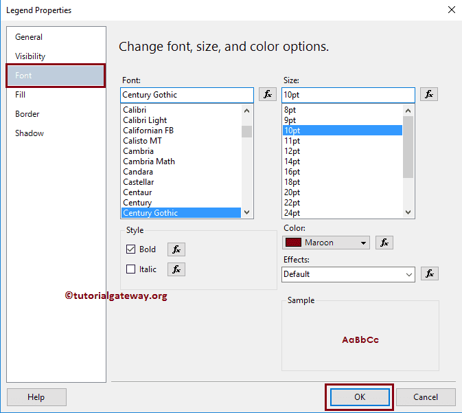
Next, Under the Font tab, we can change the Font style, size, and color of a Legend. For now, we are changing the Font to Century Gothic, Color to Maroon, Style to Bold, and Size to 10pt
Click OK button to close the Properties window. And hit the preview tab to see the SSRS bubble chart report preview
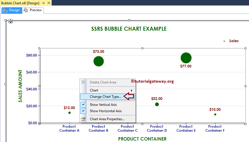
Convert 2D Bubble Chart to 3D Bubble Chart in SSRS
SSRS allows us to change the chart type even after creating a Bubble Chart. To do so First, select the Bubble Chart, and right-click on it to select the Change Chart Type… option from the context menu
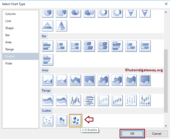
Once you select the Change Chart Type… option, it will open a new window called Select Chart Type to select the change. Here we are selecting the 3D Bubble Chart
Click on the preview tab to see the 3d bubble chart in SSRS report preview
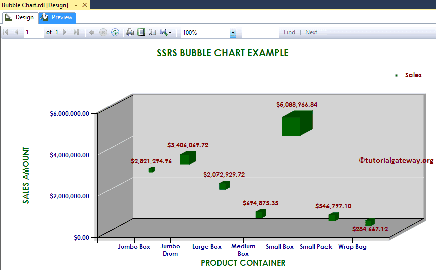
From the above screenshot, you can observe that we successfully changed the Chart Type from 2D Bubble Chart to 3D Bubble Chart in SSRS.