This Tableau article shows how to create a sunburst chart using the Dual axis approach, MAKEPOINT function, and map with an example. We used FactInternetSales, DimCustomer, DimGeography, and DimSalesTerritory Tables for this demo.
Create a Tableau Sunburst Chart
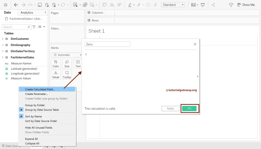
To create a Tableau Sunburst Chart, right-click the Empty space and select the Create Calculated Field.. option, which will open the below-shown window. Let me rename it as Zero and 0 as the value. Then, please refer to the Calculated Field article in Tableau.
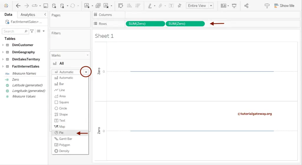
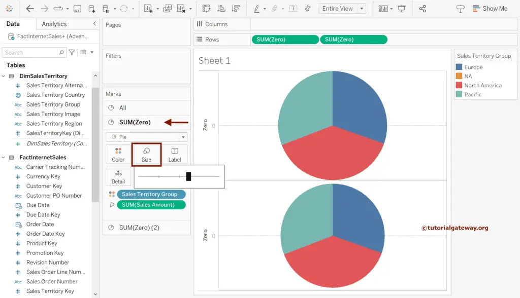
Add the Zero calculated field twice to the Rows shelf, and change the Marks from Automatic to Pie Chart. Remember to change the All section; otherwise, change Marks for both SUM(Zero) and SUM(Zero)(2).
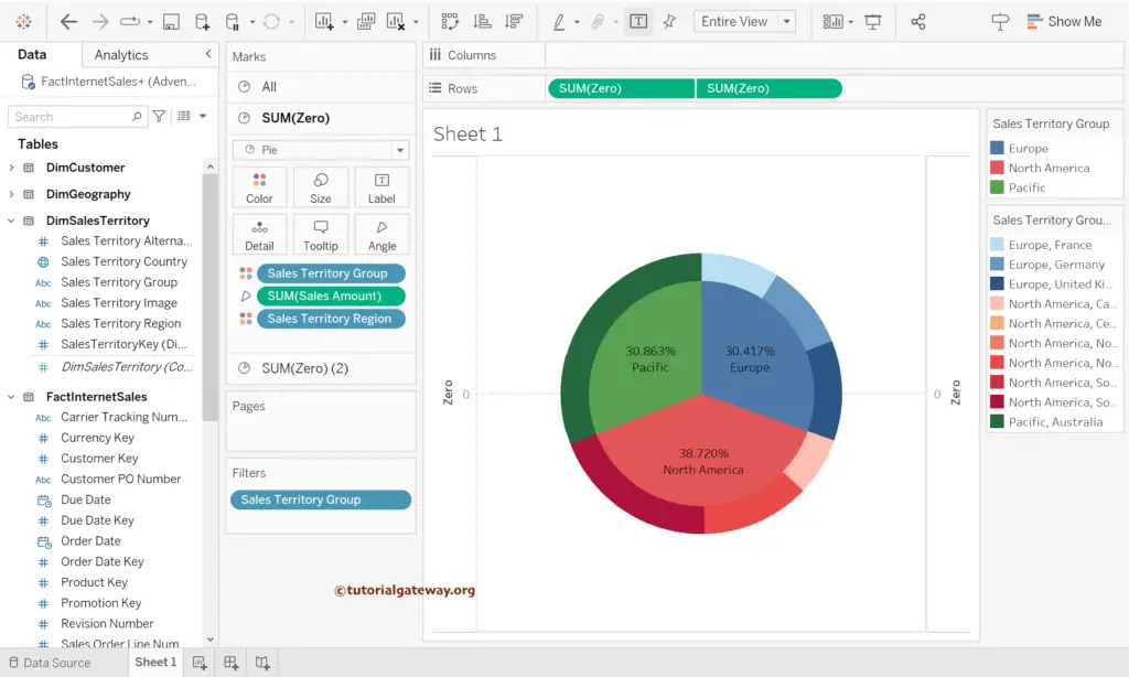
Choose an individual section of SUM(Zero) and SUM(Zero)(2) and add Sales Territory Group to the Color shelf and Sum of Sales Amount to Angle.
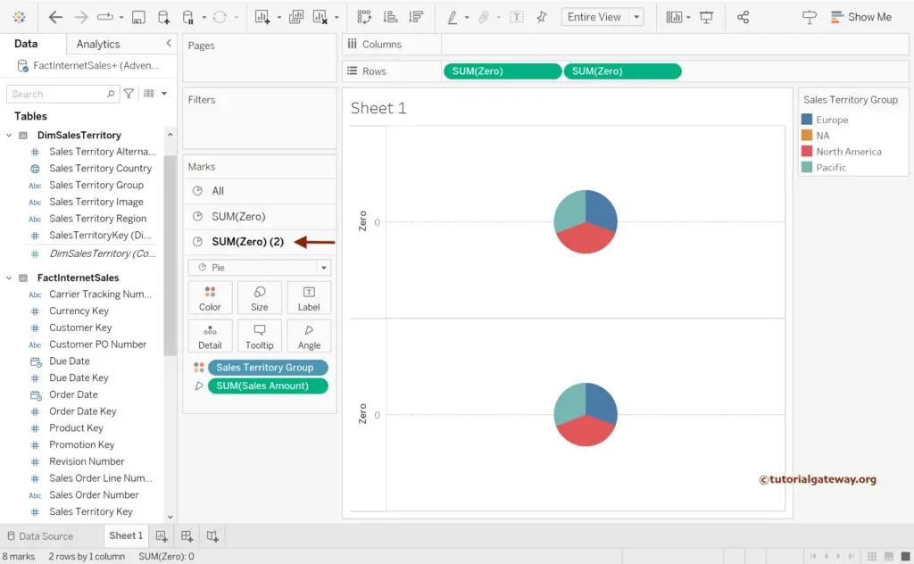
Use the Size shelf to change or increase the size of a Pie chart.
Under the SUM(Zero)(2) section, add Sales Amount and Territory Group to the Label shelf. Next, click on Sales to add Quick Table Calculation as the Percentage of Total.
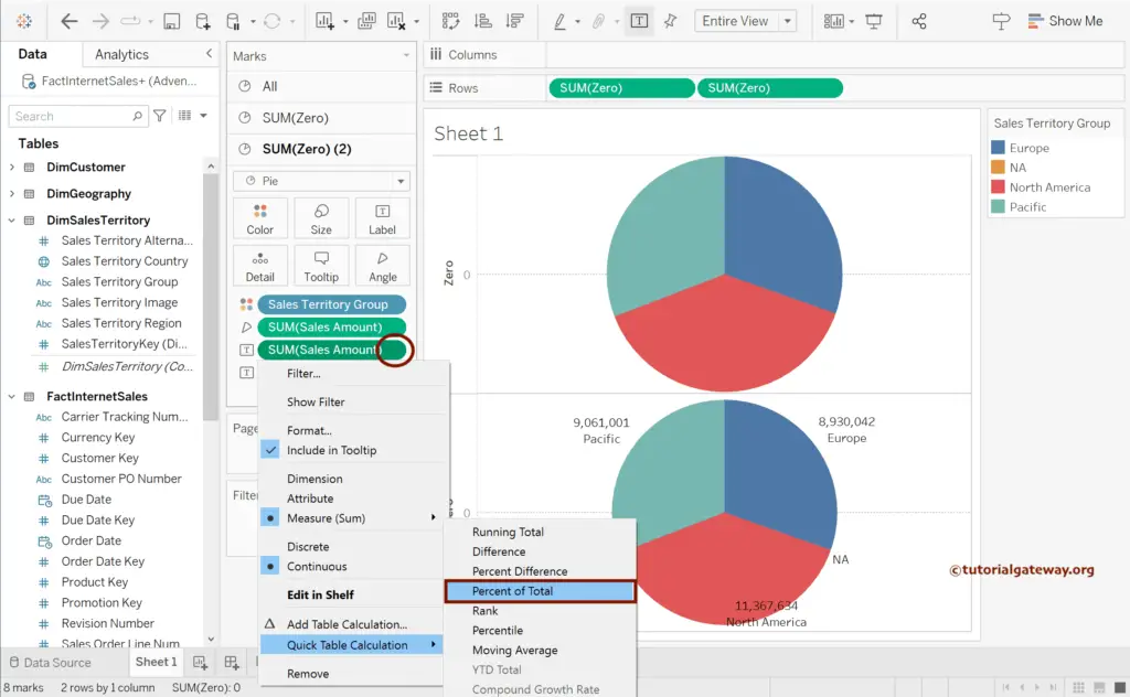
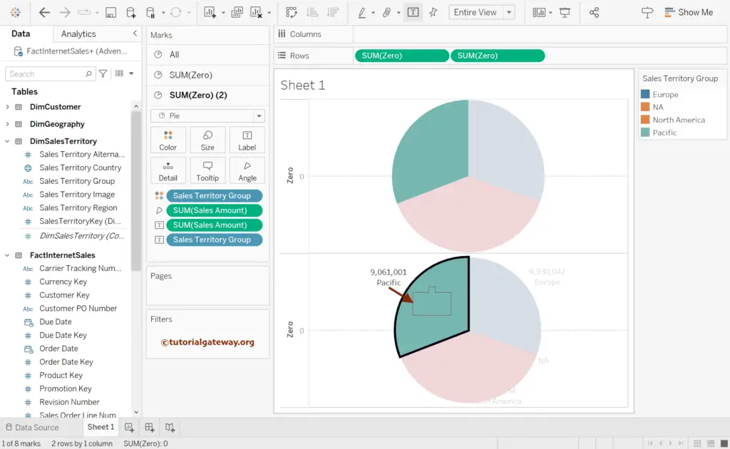
Select each label and drag them to the middle of each pie for Tableau Sunburst Chart.
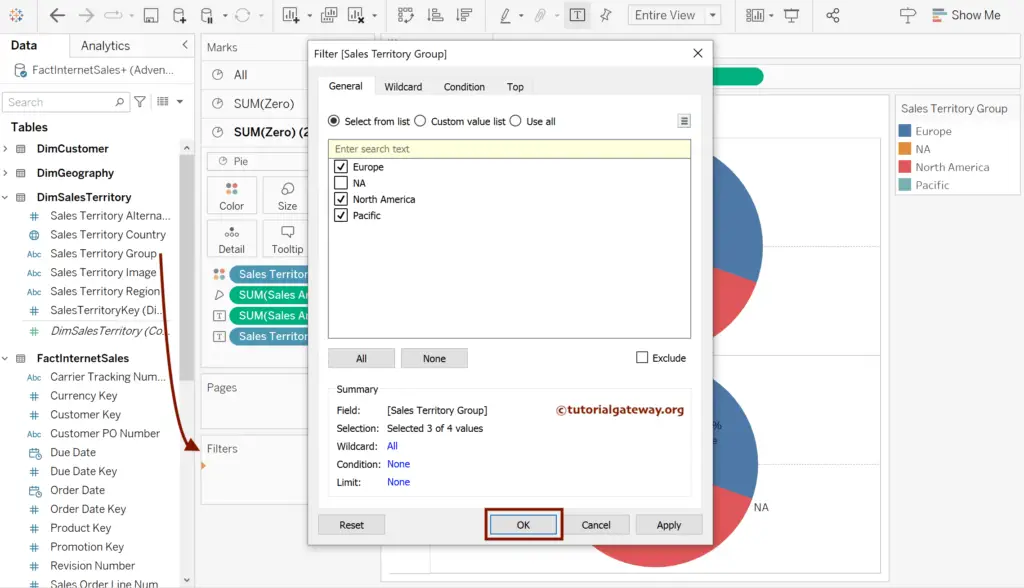
Drag the Sales Territory Group to the Filters shelf and uncheck the NA from the list.
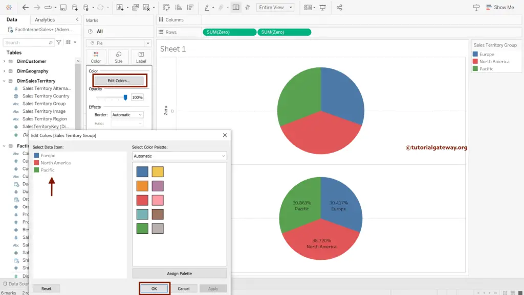
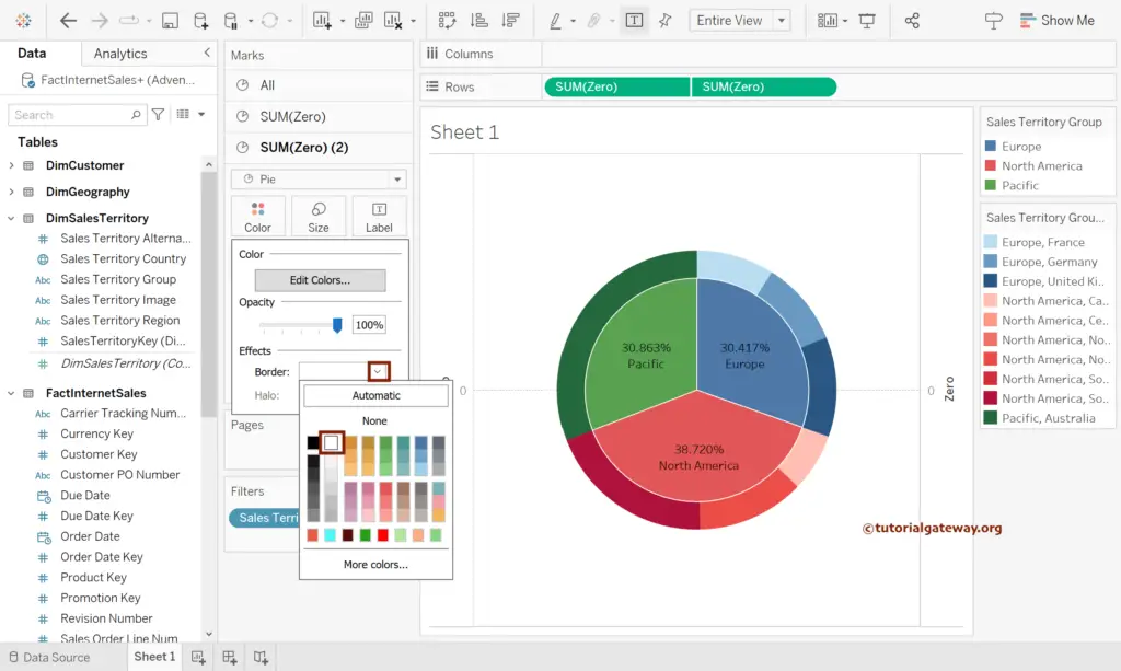
Adjust the Colors of each pie for Tableau Sunburst Chart.
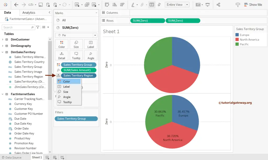
Under the SUM(Zero) section, add Sales Territory Region to the Detail shelf.
Next, click on the Detail icon and change it to Color.
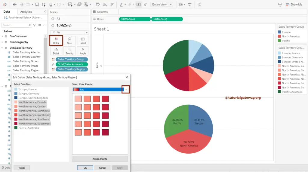
Click the SUM(Zero) Color shelf and match the colors of each Region to the corresponding group.
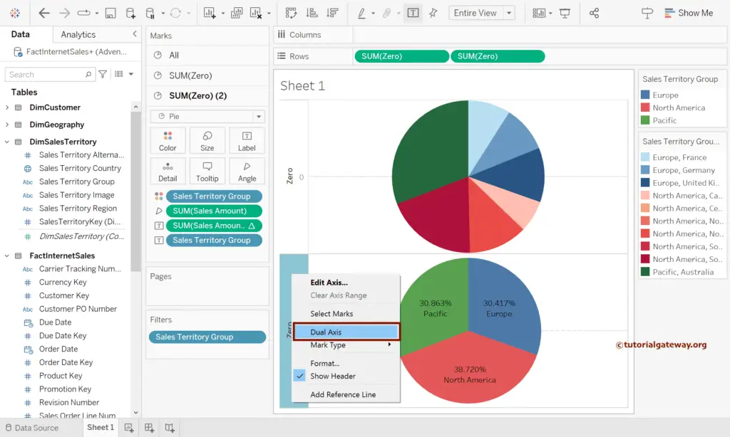
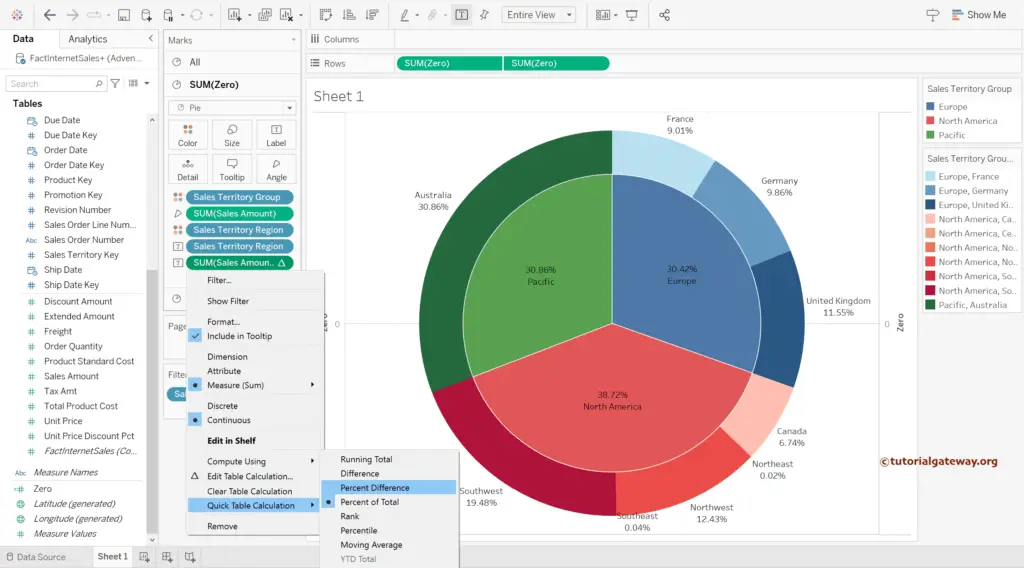
Right-Click the second Axis and choose the Dual Axis option.
Now, you can see the Tableau sunburst chart.
Formatting
Add Borders to Sales Territory Group in Tableau Sunburst Chart.
Add the Sales Amount and Sales Territory Region to SUM(Zero) Label shelf. Next, click on Sales to add Quick Table Calculation as the Percentage of Total.
Let me do some quick formatting to the Tableau sunburst chart.
- Right-Click on the Zero Axis and uncheck the Show Header option.
- Go to Formatting Menu -> Format Lines -> Set Zero Lines to None.
- Click the A button and change the Font of a Worksheet.
- Double-click the Tooltip under the All section and remove the Zero from the Tooltip.
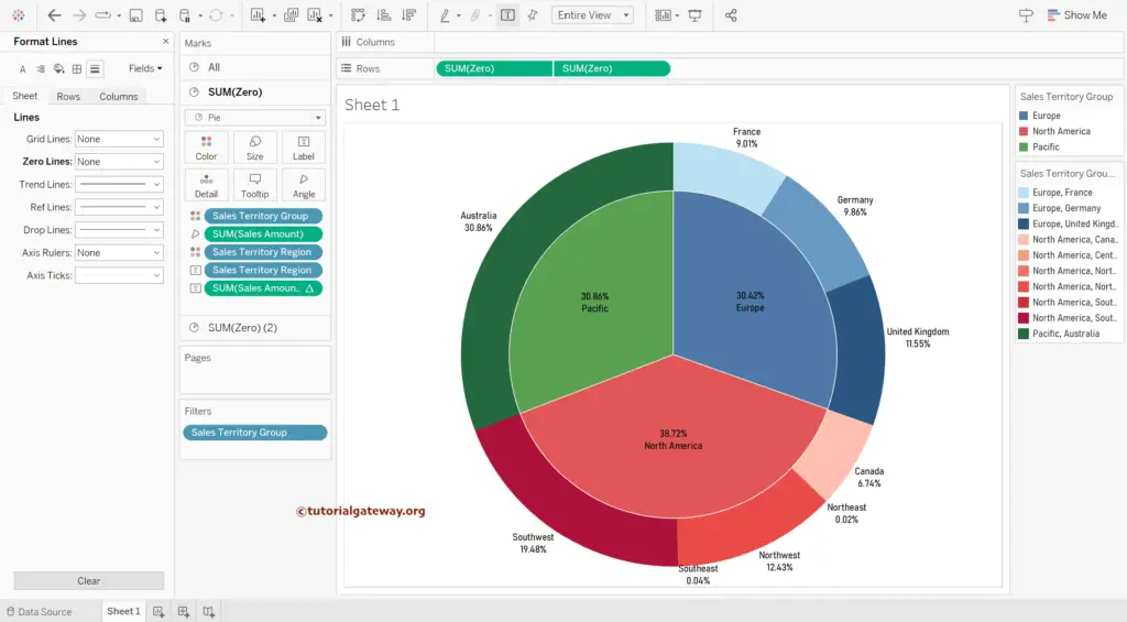
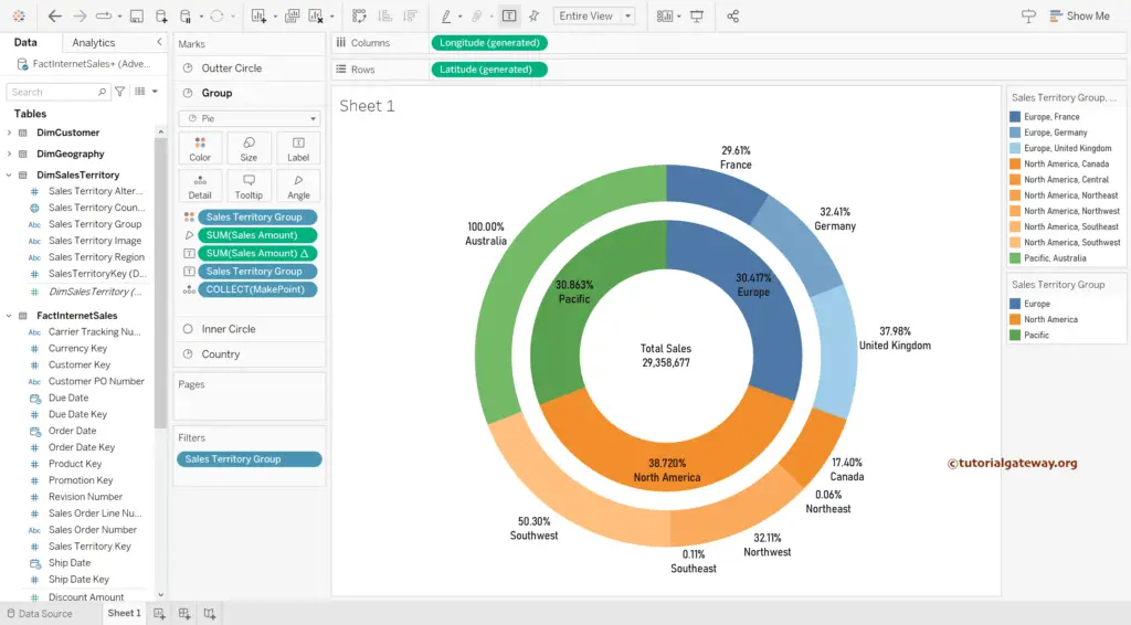
Tableau Sunburst Chart using Maps
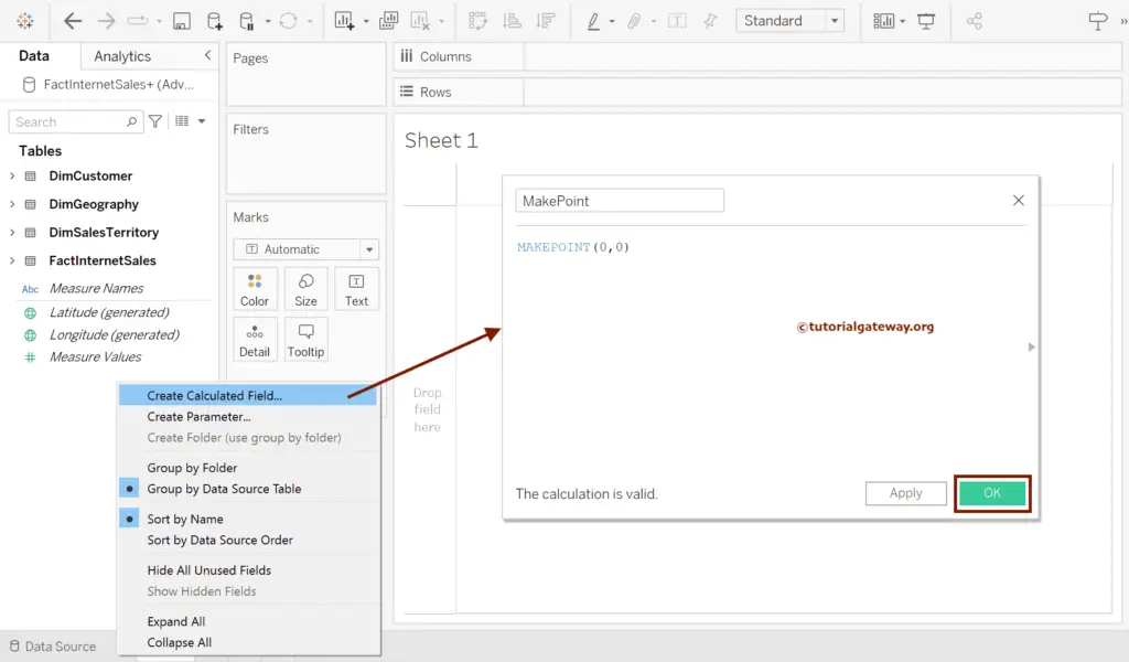
This Tableau section shows how to create a sunburst chart using the MAKEPOINT function and maps with an example. We used DimCustomer, DimGeography, DimSalesTerritory, and FactInternetSales Tables for this demo.
Right-click the Empty space and choose the Create Calculated Field.. option will open the following window. Let me rename it and add MAKEPOINT(0, 0) as the value.
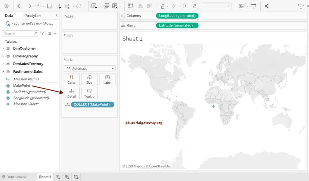
Double-click on the Makepoint field or add it to the Details shelf to create a Map with auto-generated Latitude and Longitude.
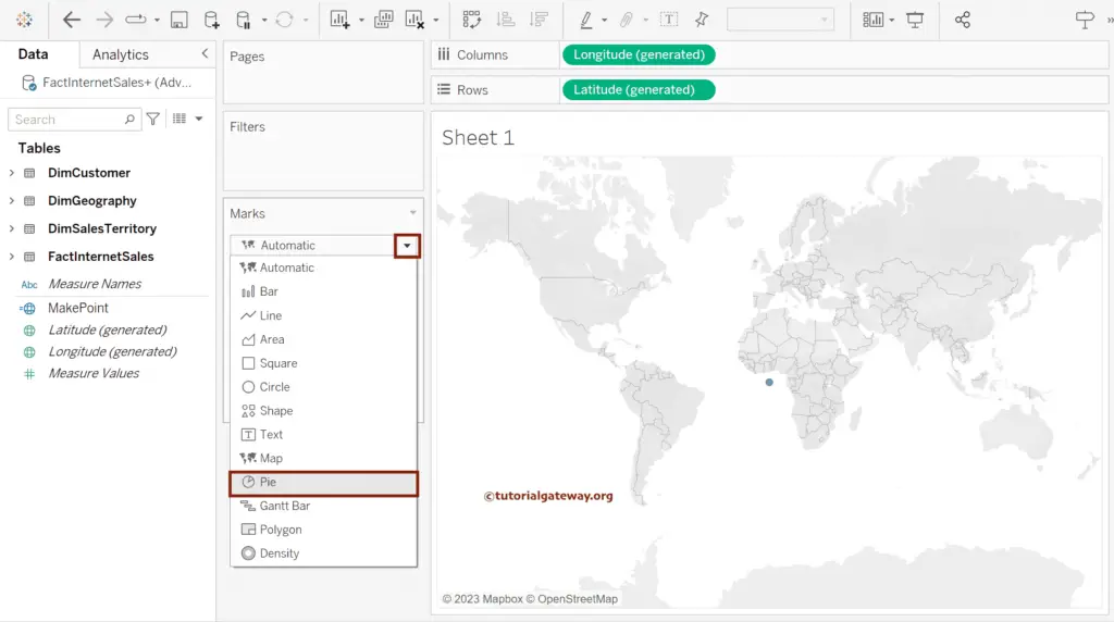
Next, change the Markstype from Automatic to Pie Chart.
Use Control + Shift + b to increase the size of a circle. Then, add Sales Territory Group to Color and Sum of Sales Amount to Angle shelf.
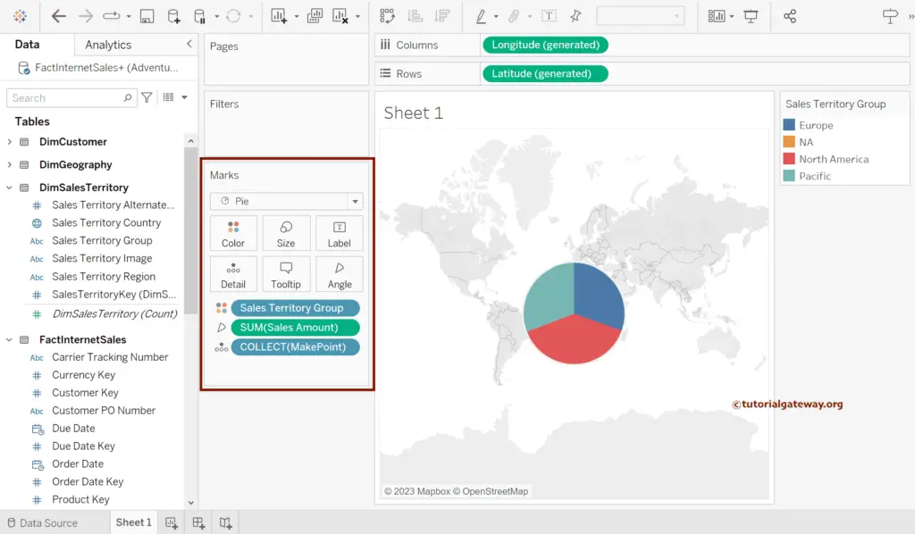
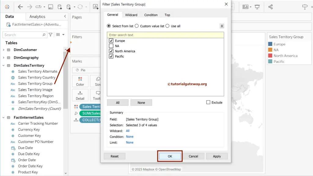
Add Sales Territory Group to Filters and uncheck the NA from the list.
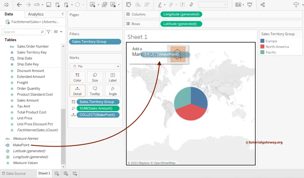
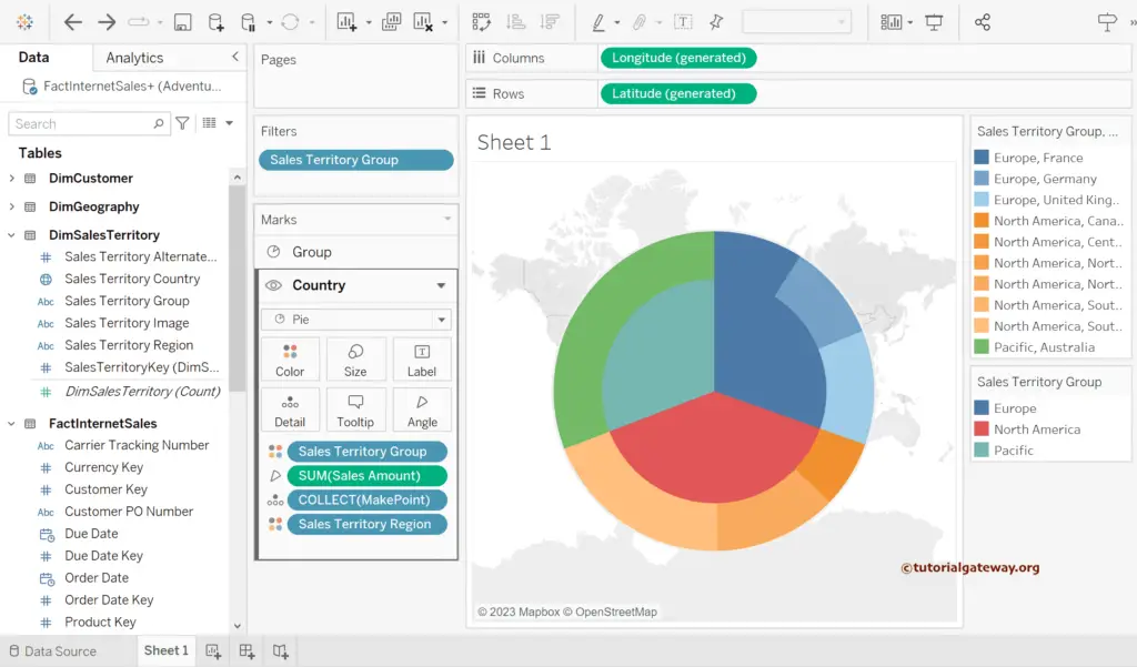
Drag and drop the MakePoint field to Marks Layer to create another Pie.
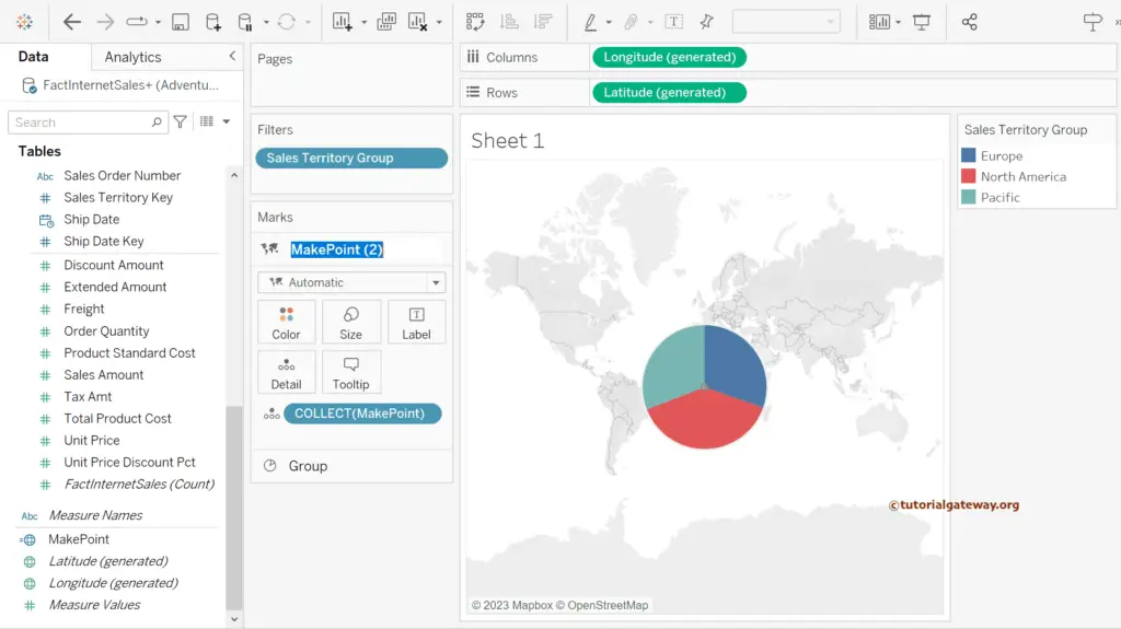
You can see the small grey circle in the middle of the Pie chart. Let me rename it as Country and the Pie chart as Group.
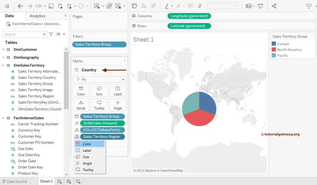
Choose the Country section and add Sales Territory Group to Color, Sum of Sales Amount to Angle, and Sales Territory Region to Details shelf. Next, convert the Region from Detail to Color.
Rearrange layers by dragging Group to the Top, or click the down button and select move down. Here, we moved the territory group on Top of the Country and saw the Tableau Sunburst Chart.
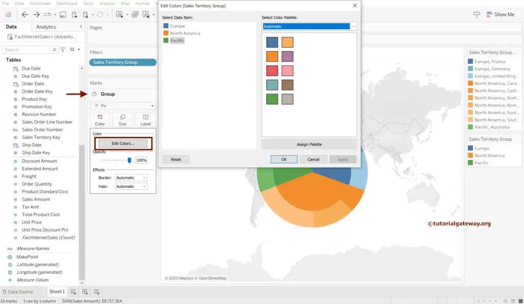
Edit the Colors of the Sunburst Pie Chart under the Group section.
Drag and drop MakePoint to Marks Layer two times and rename them Inner and Outer Circle. These two help create white color rings.
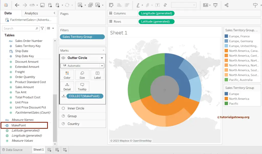
Drag the Inner Circle Layer in-between the Ground Country, change the Marks type to Circle, Color to White, and adjust the size.
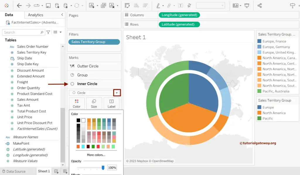
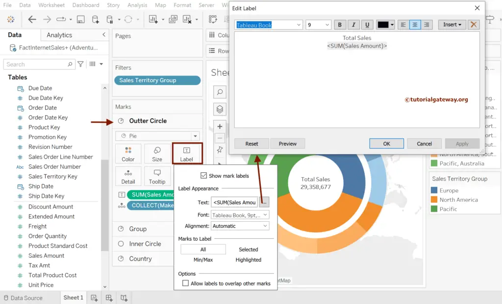
Change the Outer Circle type to Pie and add Sales to the Label shelf. Next, Click the Label shelf and format the labels.
Formatting Tableau sunburst Chart Colors
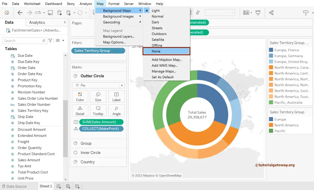
Go to Maps -> Background Maps -> None.
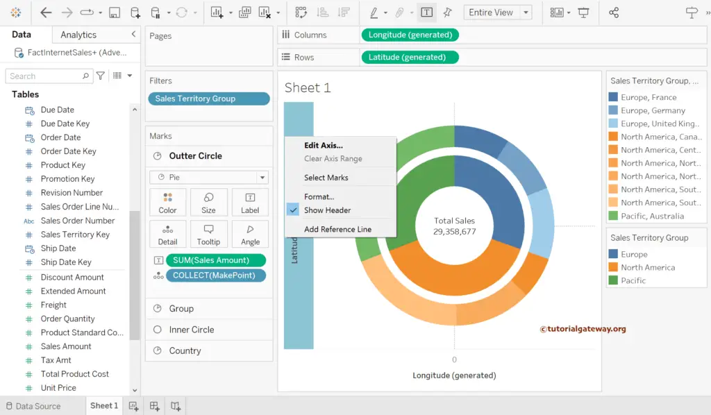
Right-Click on the Latitude Axis and uncheck the Show Header option.
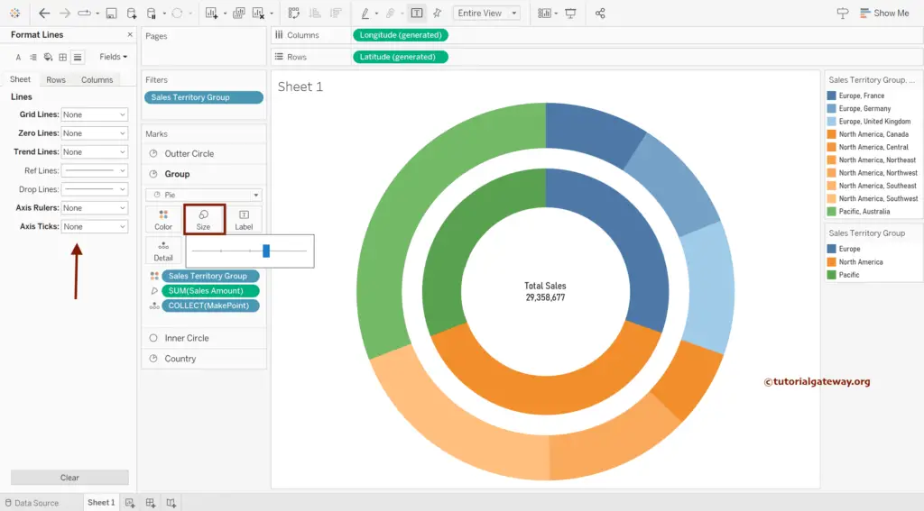
Use the Size shelf to change the size of each circle of the Tableau sunburst chart using Maps and Makepoint. Next, format the font and remove the Grid Lines, Zero Lines, and Axis Rulers.
Under the Group section, add Sales Amount and Sales Territory Group to the Label shelf. Next, click on Sales to add Quick Table Calculation as the Percentage of Total.
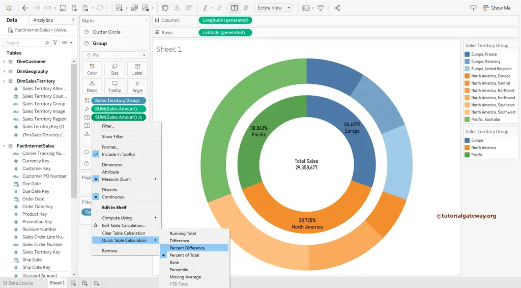
Similarly, add Sales and Territory Group to the Label shelf under the Country section. Next, click on Sales to add Quick Table Calculation as the Percentage of Total for the Tableau Sunburst Chart using Maps.