
Tableau is the leading business intelligence tool available in the current market. The first section of the Tableau Tutorial for beginners will show you the step-by-step process of connecting with different data sources. The next section of this Tableau tutorial helps to learn to create data visualizations like tables, charts, maps, dashboards, and stories with screenshots.
Using this Tableau Desktop, you can create visually rich and meaningful reports, and the tutorial gateway covers all of them. These reports tell you the story about your organization or business, perhaps the data you provide. In addition, it has a simple drag and drops features to design vivant reports.
Although it is the most powerful reporting tool, you can easily learn the Tableau tutorial in 28 days (Maximum). We provide links with examples to each topic present in the Tableau Desktop on this tutorial page.
The best way to learn tableau tutorials online is to practice every data analysis yourself. If you practice multiple times, you can master this data visualization tool.
What is Tableau?
Tableau is a Windows Application available in both Professional and Personal Versions. It has data connectors that differentiate both because the Professional version supports more data sources than the Personal.
This Tableau software is the most intelligent bi tool available in the current market, and this tutorial for beginners helps you learn quickly. It allows the data analysts to design Charts, Maps, Tabular and Matrix reports, Stories, and Dashboards without technical knowledge with a simple drag-and-drop functionality.
Tableau can connect to many data sources, from traditional Excel, text, CSV files, etc., to advanced databases, including Microsoft Azura, SQL Server, Access, Analysis Service, Analytics, SalesForce, Oracle, SAP, Teradata, etc.
Tableau allows you to find data insights and answers to questions, and it also allows you to tell a story about the business.
You don’t need any programming knowledge or coding skills to learn tutorials or use the Tableau business intelligence tool. You may need data to analyze your business and the Desktop to create reports.
Tableau Tutorial for Beginners and Advanced
Tableau is one of the leading data visualization tools available for data scientists for data connectivity, data cleaning, and creating data visualization on complex data.
Desktop Introduction and Data Sources
The Tableau desktop connects to various Data sources or datasets such as Text Files, CSV, Excel, Databases, Data warehouses, Big Data, Cloud Data, and Cloud applications. So we start this Tableau tutorial section with steps to install it and connect it to the data source or data warehouse. Or connect different sets of data sources to the Desktop.
Tableau Reporting Tutorial
Learn everything about creating Basic Reports and the options for preparing the dataset and basic formatting.
Measures and Dimensions
By default, Tableau will divide the columns into Dimensions and Measures when you connect to any data source. In general, all the numerical columns are placed under the Measures pane. In contrast, the text columns or fields with categorical information are placed under the Dimensions pane.
Remember, you can drag the required field from Measure to Dimension or vice versa. Or right-click and select the Convert To Measure or Convert to Dimension option.
A simple example can be an Order ID or Employee ID. Tableau initially considers them as Measures, but you must drag them back to the Dimension pane.
Tableau Measure Names and Measure Values tutorial
By default, Measure Names hold the dimensions, and the Measure Values contain your data’s Measures. For instance, add Profit and Sales measures to the Rows shelf and a country field to the column shelf.
In the above scenario, the aggregated values of measures (AGG(Sales) and AGG(Profit)) will show up under the Measures values and the actual measures (Profit and Sales) under the Tableau Measure Names. Please refer to the Line chart to view this.
- Creating the first Report
- Data Labels
- Format Report Title
- Create Folders
- Sorting Data
- Add Totals, Sub Totals, and Grand Totals to Report
- Joining Tables
- Data Blending
- Table Report
- Crosstab Report
- Annotations
- How to Show or Hide Cards and Shelfs?
Tableau Tutorial on working with Data Visualization tool
This Tableau tutorial helps beginners prepare data for their sheets in an understandable format.
By creating parameterized Tableau reports, you can pass the control to end-users. For instance, there are 100 records in a report, and if we allow the user to enter his own value. Then, he might see 10 or 20 or all the 100 records by passing the parameter value.
- Creating and Removing Hierarchies
- Bins
- Parameters
- String Parameter
- Sets
- Combined Sets
- Grouping
- Unpivot Table Columns
- Pivot Table Columns
- String Concatenation
Tableau Tutorial on Charts
This tutorial section shows the charts available on the Tableau Desktop to create data visualization. The Formatting option article shows all the options to format the chart or table, including text, font, numbers, style, borders, background, etc.
- List of Charts
- Area Chart
- Bar Chart
- Box and Whisker Plot
- Bubble Chart
- Bump Chart
- Bullet Graph
- Butterfly Chart
- Circle Views
- Cumulative Histogram
- Donut Chart
- Dual Combination Chart
- Funnel Chart
- Gantt Chart
- Heat map
- Highlight Table
- Histogram
- Line Chart
- Lollipop
- Pareto Chart
- Pie Chart
- Scatter Plot
- Stacked Bar Chart
- Text Label
- Tree Map
- Word Cloud
- Waterfall Chart
Tableau Tutorial on Dual Axis Reports
The following Tableau tutorial for beginners section helps you learn advanced reports. For instance, If Columns Shelf has Country Dimension, and Rows Shelf has Sales and Product Cost Measures in your sheet.
For the default Tableau Bar chart, you can place one measure on the Rows shelf; please check its beginners tutorial. However, if you want to put multiple measures, then you have the following options to place measures on
- Individual Axis – Create an individual axis for each measure. The above scenario creates two bar charts, one with Country and Sales and the other with Country and Product Cost.
- Blended Axis – Blend the two Measures to share the same axis by both of them. The above scenario creates two side-by-side bar charts for two measures against the Country.
- Dual Axis Reports – Bend the measures and place both measures on the same axis. It paces the Country as the X-Axis and places Sales and Product Cost Measures on either side of the Y-Axis.
Tableau Reference Lines Tutorial
The Tableau Reference lines are helpful to mark the critical points within the chart or based on the axis, so learn the tutorial. For example, a bar chart shows the sales by region or product. If we add an average reference line to it, it will show each bar’s average point. By seeing the lines, we can identify whether the product is underperforming.
Learn Tableau Maps Tutorial
Nowadays, people extensively use maps to identify places or see information. Therefore, it will be wise to display our data in Tableau Basic and Symbol Maps, where the highest Sales, profit, or customer base is with dark color, etc. The best part of this application is using Google Maps to represent the spatial data.
Suppose your Tableau data doesn’t have latitude and longitude details but includes the geographic fields with the globe icon, including country, state, province, city, or postal codes. It uses that information and automatically generates the latitude and longitude by considering the center points.
Tableau Dashboard Tutorial
A dashboard is a combination of multiple sheets shown on a single page. Within this, one can view a wide variety of information or different analytics. By seeing a dashboard, one can easily monitor the business workflow.
As the name suggests, A story may contain a series of dashboards or sheets to convey business information.
Learn Tableau stories and Dashboards for data visual analytics tutorial training.
Tableau Action Filters tutorial
This section covers the list of supporting action and regular filters with a real-time example of each filter to learn. Learn about these Tableau Action Filters and calculations.
- Action Filters
- Highlight Action
- Go To Sheet Action
- Go to URL Action
- Guide to Normal Filters Introduction, Conditional Filters, and Context Filters. For all the remaining filters, please visit the Filters introduction article.
Tableau Table Calculations tutorial
Tableau Calculated Fields allows you to create a new field based on the existing data and some built-in functions, and this beginner’s tutorial covered all of them.
The Table calculations are pre-defined to find the moving average, running total, running difference, etc. The following are some table calculations performed on the measures to achieve our business objective.
- Calculated Fields
- Create Table Calculations
- Cumulative Sum
- Calculate Rank – The Best Way
- Quick Table Calculations
- Running Total
- Moving Average
- Percentage Of Total
- Percentage Difference
- YTD Table Calculations
Learn Tableau Built-in Functions
Like any server, it provides various built-in functions for numeric data, string columns, or dates. It also has the If else and case statements to create complex expressions. We must create a calculated field to create or work with all the following functions.
This section of the Tableau tutorial explains the list of available built-in standard functions to use in data visualization and learning.
- Case Function
- If, If Else, and Else If
- Please refer to the Introduction to Functions article for all the remaining functions, including Logical, Math, String, Table, Type Conversion, Date, and Aggregate Functions.
Tableau Products Tutorial
We can divide the products into two types
- Developer Tools – Tableau Desktop and Public
- Sharing Tools – Tableau Server, Online, Reader.
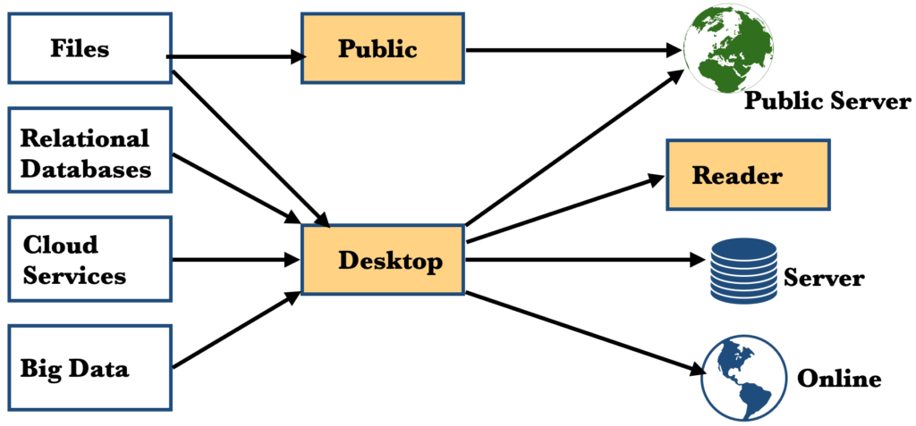
Tableau Desktop
The Tableau Personal edition lets you share your tutorial workbooks with the Public. The main advantage is the cost-effectiveness of working with Excel, Access, text, spacial files, etc.
With Profession, you can share Tableau tutorial reports with the Server and the Public. If you want to connect to databases or a wide variety of data sources and want to publish or distribute your workbooks to the server, use the Professional.
Both versions allow you to create workbooks that contain sheets (reports), dashboards, and stories.
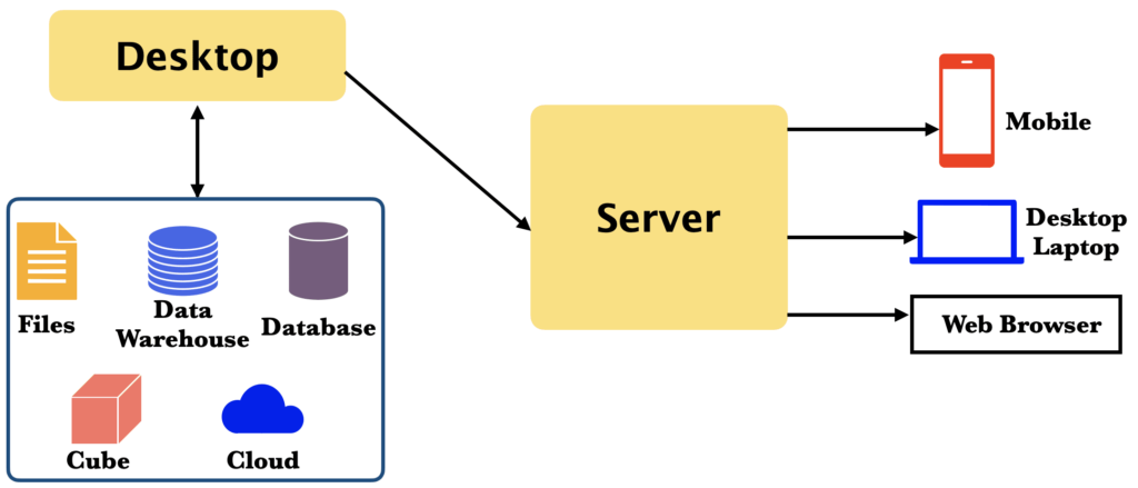
Tableau Server
It will be hosted within the organization’s premises. Use the server to deploy reports; you can share those data analytics across the organization.
We can publish the required workbooks to this Tableau server using the Desktop so that all the users with the required permissions can access that tutorial report. You can control who can View, Interact, and Edit within the permissions section.
It allows the users to ask questions and get answers from the published data source. For instance, when you type the Sum of Sales Vs. Profit question generates a report.
The administrators can view the performance. Users with administrator access can edit/alter the existing Visualization or create a new report using the web browser.
This Tableau server has the option to create subscriptions. With this option, subscribers get an email notification when an update is in the published report.
Compared to Online, it is more secure because it resides within the company firewall, which provides extra security. In some scenarios, you can also host it in a cloud such as Google Cloud, Azura, and AWS.
Tableau Online
A cloud-based platform allows us to distribute, share, and collaborate on dashboards in a secure environment. Tableau or a third-party partner maintains the cloud network performance.
All the reports will be hosted in the cloud, and users with permissions can view them. However, it means all the users who want to access it must have a service license. So, there is no guest access to the online server.
Tableau Workbooks published online must use the Data Extract option, which must be refreshed regularly.
Dashboard starters enable you to connect to popular web applications and help you create pre-defined dashboards seamlessly.
Tableau Reader
It’s an entirely free product. The reader allows one to view and interact with the reports generated by licensed users. For example, you can view and interact with twbx workbook files developed by other users on a Desktop. However, you have no permission to modify workbooks.
Tableau Mobile
It allows access to reports on mobile devices and supports Android and IOS devices.
Tableau Public
Free Product. So, It has a very limited number of data connectors. However, you can use this one if you have the Excel or text files to analyze. Also, restrict the number of rows you can use, and the storage space is limited.
Unlike Reader, it allows you to develop reports. However, all the workbooks created by this product will be saved to the Public cloud. Tableau Public allows you to see all the Visualizations made by the community people across the world. And you can find all the data analytics you might need for your organization.
The best part is that you can download any chart and twist or change it per your needs. Overall, it is best suitable to get hands-on experience with the product.
Tableau Public Premium
It is an annual subscription-based service that helps or prevents saving the work to the public.
Tableau Prep
Regarding data analytics, preparing data is a significant task, as far as I know. Because if your data is more polished or clean, it is a matter of time to get all the charts your business needs the most.
The introduction of Tableau Prep has completely removed the problem you might face in preparing your data. Especially if you are a non-technical user, you can prepare your data by dragging and dropping the required fields.
The following are some of the important features of the Tableau Prep.
- It enables you to connect to the data you need and combine data from multiple sources by dragging them. On the bottom pane, you can see the actual data.
- It will automatically perform joins on the tables that we drag in. You can also create calculated fields to perform complex operations and view the result.
- The best part is that you can remove the unwanted columns or filter the data, combine them, and create new fields using existing data (calculated fields).
- You can view this prepared data on the Tableau Desktop. You can also create reports using this data.
- Share your data by publishing it to the server and allowing others within the organization to slice and dice it. You can also schedule, manage, and monitor the data flows across the organization.
Why Tableau?
The three most important things that make a business intelligence tool stand out are security, ease of use, and connection to many data sources. Tableau has all three qualities and many more. The following are some of them.
- With the click of a mouse, it connects with a wide variety of data sources hassle-free.
- It supports all kinds of charts that are useful for business decisions.
- Easy for non-technical users to create a visualization. Simply selecting the required chart from the Show Me window will generate the chart for you. Or, drag and drop fields to Rows and Columns shelves.
- Tableau supports live and in-house data; this tutorial will teach you everything.
- It has trends, statistical summaries, and forecasts to help you understand the patterns in your data.
- You can seamlessly share your work and reports across the organization or worldwide.
- Secured environment to access reports on the server or cloud.
- Access reports from a Web browser, Mobile phone (both IOS and Android), and Tablet.
- Dashboards show all the information to understand the business and the ability to make decisions quickly.
- Its Performance recorder built-in tool provides detailed information about workbook performance. That includes connecting to data sources, query execution, data blending, Layout, etc. This Tableau summary report can analyze what took too long or where we can improve the performance.
- It keeps the audit information of every action we do in the interface. Because of this, when you make a mistake or make many unwanted changes, you can use the undo button or redo to get it to roll back to normal.
- It has a Duplicate Sheet option that allows you to duplicate the existing data analytics to an entirely new sheet.
File Types in Tableau?
The following are the supporting file types, and this Tableau tutorial article explains how to learn every one of them.
- Workbook – twb extension
- Packaged Workbook – twbx extension
- Data Source – tds
- Packaged Data Source – tdsx
- Bookmark -tbm
- Data Extract – tde
Workbook
Every Tableau workbook contains sheets (charts) and dashboards. That means it has all the information about the Visualizations or sheets we created, dimensions, and measures we used and applied.
It contains metadata about the connection to the data source but not the actual data. And it also stores the filters we used and the formatting applied to the charts.
Packaged Workbook
Tableau packaged workbook is a zip file combining the workbook twb file and the data source (actual data to work). So one can work with a twbx file even without the internet.
For instance, if you want to share a workbook with a person who doesn’t have access to the data source, you can send a twbx file because it consists of the actual data. If a person doesn’t have a Desktop license, they can view this twbx file in the reader.
Tableau Data Source
The tds file contains the data source connection information and the metadata. So, for example, if it is a text or Excel, it saves the file location. And if it is a database, then instance, port, server name, database, etc.
The Tableau Data Source also stores the information about the bins, sets, groups, and calculated fields we created. By default, the tds file is a part of the workbook but also saved separately to share this metadata with others. For instance, if you want to work with the same data source that has already been fine-tuned by creating bins, groups, and some calculated fields, save them as tds. It saves time, and you can use it at any time.
Packaged Data Source
This zip file contains all the tds file information and the actual files. For instance, our data source is an Excel file. Therefore, the tds file has the file location, whereas the tdsx has the actual Excel file and location information.
Tableau Bookmark
When sharing a single sheet or chart, you can save it as a bookmark. Or you can save the frequently used sheet as a snapshot. It is beneficial to share a sheet instead of a whole workbook.
You can save a worksheet as a bookmark by clicking the Windows Menu -> Bookmark option -> Create Bookmark. And one can access it from the exact location, just under the create sub-menu. The only limitation is that you can’t create a bookmark for a dashboard.
Data Extract
Tableau allows working with either static or live data. The live connection allows working with live or up-to-date data. By simply clicking the refresh button, you can see the updated records. So, if you want to work with a static version, you perform data extraction for that time interval or period.
On your Desktop, in the top right-hand corner, you can use the radio button to switch between Live and Extract. When you choose the Extract option, you are actually importing all the data into the data engine or in memory.
Data Extract uses
- It improves the performance because we work on a required subset of data. And it will also reduce the server load.
- Tableau provides data access even when offline because you can save them locally. When there is a situation where you don’t have the option to connect to live data, you can simply work with this extract.
- If your data source does not support the median and count calculated functions, use the Data Extract option to add them to extracted data by default.
Tableau Architecture
Data Layer
Tableau allows you to work with all varieties of data. You can work with databases, data warehouses, cubes, big data, Access, Excel, flat files, etc.
The best part is that you don’t have to bring all the data into the memory. Instead, you have the leverage to bring it when you needed.
Data Connectors
It has many built-in data connectors to work with all the major companies. That includes Microsoft SQL Server, Azura, Oracle, SalesForce, Teradata, Hadoop, etc. On top of this, Tableau supports the ODBC connection, which is the traditional connection string option for most Data sources. There are two options to connect with data.
- Live Data: With this option, you can send dynamic queries such as SQL or MDX to the database and get the aggregated information from it. It avoids importing all the data into memory, and if the backend database is fast, you can get performance advantages.
- Extract or in-memory: In a few steps, you can connect with any type of data, extract required records and bring it into the memory. Moreover, it has a fast database engine to get query responses.
Which Tableau Product is Best for You?
The answer relies on four key attributes.
- What Data Sources do you need to connect, or what kind of data do you want to use in your reports.?
- How do you want to use your workbooks?
- How do you like to share workbooks?
- Do your workbooks have to be updated automatically or on a scheduled basis?
- Are your reports limited to a few people within the organization or distributed worldwide on the cloud?
Tableau used in
- Education
- Finance
- Government Sector
- Hospitals
- Insurance Companies
- Law firms
- Military, etc.
What is Data Visualization?
Data Visualization is a graphical representation of the data or visual communication of data. Two important advantages are
- Data analysis – creating visual elements or data analytics, such as graphs, charts, etc., to understand the data.
- Visual communication with data (excel tables, text files, database tables).
Why Data Visualization?
The company generally asks questions by conducting surveys to know about its products. Or, they tend to see the long tables with aggregated information to understand the basics. However, using data visualization on historical data, they get all the necessary answers and raise many more questions for improvement.
There are many reasons for this, and the following are some of the many reasons to use Tableau data visualization.
- Understand the Business trends, such as Identifying the Sales of a particular product and finding low-performing goods.
- Identifying the area (Post Code, City, State, Country, etc.) where the company was getting more profits or orders.
- Find the correlation between the Sales and Profit or Product Manufacturing Cost vs. Sale Price.
- Understand the customer purchase patterns, including age, behavior, location, etc.
- Understand the Sales over the years by comparing this year with previous, monthly-based comparisons, and so on.
With the help of the above information, one can quickly identify the issues within the business. It also helps to make decisions without further damage or to improve sales. For example, when a company wants to introduce a new product, these data analytics help them understand customer behavior.
Apart from all the above, it is all about big data nowadays. It is humanly impossible to understand or make a business decision by seeing the trillions of records we get daily or hourly. What if we have the best data visualization tool like this one to generate good visuals?
Why is Tableau the best data visualization tool in 2024?
There are many data visualization tools available in the market. Still, Tableau and Power BI lead the race with a high customer base.
Tableau data visualizations tool helps create interactive data analytics using the data sources and share them online. The Desktop will help you develop sheets, charts, dashboards, and stories. And we can use them in the local system, or we have to publish them to the server.
We can distribute the interactive data visualizations online and access them from mobile, tab, or Desktop using Server. With the help of the server administrator, you can control the user roles, content access, etc.