
This article will show how to create Tableau reports in the new version using the Microsoft SQL Server database as a data source. For this report’s demo, we will use the Data connection we created in our previous article.
Please refer to Connecting to SQL Server article to understand the Data Source and the Tableau Dataset.
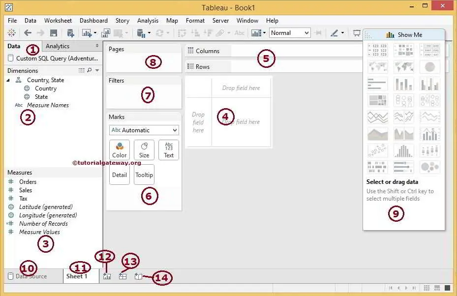
Before we start creating our first tableau report, Let us understand the different regions present in the Report Design.
- Data: This will display the list of currently connected data Sources. We have only one at this time. Otherwise, it shows all the data sources available.
- Dimensions: Within the reporting, place columns with string data under the Dimensions section
- Measures: Place columns with Numeric data or Metric values under the Measures section
- It is where we design our reports by dragging Measures and Dimensions.
- Columns or Rows: This is the region where we place the Measures and Dimensions as per our requirement.
- Marks: Using this section, we can change the color, size, and metric value. We can also add the Tooltip for the report.
- Filters: Place a field in this region to filter the reports.
- Pages: Tableau reports preview will be divided into different pages using the field placed in this Pages Card.
- Show Me: This region will show the Visualizations or Charts available for the given data.
- Data Source: This tab create a new Data Source or Edit the existing Data Source.
- Sheet 1: This is the sheet we are currently working on.
- This button creates a new Sheet for the Table report.
- This button will create a new Dashboard.
- Use this button to create a new Story.
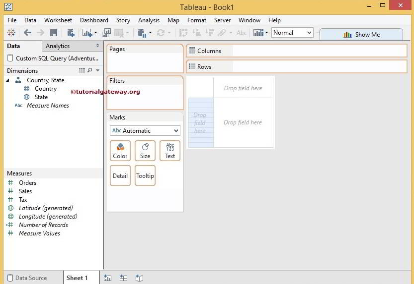
Placing Columns in Tableau Reports
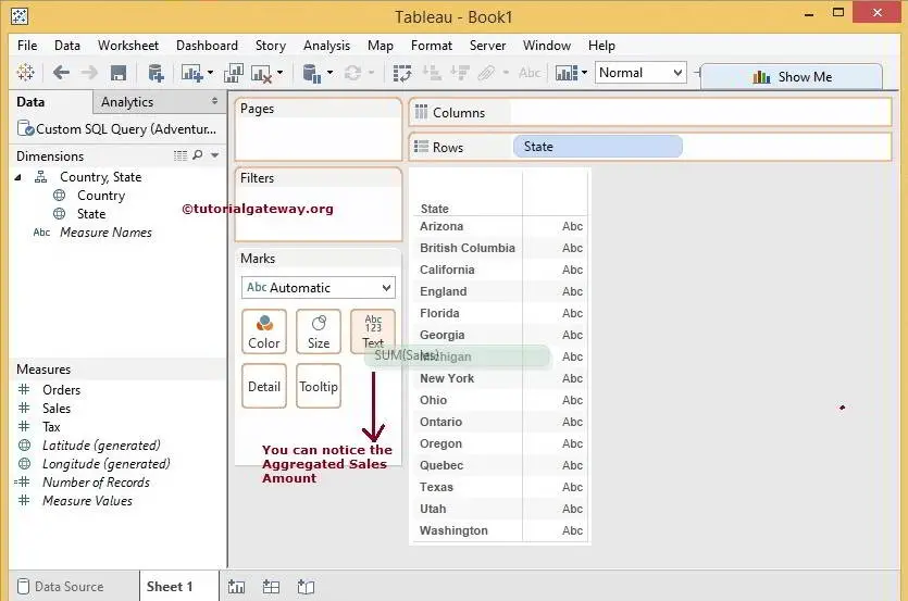
When we select the State column, all the available regions will highlight. It means we can put a state column in any of the highlighted areas. In this example, we are placing the State column in the Row section, and we can do it in two ways:
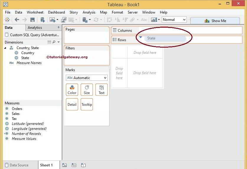
Method 1: Drag the State column from the Dimensions region to the Reports region. From the below screenshot, see that the Row field is highlighted with a blue color.
Method 2: Drag the State column from a Dimensions region to the Rows section. See that the Blue color down arrow indicates the position of the State dimension. Then, choose any of the methods.
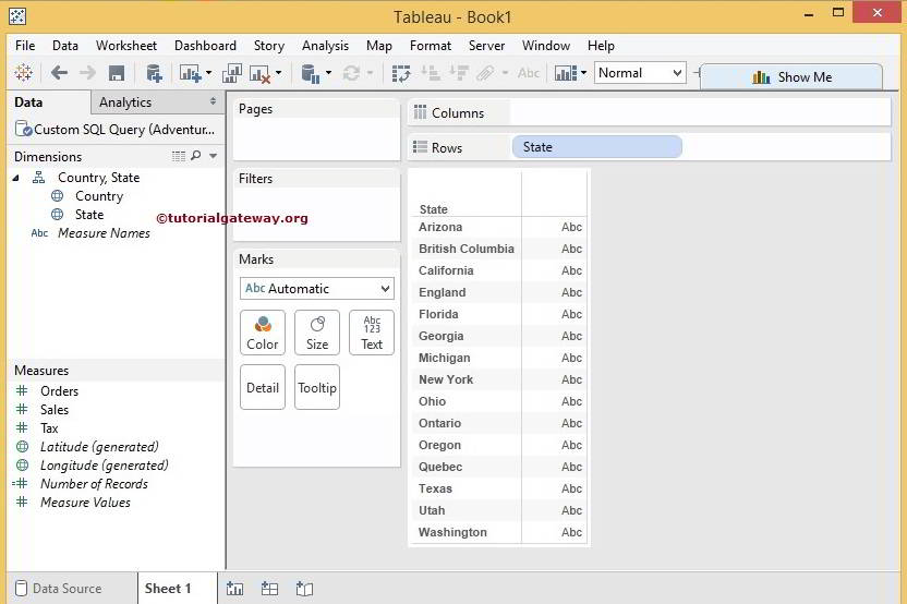
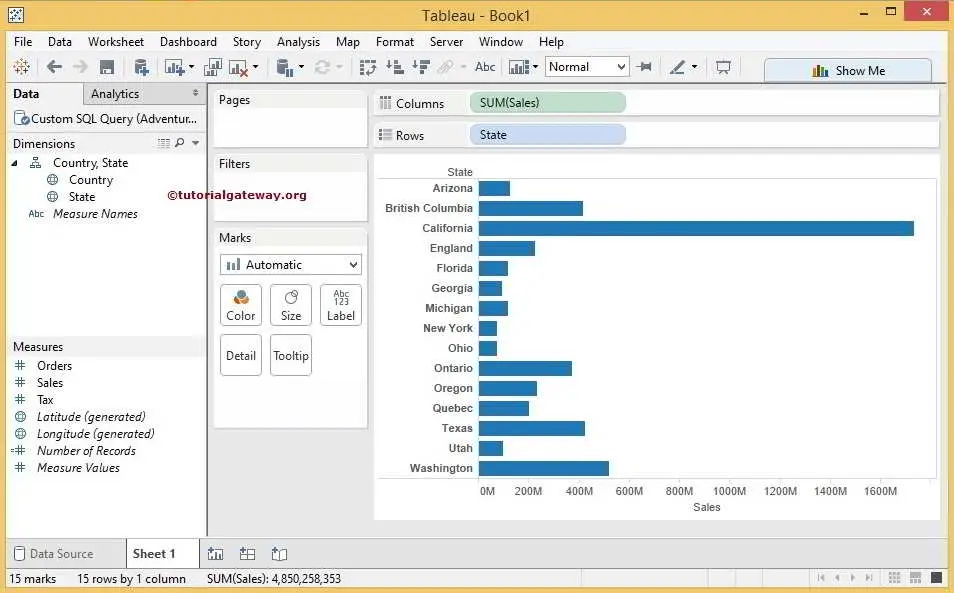
Once we placed the State column and Sales Metric values, the Report region shows the table report, as shown below.
Place Metric Values in tableau Report
Next, We have to add metric or numeric values to analyze, and we can do it in two ways:
Option1: Drag the Sales Measure from Measures Region to the Text area in the Marks region. From the below screenshot, see the Text area highlighted.
Option 2: Drag the Sales Measure from Measures Region to the report region. From the below screenshot, the Abc Row field border is highlighted with a solid black color and displays the Show Me text. Choose any of these options.
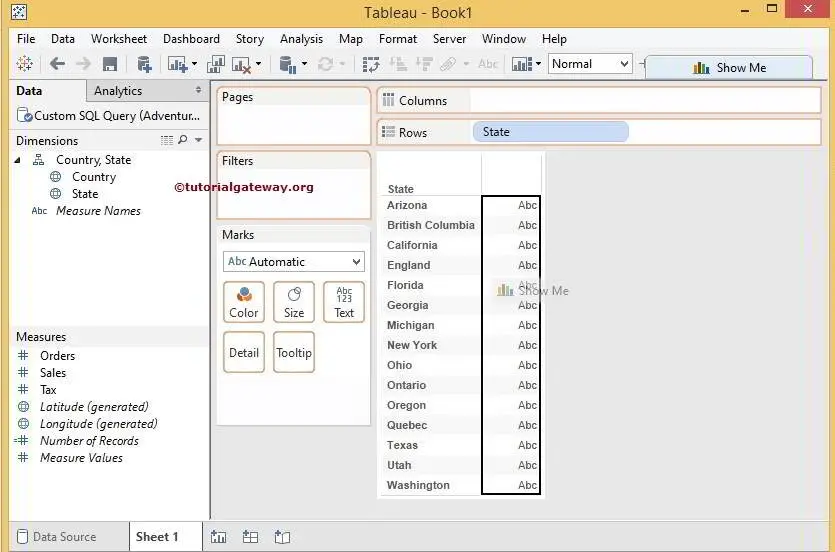
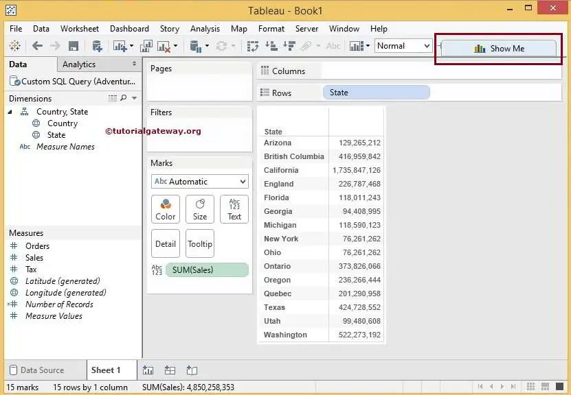
Once we placed the State column and Sales Metric values, the Report region shows the table report, as shown below.
Show Me in Tableau Report
Observe the upper right corner. There is a Show Me button, which is the most important and useful in Tableau. Alternatively, the Show Me button made the developer’s life easy. We will explore more in the upcoming articles, but please click on that button for now.
Once we click on the Show Me button, a drop-down window displays available Charts. Although there are many charts, only a few are active, and the remaining are Grayed-out because Desktop will analyze our table report and shows the possibilities. To demonstrate, we are selecting the Data bar as shown below
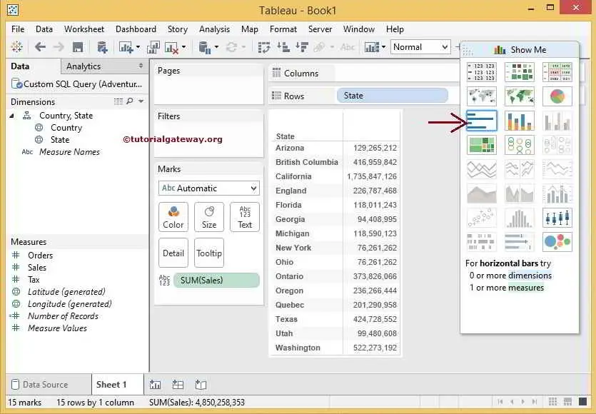
Once we select, Our table report will automatically be converted to the Data bar, as shown below.
Comments are closed.