Tableau Histogram visualizes the statistical information that is organized within the user-specified range. Although it looks like a Bar chart, a Histogram displays data in equal intervals. This article shows how to Create a Tableau Histogram chart with an example.
Tableau Histogram is a graphical representation of the distribution of quantitative data in a dataset. It arranges the numeric data on the X-axis with predefined sizes or intervals, known as bins, where each bin is equally sized. Histogram uses rectangle bars on the Y-axis to plot the continuous numerical data. Each rectangle bar in the histogram represents the count of data points (Measure values) falling into a particular bin (interval).
We use a custom query against the SQL Server for this Tableau Histogram demo.
SELECT Geo.EnglishCountryRegionName,
       Geo.StateProvinceName,
       Geo.City,
       Prod.EnglishProductName,
       Prod.Color,
       Fact.OrderQuantity,
       Fact.TotalProductCost,
       Fact.SalesAmount,
       Fact.TaxAmt,
       Fact.[Freight]
FROM DimProduct AS Prod
   INNER JOIN FactInternetSales AS Fact
      ON Prod.ProductKey = Fact.ProductKey
   INNER JOIN DimSalesTerritory AS Terry
      ON Terry.[SalesTerritoryKey] = Fact.[SalesTerritoryKey]
   INNER JOIN DimGeography AS Geo
      ON Geo.[SalesTerritoryKey] = Terry.[SalesTerritoryKey]
Create a Tableau Histogram
Like any other charts in Tableau, we can create a histogram in multiple ways, and this section covers all those possibilities with examples. We use the default Sample Superstore dataset to demonstrate the first two approaches.
The following are the steps to create a Tableau histogram on the desktop.
The first approach using Show Me
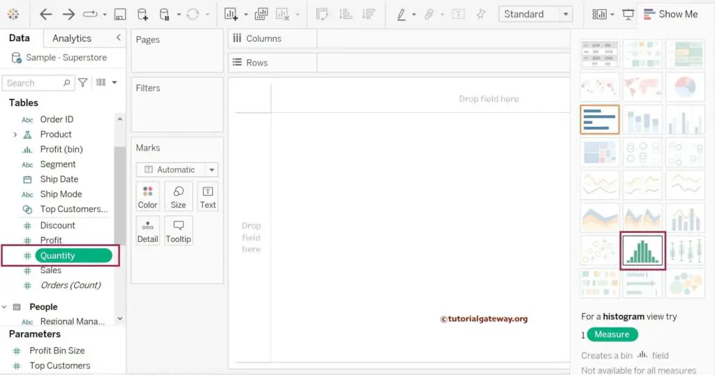
A histogram is one of the predefined charts available in the Show Me window. So, you can use the Show Me window to create a Histogram, which is the most recommended way of building it. The following steps are to create a Tableau histogram on the Desktop Show Me button.
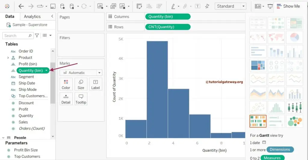
We can create a Histogram in Tableau using a single Measure (numeric column). So, let me select the Order Quantity Measure value and click the Histogram chart (marked with a red box) in the Show Me window.
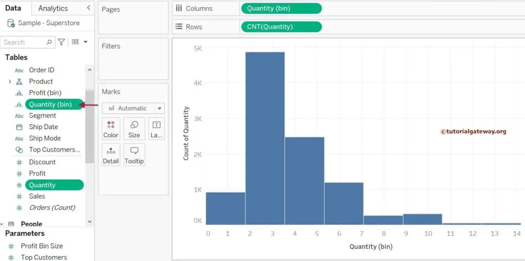
Once you click that, it will first create a bin of equally sized numbers for Order Quantity. Next, it adds the Quantity (bin) to the Columns shelf and the Quantity Measure value to the Rows shelf. Instead of using the default SUM aggregation, it uses the COUNT function on Quantity in the Rows shelf. It means each bar represents the count of Quantity within that particular bin.
The below screenshot shows you the Tableau Histogram created using the Show Me window. If you observe, there is no space between the bars because that is the default nature. However, you can use the size card to change it as per your requirements.
Please refer to Create Bins to learn about creating bins and editing them. Also, refer to Connecting to Server, Bar chart, Charts, and table calculations in Tableau.
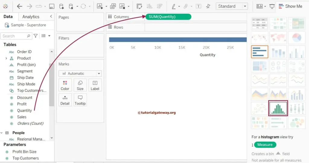
The second approach of creating Tableau Histogram
Before entering the Tableau Histogram example, let me remove the Quantity (bin) from the Dimensions section.
Drag and drop the Quantity Measure to the Columns shelf, and it uses the default aggregation SUM. Next, expand the Show Me window to click the histogram chart.
It follows the steps we explained in the first approach and creates a Histogram for you.
Although Tableau automatically generates the Quantity (bin), the bin size must be the same for Histogram. The best part is you can edit the bin size and change the default value per the requirement. For example, you can edit the bin size if you want to show a few or more bars in a histogram. To do so, right-click the newly created Quantity (bin) and change the number. Please refer to the Create Bins article for further reference.
Create a Tableau Histogram Manually – Third Approach
To create a histogram manually, you have to do some workaround. First, identify the Measure value for this chart and analyze the ideal bin size.
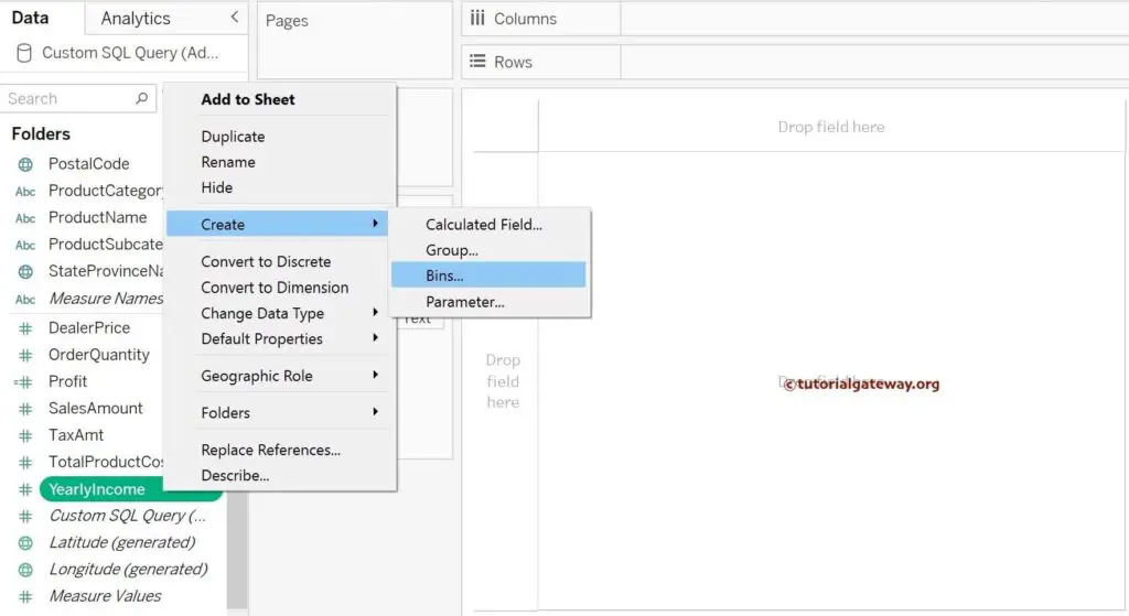
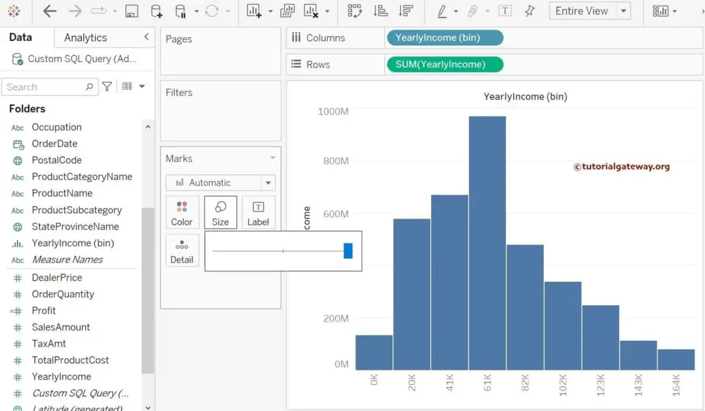
We use the Yearly Income column as the Measure value to demonstrate this Tableau Histogram example. So, right-click on the Yearly Income from the Measure region, select the Create option, and click the Bins.. option.
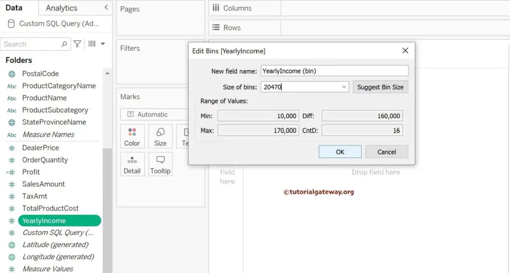
It will open the Edit Bins window with the default field name (YearlyIncome (bin)) and size (20470). Let me leave them as they are for now because I was Ok with the bin size. If not, change the Name and the default bin size (25000, 15000, etc).
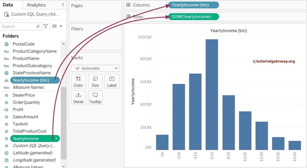
Drag and drop the newly created YearlyIncome (bin) to the Columns shelf and the Yearly Income Measure value to the Rows shelf. Once you have done that, it will show you the Tableau Histogram with equally sized bins of size 20470, and each bar size represents the Sum of the Yearly Income belonging to each bin.
Use the Size card on the Marks shelf to remove or reduce the spaces between each bar.
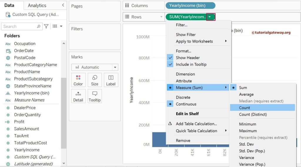
To change the default aggregation on the Rows shelf from SUM to COUNT, click the down arrow beside the SUM(YearlyIncome). Next, select Measure (Sum) from the drop-down menu and choose the Count option.
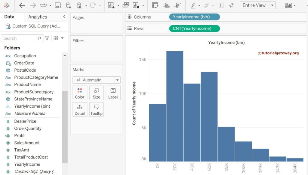
Now you can see the Tableau Histogram where each bar represents the count of Yearly Income.
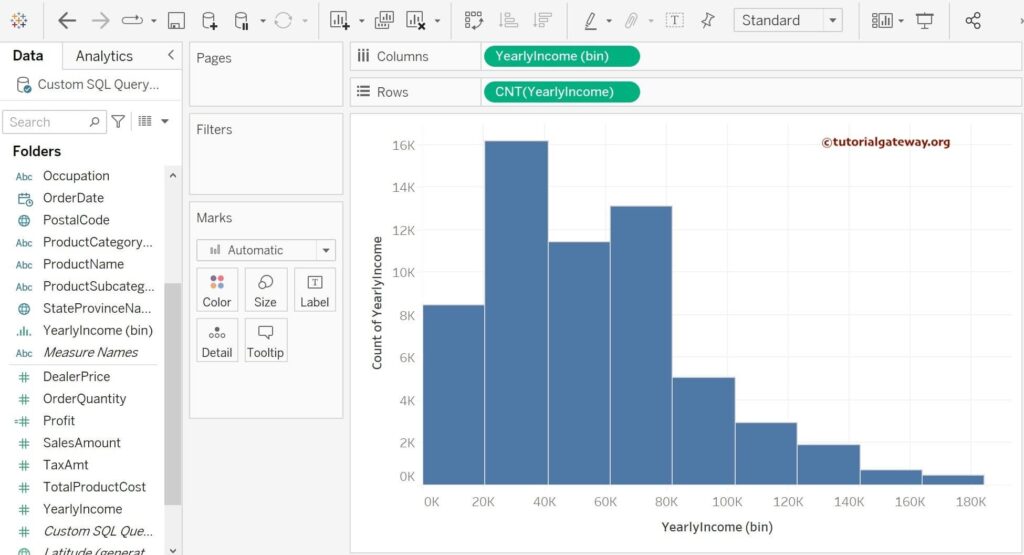
To verify whether we did it correctly or not, create one more histogram using the Show Me window and compare both. The below image is created using the Show Me window.
Add Data Labels To Tableau Histogram
Click the T button, and the Toolbar will add the data labels to the Histogram. The image below shows the yearly income count for each bin as the data labels on top of each rectangle.
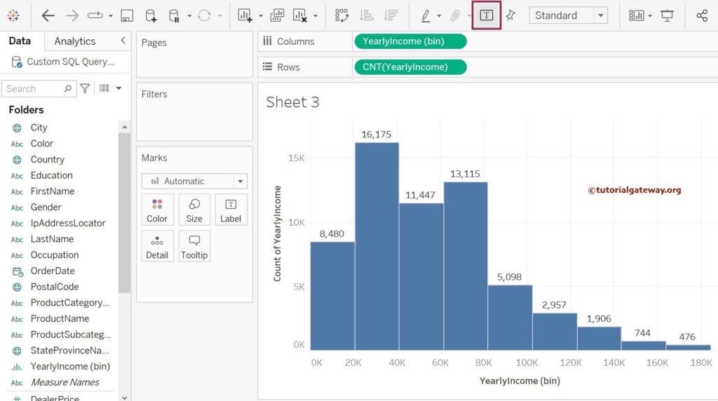
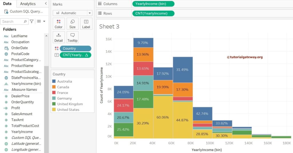
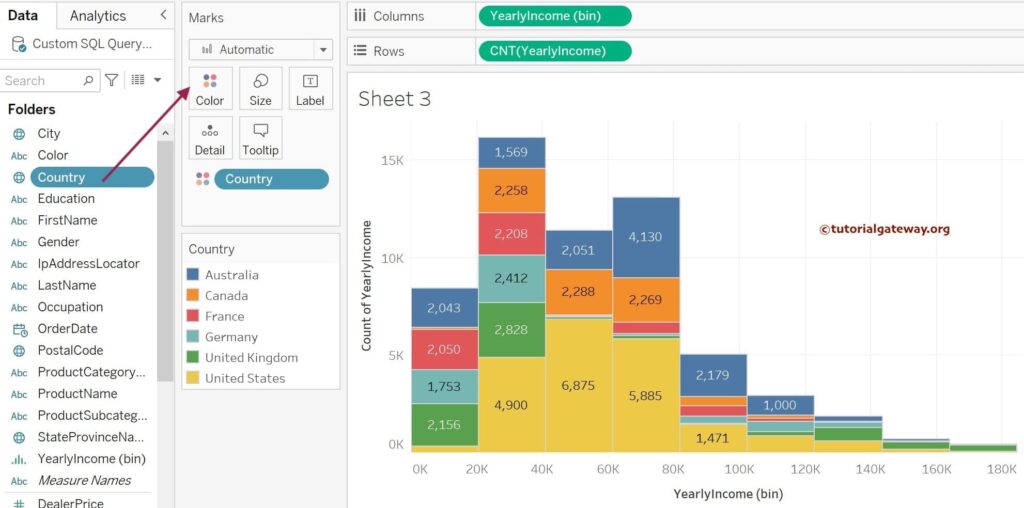
Tableau Stacked Histogram
The stacked histograms are helpful to further divide each rectangle bar based on another dimension. For example, if you want to see the Orders of each country belonging to a particular bin size, use the histogram of Orders and country as the stacked column.
In this example, let me use the Tableau Show Me window to create a Stacked Histogram using the Yearly Income Measure. Next, drag and drop the Country Dimension to the Color card on the Marks shelf. It will divide each rectangle bar for each country. As we have enabled the data labels in the previous step, it also displays the count for each country.
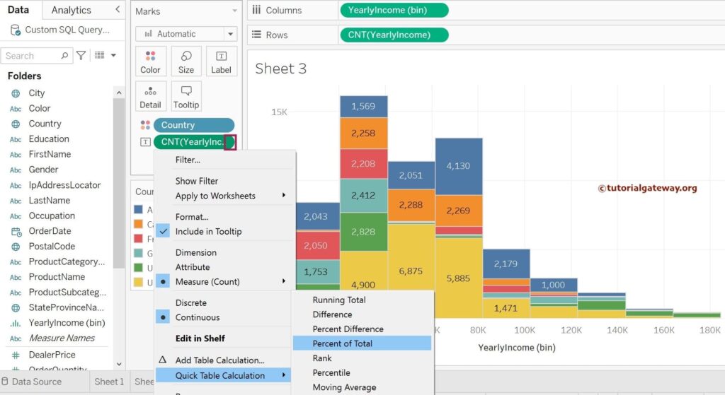
Display Percentages on Tableau Histogram
Instead of displaying the plain totals, our task is to show the Percentage of the Total for each country. To do that, within the Marks shelf, click the down arrow beside the CNT(YearlyIncome), select the Quick Table Calculation option from the menu, and choose the Percentage of Total.
Once completed, the Tableau Staked histogram will display the Total Percentage of Yearly Income against the YealyIncome bin.
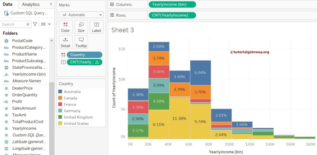
If you observe the above screenshot, it displays the percentages, but they are not showing the correct result. By default, it calculated the Table across, so you must manually change them.
Edit Table Calculation
If you want to edit the table calculation of a Tableau Histogram, Please click the down arrow beside the CNT(YearlyIncome) and choose Edit Table Calculation.. option.
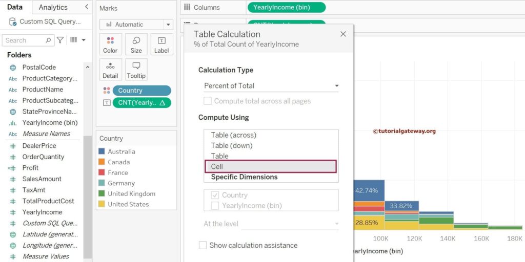
Once you choose the Edit Table Calculation.. option, a window called Table Calculation will open to change the calculation type or compute using. Here, changing the Compute using from default to Cell would be best.