
Tableau Heat Map is used to display the data along with colors. So, we can compare the records based on their color. In addition, we can create a Tableau heat map using one or more Dimensions members and Measure value. For instance, How many products have fallen short, How many are above our expectations, and so on.
In this article, we will show you how to Create a Heat Map in Tableau with an example, and the custom query we are going to use for this report is:
SELECT Geo.EnglishCountryRegionName,
       Geo.StateProvinceName,
       Geo.City,
       Prod.EnglishProductName,
       Prod.Color,
       Fact.OrderQuantity,
       Fact.TotalProductCost,
       Fact.SalesAmount,
       Fact.TaxAmt,
       Fact.[Freight]
FROM DimProduct AS Prod
   INNER JOIN FactInternetSales AS Fact
      ON Prod.ProductKey = Fact.ProductKey
   INNER JOIN DimSalesTerritory AS Terry
      ON Terry.[SalesTerritoryKey] = Fact.[SalesTerritoryKey]
   INNER JOIN DimGeography AS Geo
      ON Geo.[SalesTerritoryKey] = Terry.[SalesTerritoryKey]
Please visit the article Connecting to SQL Server and Charts to understand the SQL configurations and the available records.
How to Create a Heat Map in Tableau?
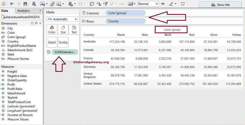
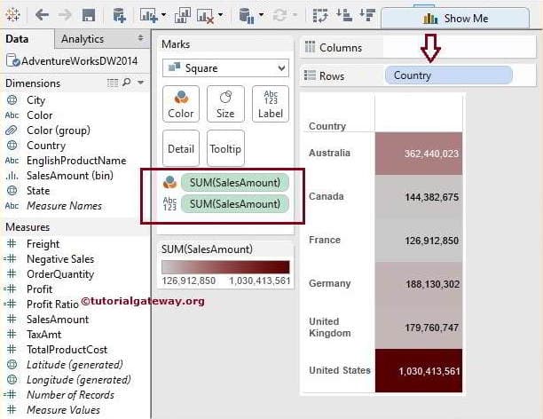
In this example, we will create a Heat Map on the Matrix report or crosstab report. But, first, Drag and Drop the Colors group (which we created in the Grouping article) from Dimension Region to Columns Shelf and Country name from Dimension Region to Rows Shelf.
Next, Drag and Drop the Sales Amount from the Measures region to the Text Field present in the Marks card, as shown below.
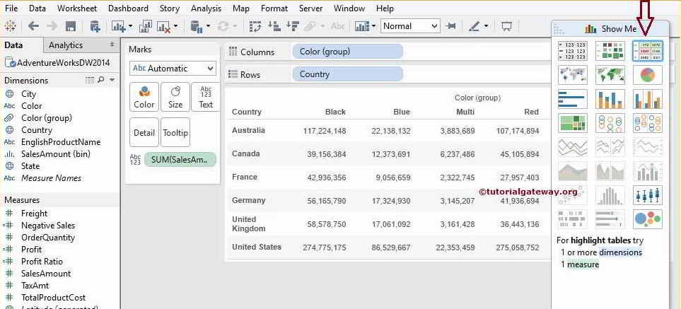
Next, Please select the Tableau Heat Map from the Show Me window.
Once complete, the following Tableau highlight table screenshot will display with the default color coding. The density of the green represents the value.
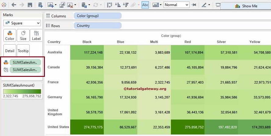
From the above screenshot, you can observe that we successfully created the Tableau Heatmap.
How to Format Tableau Heat map Colors?
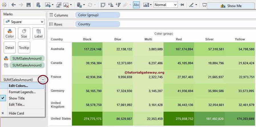
The desktop also allows us to format or edit the heat map default green. To format the default density marks, Please click on the Down arrow as shown below and select the Edit Colors.. option from the drop-down menu.
Please click the Color button to select the required one for your Tableau Heat map report.
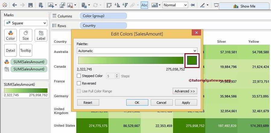
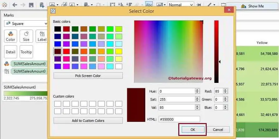
Once you click the button, a new window will open to edit or pick a new color. For now, we are selecting some random ones.
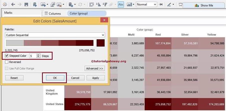
From the Edit window, you can click on the Apply button to see the live preview, as shown below. If you are uncomfortable with the Tableau Heat Map color combination, you can edit and reapply. It is the main advantage of the desktop.
If you select the Stepped Option, Palette will break the color into intervals specified in the Steps box. It is five intervals by default, but you can change the steps in the report requirements.
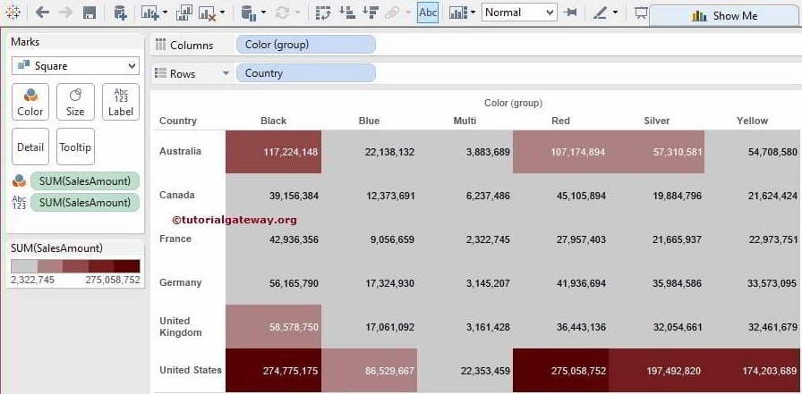
From the below, you can see the final output of our Tableau Heat Map.
Let us change the Matrix to a regular table for data visualization. To do this, Please remove the Color Group from the Columns Shelf and see the Heat Map for a detailed understanding.
Comments are closed.