An R ggplot2 Scatter Plot is useful for visualizing the relationship between any two data sets. Let us see how to Create, Format its size, shape, and color, add the linear progression, changing the theme of a Scatter Plot using ggplot in R Programming language with an example.
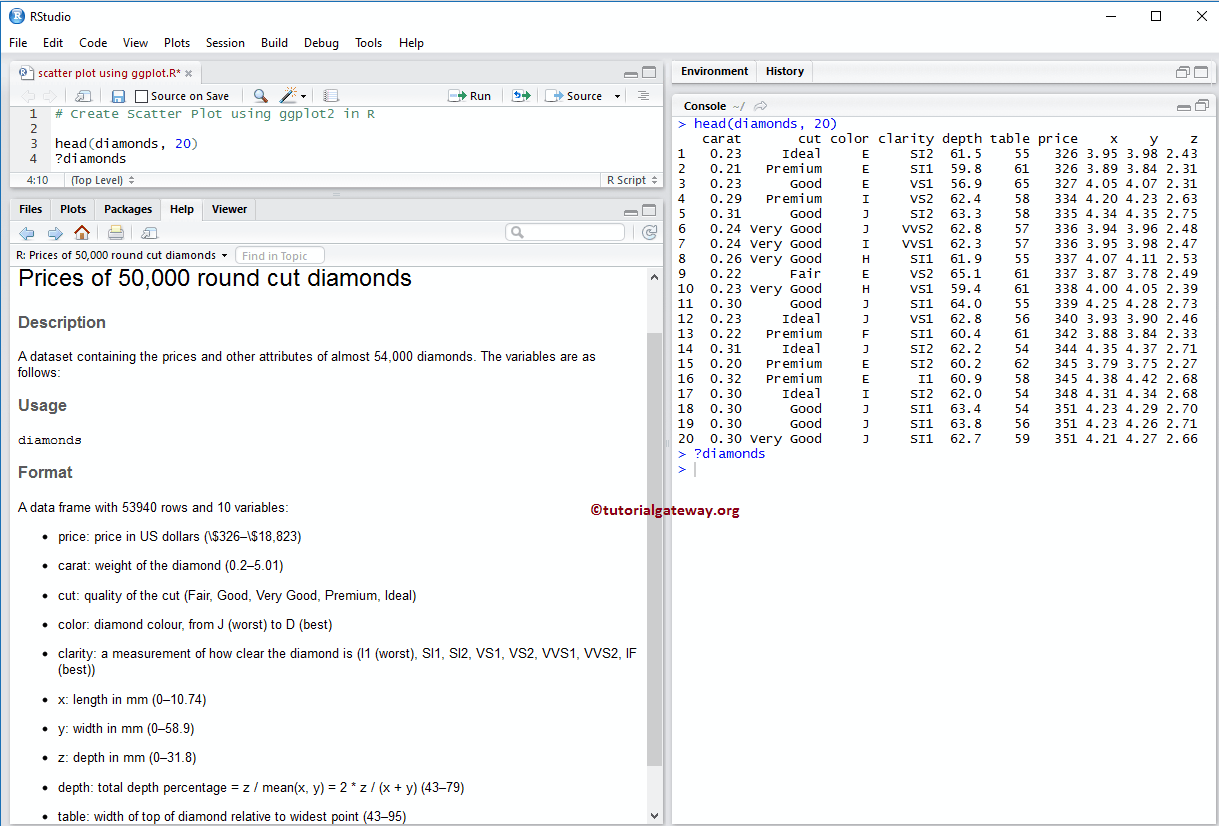
For this ggplot scatter plot demonstration, we are going to use the diamonds data set that the R Programming provides, and the data inside this dataset is:
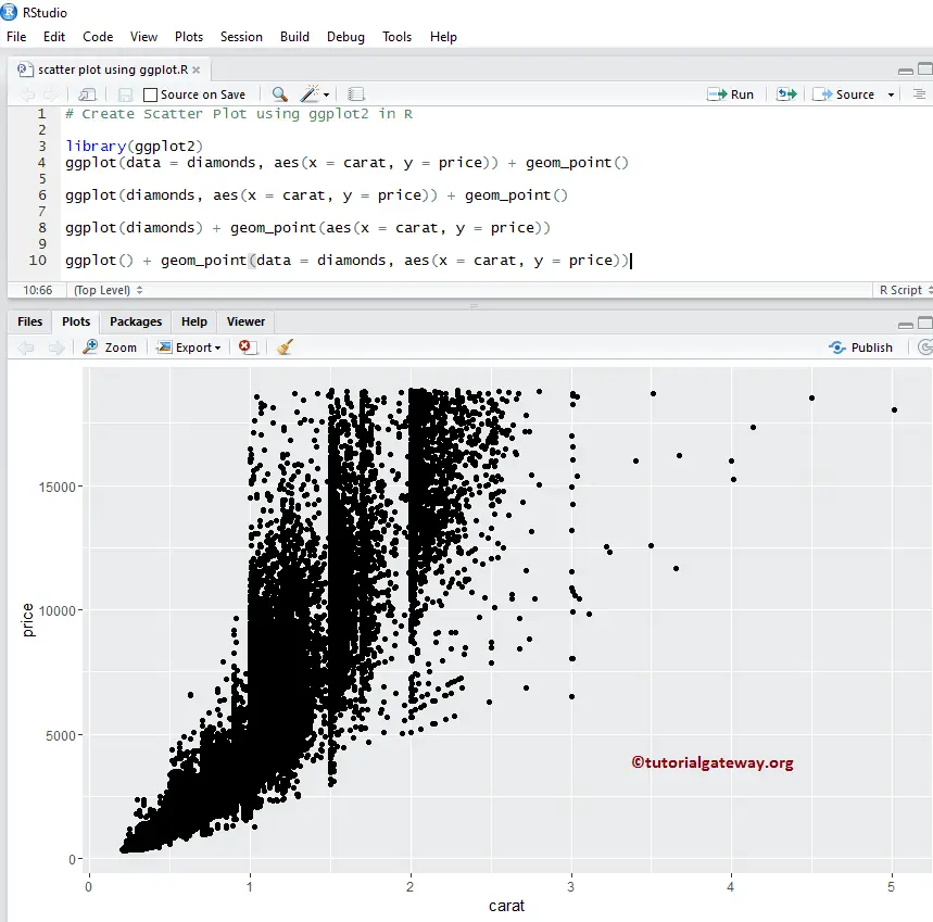
Create a Scatter Plot using ggplot2 in R
This example shows you the different ways to create a scatter plot using this package. And we use the above-shown diamonds data set, which the RStudio provides.
TIP: ggplot2 package is not installed by default to draw this. Please refer Install Packages article to install the R Programming package.
# Create
# Importing the ggplot2 library
library(ggplot2)

# Default way
ggplot(data = diamonds, aes(x = carat, y = price)) + geom_point()

# Approach 2
ggplot(diamonds, aes(x = carat, y = price)) + geom_point()

# Approach 3
ggplot(diamonds) + geom_point(aes(x = carat, y = price))

# Fourth Approach
ggplot() + geom_point(data = diamonds, aes(x = carat, y = price))
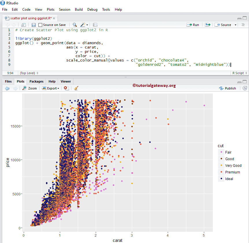
Change the Color of a Scatter Plot using ggplot2 in R
In this example, we change the color of a scatter plot drawn by the ggplot in R.
- color: Please specify the color you want to use. For example “red”, “blue”, “green” etc. In this example, we are using the values present in the cut column as color. You can try changing it to any other column.
- scale_color_manual: By default, the color argument assigns some default colors, and to change this, we can use this function. From the below code snippet, you can observe that we are assigning some random colors to each diamond cut.
NOTE: If you require to import data from external files, then please refer R Read CSV article to understand importing the CSV file.
# Changing Colors
library(ggplot2)
ggplot() +
        geom_point(data = diamonds,
                   aes(x = carat,
                       y = price,
                       color = cut)) +
        scale_color_manual(values = c("orchid", "chocolate4",
                                      "goldenrod2", "tomato2", "midnightblue"))
Change Shape & Size of a Scatter Plot using ggplot2 in R
In this example, we change the size and shape of a dot in the R ggplot scatter plot.
- shape: This argument can help you to change the default dot to any other shape. Or assign any column values to this as well, as we did in this example.
- size: It helps to change the size of each dot.
# Changing Shapes
library(ggplot2)
ggplot(diamonds)  +
  geom_point(aes(x = carat,
                 y = price,
                 color = clarity,
                 shape = cut)) +
  scale_shape_manual(values = c(1, 4, 9, 7, 5)) +
  scale_color_manual(values = c("orchid", "chocolate4", "goldenrod2",
                                "pink3", "tomato2", "midnightblue",
                                "khaki4" ,"seagreen"))

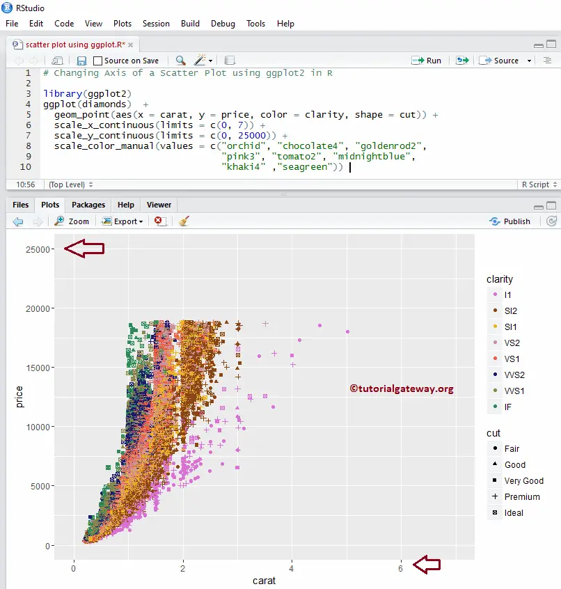
Change the Axis of a Scatter Plot using ggplot2 in R
In this R example, we show how to change the default axis limits drawn by the ggplot scatter plot.
- scale_x_continuous: This function can help to specify the limits for the X-Axis
- scale_y_continuous: It helps to specify the limits for the Y-Axis
library(ggplot2)
ggplot(diamonds)  +
  geom_point(aes(x = carat, y = price, color = clarity, shape = cut)) +
  scale_x_continuous(limits = c(0, 7)) +
  scale_y_continuous(limits = c(0, 25000)) +
  scale_color_manual(values = c("orchid", "chocolate4", "goldenrod2",
                                "pink3", "tomato2", "midnightblue",
                                "khaki4" ,"seagreen"))
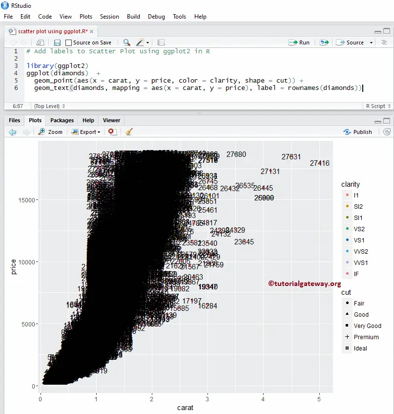
Add labels to Scatter Plot
In this example, we add labels for each spot in an R ggplot2 ggplot scatter plot.
library(ggplot2)
ggplot(diamonds)  +
  geom_point(aes(x = carat,
                 y = price,
                 color = clarity,
                 shape = cut)
             ) +
  geom_text(diamonds,
            mapping = aes(x = carat, y = price),
            label = rownames(diamonds))
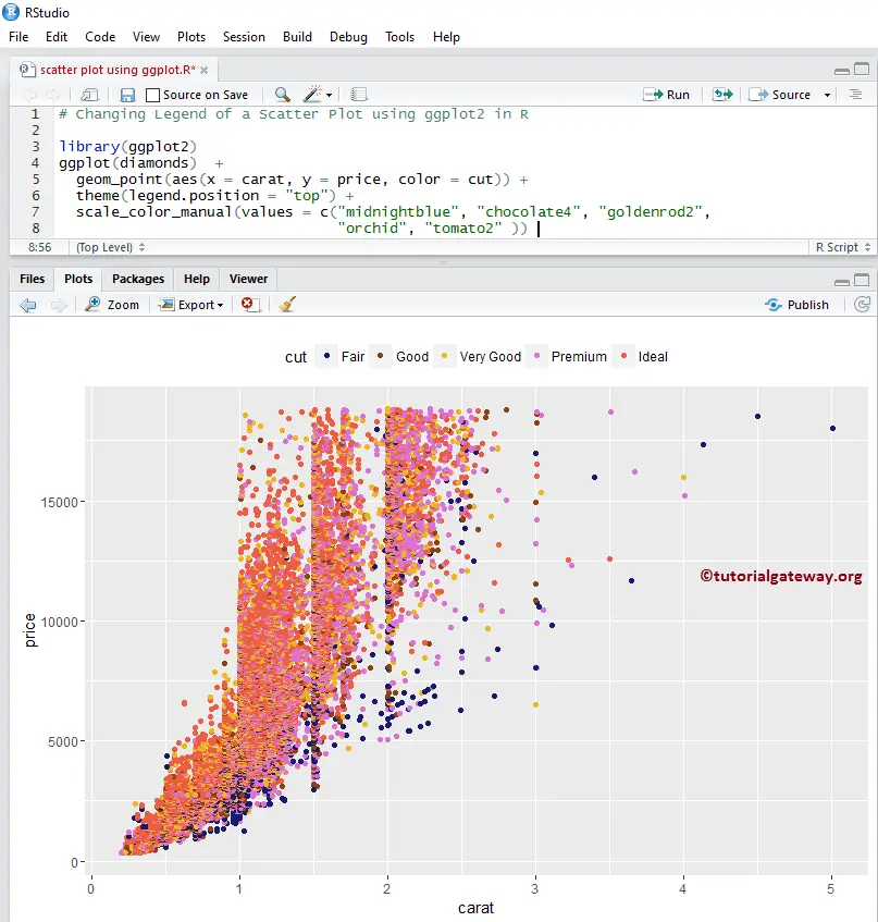
Alter R ggplot2 ggplot scatter plot legend position
By default, ggplot positions the legend on the right-hand side. Here, we change the legend position from right to top. Remember, You can use a legend.position = “none” to completely remove the legend.
library(ggplot2)
ggplot(diamonds)  +
  geom_point(aes(x = carat, y = price, color = cut)) +
  theme(legend.position = "top") +
  scale_color_manual(values = c("midnightblue", "chocolat4", "goldenrod2",
                                "orchid", "tomato2"))
Add Regression Lines to R ggplot2 ggplot scatter plot
The following examples show how to add a new layer called regression lines to the region.
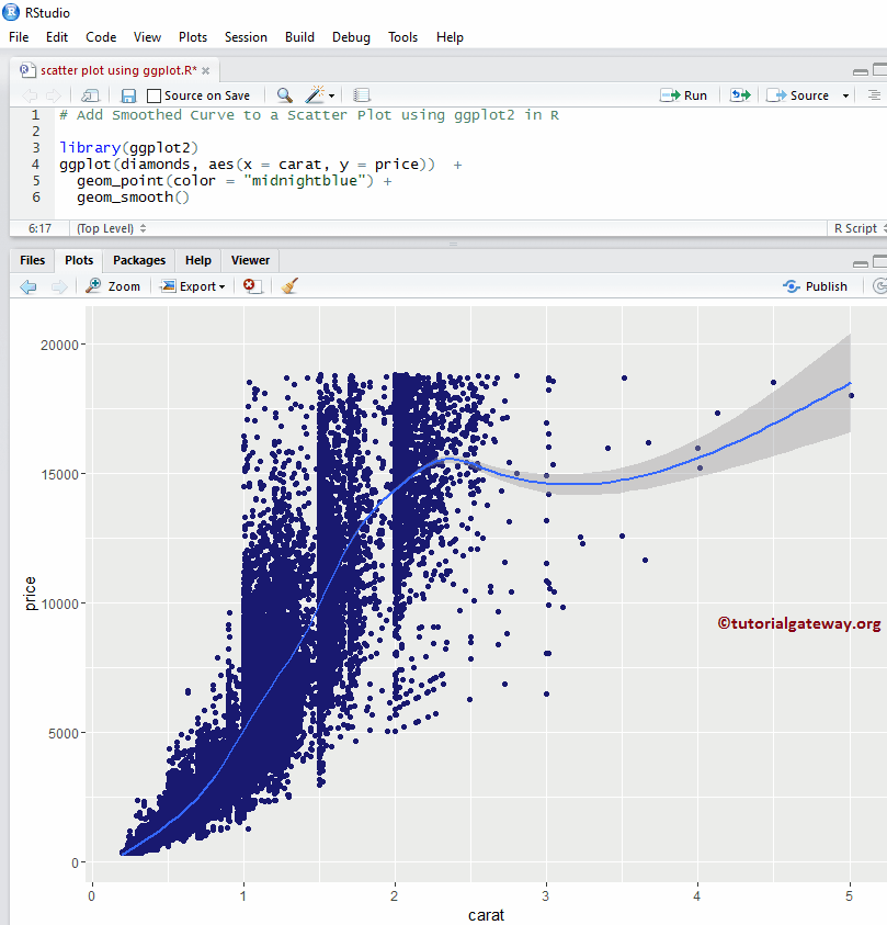
Add Smoothed Curve to Scatter Plot using ggplot2 in R
In this example, we show how to add the smoothing curve to a scatter plot using the geom_smooth() function.
library(ggplot2)
ggplot(diamonds, aes(x = carat, y = price))  +
  geom_point(color = "midnightblue") +
  geom_smooth()
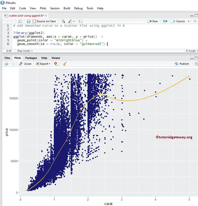
Remove Standard Error
By default, the geom_smooth() function add the standard error to the smoothing curve. Let us remove that smoothing curve from the R ggplot2 ggplot scatter plot.
library(ggplot2)
ggplot(diamonds, aes(x = carat, y = price))  +
  geom_point(color = "midnightblue") +
  geom_smooth(se = FALSE, color = "goldenrod2")
From the above code snippet, see that we changed the default color of the points and the smoothing curve.
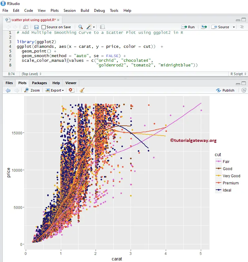
Add Multiple regression lines to Scatter Plot using ggplot2 in R
In this example, we add the multiple regression lines to the scatter plot using the method argument. Here, we haven’t done much; we just added the color argument. It means the geom_smooth() function is drawing the regression line for all the different diamond cuts.
library(ggplot2)
ggplot(diamonds, aes(x = carat, y = price, color = cut))  +
  geom_point() +
  geom_smooth(method = "auto", se = FALSE) +
  scale_color_manual(values = c("orchid", "chocolate4",
                                "goldenrod2", "tomato2", "midnightblue"))
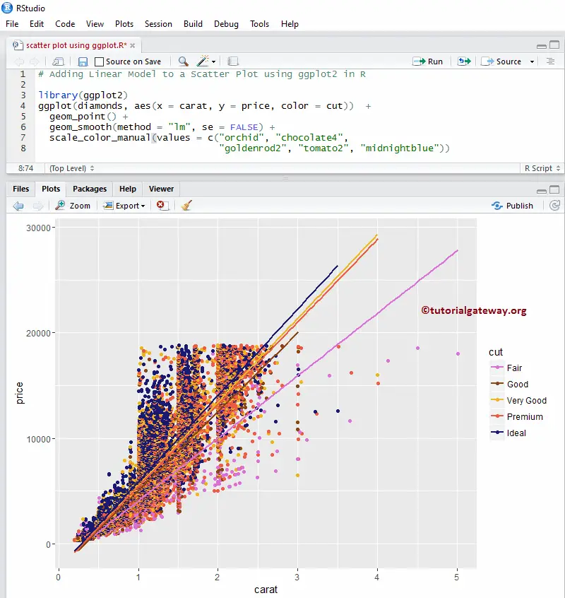
Add Linear Model to a Scatter Plot using R ggplot2 ggplot
Here, we add the linear progression to the scatter plot changing the method argument default value to lm (linear model).
library(ggplot2)
ggplot(diamonds, aes(x = carat, y = price, color = cut))  +
  geom_point() +
  geom_smooth(method = "lm", se = FALSE) +
  scale_color_manual(values = c("orchid", "chocolate4",
                                "goldenrod2", "tomato2", "midnightblue"))
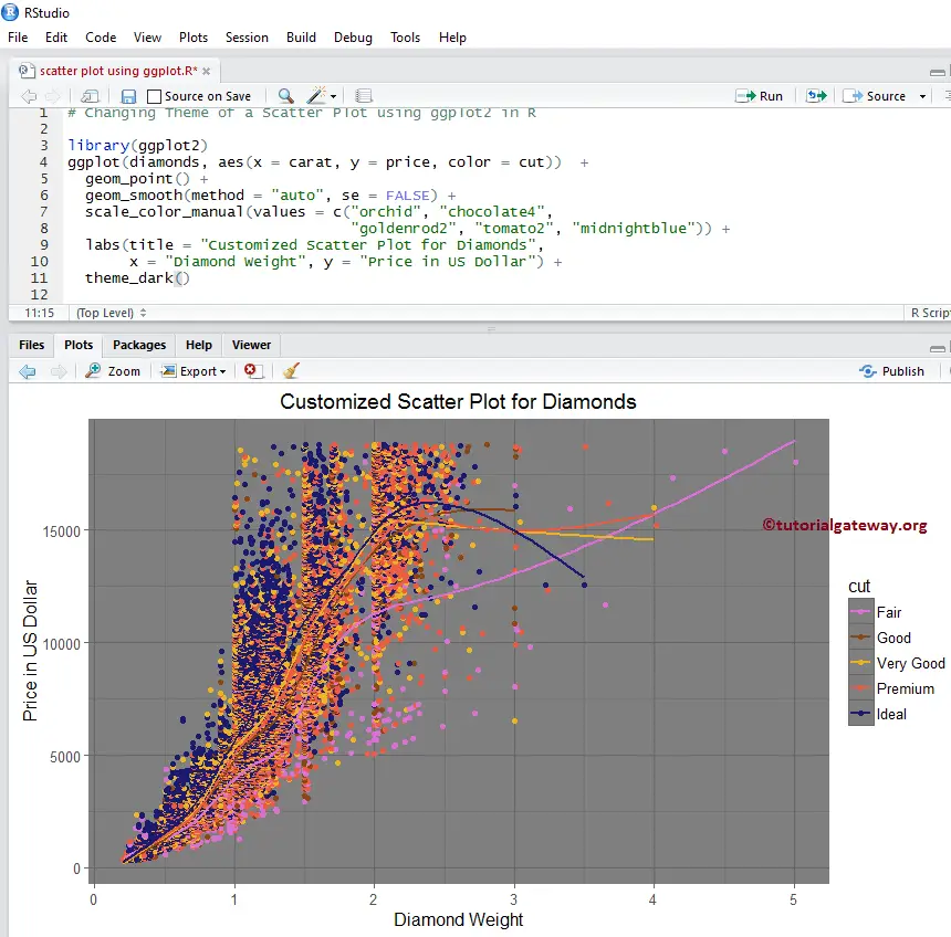
Changing Theme of a Scatter Plot
Let us assign a name to the R ggplot2 ggplot Scatter plot and change the default names of X-Axis and Y-Axis using labs function.
- theme_dark(): Use this function to change the default theme to dark. Type theme_ then R Studio intelligence shows the available options. For example, theme_grey().
- title: Provide the Title.
- x: Please specify the label for the X-Axis.
- y: Specify the label for the Y-Axis.
# Changing Theme

library(ggplot2)
ggplot(diamonds, aes(x = carat, y = price, color = cut))  +
  geom_point() +
  geom_smooth(method = "auto", se = FALSE) +
  scale_color_manual(values = c("orchid", "chocolate4",
                                "goldenrod2", "tomato2", "midnightblue")) +
  labs(title = "Customized Scatter Plot for Diamonds",
       x = "Diamond Weight", y = "Price in US Dollar") +
  theme_dark()
Adding 2D Density
The following examples show how to add the 2D density layer to the scatter plot region.
Adding 2D Density to a Scatter Plot using R ggplot2 ggplot
The ggplot2 allows us to add multiple layers to the chart. In this example, we add the 2D density layer to the scatter plot using the geom_density_2d() function.
# Adding Linear Model

library(ggplot2)
ggplot(diamonds, aes(x = carat, y = price))  +
  geom_point() +
  geom_density_2d()
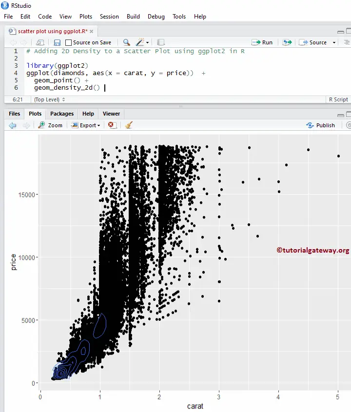
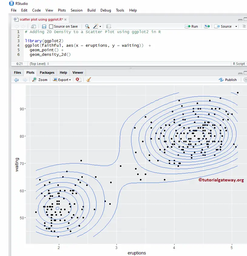
I think the diamond data set is too large to show the 2D density. Let me change the data set to faithful.
# Adding 2D Density

library(ggplot2)
ggplot(faithful, aes(x = eruptions, y = waiting))  +
  geom_point() +
  geom_density_2d()
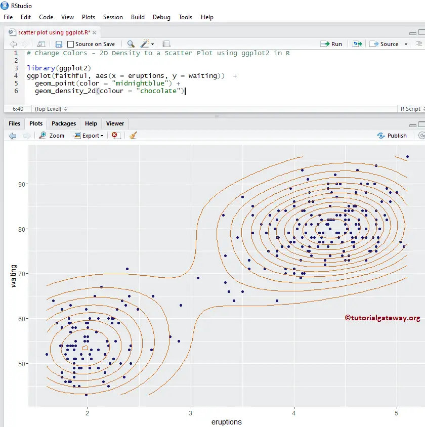
Changing Colors of a 2D Density Scatter Plot
Let us change the default colors drawn by the scatter Plot and the geom_density_2d() function using the color argument.
# Change Colors - 2D Density

library(ggplot2)
ggplot(faithful, aes(x = eruptions, y = waiting))  +
  geom_point(color = "midnightblue") +
  geom_density_2d(colour = "chocolate")
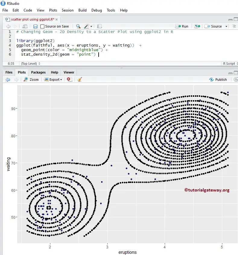
Add 2D Stat Density to a Scatter Plot
This example shows how to change the R ggplot2 ggplot scatter plot default lines drawn by geom to points using the stat_density_2d() function.
# Changing Geom - 2D Density

library(ggplot2)
ggplot(faithful, aes(x = eruptions, y = waiting))  +
  geom_point(color = "midnightblue") +
  stat_density_2d(geom = "point")
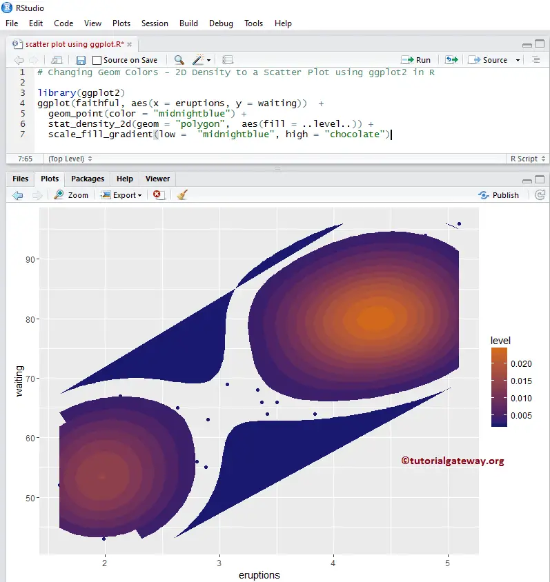
Changing Colors of the R ggplot 2D Stat Density Scatter Plot
Let us change the default 2D stat density using the scale_fill_gradient() function in R ggplot2. There are many functions like scale_fill_gradient2, etc., so try them to change the look and feel.
# Changing Geom - 2D Density

library(ggplot2)
ggplot(faithful, aes(x = eruptions, y = waiting))  +
  geom_point(color = "midnightblue") +
  stat_density_2d(geom = "polygon",  aes(fill = ..level..)) +
  scale_fill_gradient(low =  "midnightblue", high = "chocolate")