
Power BI Pie Charts are very useful for visualizing High-level data. For example, Sales by Continent or region, Orders by Country, Customers by region, Sales by Main product Group, etc.
Let us see how to Create a Pie Chart in Power BI with an example. For this pie chart example, we will use the SQL Data Source we created in our previous article.
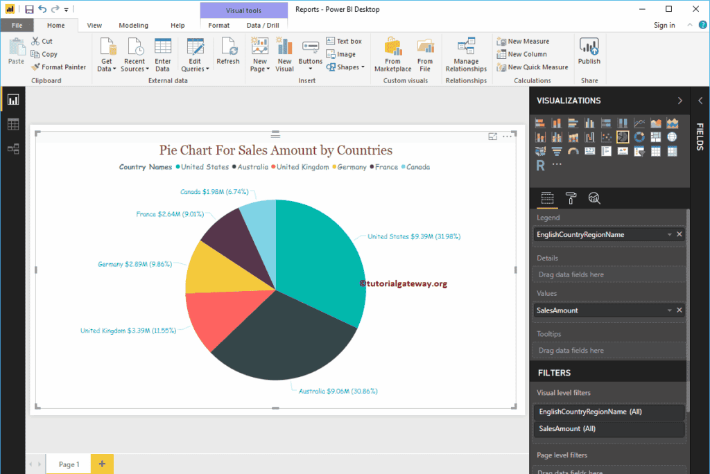
Create a Pie Chart in Power BI
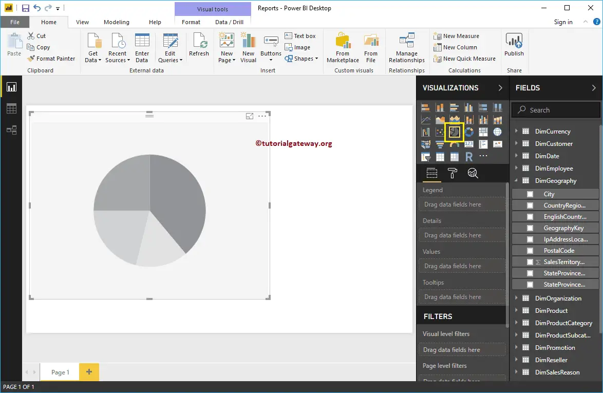
When you click on the Pie Chart under the Visualization section, it automatically creates a Pie Chart, as shown in the below screenshot.
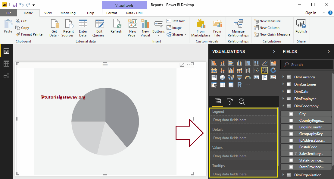
To add data to the Power BI Pie Chart, we have to add the required fields:
- Legend: Drag the column that you want to display as the legend.
- Details: Please specify the Column name on which you want to partition your Pie Chart. Values are split based on this field.
- Values: Any Numeric value, such as sales amount, Total Sales, Customer count, etc.
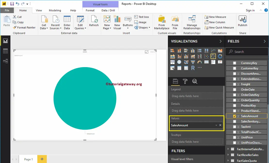
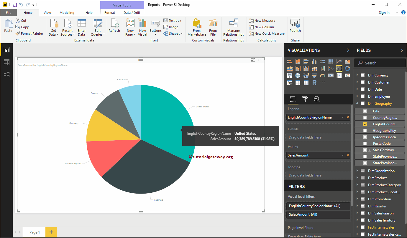
In this example, we create a Power BI Pie chart for Sales Amounts by country Names. So, Drag the Sales Amount column to the Values field. Please refer to the Connect to SQL Server and the List of Charts article to understand the Power BI Data Source.
Next, checkmark the English Country Region Name, or Drag and drop it to Legend region to automatically create a Pie Chart for you.
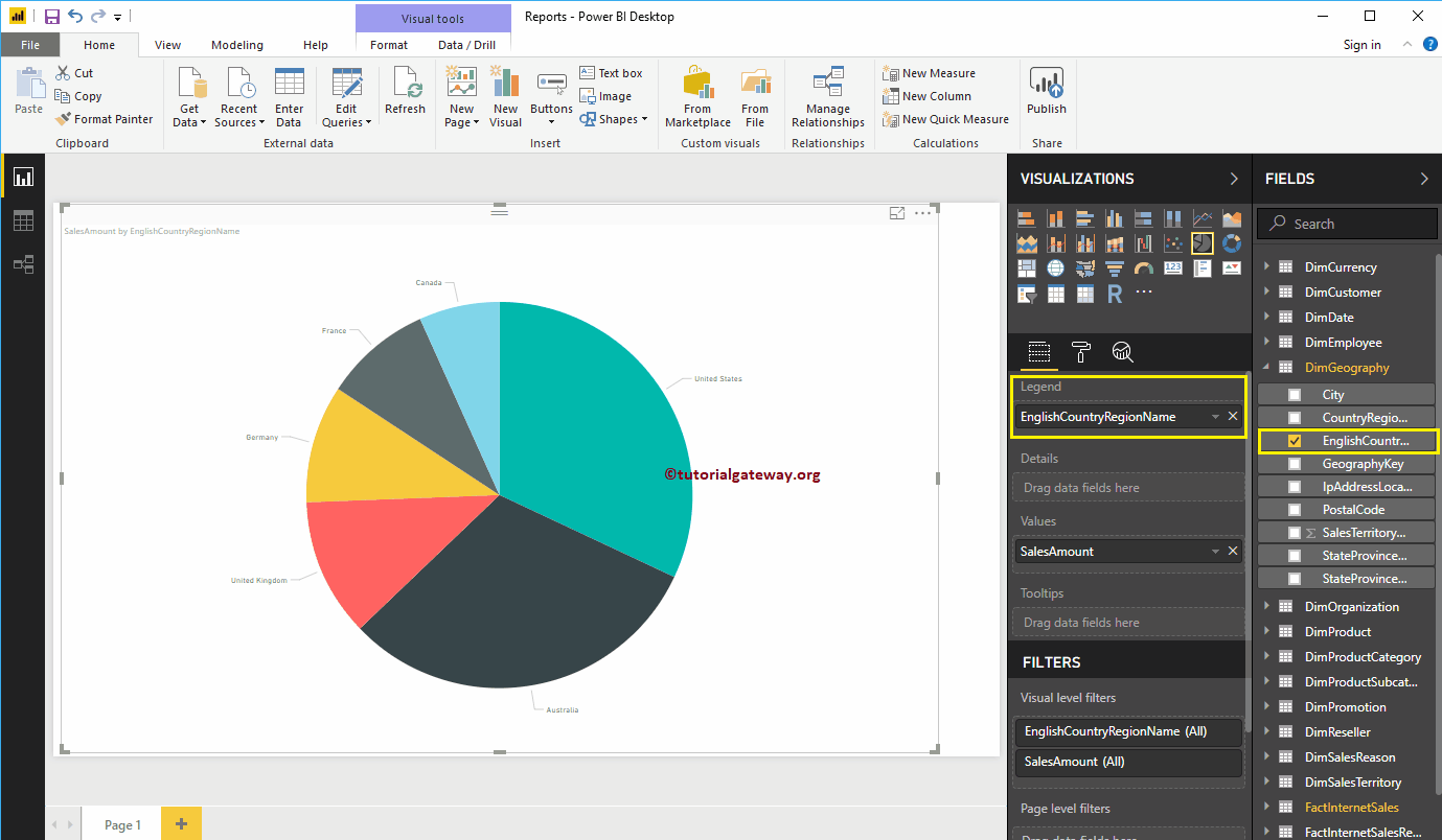
Hover over any slice to show you the Tool-tip of Country Name and Its Sales Amount.
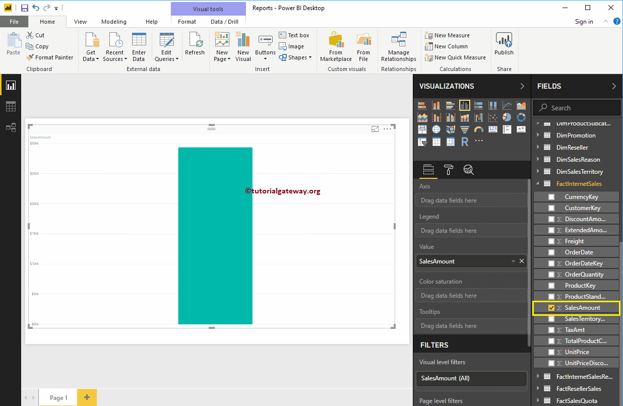
Second Approach to Create a Pie Chart
Drag and Drop the Sales Amount from the Fields section to Canvas automatically create a Bar Chart, as shown in the screenshot below.
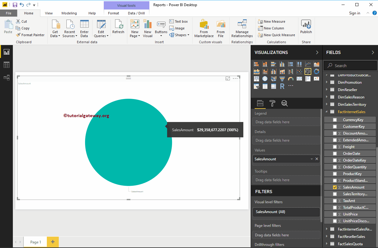
By clicking the Pie Chart in the Visualization, convert the Bar Chart to the Pie Chart.
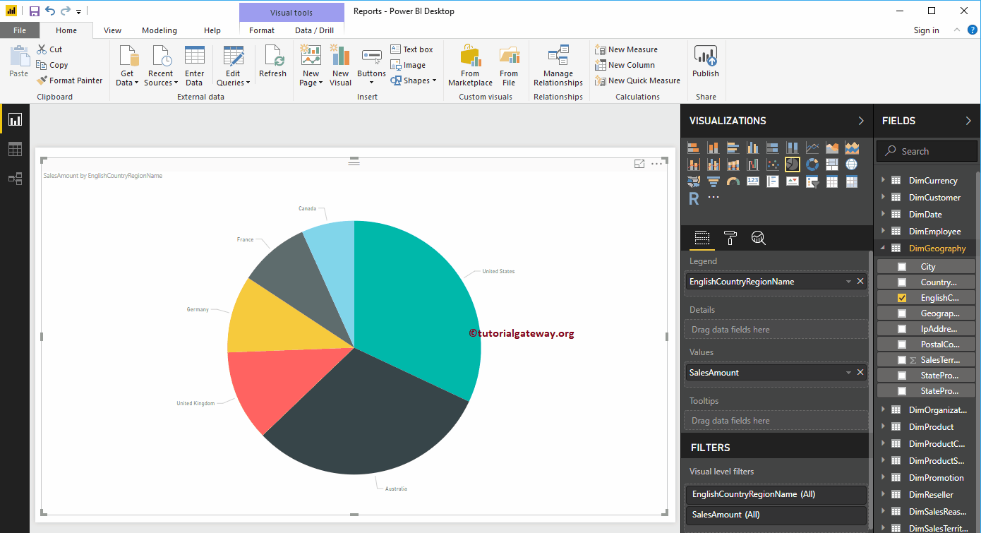
Add the Country Name to the legend. Remember, we haven’t added anything to the Details section. So, it considers the English Country Region Name (legend) as the Details.
If I add State Provide Name to the Details (explicitly), then the Pie Chart displays the Sales by State province Name, and the legend displays the Country Name.
Let me do some quick formatting of this pie chart.
NOTE: I suggest you refer to the Format Pie Chart article to understand the steps involved in formatting legend, Data Color, Background Color, Title, and Slice colors.
FAQ’s
Pie Charts are mainly helpful in displaying high-level information, such as Sales Vs. Category, Sales vs Region, Sales vs Segment. You can identify which pie is performing better and the contribution percentage by seeing it.
Expand the Filters section, add the fields to the Filters on the Visual section, and choose a basic or advanced option.
Click on the … dots, choose the sort by Measure or dimension, and select either Ascending or Descending.
Go to the Format chart tab, and under the Shape section, change the Start angle to rotate the chart.
Under the Visualization section, change/replace the Legend field or the Values field.
Pies don’t work to display more than 5 or 6 categories—anything above overwhelming the humans to understand the data.